
Inspiration With the growing impact of climate change, wildfires have become a recurring threat—devastating ecosystems, displacing communities, and straining emergency response systems. We wanted to explore how geospatial storytelling and real-time data could be used to visualize these hazards in an engaging, accessible, and informative way. GeoQuest: The Hazard Chronicles_SSSH was born from the idea of turning raw disaster data into a powerful public awareness and planning tool.
What it does This interactive Story Map brings real-time wildfire incidents to life using data-driven maps, custom visuals, and narrative storytelling. Users can:
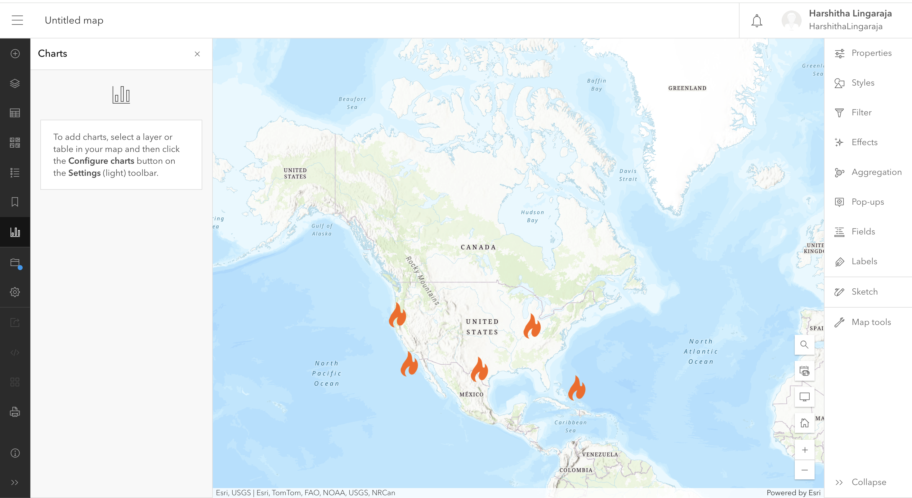
Explore active wildfire perimeters across the U.S.
Click through fire events to see details like acres burned and incident complexity Understand wildfire trends through charts and satellite images Learn how to stay prepared and reduce risk through a data-informed call to action
How we built it Dataset: WFIGS Interagency Wildfire Perimeters (Current), processed in Python Tools: ArcGIS Online, ArcGIS StoryMaps, Python (for data cleaning), Excel
Method:
Cleaned and filtered raw wildfire data Added mock coordinates for visualization using a free ArcGIS account Designed a Map Tour to display fire locations with custom pop-ups Integrated supporting media, charts, and a live data reference for real-time context
Challenges we ran into Free ArcGIS Online accounts do not support hosted feature layers, so we had to creatively simulate location data using mock coordinates Balancing storytelling with technical accuracy was tricky—especially when summarizing data without oversimplifying complex events Ensuring accessibility and interactivity while keeping the interface clean and intuitive Accomplishments that we're proud of Created an interactive Story Map using only public tools Successfully simulated real-time wildfire mapping without live API access Developed clear, accessible content that communicates real risks to a general audience Integrated multiple forms of media to enhance learning and user engagement
What we learned How to transform geospatial data into a compelling narrative The power of cartographic storytelling in raising awareness of environmental hazards Techniques for designing interactive experiences in ArcGIS with limited technical resources The importance of accessibility, design simplicity, and user empathy in public-facing tools
What’s next for GeoQuest: The Hazard Chronicles_SSSH We plan to expand this project to include other environmental hazards—such as floods, hurricanes, and air pollution—each with its own story module.
Future goals include: Integrating live data APIs for real-time simulations Adding community-sourced hazard reports Embedding predictive models for fire spread and risk assessment Launching a public-facing dashboard to support emergency preparedness education

Log in or sign up for Devpost to join the conversation.