Inspiration
Learning about data and seeing bubble graphs in my class on global health to understand how countries increased or decreased in health over time inspired me to create a bubble graph system to make data collected from Ai camera easier to comprehend and help tell a story as it moves through time.
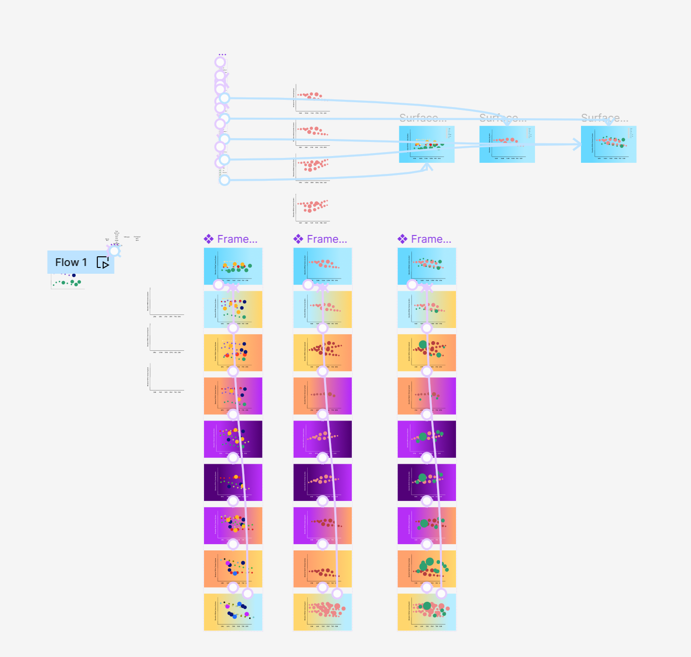
What it does
It collects data and uses it to classify different objects and show them in frequency and in location. Using a bubble graph, the area of the circle increases depending on the frequency it has during a specific time. It also has a selection tool where you can check what objects are shown in the camera, you want to specify as it goes through a time of the day and night. Where the circle is within the data is where in the x and y axis it is within the camera system.
How we built it
Using UX/UI and using google collab with Python. I used the Dataset given by Toren AI to implement to Google Collab and coded using Python to rearrange it into a more comprehensible graph and then used wireframing to create the front-end style.
Challenges we ran into
Understanding how to translate data into code
Accomplishments that we're proud of
Being able to create an understanding of Python data
What we learned
How to improve in Google Collab and python
What's Next for Generating Objects Through Density and Time
I would like to continue with the project. I was able to create a final mock-up for the project but I would like to dive in with using the data I was coding and implement it to design styles I have and make that data interactive.

Log in or sign up for Devpost to join the conversation.