Inspiration:
This is my first hackathon and I wanted to try something related to what I learned in the data science workshop.
What it does:
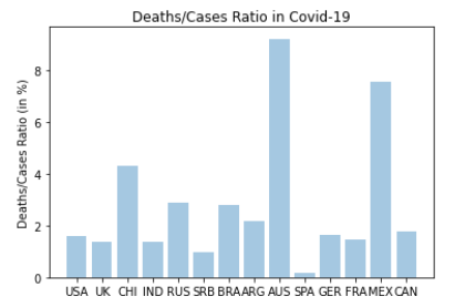
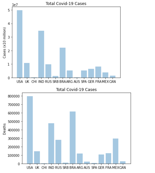
This project takes data from a covid-19 statistics data set and sorts it into graphs for 14 different countries, showing their total number of cases, deaths, and deaths/cases ratio.
How we built it:
I built it in colab with python, using numpy and pandas.
Challenges we ran into:
It was a challenge to create the percentage for the ratio of deaths to cases, but I used a for loop to do it.
Accomplishments that we're proud of:
Learning how to create the graphs and visuals, as it was something I never knew you could do in python.
What we learned:
I learned how to use colab with numpy and pandas. I also learned how to present data in graphs with python.
What's next for General Hack/Data Science Stefan Ilic:
I will continue investigating covid-19 to learn and expand to more complex datasets and presentations.
Built With
- colab
- python

Log in or sign up for Devpost to join the conversation.