
Inspiration
Cleaner, Safer and Smarter technology to reduce Gas turbine emissions
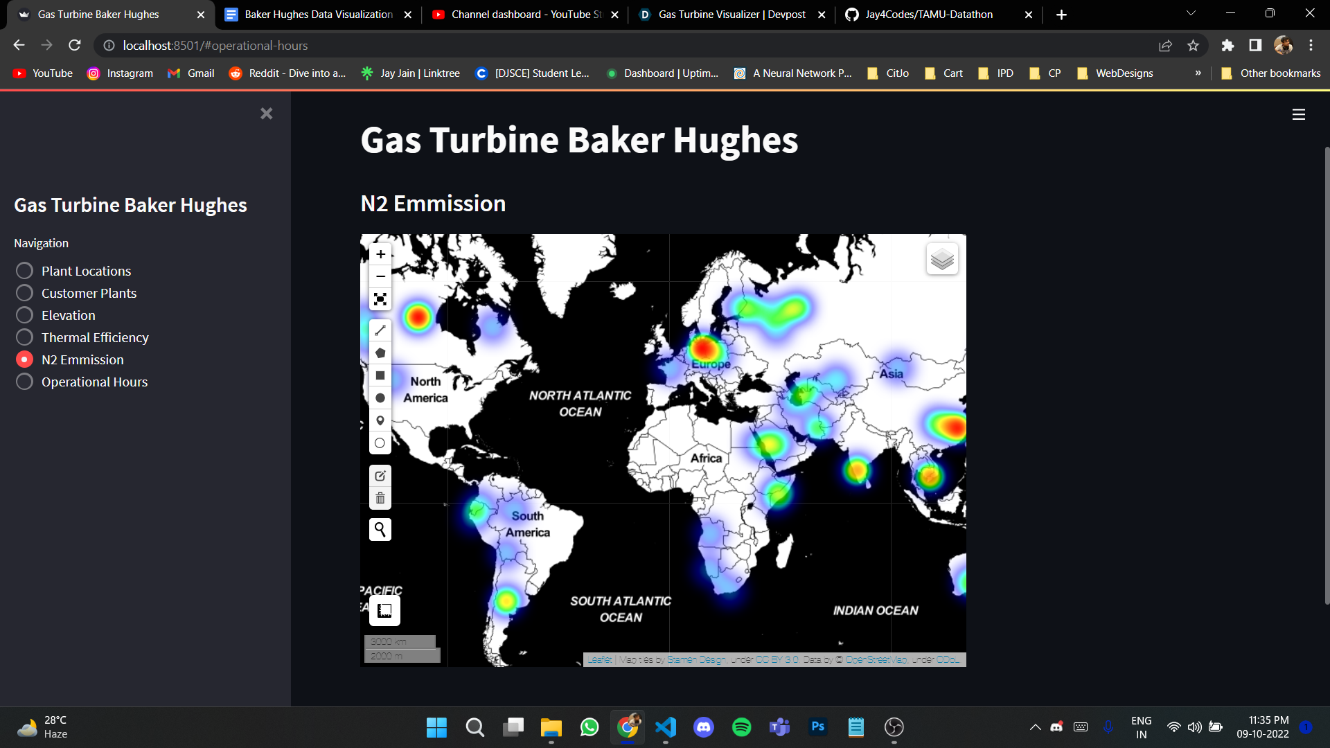
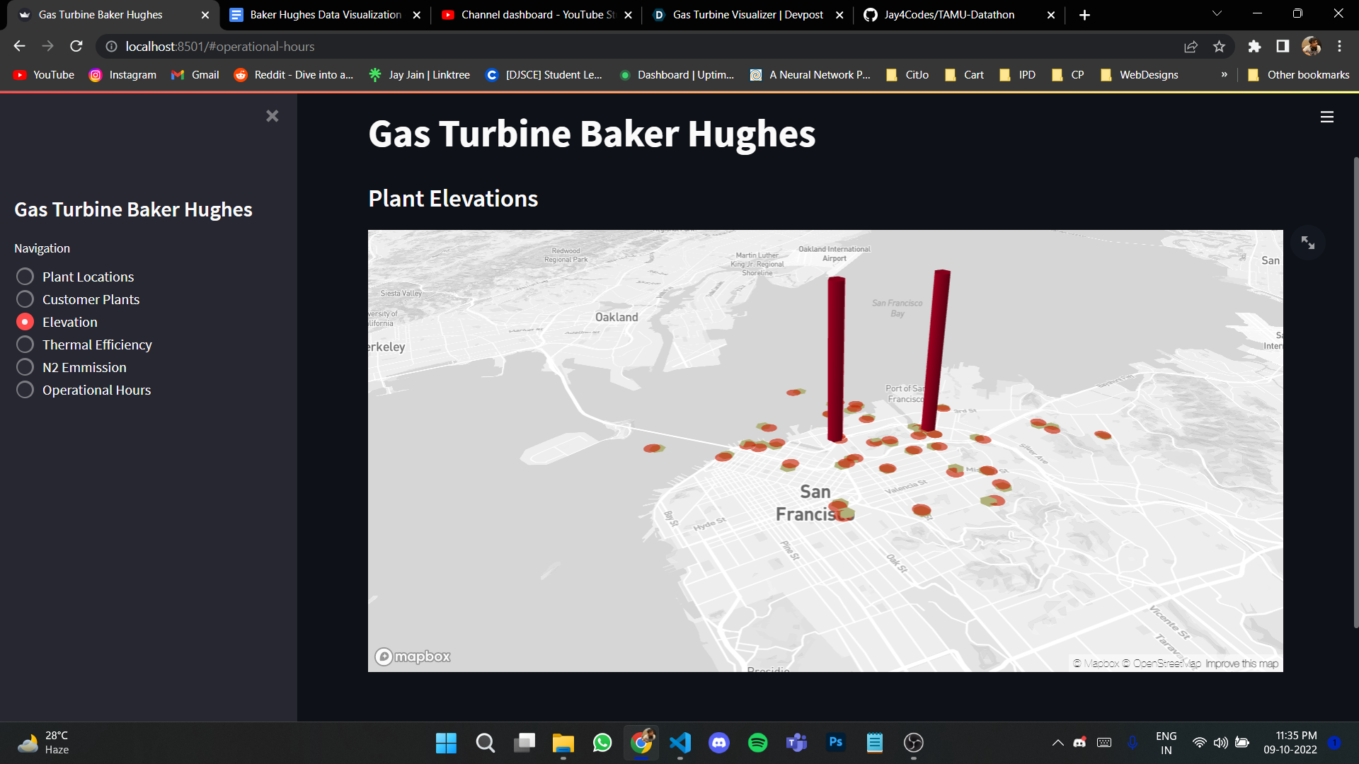
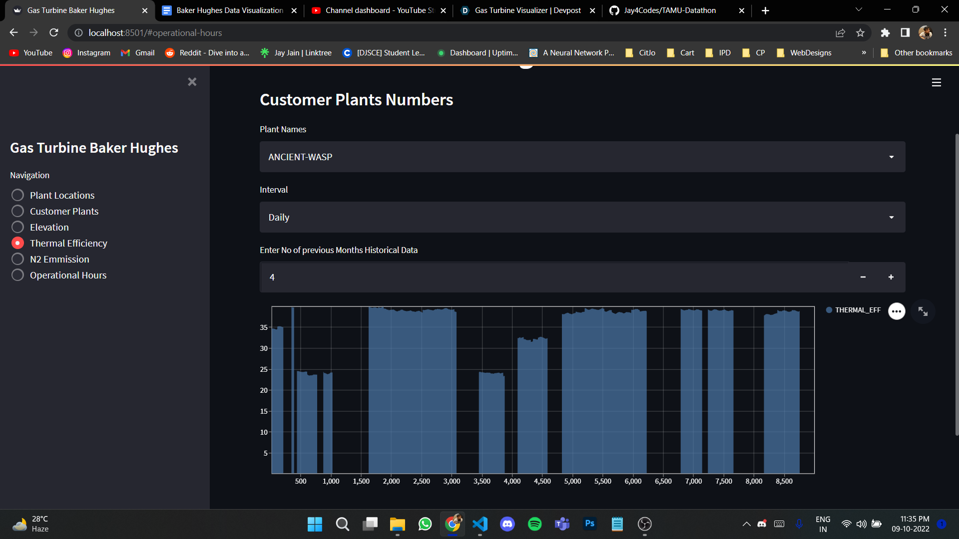
What it does
The visualizer helps to analyze various emissions
How we built it
The data were joined according to different power plants and the customer name. After joining zero value was filled for power plants that were not working . Streamlit software was used to make the dashboard interactive.
Challenges we ran into
The data was huge so a lot of time was required to clean and redesign it.
Accomplishments that we're proud of
Exploring the various visualization methods and libraries
What we learned
Spirit of working as a team and developed more deeper skills in python
What's next for Gas Turbine Visualizer
UI design upgrades and alive more interactive dashboard


Log in or sign up for Devpost to join the conversation.