-
-

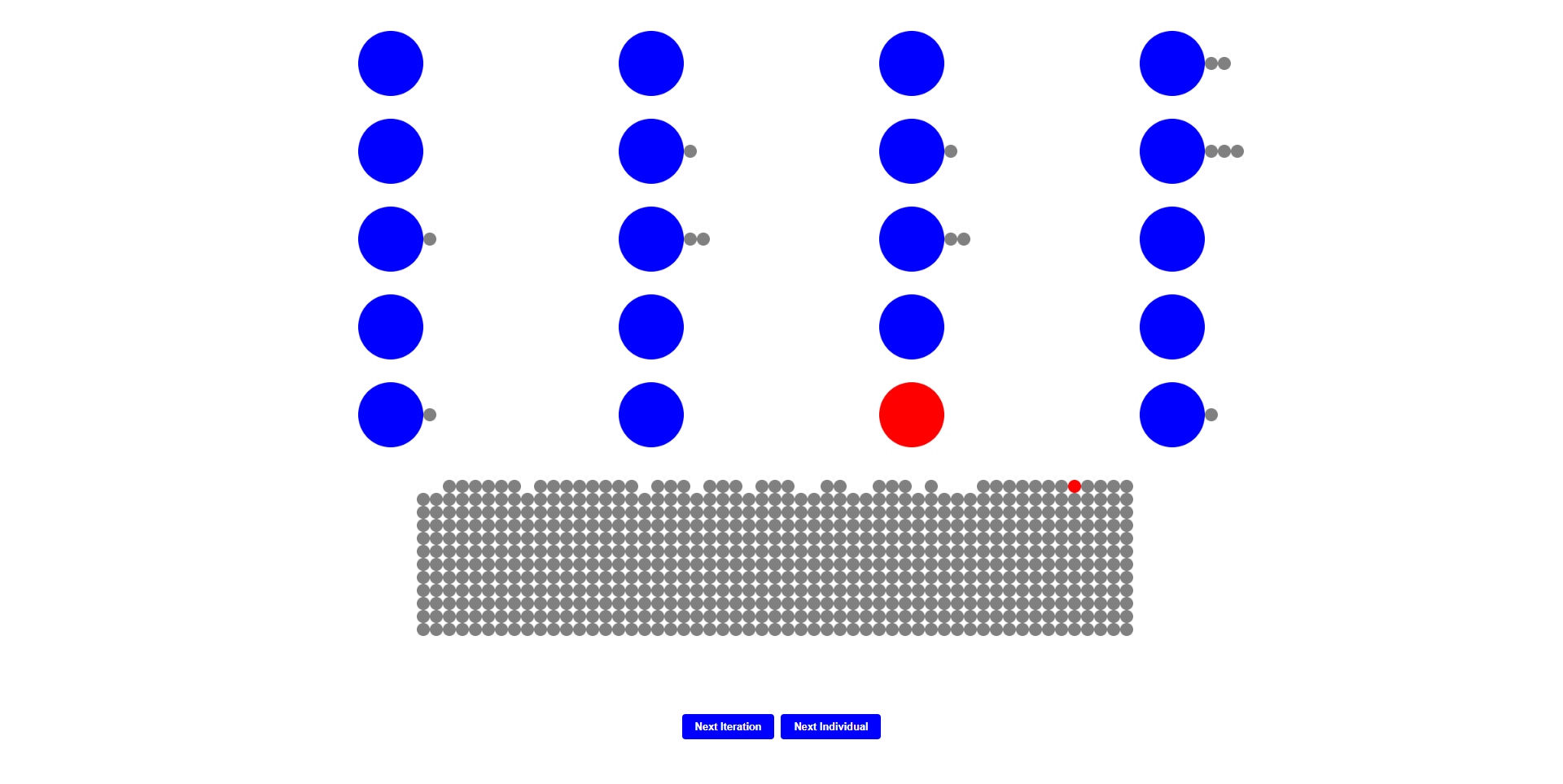
An image displaying a rejected candidate
-
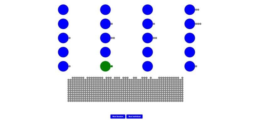
An image displaying an matched candidate

Inspiration
We were inspired by the medical residency matching program, known as "The Match", but the lack of information makes it difficult to truly capture how this process really works. Using basic information, we wanted to create a visual that could help medical students better understand their odds at matching into a program they would want.
What it does
This visualization displays the results of the Gale-Shapely matching algorithm, which is the same algorithm the NRMP uses to match residency applicants with programs. Given a list of applicants and their preferred programs in order, and a list of programs and their preferred applicants in order, the algorithm attempts to pair applicants to programs based on their respective rankings. This visualization shows every step of the process, highlighting rejected applicant-program pairs in red while highlighting matched applicant-program pairs in green and moving them next to each other.
How we built it
Using react.js and python, we created this visualization.
Challenges we ran into
Some challenges we ran into was finding a good dataset on this subject. Much of the residency matching criteria varies from school to school, with some being more focused on quantitative stats whereas others were sorting holistically. This lead to some difficulties and leading our simulation to be more theoretical than initially intended. We also ran into some challenges when exporting a .csv dataset from R, as it was not in the format we wanted it to be in, so we found it easier to learn python in the short amount of time given and generate a dataset from there. When creating the visualization itself, working with an html canvas element is not something that either of us were familiar with and much research had to be done to not only make the visualization accurate, but also responsive.
Accomplishments that we're proud of
Only one of our members had previous experience with coding, so we were proud that both of us had meaningful contributions to the final product. Additionally, this visualization is both functional and responsive, and is more interactive than the static websites the one member who did have web dev experience has worked on in the past. We believe that the project itself tackles a problem that while niche, has not been tackled in a sufficient manner before. A finalized and polished visualization built off of the foundation created today can become a valued tool for any residency program applicant in the future, and can easily be optimized when given more accurate datasets to help residency applicants maximize their chances of matching with a program.
What we learned
We learned how to create randomly generate a dataset with lists using python. Additionally, we learned the intricacies of the Gale-Shapely algorithm, through implementing it in JavaScript, utilizing object oriented programming to its fullest ability.
What's next for Gale Shapely Algorithm Visualization
Eventually, we plan to use a well-compiled dataset that could accurately simulate a student's odds with an actual school given their quantitative data. Alongside this, we initially planned to use monte-carlo simulations to help predict an applicant's probability of matching my utilizing the law of large numbers on random dataset and calculating the proportion of times in which an example candidate matches with a program.
Built With
- python
- react.js

Log in or sign up for Devpost to join the conversation.