Inspiration
I’ve always been fascinated by science fiction’s power to reframe our perspective, turning data into an epic journey. When I discovered the richness of OECD well-being metrics—from health to life satisfaction—I imagined guiding users on a “Galactic Odyssey” through those numbers. Framing these global statistics as interstellar waypoints felt like the perfect way to spark curiosity and make trends feel alive.
What it does
This immersive Dash app lets me explore humanity’s well-being across time and space:
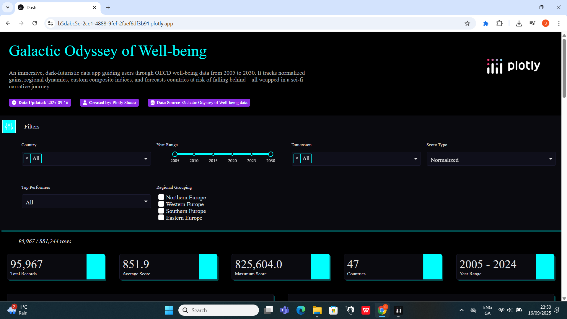
- Global Filters: I can slice by country, year range, dimension, score type, top performers, and regional grouping.
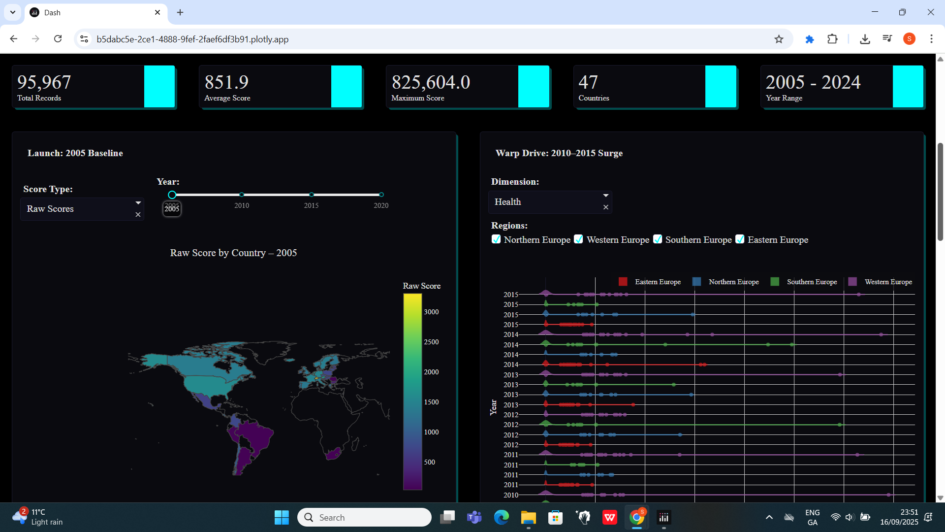
- Launch: 2005 Baseline: I animate raw vs. normalized scores on a world map (2005–2020) and highlight the three biggest gainers.
- Warp Drive: 2010–2015 Surge: I dive into distributions of Health, Education, Income, or Life Satisfaction across European subregions using ridgeline plots.
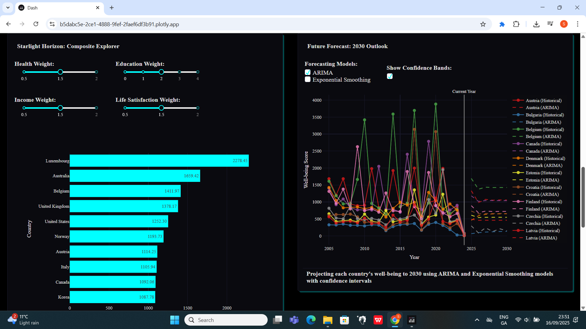
- Starlight Horizon: Composite Explorer: I adjust neon sliders to assign custom weights and watch the top-10 bar chart update live.
- Future Forecast: 2030 Outlook: I compare ARIMA and Exponential Smoothing projections with confidence bands and flag countries at risk.
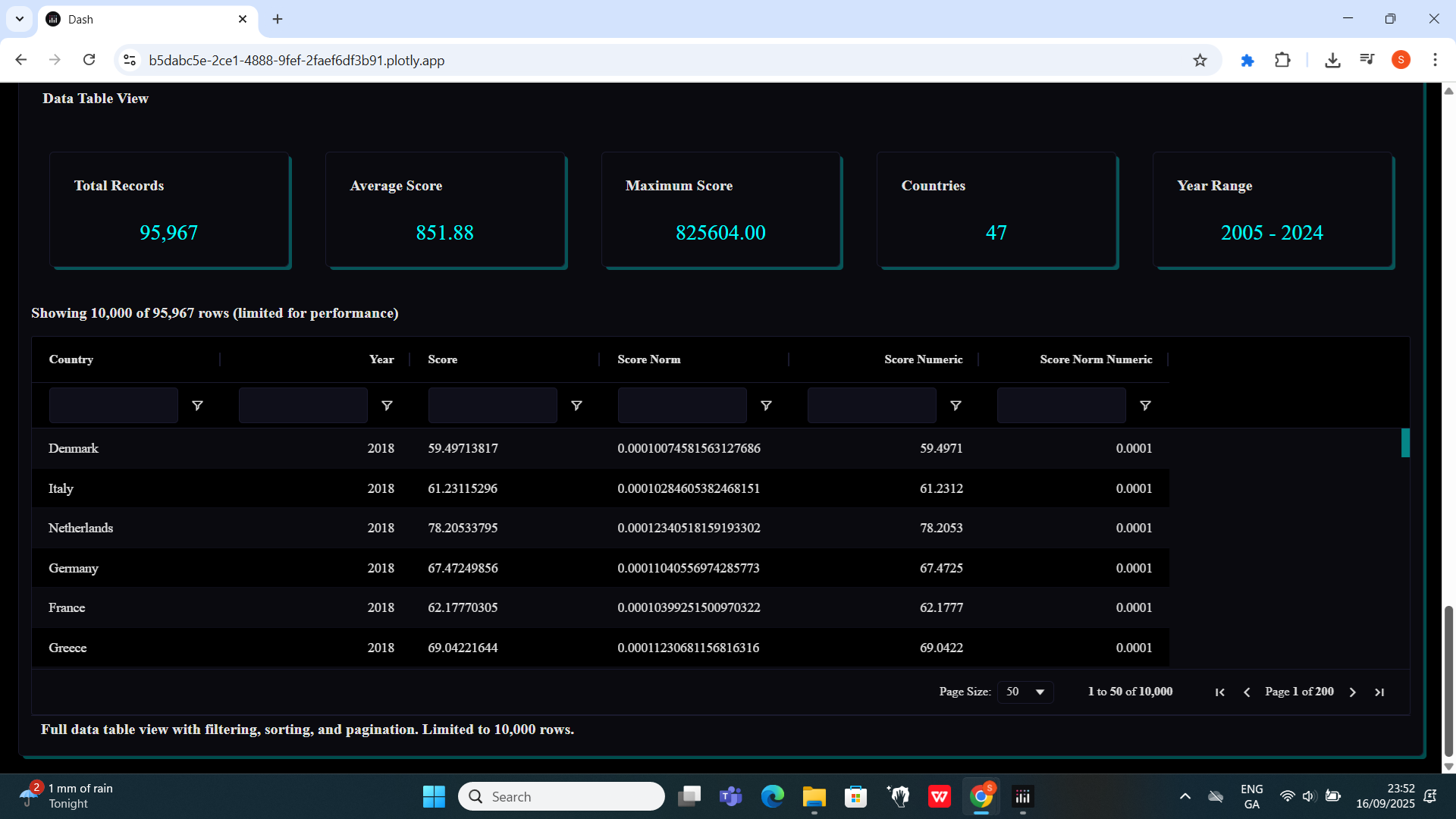
- Data Table View: I drill into all 95,967 records with sorting, filtering, pagination, and summary stats cards.
How we built it
I first prepared the data as below:
import pandas as pd

# Convert numeric columns
numeric_cols = [c for c in df.columns if c not in ['Country', 'Year']]
df[numeric_cols] = df[numeric_cols].apply(
    lambda col: pd.to_numeric(col.astype(str).str.replace(',', ''), errors='coerce')
)

# Melt into long format
df_long = df.melt(
    id_vars=['Country', 'Year'],
    value_vars=numeric_cols,
    var_name='Dimension',
    value_name='Score'
)

# Normalize each dimension to [0, 1]
df_long['Score_norm'] = (
    (df_long['Score'] - df_long.groupby('Dimension')['Score'].transform('min')) /
    (df_long.groupby('Dimension')['Score'].transform('max') -
     df_long.groupby('Dimension')['Score'].transform('min'))
)

df_long.to_csv('wellbeing_long.csv', index=False)
Then, I used Dash and Plotly for the core visualizations, dash_design_kit for consistent layout, and dash_ag_grid for the high-performance data table. My get_data() function centralizes the CSV load and cleansing, while a dedicated filter_component unifies all six global filters. Each narrative card lives in its own module with a layout definition and _update_logic callback for clear separation. For forecasting, I tapped into statsmodels’ ARIMA and Exponential Smoothing, then overlaid shaded confidence intervals in Plotly.
Challenges we ran into
- Merging global and card-specific inputs so the preview engine never 404s or loses context.
- Stacking dozens of violin traces for the ridgeline, managing legend groups and consistent row heights.
- Guaranteeing the dropdown never showed raw field names (like OBS_VALUE) when my sci-fi labels didn’t match the data.
- Casting NumPy types to native Python booleans and ints so Plotly wouldn’t raise value-type errors.
- Designing forecasts that balance clarity (confidence bands) with risk annotations without cluttering the chart.
Accomplishments that we are proud of
- A seamless six-filter panel that drives every chart without redundant controls.
- Immersive, dark-futuristic styling—neon slider accents, gold highlights on world maps, and a cohesive cosmic theme.
- Modular code: each card is self-contained, testable, and preview-ready.
- A live composite index builder with real-time bar-chart updates.
- A performant 10,000-row Ag-Grid view paired with dynamic summary cards.
What we learned
- How to chain Dash callbacks elegantly, merging global and local inputs.
- Advanced Plotly Graph Objects techniques for overlay traces and multi-axis layouts.
- That NumPy types can break prop validation in Plotly—always cast to native Python types.
- The value of
test_inputsto enable WYSIWYG previews for complex components. - Ways narrative design can transform a standard BI dashboard into an experiential journey.
What’s next for Galactic Odyssey of Well-being
- I want to build a mobile-first interface so I can inspect well-being trends on the go.
- I plan to add geospatial drill-downs at the city or regional level for localized insights.
- I’ll explore collaborative annotations so teams can leave notes directly on the visualizations.
- I aim to expose a public API for programmatic access to normalized and composite scores, fueling further data storytelling.


Log in or sign up for Devpost to join the conversation.