-
-
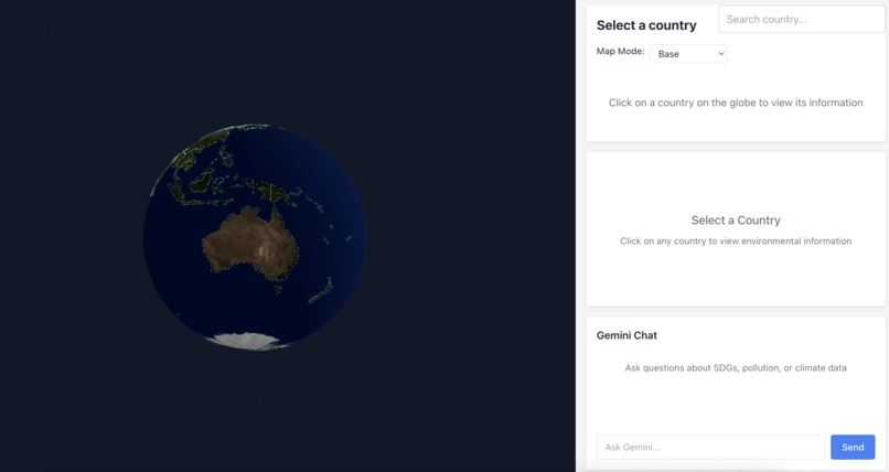
tool built
-

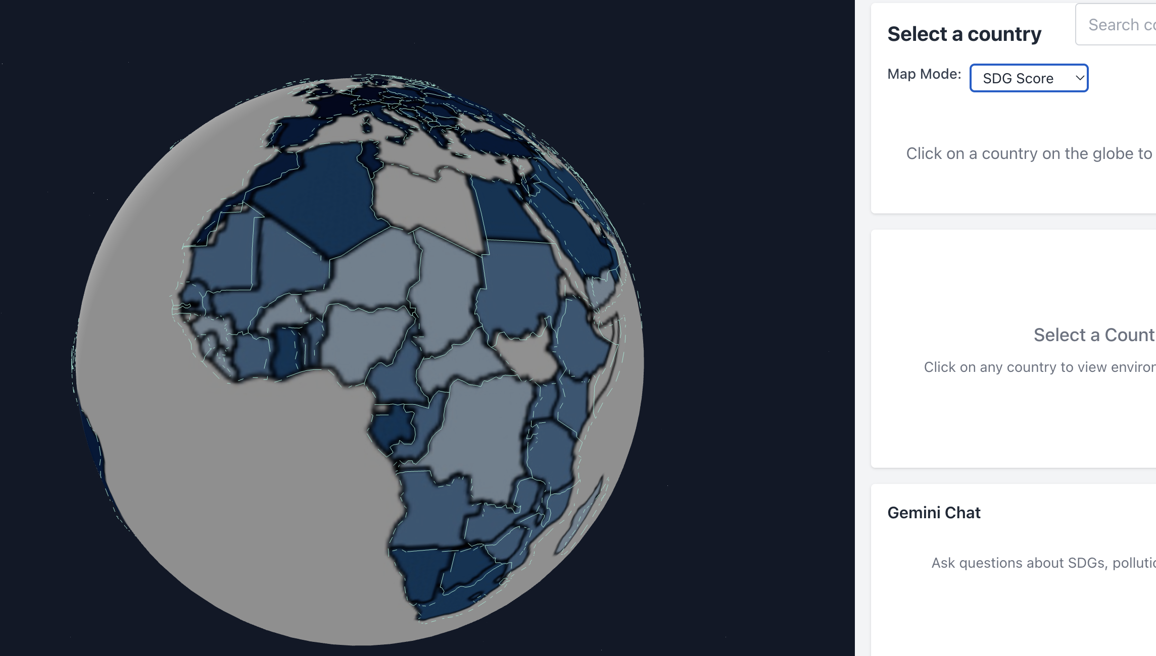
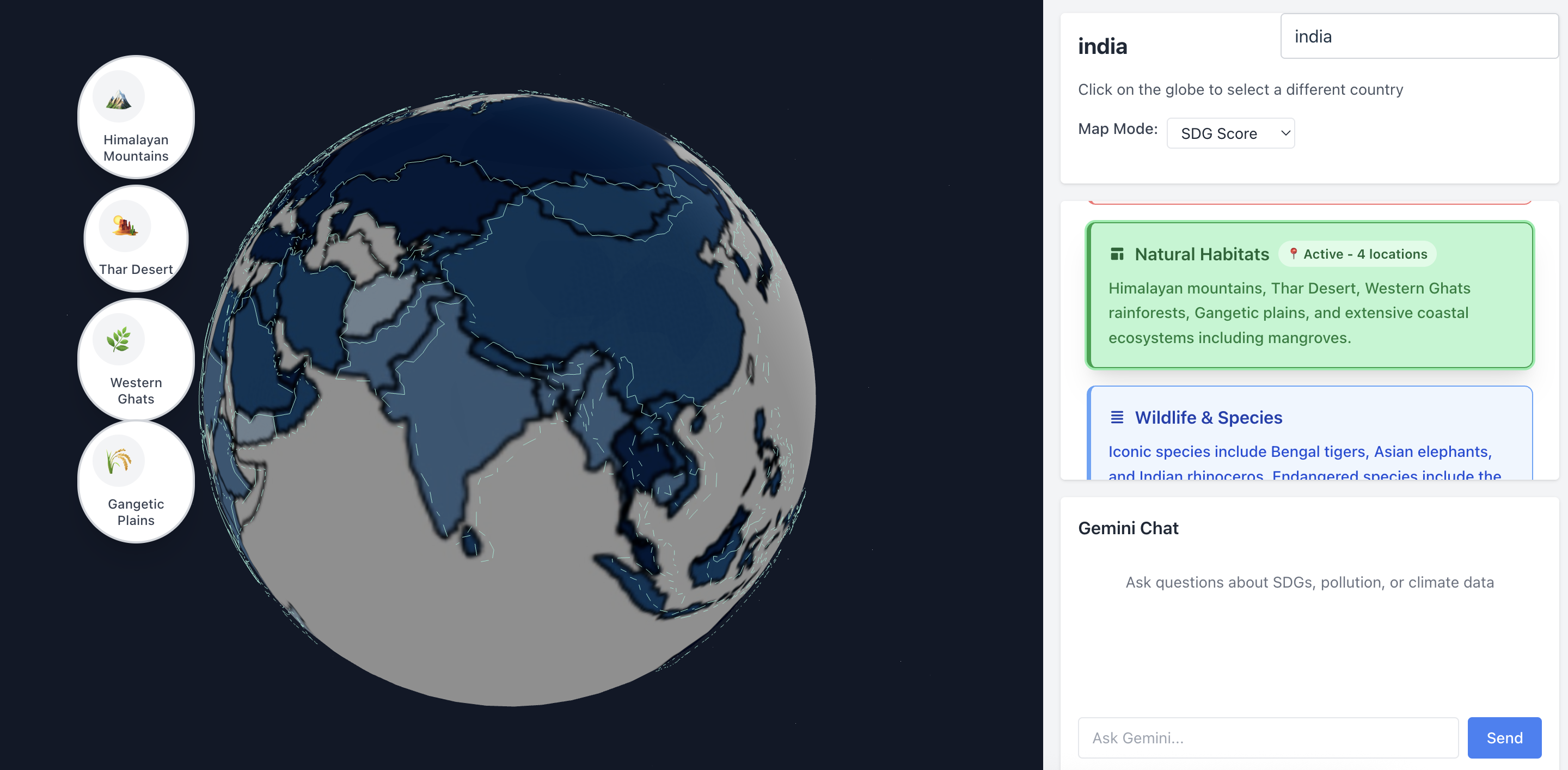
various indicators for map
-
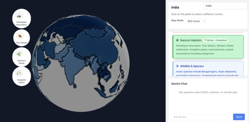
pop up when information is clicked
-
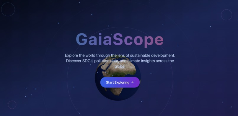
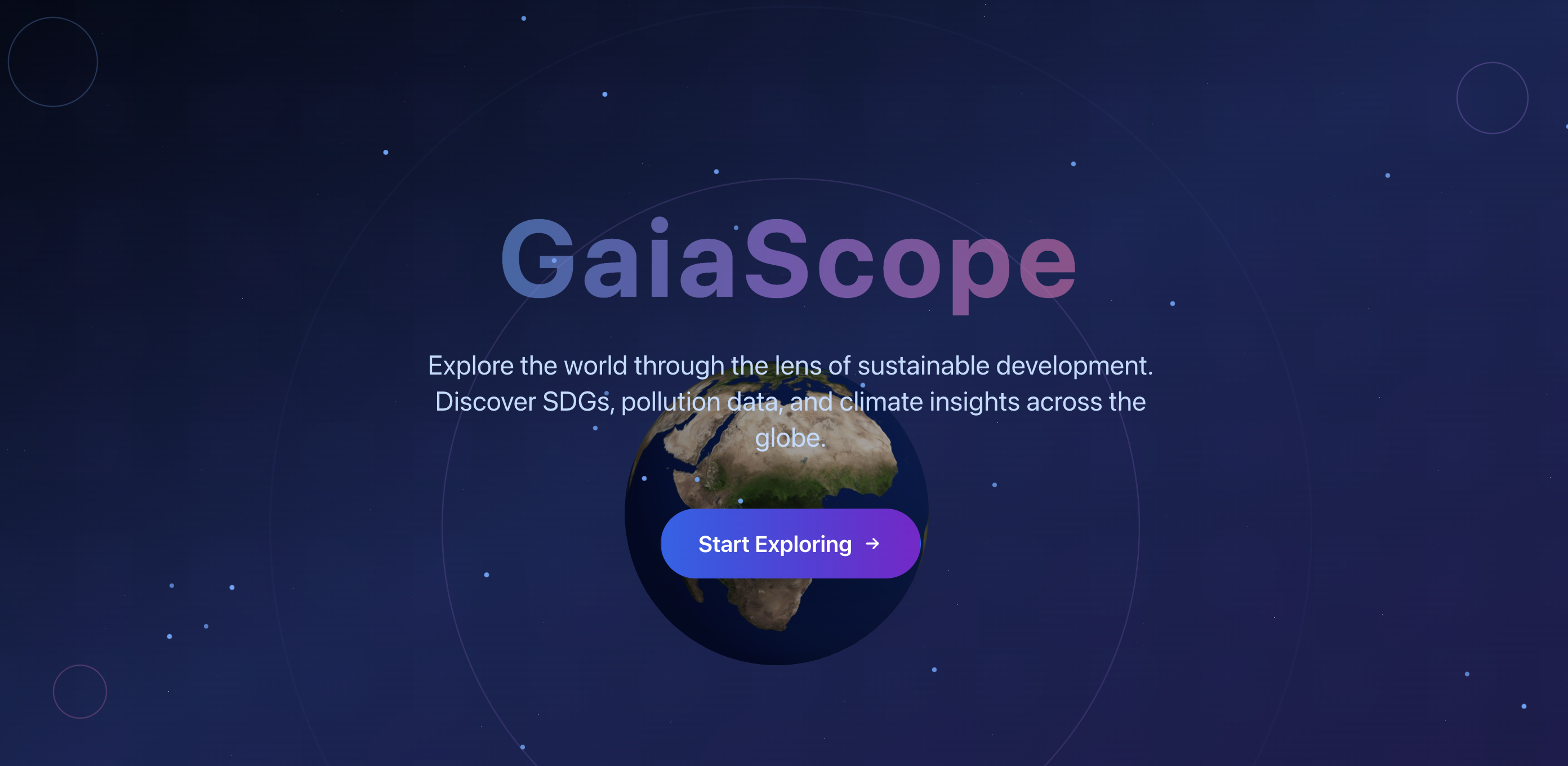
welcome screen

Inspiration
The climate crisis often feels distant or abstract — we wanted to create something that brings sustainability issues to life in a tangible, interactive way. With the UN’s 17 Sustainable Development Goals (SDGs) as a backbone, we envisioned a global dashboard where users could see and understand the environmental and social challenges facing each country. That’s how GaiaScope was born.
What it does
GaiaScope is an interactive 3D globe that visualizes each country’s progress on SDGs, along with real-world environmental metrics like carbon emissions, pollution levels, and forest loss. Users can:
Click on any country to view live SDG stats and trends Toggle map overlays (pollution, climate impact, SDG score) Ask questions to a built-in Gemini AI assistant, like: “How can Canada improve on clean energy?”
How we built it
Frontend: React.js + TailwindCSS for responsive UI Visualization: Globe.gl (Three.js wrapper) for the 3D globe Data: Pulled from the UN SDG Data, World Bank, OpenAQ, and Global Forest Watch AI: Integrated the Gemini API for natural language answers and data explanations Deployment: Vercel for instant previews and production deployment We worked in branches, used GitHub PRs to merge safely, and collaborated through VS Code + GitHub Copilot for AI-assisted coding.
Challenges we ran into
Syncing multiple datasets (UN SDG, pollution, etc.) into a consistent structure Managing globe interactivity without performance drops Integrating Gemini in a way that felt seamless — not like a disconnected chatbot Dealing with Git merge issues and branch syncing as we worked in parallel
Accomplishments that we're proud of
Getting a functional 3D globe with real SDG overlays working under time pressure Building a clean UI that makes complex global data digestible Successfully integrating Gemini to provide real, intelligent responses to SDG questions Pulling off smooth teamwork and version control despite working from separate machines
What we learned
How to work with real-world open data APIs and normalize messy data How to build interactive globe visualizations with WebGL How to integrate AI not just as a gimmick, but as a helpful and meaningful tool The power of version control and collaboration (and what happens when you forget to pull 😅)
What's next for GaiaScope
Add time-based visualizations to explore SDG changes over decades Let users simulate “what-if” scenarios (e.g., what happens if a country cuts emissions by 30%) Expand to local/city-level insights for personalized action Package GaiaScope as a tool for educators, activists, and policymakers Integrate user accounts to let people save views, track favorite countries, or suggest changes to the dataset Compare countries and simulate changes over time

Log in or sign up for Devpost to join the conversation.