-
-
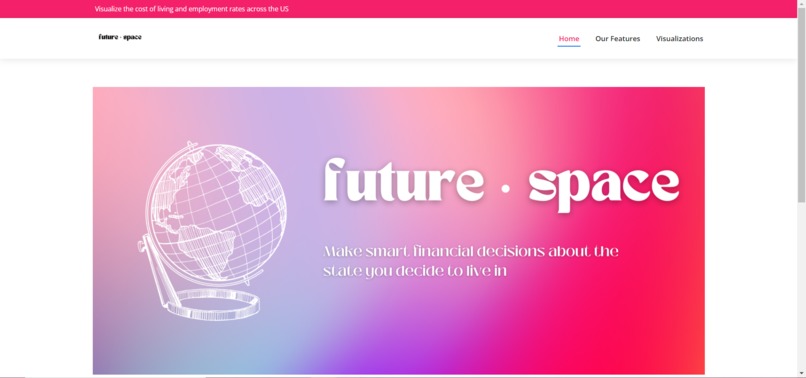
Landing Page
-
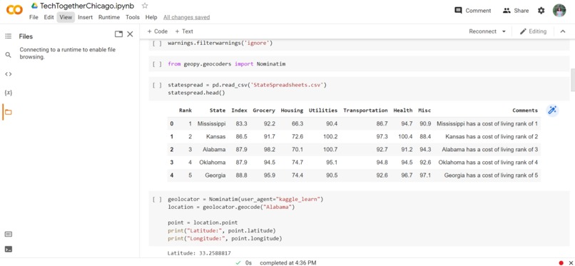
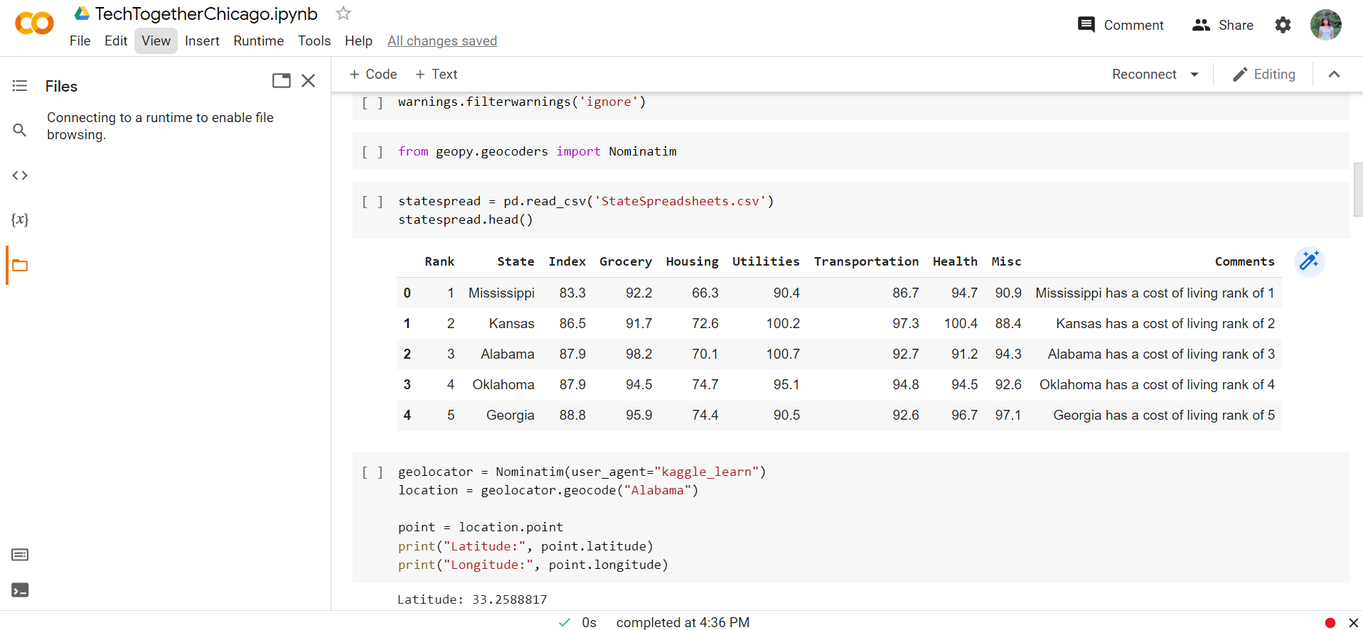
Code Snippet #1
-
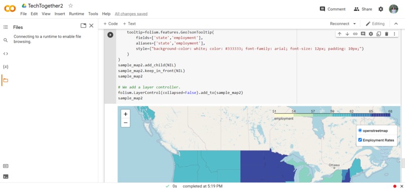
Code Snippet #2
-
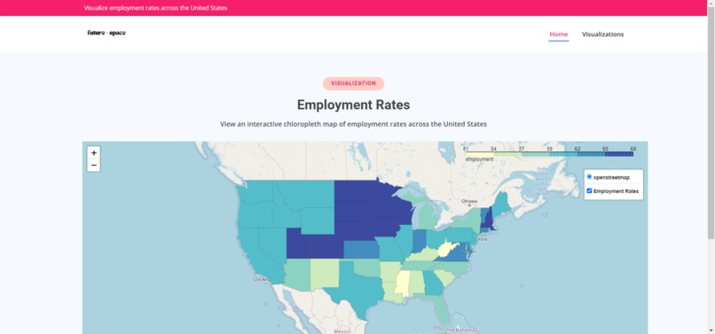
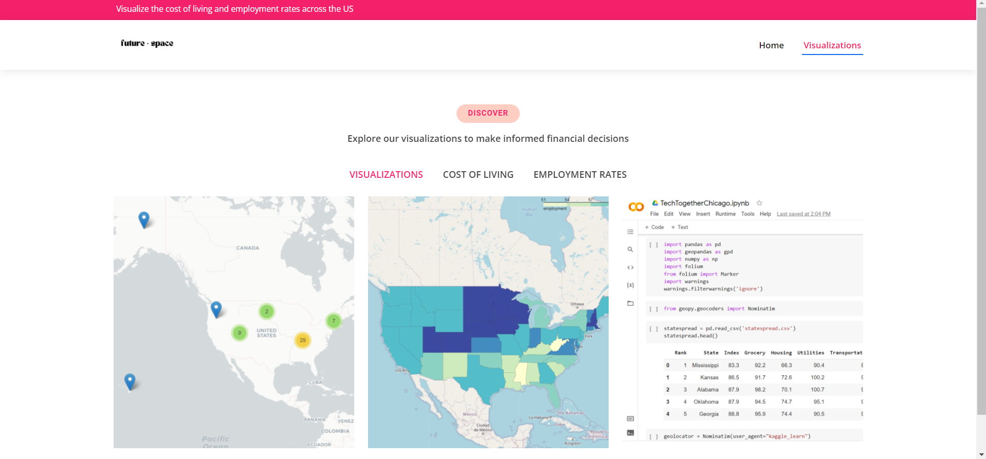
Employment Rate Map
-
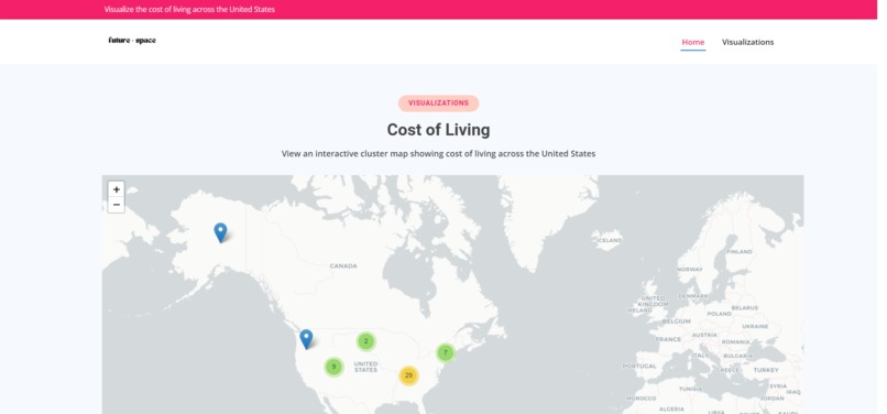
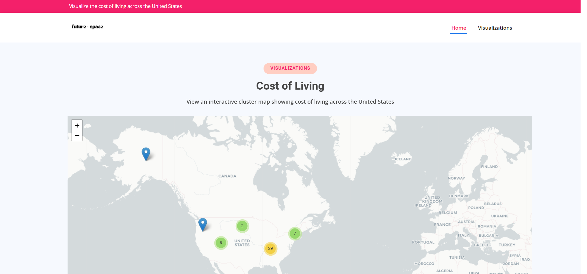
Cost of Living Map
-
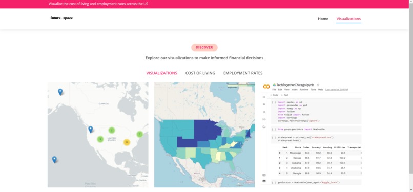
Visualizations Page
-
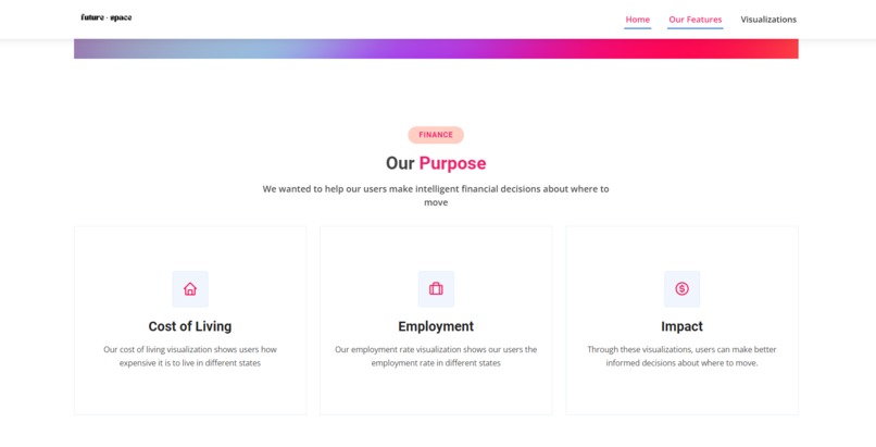
Features


Due to the poor audio quality, I highly recommend turning the video subtitles on
Devpost Questions
Inspiration 💡
We were inspired to create these visualizations by the maps of the New York Times. While few people are willing to search for and read through vaccination or Covid rates for each state, many people view the NYT Covid case and vaccination maps. Geospatial data visualizations can concisely represent data on a map in a way that is engaging. We wanted to build this project to help users considering a move to another state for college, employment, etc. view the cost of living and employment rates of each US state to make an informed financial decision about where to move.
What it does
Our hack utilizes python to create geospatial data visualizations of employment rates and the cost of living across the United States.
How we built it
Data Curation, Processing & Visualization
Our first step in building this hack was data curation and processing. For our first cost of living map, we compiled US government data on the average cost of living by state based on groceries, housing, utilities, transportation, healthcare costs and other factors into a csv file. Then, we utilized the geopandas python library to create a geolocator using Nominatom’s geocoding software. We used this geolocator to iterate through the dataset and geocode the states to find their latitude and longitude. We converted the csv file to a geopandas geodataframe by generating geometry points from the latitude and longitude so it could be used for data visualization. We iterated through the data and used the geometric points we created to plot markers displaying the cost of living rank
For our second employment rate map we used a shape file of the boundaries of America's states to create a chloropleth map. We curated a dataset of the employment rates of the states based on government data. Then, we merged the two datasets and used folium to create our map and a draggable legend that allows the chloropleth layer to be toggled on and off and allows markers to be displayed on hover. Finally, for this map, we implemented a click to zoom feature where users can click on a state to zoom in.
Frontend
We created the frontend using the CSS Bootstrap library and JavaScript for animations. We saved our folium visualizations into html files which we stored on our website using html iFrame tags.
Challenges we ran into
As this type of project was entirely new to us, there was a steep learning curve in processing the data and creating the visualizations. We also had quite a bit of trouble with embedding our visualizations into our site.
Accomplishments that we're proud of
We're really proud that we were able to create functional, engaging visualizations and that we were able to create a well-designed site with a smooth user experience.
What we learned
We learned a lot at this hackathon! Rhea learned to merge datasets and became very familiar with python error messages. She also created her first chloropleth map and her first marker cluster map. She learned how to create a draggable legend and how to toggle layers of the map on and off. She also learned to implement a click to zoom function. Maya learned more about CSS Bootstrap's features. They also learned how to embed visualizations into a website which they were doing for the first time.
What's next for FutureSpace
There's so much more that we want to do! We want to make our map more specific by putting the employment rates of counties and cities rather than just states. We also want to create more individual maps on healthcare costs, utilities and more. We plan to eventually add a search function where users can use a search bar to find a location rather than zooming into the map
Judging Criteria
Originality
While the data we used is readily available on the internet, our visualizations are unique and new! We took a novel approach to plotting this data on a map in a way that is interactive and interesting. We created marker cluster features which allow users to zoom in by clicking on clusters as well as allowing our users to toggle layers on and off our maps. As far as we're aware, our hack is the first website we could find displaying cost of living and employment rate visualizations side by side so our users would get a sense of what it would be like financially to live in the state.
Execution
We put a lot of importance on our interface and the experience navigating through it. Rather than crowding the page, we used whitespace to emphasize our elements. We decided that we wanted our website to be minimalistic but modern with bright, statement colors so it would be eye-catching. As for the user experience, we added several animations to make the transition of elements smooth as our users scroll down the site or switch to different pages using the navbar. After many hours spent troubleshooting and de-bugging, all of the components of our site are functional which you can see for yourself if you click our "try-it-out" link!
Usefulness
We don't expect our users to decide whether to move to a different state solely based on our visualizations but we believe that it can be a very helpful tool in assisting our users to think of the financial aspects of a move. The cost of living and the job opportunities of an area are extremely important factors to take into account and our visualizations display this information in a novel and exciting way. We feel like this is something people would actually use because when people are thinking of making a move, these questions often come up and our visualizations provide an answer. Part of our inspiration in creating this came from college application season a few months ago when our friends were looking into the states in which their colleges were located. Many of them were interested in how much it would cost them for groceries, housing, etc. and a lot of them were also curious about job opportunities in the state. There is a clear need and usefulness for visualizations like these.
Learning
This was our first project together and our first attempt at a data analysis project. While we had quite a bit of experience with python and Rhea took a course on geospatial analysis, this was her first independent project outside of the course exercises that had hints and solutions. Thanks to her prior knowledge of python and pandas, she was able to create her first dataset and used previous data curation and processing knowledge alongside many hours of troubleshooting and Stack-Overflow-ing to make it ready for visualization. Her course taught her the basics of the folium library but she had to read many articles and use the folium documentation to build the visualizations. On the frontend, Maya had experience with CSS Bootstrap but was able to learn a lot more about using html,CSS and JavaScript to create a functional website with many pages and animations. Our biggest struggle, however, was getting the folium visualizations to show up on the webpage. As we've never implemented python into a website before, this was extremely challenging. We watched several videos on Flask implementations to no avail. At one point, we were seriously considering starting our visualizations from scratch and using Mapbox software or just taking a GIF of the map in action to embed. Finally, after scouring the internet for a solution, we were able to download the visualizations in html files and embed them in our website.
Built With
- bootstrap
- css
- folium
- geopandas
- html5
- javascript
- leaflet.js
- numpy
- pandas
- python

Log in or sign up for Devpost to join the conversation.