-
-
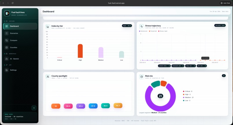
Home page
-
Data
-
Graph
-
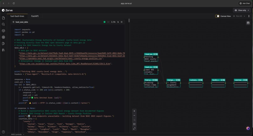
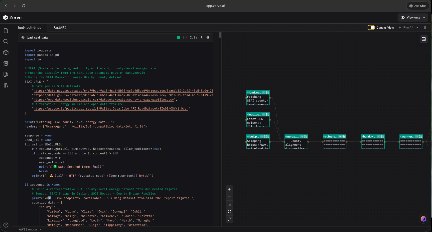
Zerve.ai Notebook
-
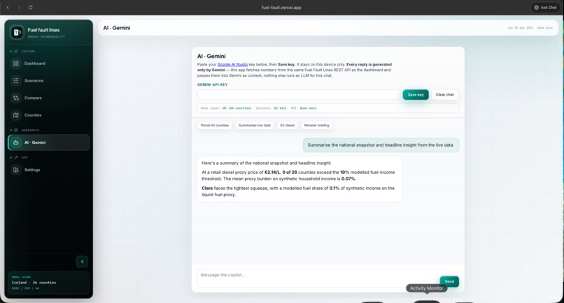
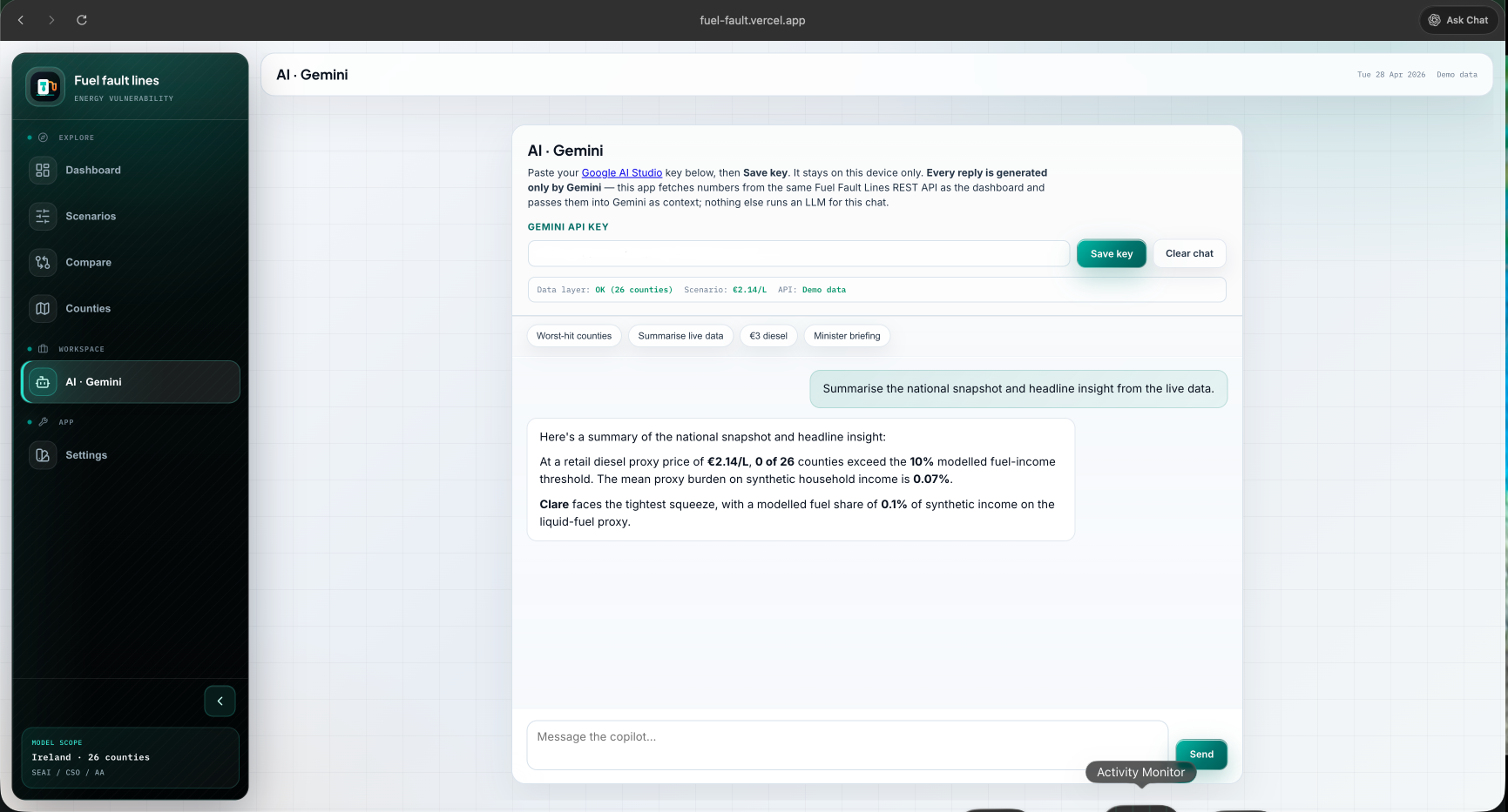
AI Chat

Inspiration
This project was inspired by fuel protests and cost-of-living pressure in Ireland the moments when pump and heating-oil prices become impossible to ignore on the news, in town, and in household budgets. Those protests made something obvious: people experience fuel stress unevenly, but public debate often collapses into one national headline or a shouting match, not a shared picture of who is exposed and how much room there is before assumptions break.
I wanted something calmer and more durable than a hot take: a small, transparent surface where you can move a €/L lever, see county-level vulnerability and tiers, run A vs B scenarios, and still inspect the model’s limits in /meta and exports. So I built Fuel Fault Lines a FastAPI + single-page dashboard stack that keeps one in-memory cohort as the source of truth for the UI and any script that speaks HTTP, with optional Gemini only as a browser-side assistant grounded in what the API actually returns.
It is not official fuel-poverty statistics. It is a structured sandbox for the same question the protests surface in the street: when liquid fuel gets expensive, where does the burden land first and what does that look like county by county? Ireland still has a meaningful liquid-fuel–heated housing stock, and price, income, and building condition do not line up evenly across counties. Too often the conversation jumps between forecourt shocks, retrofit costs, and social protection, without a shared, inspectable object that answers: at this €/L, where does a transparent fuel-share-of-income proxy cross a line we can defend, and which counties move first?
Fuel Fault Lines exists to make those assumptions visible and stress-testable: one model, many scenarios, outputs you can compare, export, and wire into other tools without pretending to replace official fuel-poverty statistics.
What it does
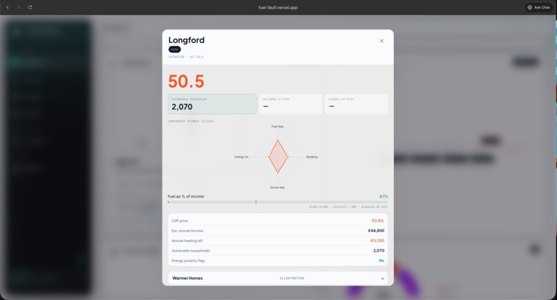
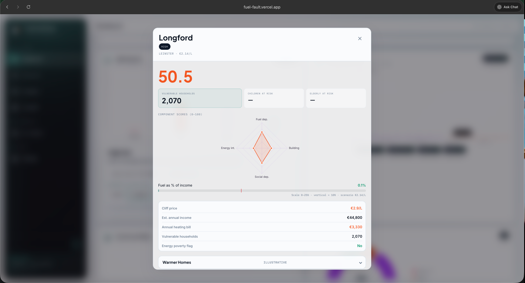
- County-level dashboard for twenty-six counties: vulnerability index, risk tiers, register colouring, and narrative context that updates with the active diesel / heating-oil €/L price.
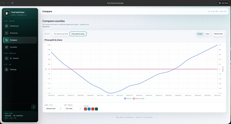
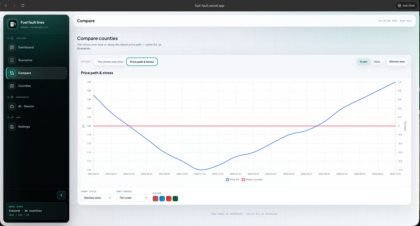
- Scenarios and Compare (A vs B) so you can see who crosses a modelled threshold when prices move, not only a single national snapshot.
- Charts and trajectories including stress vs implied price and tier / risk-mix views with drilldowns that surface county lists and links into deeper county views.
- FastAPI hub (
api/) exposing OpenAPI routes (/health,/county/{county},/scenario,/history,/deep-dive/{county}, exports,/meta,/insights/*, etc.) so the same numbers power the browser and any script or notebook. - Optional AI · Gemini page: only Gemini generates prose; your API key stays in the browser; the app pulls read-only context from the REST API so the model does not invent live statistics when the hub is down.
- Integrator-friendly fragments e.g.
GET /insights/submission-packas scaffolding for summaries, checklists, and short copy (raw material for comms, not an authoritative statistic).
No database one in-memory cohort built at startup from public-style signals (SEAI-oriented energy profiles, CSO deprivation structure, price lever), with documented fallbacks when upstream feeds are slow or unavailable.
How we built it
- Backend: FastAPI + pandas: a single canonical DataFrame drives every route so dashboard, exports, and validation stay aligned. Startup can pull from a Zerve-style variable or a local pipeline, depending on environment.
- Frontend: One static
index.html(vanilla JS, Chart.js, maps) served bydev-server.mjs—zero npm dependencies, only Node built-ins. Local dev proxies/api/*to a configurable upstream hub over HTTPS, or you can point the UI straight at local uvicorn via query param /localStorage/window.__FFL_API_BASE__. - Trust and operability:
/metaand export routes document lineage and limits; the UI surfaces connection / demo mode when the hub misbehaves so users know what they are looking at.
Challenges we ran into
- Single-file UI at scale—maps, multi-page navigation, charts, compare matrices, notices, and optional Gemini in one document means careful state wiring and guarding against partial loads (502s, empty series, missing county rows).
- Same definition everywhere—fuel share of income, tiers, and “over threshold” counts must match across tooltips, drilldowns, scenario curves, and the API; small inconsistencies show up immediately on a map.
- External data at startup—SEAI/CSO-style fetches can be slow or flaky; we needed predictable fallbacks and clear UX when the app is in demo vs live mode.
- No build pipeline—everything runs as-is, which is liberating but means discipline (no TypeScript compiler catching regressions) and manual verification for chart edge cases (empty history, sparse labels, tiny bar values).
Accomplishments that we're proud of
- A coherent story from €/L slider → national chips → county register → deep dive → exports, with the API as the source of truth the UI never outruns.
- Compare mode and matrix views that treat “what if we add €0.20?” as a first-class question, not an afterthought.
- Honest boundaries—documented limitations,
/meta, and chat instructions that keep Gemini subordinate to live hub data when it exists. - Submission-pack style JSON for people who need structured raw material for write-ups, not magic auto-policy.
- Polishing chart drilldowns so tier, risk-mix, and stress slices feel like real exploration surfaces (county chips, weighted mix language, resilient stress rendering)—not forgotten footnotes under the canvas.
What we learned
- One DataFrame, many surfaces dramatically cuts “the dashboard says X but the export says Y” bugs—worth the upfront shaping of the hub.
- Vanilla JS + one HTML file can carry a surprising amount of product if you invest in small reusable patterns (notices, drill panels, API base bootstrapping).
- Making failure visible (connection pill, demo mode, empty states) builds more trust than pretending the network is always perfect.
- LLM features land better when they are narrowly scoped (browser key, read-only context, “do not invent counties”) instead of a generic chat bolt-on.
What's next for Fuel Fault Lines
- Tests and CI around the FastAPI layer (golden JSON for key routes, startup with mocked upstreams).
- Deeper validation UX—more explicit sensitivity and stability notes where the model is weakest, still without a heavyweight build.
- Accessibility and performance pass on the single-page shell (keyboard paths, chart alternatives, lazy sections).
- Optional packaging (e.g. Docker compose for
uvicorn+ static serve) without losing the “clone and run” simplicity. - Tighter integrator docs—short cookbooks for notebooks and
/insights/*consumers, including versioning notes when the DataFrame shape evolves.


Log in or sign up for Devpost to join the conversation.