-
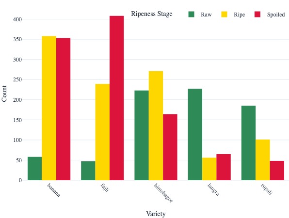
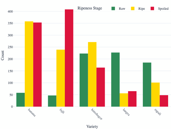
Comparative analysis of mango varieties by ripeness stage showing distribution patterns across Raw, Ripe, and Spoiled stages
-
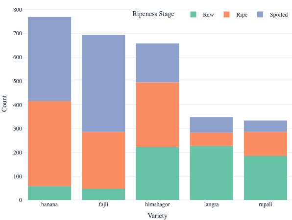
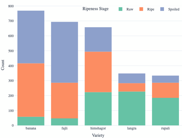
Ripeness Stage Distribution Variety
-
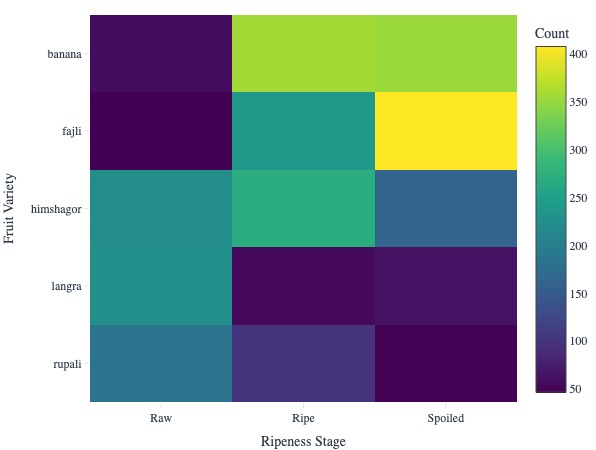
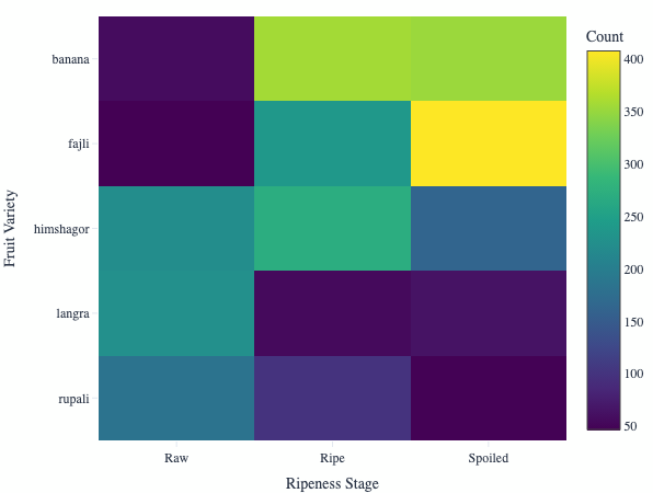
Heatmap showing the distribution of fruit varieties across different ripeness stages.
-
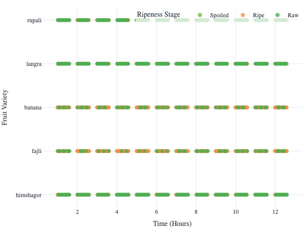
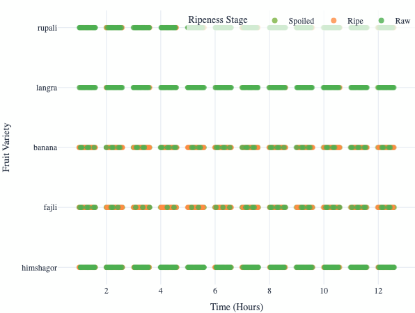
Scatter plot showing the temporal progression of fruit ripening stages across different varieties.
Inspiration
Fruit ripeness is often judged by sight, touch, or smell — but these methods are subjective and unreliable. Inspired by the need for better food quality monitoring in agriculture and supply chains, we explored how electronic nose sensors can objectively detect fruit freshness, ripeness, and spoilage.
What it does
Fruit Ripeness Explorer is an interactive data app built with Plotly Studio that visualizes how chemical signals change as fruits ripen. It allows users to: • Explore time-series trends of sensor readings across ripeness stages (Raw → Ripe → Spoiled). • Compare ripeness fingerprints of different fruit varieties using radar plots. • Identify spoilage indicators such as spikes in alcohols, esters, or CO₂. • Ask natural language questions (e.g., “Which fruit spoils fastest?”) and receive AI-powered insights with dynamic charts.
How we built it
• Dataset: Sensor measurements (electronic nose) collected for fruits at multiple ripeness stages.
• Plotly Studio: Designed dashboards with interactive line charts, radar plots, and comparative visualizations.
• Agentic Analytics: Integrated natural language queries to turn plain questions into actionable insights and visual stories.
Challenges we ran into
• Structuring time-series sensor data into formats suitable for quick visualization.
• Reducing complexity: the original ML pipeline was heavy, but we simplified it into a visualization-first app.
• Making insights accessible to non-technical users while retaining scientific accuracy.
Accomplishments that we're proud of
• Created a unique, fruit-generic app (not just mangoes) that stands out from typical dashboards.
• Successfully blended scientific sensor data with agentic AI storytelling.
• Delivered an app that’s both educational and practical for agriculture, food storage, and consumer awareness.
What we learned
• Agentic Analytics in practice: We learned how Plotly Studio can combine interactive charts with natural language queries, making data exploration more intuitive for non-technical users.
• Data storytelling matters: Visuals alone aren’t enough — adding AI-generated narratives made the ripening process more understandable and engaging.
• Simplicity beats complexity: Our initial approach involved heavy ML pipelines, but for this challenge, focusing on lightweight, interactive visualizations provided faster insights and broader accessibility.
• Domain knowledge + visualization = impact: Understanding fruit ripening chemistry (esters, alcohols, CO₂) helped us design visuals that reveal real-world meaning, not just raw numbers.
• Cross-discipline thinking: We combined concepts from agriculture, IoT sensors, data visualization, and AI to create an app that bridges science and usability.
What's next for Fruit Ripeness Explorer
• Add more fruit datasets (bananas, apples, oranges) to make the app more universal.
• Incorporate simple predictive models to estimate “days to ripeness.”
• Connect to IoT sensors for real-time monitoring in storage and supply chains.
Built With
- electronicnosesensordataset
- plotlycloud
- plotlystudio
- plotlyvisualizations

Log in or sign up for Devpost to join the conversation.