-
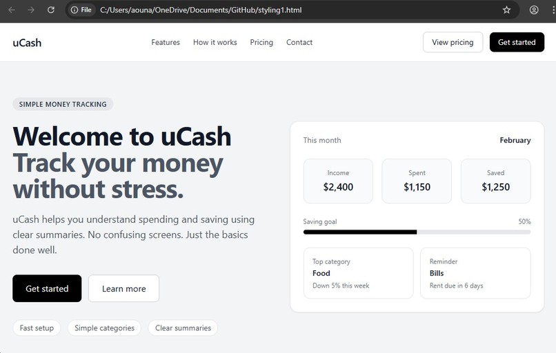
main page
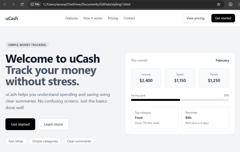
uCash was made because money apps can feel confusing. I wanted to make something that feels simple and calm. I thought it would be nice to have a website that shows money in a clear way so people do not feel stressed.
uCash is a front end website that shows a simple money tracker. It has a monthly overview with income, spending, and savings. When you scroll, you can see features, pricing, and contact sections. The buttons move you to different parts of the page, so it feels smooth and easy to use.
I built the website using HTML and Tailwind CSS. I used black, white, and gray colors to keep it clean. I used simple layouts with rows and columns to organize everything. I made sure the page works on big screens and small screens.
One hard part was keeping it simple but not boring. I had to adjust spacing and layout many times so it looked right. Small changes made a big difference.
I am proud that the website looks neat and easy to read. It feels like a real product page even though it is only the front end. I learned that simple design takes careful thinking. Next, I want to add real money tracking features so it can become a real app.


Log in or sign up for Devpost to join the conversation.