-
-
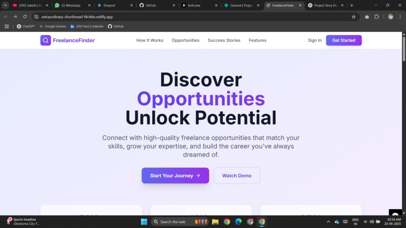
landing page
-
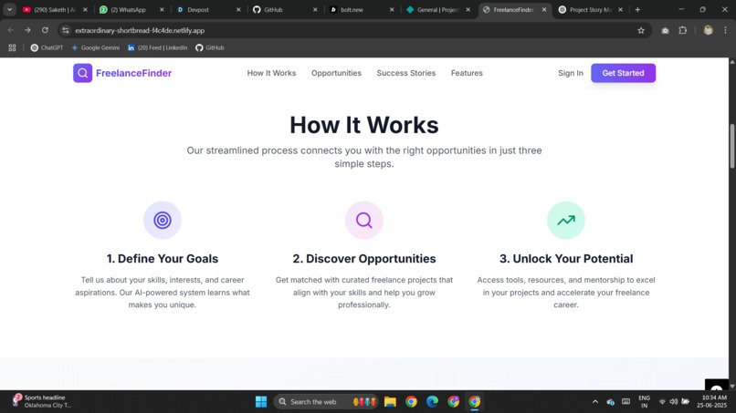
how it works


Inspiration
The inspiration for this project stemmed from a desire to create a sleek, responsive web experience that showcases modern UI/UX design principles. I wanted to push my limits in frontend development, experiment with animations, and deliver a clean, visually engaging interface. Exploring real-world portfolios and design templates motivated me to create something unique yet user-friendly.
What I Learned
Throughout this project, I deepened my understanding of: Responsive web design using Tailwind CSS Component-based development with React.js Managing dynamic content and layout using Framer Motion Hosting and continuous deployment with Netlify I also learned the importance of balancing aesthetics with performance, ensuring fast load times while maintaining rich visuals.
How I Built It
Planning & Wireframing: I began by sketching layout ideas and defining the visual theme.
Development:
Built the structure using React.js and styled it with Tailwind CSS Implemented smooth transitions and animations using Framer Motion Deployed using Netlify for continuous integration and easy sharing. Optimization: Focused on performance, responsive behavior across devices, and clean code structure.
Challenges Faced
Creating smooth, consistent animations that worked well across all screen sizes. Debugging layout shifts that occurred during dynamic rendering. Fine-tuning responsive breakpoints for various devices.

Log in or sign up for Devpost to join the conversation.