

Inspiration
Formula One has been my favourite sport since I was a child. Extreme precision, great accuracy, and a good team are required for a team to compete in and win the Grand Prix. When someone decides to act on their own, the team might either lose rank or immediately exit the tournament. The global championship is contested by all of the major teams, including Scuderia Ferrari, McLaren, Red Bull, Renault, and many others. As a data science aficionado and Formula1 fan, I chose to analyse the Formula1 dataset that we obtained from Kaggle, which supplied us with an open dataset containing multiple data variables such as Formula1 drivers, races, lap durations, season statistics, and so on. I chose to analyse this information using several visualisation tools, such as Tableau, Plotly, Matplotlib, Seaborn, and others. As it turns out, the dashboard appears to be very promising and opens up the possibility of analysing this massive platform, which is open for the data science world to analyse the history and results and apply modern techniques and methodologies such as machine learning, reinforcement learning, ARIMA modelling, and numerous others.
What it does
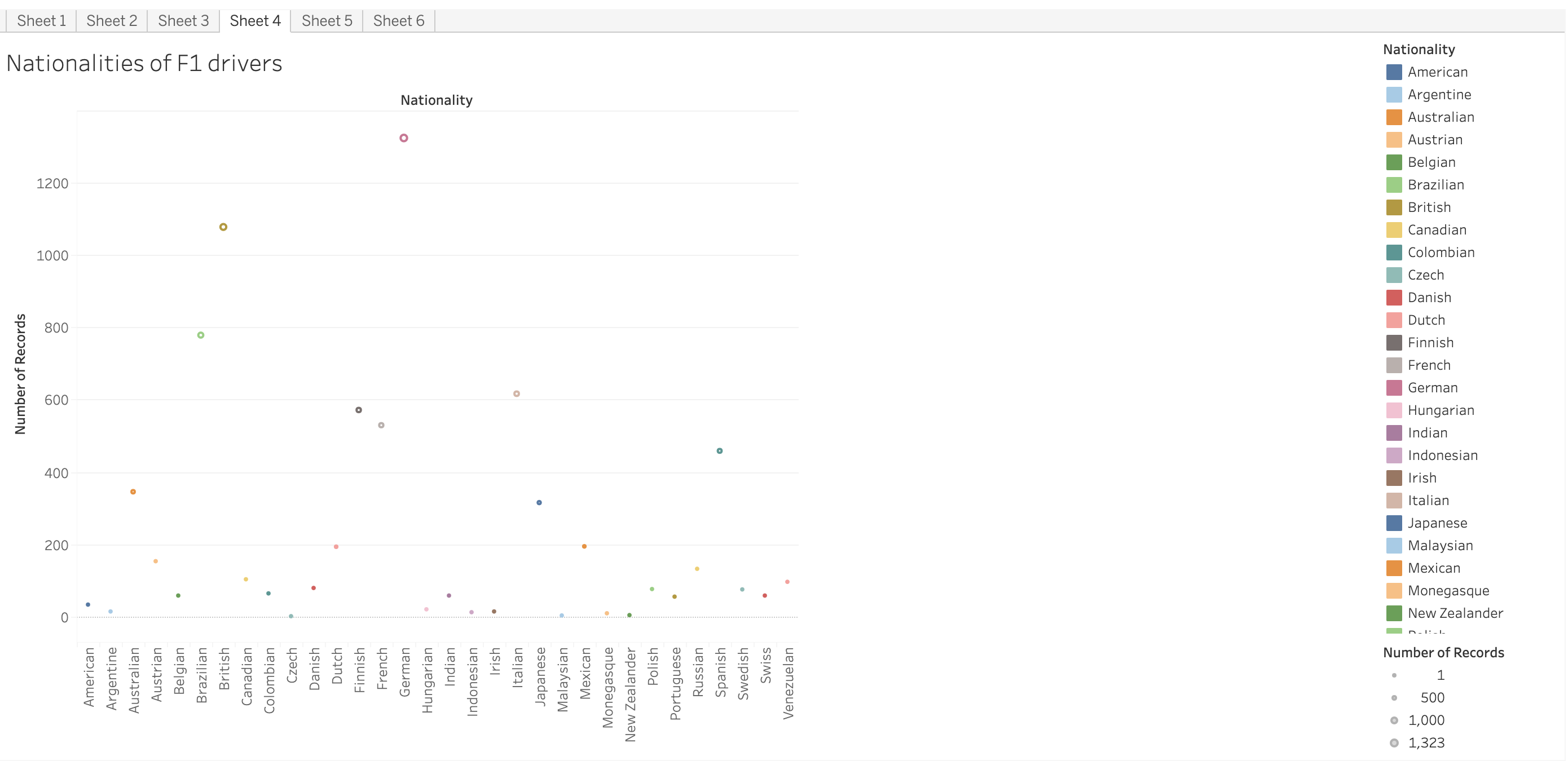
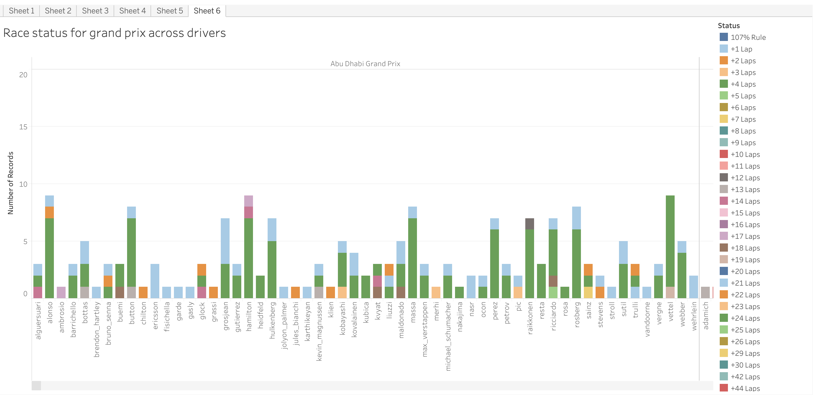
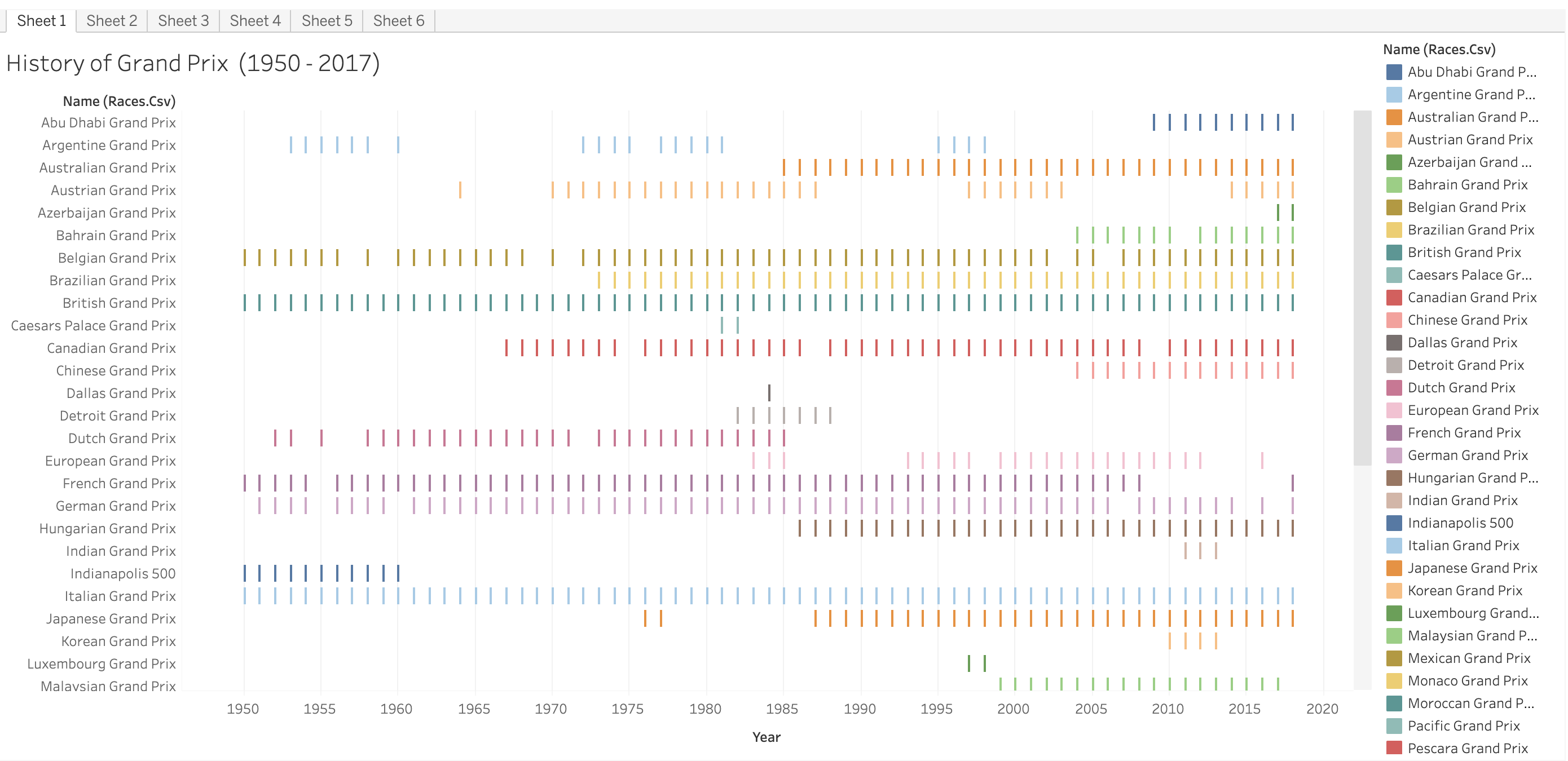
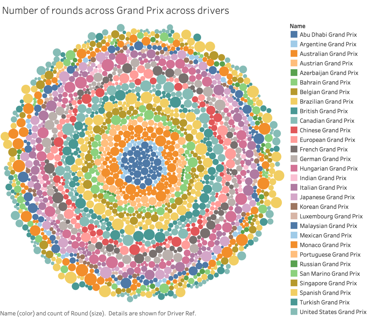
As a data science enthusiast and Formula 1 fan, I have chosen to analyze the Formula 1 dataset obtained from Kaggle. This dataset contains various variables such as Formula 1 drivers, races, lap durations, season statistics, and more. To analyze this information, I have utilized several visualization tools including Tableau, Plotly, Matplotlib, Seaborn, and others.
Through my analysis, I have created a dashboard that shows great promise in unlocking the potential of this vast platform. It provides a comprehensive view of the history and results of Formula 1, allowing the data science community to apply modern techniques and methodologies such as machine learning, reinforcement learning, ARIMA modelling, and many others.
The dashboard I have developed enables me to delve into the intricacies of Formula 1, exploring the patterns, trends, and insights hidden within the dataset. By visualizing the data using these powerful tools, I can gain a deeper understanding of the sport, its drivers, teams, and the factors that contribute to success on the race track.
By combining my passion for Formula 1 with my skills in data science, I am able to uncover valuable insights and contribute to the ongoing analysis and exploration of this exciting sport. The possibilities are endless, and I am excited to continue my journey of discovery through the world of Formula 1 data analysis.
How we built it
Data Collection: We obtained the Formula 1 dataset from Kaggle, which provided us with a comprehensive and open dataset containing multiple variables related to Formula 1 races, drivers, lap durations, season statistics, and more. This dataset served as the foundation for our analysis.
Data Cleaning and Preprocessing: We began by cleaning the dataset to ensure its quality and consistency. This involved handling missing values, removing duplicate entries, and addressing any inconsistencies or errors in the data. We also performed data preprocessing tasks like data normalization or transformation, if necessary, to prepare the dataset for analysis.
Exploratory Data Analysis: With the cleaned dataset, we conducted exploratory data analysis (EDA) to gain insights into the data and identify any patterns, trends, or relationships. This involved using statistical methods, data visualization techniques, and summary statistics to explore the dataset from various angles.
Selection of Visualization Tools: Based on the nature of the data and the insights we wanted to showcase, we selected multiple visualization tools to create a comprehensive and interactive dashboard. Some of the tools we utilized included Tableau, Plotly, Matplotlib, Seaborn, and others. These tools offered a wide range of options to visualize the data effectively.
Dashboard Design and Development: We designed a visually appealing and user-friendly dashboard that presented the analyzed data in an intuitive manner. The dashboard included various charts, graphs, and interactive elements that allowed users to explore different aspects of the Formula 1 dataset. We ensured that the dashboard was informative, easy to navigate, and provided a holistic view of the data.
Iterative Refinement: We continuously refined our analysis and visualization as we gained more insights and received feedback. This involved revisiting our data cleaning and preprocessing steps, modifying visualizations for clarity, and incorporating additional features or functionalities into the dashboard. We iterated on this process until we were satisfied with the final result.
Integration of Modern Techniques: In addition to traditional analysis and visualization, we explored the application of modern techniques and methodologies such as machine learning, reinforcement learning, and ARIMA modeling to the dataset. These techniques provided further opportunities for deeper analysis and predictive modeling.
Challenges we ran into
Data Quality and Completeness: One of the primary challenges was dealing with data quality issues and incomplete information in the dataset. We had to address missing values, inconsistencies, and errors to ensure the accuracy and reliability of our analysis. This required careful data cleaning and preprocessing techniques.
Data Integration and Structure: The dataset we obtained from Kaggle might have contained multiple files or tables that needed to be integrated and structured properly for analysis. Merging and joining different data sources with varying formats and structures posed a challenge and required careful consideration to maintain data integrity.
Data Volume and Performance: The Formula 1 dataset could be quite extensive, containing a vast amount of data spanning multiple seasons, races, and drivers. Handling and processing such a large volume of data posed challenges in terms of computational resources and performance optimization. We had to optimize our analysis and visualization techniques to ensure efficiency and responsiveness.
Visualization Choices and Design: Selecting the most appropriate visualization techniques and designing an effective dashboard presented its own set of challenges. We needed to choose the right types of charts, graphs, and interactive elements that conveyed the insights clearly and intuitively. Iteratively refining the visualizations to enhance their effectiveness and aesthetics required careful consideration.
Interpretation of Results: Interpreting the analysis results and deriving meaningful insights from the data was another challenge. It required a deep understanding of the domain and the context of Formula 1. We had to carefully analyze the relationships and patterns within the dataset to draw accurate conclusions and present valuable insights.
Incorporating Modern Techniques: Integrating modern techniques like machine learning, reinforcement learning, or ARIMA modeling into the analysis posed additional challenges. These techniques required a solid understanding of their implementation, appropriate feature engineering, and model selection. Overcoming these challenges involved research, experimentation, and iterating on the implementation.
What's Next for Formula One Data Analysis
I can analyse further seasons and develop a model around it which is predictive of what upcoming seasons could look like
Built With
- arima
- machine
- machine-learning
- matplotlib
- python
- seaborn


Log in or sign up for Devpost to join the conversation.