Inspiration
State health offices in Nigeria often can't even see where the worst gaps are. A lot of the records are on paper or scattered, so nobody has a clear picture of which areas have basically no working clinic. And while everyone waits around for better data, kids and mothers keep dying from things that are preventable. We wanted to build something that makes that gap, and the cost of ignoring it, impossible to look away from.
What it does
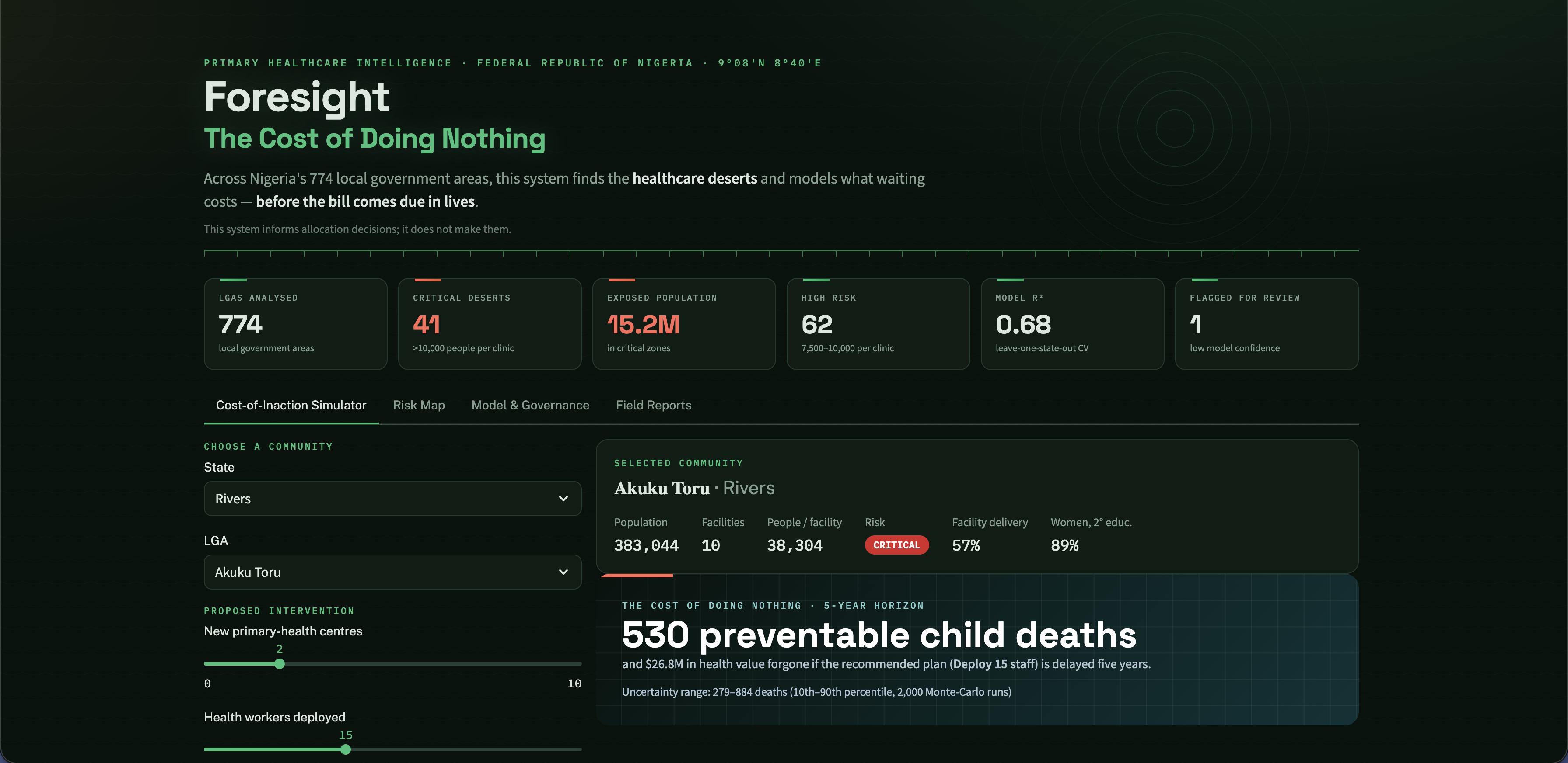
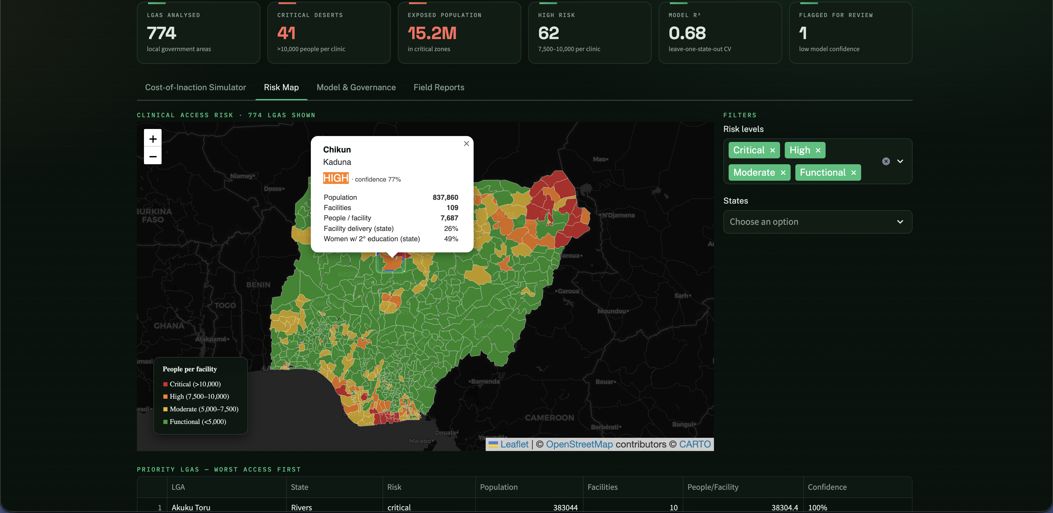
It pulls four public datasets together and scores all 774 local government areas by how many people each clinic has to cover. Then for any area you can run a "what if we wait" check that shows what delaying help for 1, 3, or 5 years costs in preventable deaths and money. You can compare options like building clinics or sending staff against just doing nothing. Every number shows up as a range, not a single number pretending to be exact.
How we built it
We clean and merge the data, score each area's risk, train a small model that learns how much better clinic access actually gets people to use care, and run the cost-of-waiting projections on top of that. It all runs in a Streamlit dashboard with the map as the way in. For the projections we run the simulation a few thousand times with the inputs nudged around, so we end up with a low, middle, and high estimate instead of one number.
Challenges we ran into
The DHS data was messier than we expected. It lists the same state several times under different survey windows, so we had to write logic to get it down to one clean value per state. And our first model was worse than just guessing, which sent us down the path that became our biggest takeaway.
Accomplishments that we're proud of
We didn't fake the data or the certainty. The model is upfront about what it doesn't know, it flags shaky areas for a human instead of guessing, and there's an offline form so communities with no internet signal don't just disappear from the map.
What we learned
Building clinics helps, but it's not the whole story. When we checked what predicts whether women actually deliver in a clinic, access barely explained anything until we added women's education, which turned out to be the strongest factor. So we built that into the model so the tool doesn't over-promise what a new building alone will do.
What's next for Untitled
We want to calibrate it with real state health offices instead of only published numbers, add more types of interventions, and set up the drift checks so it stays accurate as new survey rounds come out. Eventually, it could extend to other countries with the same data-gap problem.
Built With
- folium
- geopandas
- github
- numpy
- pandas
- python
- rasterio
- scikit-learn
- streamlit


Log in or sign up for Devpost to join the conversation.