-
-
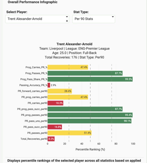
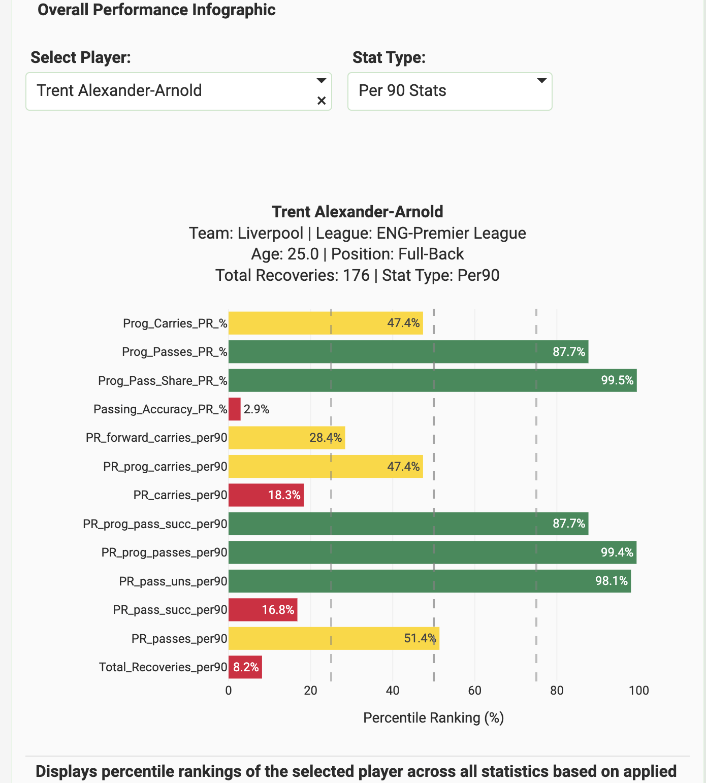
Percentile rankings across different metrics, providing a full player profile
-
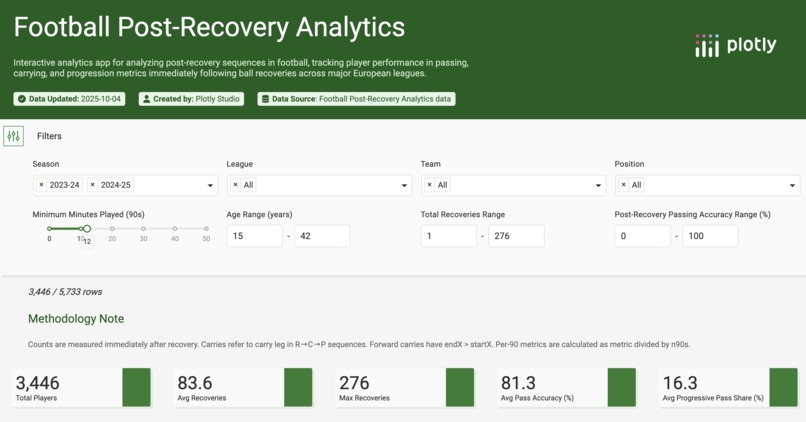
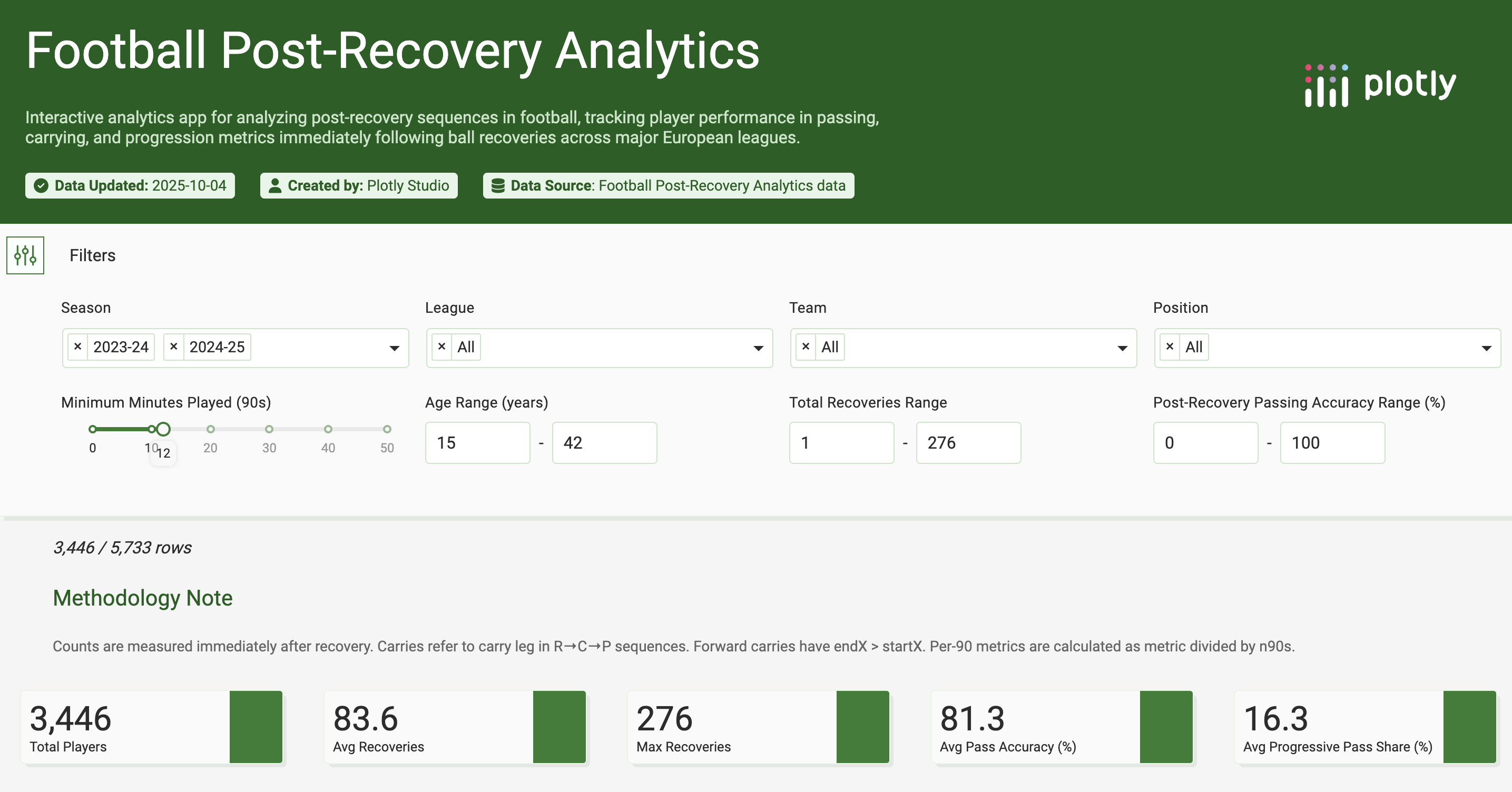
Filtering and Data Cards
-
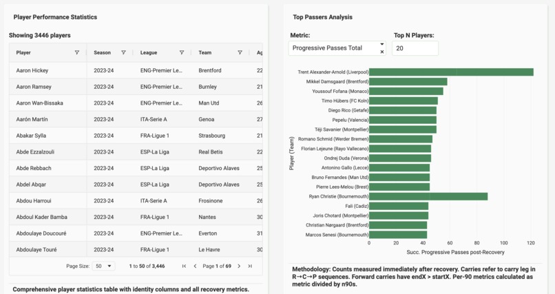
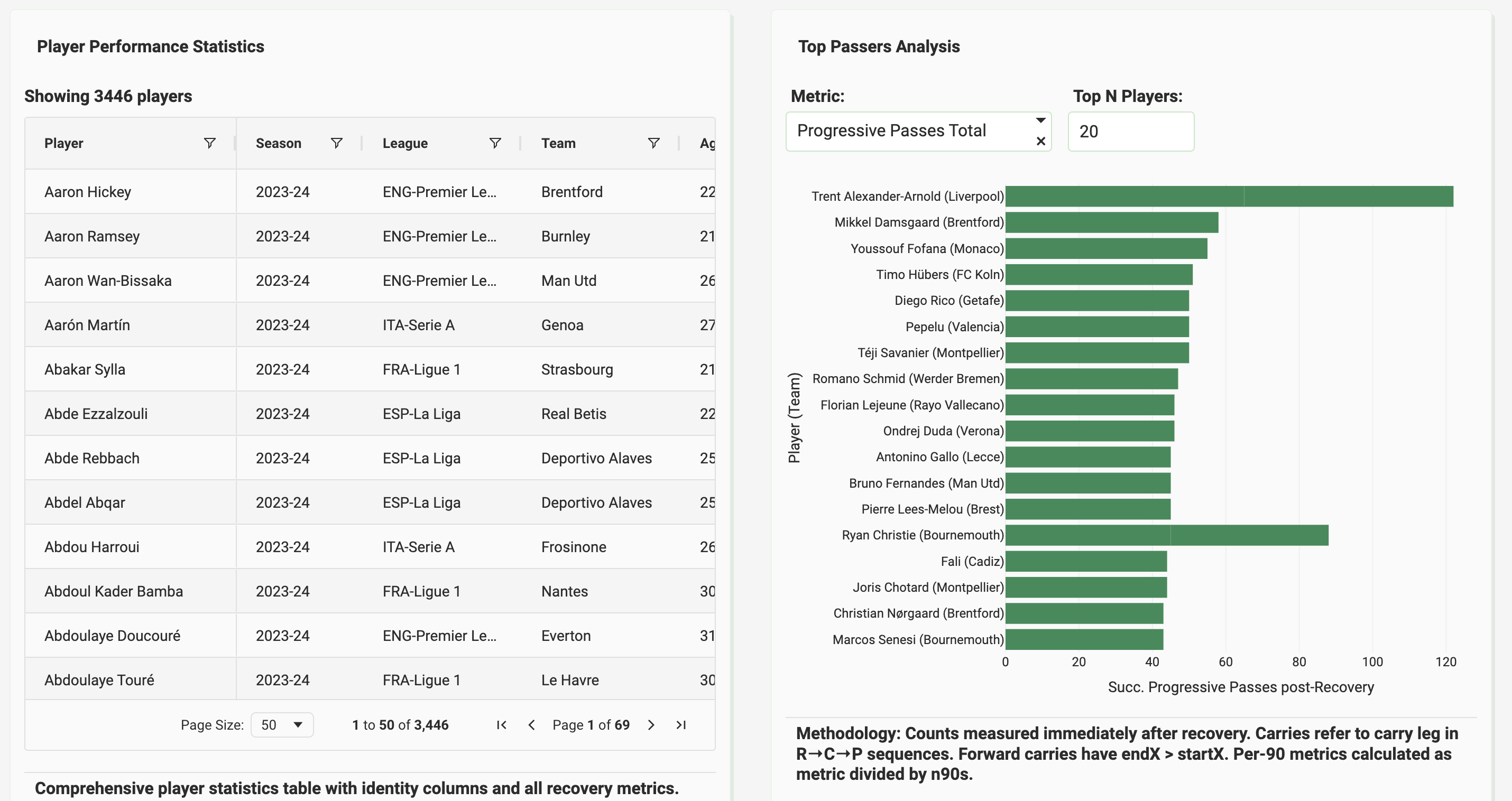
Interactive table to look at raw numbers and best passers analysis
-
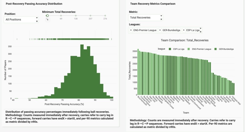
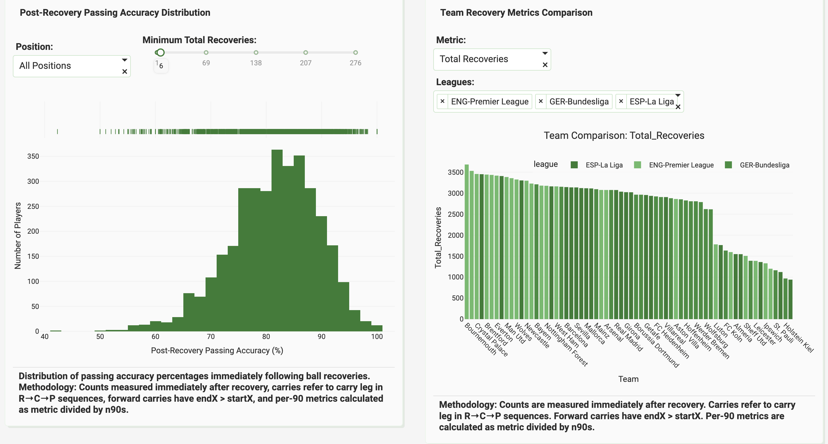
Passing accuracy distribution and team totals for balls recovered
-
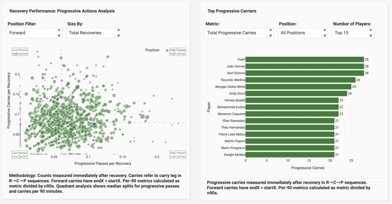
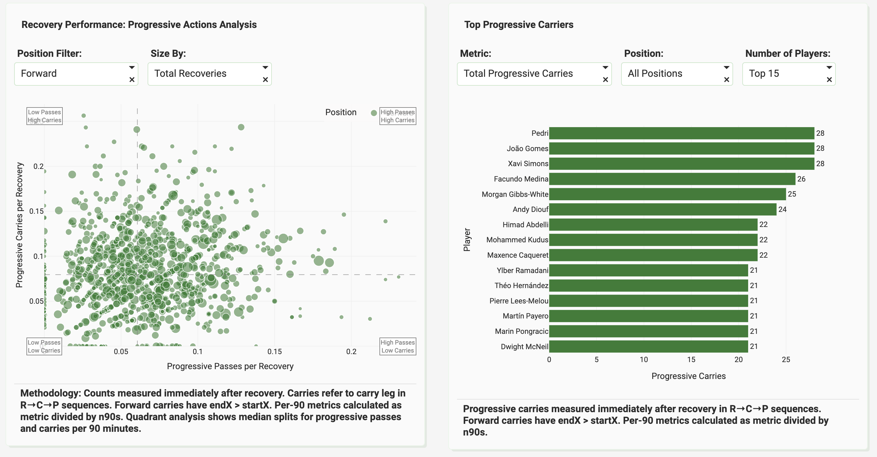
Position based analysis and best ball carriers analysis using multiple metrics
Inspiration
Having worked on several football (soccer) data projects using other softwares for dashboard deployments, I always wanted to give Plotly a try due to it's ease of use and interactive capabilities. This is is a recreation of an old web app of mine based on the same concept, which has been used by nearly 400 unique users.
What it does
Football post-recovery analysis gives you a deep dive into player behaviour after they have won the ball back. It presents relevant statistics neatly and in an easy to understand way. The percentile ranking chart helps the user to find similar players or players that match their requirements.
How we built it
Harnessing the brilliant AI capabilities provided by Plotly Studio were sufficient for the deployment as I had already trimmed the event data file to a smaller parquet file, with data perfectly cleaned to suit our requirements.
Challenges we ran into
In the past, I have used action maps to showcase actions down to the even level so that scouts and other users can have a visual look at player performance on the pitch. It was done by using a matplotlib library named mplsoccer, I had a few issues in figuring out how to implement it on plotly.
Accomplishments that we're proud of
A visually pleasing, simple to use and relevant app which has used event level data from two full seasons of football in five of the best football leagues in the world.
What we learned
Harnessing plotly's capabilities to create a working dashboard. Having worked on over 6 web apps, which have amassed more than 2000 unique users, I found plotly easier to use, control and deploy. I will be exploring more so that I can migrate my apps to plotly in the future.
What's next for Football Post-Recovery Analytics
Granular, event level maps to showcase particular actions on the pitch for better analysis.


Log in or sign up for Devpost to join the conversation.