-
-

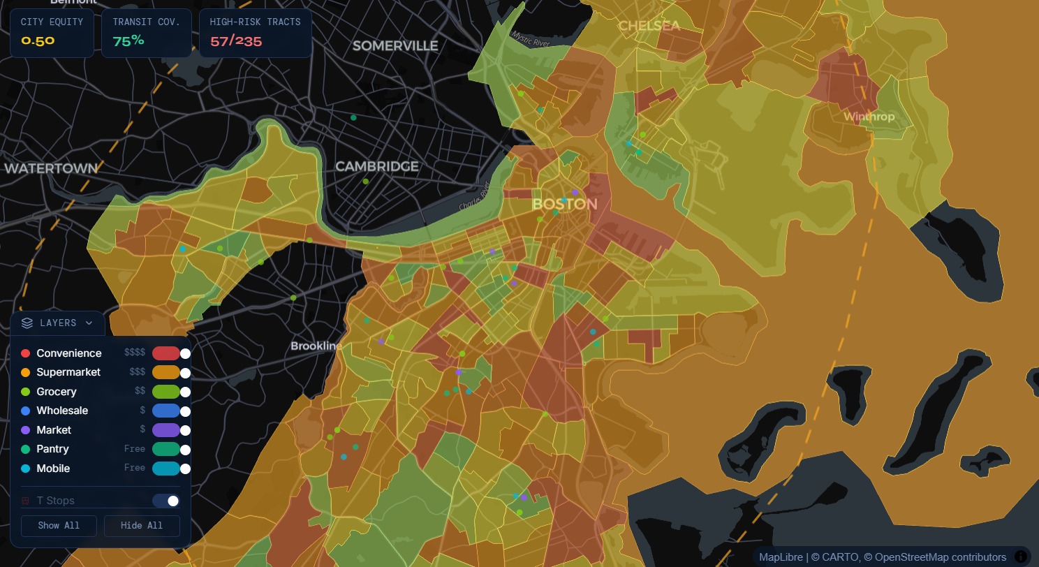
FoodGrid demo
Inspiration
A lot of existing tools focus on a single dimension (for example, grocery distance or a static "food desert" label). But in real life, food access is much more complex:
A neighborhood may have food nearby, but it may be too expensive.
A pantry may be affordable, but hard to reach by transit.
A census tract may look "served" on paper, while families still face major barriers in time, cost, and mobility.
We wanted to build a tool that helps people (community organizers, residents, nonprofits, and policymakers) understand food-system inequities in a way that is:
- visual
- transparent
- actionable
- easy to explain
What it does
FoodGrid is a neighborhood-level mapping and exploration tool that highlights food-system equity gaps across Boston. It helps users identify underserved communities by combining multiple existing data signals into a transparent Equity Score. The platform also includes multilingual AI-powered chat navigation to make exploration more accessible.
Equity Score = (0.35×Need Score)+(0.20×Income Gap Score)+(0.15×Food Spend Burden Score)+(0.20×Access Score)+(0.10×Resource Density Score)+LILA Adjustment
Where:
- Need Score = food-related need / food insecurity signal
- Income Gap Score = neighborhood income disadvantage relative to city baseline
- Food Spend Burden Score = food affordability pressure relative to income
- Access Score = transit/distance difficulty to useful food resources
- Resource Density Score = food resources per capita (inverted so fewer resources = worse)
- LILA Adjustment = USDA Low-Income, Low-Access tract flag adjustment
How we built it
FoodGrid has two modes:
- Resident Mode — helps users find nearby food resources with SNAP info, MBTA transit context, and an AI chatbot
- Government Mode — helps analysts identify high-risk census tracts, understand why they score poorly, and run what-if simulations
It runs as a 3-service local stack:
- Frontend (Vite + React) →
http://localhost:5173 - Backend API (Django) →
http://localhost:8000 - Chat Service (Node.js + Ollama) →
http://localhost:3001
Run all services together with:
npm run dev:full
1) Frontend (React + TypeScript + Vite)
Location: src/
Role: UI layer (map, sidebars, charts, chat panel)
Core stack
- React 18 — component-based UI
- TypeScript — static typing
- Vite — dev server + bundler
- Tailwind CSS v3 — utility-first styling
- Zustand — global app state (mode, hovered/selected tract, loaded resources, layer toggles)
- Framer Motion — animations
- Recharts — government-side charts
- Lucide React — icons
- @tanstack/react-query — API fetching, caching, loading/error state
Map rendering architecture (technical)
Uses:
react-map-gl+ MapLibre GLdeck.glfor overlay data layers (stores, MBTA stops)
Key implementation detail:
- DeckGL captures pointer events, so native MapLibre
onClick/onMouseMovehandlers are not reliable for tract interaction. - Hover/click is handled through DeckGL events (
onHover,onClick), then tract features are resolved using:map.queryRenderedFeatures([x, y])
Performance optimization: MapLibre feature-state
For hover highlighting, the app avoids React re-renders on every mouse move by directly updating map feature state:
map.setFeatureState(...)
This allows hover styling (border opacity/width) to update inside MapLibre’s rendering pipeline instead of React state.
Key UI modules
MapView.tsx— DeckGL + MapLibre integration and layersuseMapInteraction.ts— hover/click + feature-state logicGovernmentSidebar.tsx— tract metrics, charts, simulation controlsResidentSidebar.tsx— nearby resources + SNAP infoChatPanel.tsx— multilingual chat UI
2) Backend (Django + Python + MongoDB Atlas)
Location: backend/
Role: serves tract/resource data and runs food-access simulations
Core stack
- Django 5.1 — web framework
- Django REST Framework — JSON APIs
- django-cors-headers — frontend/backend cross-origin support
- pymongo — direct MongoDB Atlas access
- pandas / numpy — ingestion + scoring preprocessing
- geopy — geocoding (OpenStreetMap)
- shapely — spatial computations
- pydantic — request validation
- pyshp + pyproj — shapefile → GeoJSON conversion
No Django ORM (intentional)
The project does not use Django ORM. Database access is handled directly via pymongo to MongoDB Atlas.
DATABASES = {}in Django settings- DB connection logic lives in
backend/core/db.py
This is a better fit for the project’s document/geospatial workflow than forcing SQL ORM abstractions.
Backend app structure
tracts/→ tract GeoJSON + computed scoresresources/→ food stores / pantries / marketssimulation/→ what-if simulation endpointingestion/→ management commands only
Tract scoring (backend)
Each Boston census tract gets a normalized food risk score (0–1), combining:
- need / food insecurity
- supply (inverted)
- transit coverage (inverted)
- vulnerability indicators
Higher score = worse food access.
Data ingestion pipeline
Data sources include:
- PolicyMap CSVs (demographics, SNAP, income, food insecurity)
- Census shapefiles (tract geometry)
- Food store address lists (geocoded)
Ingestion is handled with Django management commands (e.g., ingest tracts, resources, ACS).
3) Chat Service (Node.js + Express + Ollama)
Location: jigar-chatbot/chatbot/
Role: AI assistant for SNAP, food resources, and PolicyMap data questions
Core stack
- Express — HTTP server
- cors — frontend access
- helmet — security headers
- morgan — request logging
- zod — request validation
- csv-parse — PolicyMap CSV querying
- dotenv — env config
Ollama integration
The chatbot uses Ollama to run llama3.1:8b locally via Ollama’s API (localhost:11434).
This enables:
- local inference
- no external API dependency
- no per-token API cost
- offline-capable behavior (if models are local)
Smart intent routing (before LLM call)
The chat server first classifies requests:
- Structured data query (e.g., tract GEOID + metric) → direct CSV lookup (exact values)
- Metadata query (e.g., list metrics) → returns available fields
- General query → routed to Llama with a Boston food-access system prompt
Multilingual support
The chat UI supports multiple languages (e.g., EN / ES / ZH / PT / FR).
Selected language is passed into the prompt so the LLM responds in that language.
End-to-End Data Flow (summary)
- Raw data (PolicyMap + Census + resources) is ingested into MongoDB Atlas
- Django API serves tract geometries, scores, resources, and simulation outputs
- React frontend renders the map and UI (MapLibre + DeckGL)
- Node chat service handles AI/data chat queries through Ollama
- User interactions (hover/click/chat) update UI state and fetch data in real time
Technical Highlights (Why this architecture is notable)
- Direct MongoDB in Django via
pymongo(no ORM) - DeckGL + MapLibre integration with custom event handling via
queryRenderedFeatures - MapLibre feature-state hover effects (no React re-render loop on mouse move)
- Polyglot architecture: TypeScript (UI), Python (data/simulation), Node.js (chat)
- Local LLM deployment with Ollama (low-cost, private, offline-capable)
Challenges we ran into
| Challenge | Root Cause | Type |
|---|---|---|
| Click/hover broke after adding dots | deck.gl canvas intercepted pointer events | Architecture |
| WebGL startup crash | StrictMode double-mount + zero-size container | Framework / lifecycle |
| Hover border looked broken | Missing line-opacity expression | Styling / rendering |
| Django + MongoDB friction | ORM designed for SQL, not document DBs | Architecture |
| PolicyMap CSV parsing issue | Double-header file format | Data ingestion |
| GDAL install failures | Native binary dependency on Windows | Environment |
| Chatbot HTTP 400s | Frontend/backend schema mismatch | API contract |
| Hover performance issue | React state updates on mousemove | Performance |
| Cross-port API blocking | Browser same-origin policy | Infrastructure |
Accomplishments that we're proud of
Real Data, Not Fake Data Most hackathon projects use hardcoded mock numbers. This uses actual USDA, Feeding America and census data — real median household incomes, real SNAP rates, real food insecurity percentages for every census tract in Suffolk County, Massachusetts. 578+ real food stores geocoded from real addresses using OpenStreetMap. Real MBTA stop locations. When a score says a neighborhood has poor food access, that's based on actual government data.
The Food Risk Score Formula FoodRiskScore = 0.4 × need + 0.3 × (1 - supply) + 0.2 × (1 - transit) + 0.1 × vulnerability
This isn't just "color the map by income or food insecurity or any singular metric"... We built a composite scoring system that factors in four different dimensions of food access simultaneously — how much need exists, how many stores are nearby, whether you can get there by transit, and how vulnerable the population is (poverty, SNAP uptake, language barriers, elderly residents). Each dimension weighted deliberately. Pure functions in scoring.py, testable in isolation.
Zero React Re-renders on Mouse Move Every pixel of hover across 200 census tracts - zero React state updates. The border glow, the opacity change, all happening inside MapLibre's WebGL pipeline via feature-state. Most developers' first instinct would be useState(hoveredId) → 60fps re-renders → janky app. We used the right tool: map.setFeatureState() talks directly to the GPU, React doesn't know it happened.
Three Completely Different Technologies Working Together Seamlessly
Python (data science + API) + TypeScript/React (interactive UI + map) + Node.js (AI chat server) Each doing what it's genuinely best at. The data crunching and geospatial scoring is Python. The real-time interactive map with WebGL rendering is TypeScript. The AI chat is Node. They talk to each other cleanly over HTTP. Most people would just pick one language and force it to do everything badly.
Fully Offline AI — No API Bills, No Data Privacy Risk The chatbot uses llama3.1:8b running locally on your own machine via Ollama. Zero API costs. No resident's question about SNAP benefits gets sent to a third-party server. No per-token billing. Works without internet. That matters for a civic tool — the people who need food assistance shouldn't have their questions logged by a cloud company.
Two Completely Different User Modes from One Codebase Resident Mode and Government Mode are genuinely different applications with different purposes, different data shown, different UI layouts - but it's one codebase, one build, one deployment. A resident sees "food resources near me." A city analyst sees the same map but with risk scores, equity metrics, simulation controls, and charts. The mode switch is instant, no page reload.
The Simulation Engine A government analyst can ask: "What if we added a full-service grocery store to tract 25025XXXXXX?" The simulation recalculates the food risk score in real time — before and after — showing the projected improvement in supply score, transit coverage change, and overall risk reduction. That's not just visualizing the problem, that's a tool for actually solving it and making the case for policy change.
Solved the deck.gl + MapLibre Event Problem Nobody Documents Well The react-map-gl docs have a brief warning that events don't fire when MapGL is a child of DeckGL. That's it — one sentence. No solution given. We figured out the full fix: route everything through DeckGL's picking system, use queryRenderedFeatures([x, y]) to identify the underlying MapLibre feature, bridge two completely separate rendering systems. That's genuinely non-trivial and the kind of thing that could waste days if you didn't know why it was broken.
Multilingual Chatbot for a Population That Needs It Boston's food-insecure communities include large Spanish, Chinese, Portuguese, French, and Haitian Creole-speaking populations — exactly the people least likely to be served by English-only tools. The chatbot has a language selector that makes the AI respond in the user's language. A small UI addition with real-world impact for accessibility.
The Architecture Will Actually Scale MongoDB Atlas scales horizontally — add more tracts, cities, data sources without schema migrations The scoring engine is pure functions — add a new metric by changing one formula and one weight The three-server architecture means you can swap out the AI model (any Ollama model), the database, or the frontend framework independently Real management commands (ingest_tracts, ingest_resources) mean real data can be refreshed when the Census updates The Proudest Thing Overall It's a complete, end-to-end civic tech tool that a real city government could actually use. Not a demo. Not a mockup. Real data → real scoring → real map → real AI assistant → real simulation of policy interventions. Built for a hackathon, but built properly.
What we learned
Public datasets from sources like USDA and Feeding America are valuable, but they're often fragmented. Their geographies, update schedules, and definitions don't always align, so they require preprocessing and standardization before features can be meaningfully combined and correlated across datasets.
What's next for FoodGrid
A notification system where residents can subscribe to alerts when a new pantry opens near them or hours change. A contribution layer where community organizations can submit corrections to store hours and availability - crowdsourced accuracy. Historical trend comparison so government planners can see whether equity scores improved or worsened year over year. An export function in government mode that generates a PDF report of the simulation results with citations, suitable for actual city planning meetings.
AI improvements: Replace the static pre-written AI explanations in the tract panel with actual Ollama inference - the chatbot is already running, it just needs to be called from the government panel too. Add RAG (retrieval augmented generation) so the AI can cite specific rows from your PolicyMap datasets when explaining why a tract scores the way it does. Confidence intervals on the equity scores showing the uncertainty range.
Built With
- django
- express.js
- geopy
- javascript
- maplibre
- mbta
- mongodbatlas
- node.js
- numpy
- ollama
- pandas
- python
- react
- tailwindcss
- typescript
- vite

Log in or sign up for Devpost to join the conversation.