

Inspiration:
The Food Insights project was inspired by the urgent need to address global food insecurity and hunger. We were motivated by the alarming statistics that showed a significant portion of the world's population suffering from food insecurity despite there being enough food produced globally. We wanted to harness the power of data to gain insights into food security issues and contribute to finding effective solutions.
What it does:
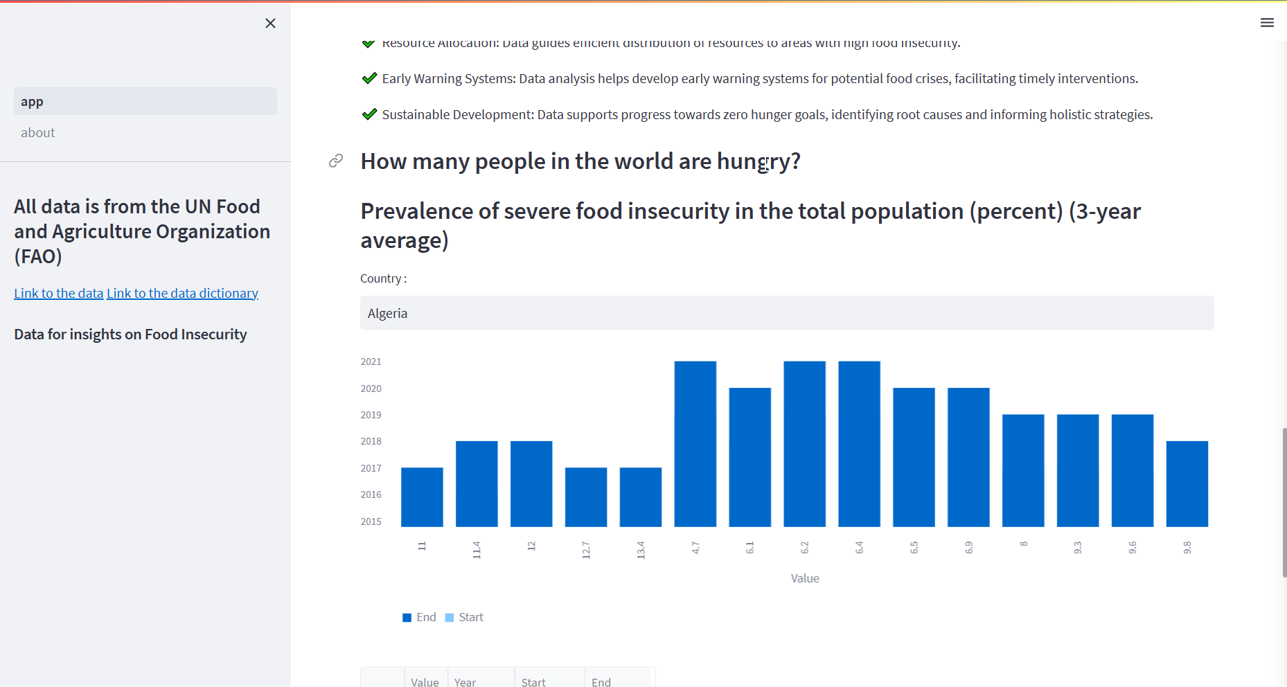
Food Insights is a web-based data visualization platform that leverages the Streamlit library to analyze and visualize food insecurity data. The platform allows users to explore and understand key aspects of food security, such as the prevalence of severe food insecurity in different countries over time. By providing interactive visualizations, it aims to raise awareness about the magnitude of the problem and highlight the importance of addressing it.
How we built it:
We built Food Insights using Python, Streamlit, pandas, and matplotlib libraries. The project involved collecting and cleaning relevant data from the Food and Agriculture Organization (FAO). We then used Streamlit to create a user-friendly interface where users can input a country of interest and visualize the prevalence of severe food insecurity for that country. The data was processed, filtered, and presented in the form of a bar chart to facilitate easy interpretation.
Challenges we ran into:
During the development of Food Insights, we encountered several challenges. One of the major challenges was cleaning and integrating the data from multiple sources to ensure consistency and accuracy. We also faced difficulties in handling missing data and transforming the date format for visualization purposes. Additionally, aligning the data with the appropriate visualization techniques and ensuring a seamless user experience posed its own set of challenges.
Accomplishments that we're proud of:
Despite the challenges faced, we successfully developed Food Insights as a functional and interactive platform. We are proud of the user-friendly interface that allows individuals to explore food insecurity data easily. The bar chart visualization provides a clear representation of the prevalence of severe food insecurity over time, helping users grasp the severity of the issue. Additionally, we take pride in leveraging open data from FAO to contribute to raising awareness about food insecurity.
What we learned:
Through the development of Food Insights, we gained valuable insights into data collection, cleaning, and visualization techniques. We learned how to effectively utilize Streamlit to create interactive visualizations and deliver a seamless user experience. Furthermore, we deepened our understanding of food security challenges and the importance of data-driven insights in addressing global issues.
What's next for Food Insights:
In the future, we aim to expand the functionality of Food Insights by incorporating more comprehensive and up-to-date datasets. We plan to enhance the visualization capabilities by incorporating additional chart types, such as geographical maps, to provide a more comprehensive view of food insecurity at a global scale. We also aspire to collaborate with organizations and policymakers to utilize the insights generated by Food Insights in shaping effective strategies and policies to combat food insecurity worldwide.


Log in or sign up for Devpost to join the conversation.