-
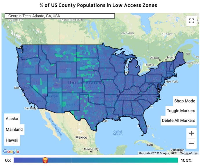
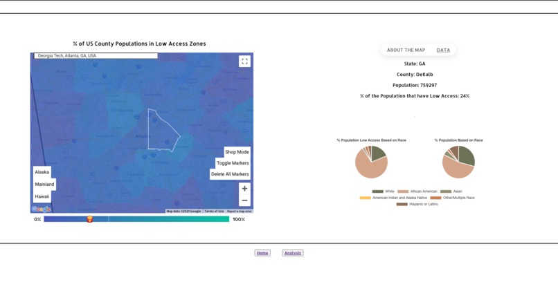
Intensity Map of % County Population in Low Access Region
-

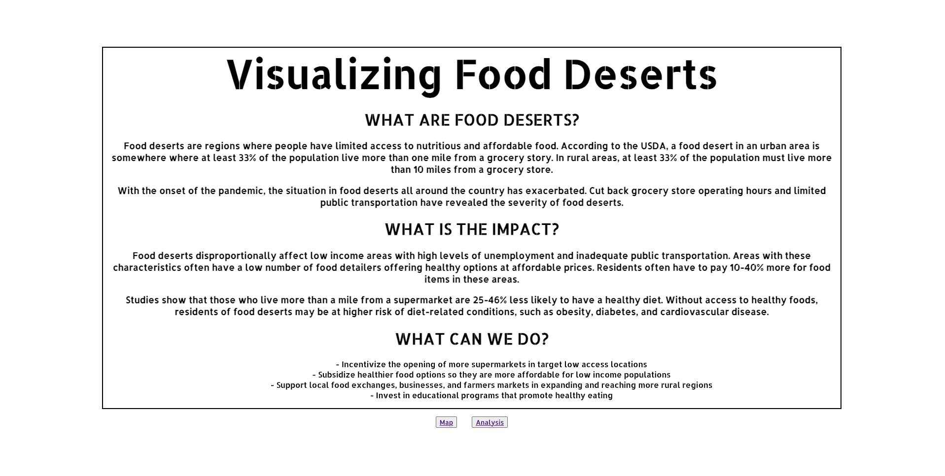
Home Page, background on food deserts
-

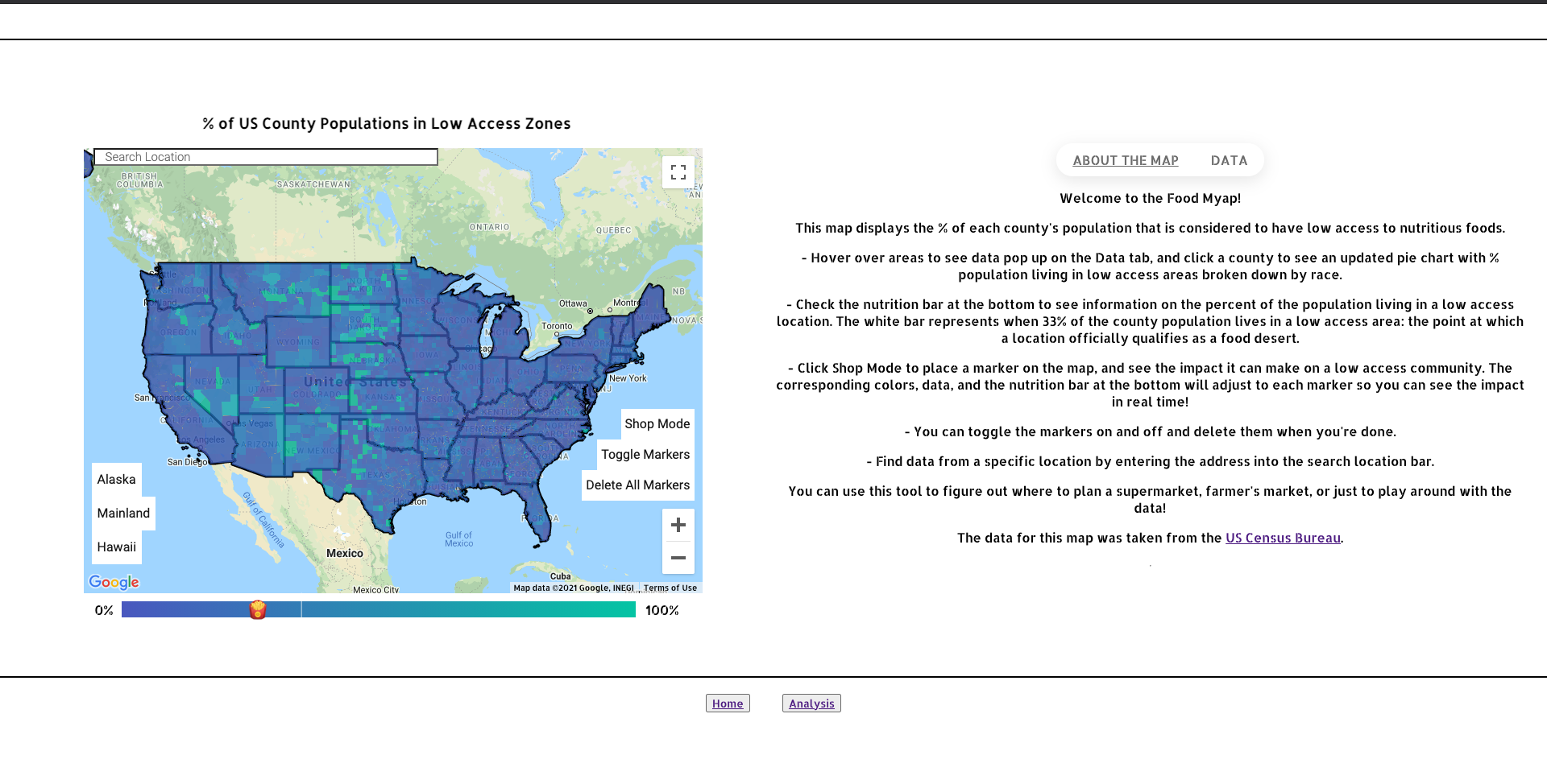
Introduction to map tool
-
ChartJS pie charts


Inspiration
I had the opportunity to work with Meals on Wheels last semester, which is a national nonprofit that deals with food insecurity, and that's where I got interested in this issue.
What it does
My project visualizes food accessibility down to the US county level through an intensity map. With hovering and clicking interaction, the user can then see more data about each county, including ChartJS pie charts that compare the racial composition of low access vs total population.
When users click the "Store Mode", they can add apple-shaped markers to the map to simulate additional markets and see the impact each additional fresh food seller has on the % population living in low access areas through color changes in the map and an indicator on the side detailing how many people would be positively impacted per store as calculated based on the county's population density.
I thought this store might help local farmer's markets expand into more low-access regions, or policy-makers decide where to open their next supermarket.
How we built it
I built it using HTML/CSS and Javascript with the Google Maps Javascript API and ChartJS. The data was taken from the census bureau with the ArcGIS API.
Challenges we ran into
I had trouble with the ArcGIS API and matching the GeoJSON and JSON datasets together so the correct data was showing for each county. But I was able to figure it out in the end! I also initially wanted to use Google API to get food pantries close to each location, but unfortunately couldn't figure out the CORS policy.
Accomplishments that we're proud of
I'm proud that I implemented a project that I enjoyed, and added additional features when initial ideas didn't work out.
What we learned
I learned how to use Google Maps API and ChartJS.
What's next for Food Deserts
I would love to implement more datasets so users can choose what data to display, and to figure out the CORS policy.

Log in or sign up for Devpost to join the conversation.