-
Preview

Inspiration
What prompted me to carry out this project was the fact that inflation has been rising over the years and, in recent years, I've noticed that food prices have also been much higher. This inflation can create a number of problems for families and people living alone, as well as food insecurity. So, when I saw that Montreal Open Data had a study about food aid requests, I was curious to discover the characteristics and trends behind the data.
Learning Journey
I had already learned how to use Power Bi in my past internship for data visualization so that's why I decided that it would be a good tool for this project. In this project, I reinforced my skills using Power Bi Desktop and learnt to analyze data and try to get out of it the most valuable information possible. I also worked on my design skills
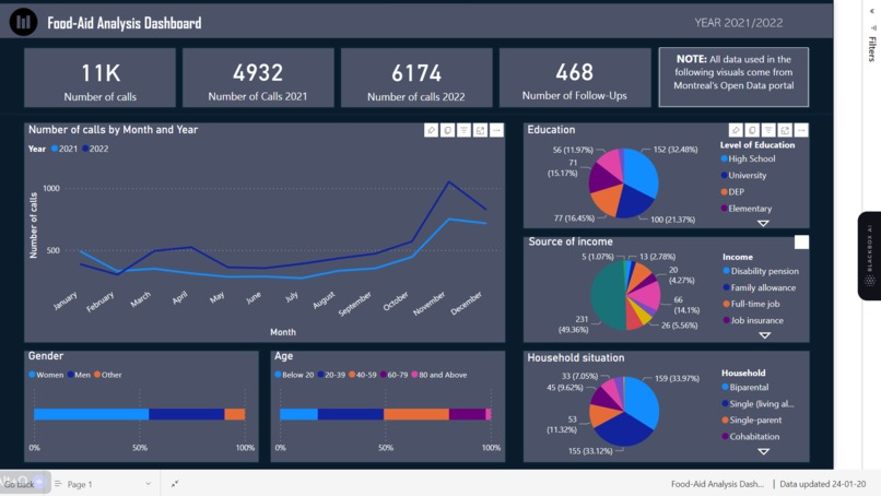
Food-Aid Dashboard
I built the project using Power Bi Desktop. This software allows you to import data such as csv files, transform them and create visualizations to better understand the trends they reveal.
Challenges
The challenges I faced were creating measures/formulas to extract the data I needed for my visualizations from the whole table, as I had to learn how to formulate them to get the information I needed. I was also faced with the difficulty of deciding what information I wanted to display in my dashboard in order to have relevant information on the trends observed.
Built With
- dax
- excel
- powerbi
- powerpoint

Log in or sign up for Devpost to join the conversation.