-
-

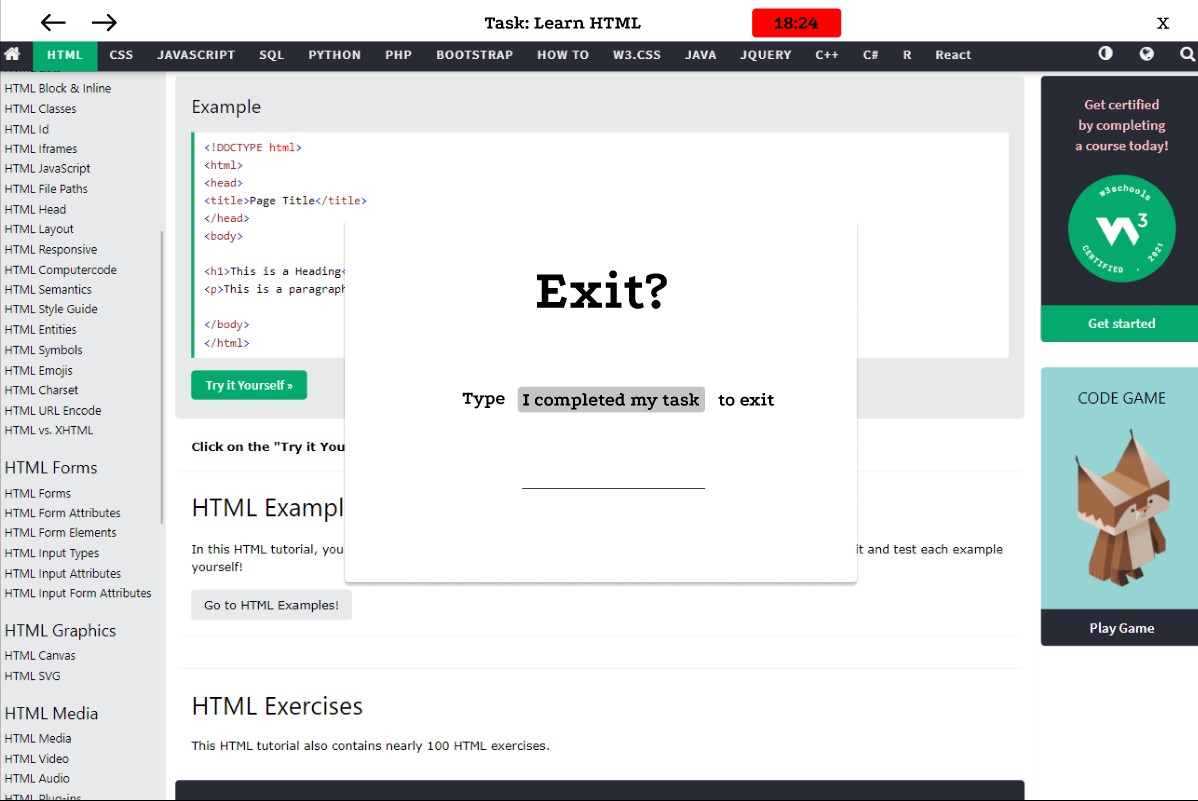
Exit
-
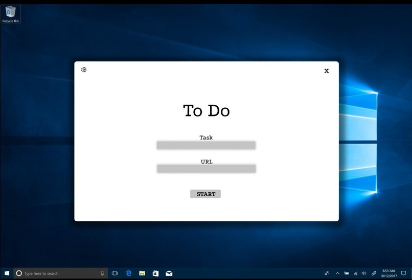
Start-up
-

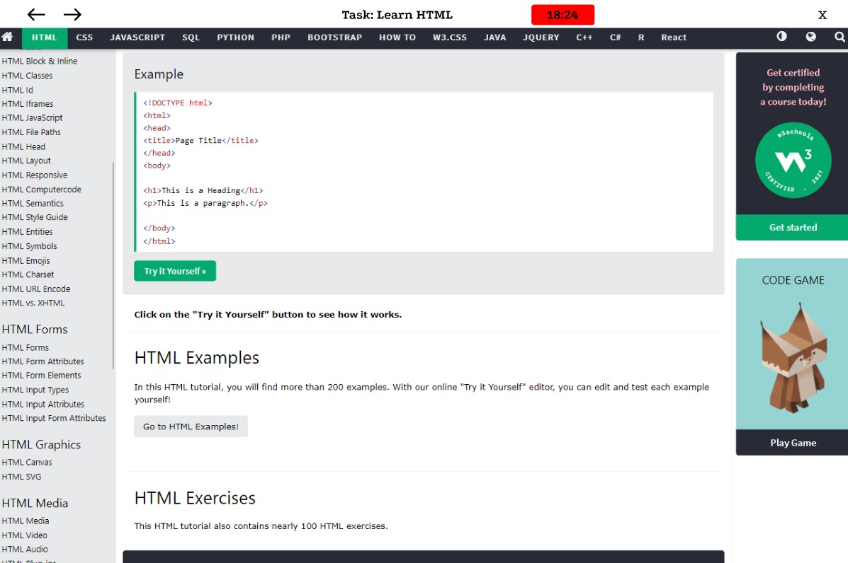
Work Mode
-

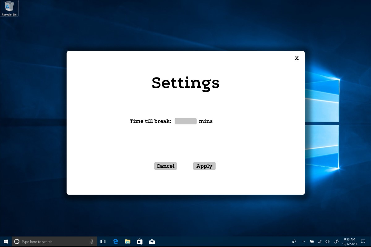
Settings
-
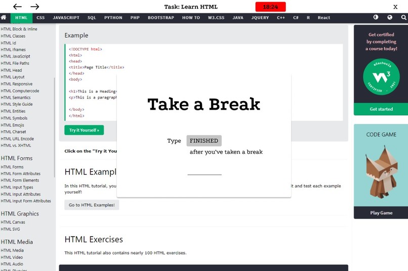
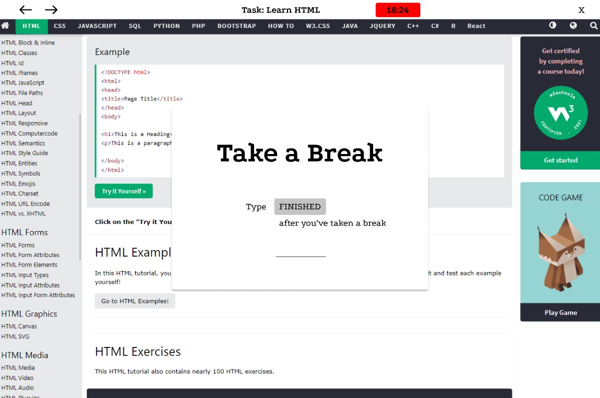
Break Time

Inspiration
I've started practicing a little bit of minimalism myself in the digital space. And I've found that the we don't need more features to get work done instead we need less. So that's why I decided to design the Focus Browser.
What it does
Focus browser is a browser that emphasizes productivity and health. It locks you down to one website domain after you've set your task and URL which is the website domain. Then it displays your task at the top instead of the usual URL bar and other button. And it also displays a timer before your break. The timer is there and is in red to display the urgency because according to Parkinson's Law "work expands so as to fill the time available for its completion". You have to type the text in the label on to the input line same thing if want to close the browser but only that it will be a longer text to type.
How we built it
This prototype was built using Figma. I had to decide what features would have to be removed in order to be "distraction free".
Challenges we ran into
Building a browser isn't that easy even if you are going to are going remove a lot of features.
Accomplishments that we're proud of
Be able to build a prototype of what it could be.
What we learned
I've learned that designing a good user interface and user experience are very crucial for a product. It is not always the more features the better, because not all features are essential and a lot of features is just good for the technical side but a few essential features is good for the user so they don't get lost.
What's next for Focus Browser
Hopefully this can really be built once skills and tools are adequate.
Built With
- figma

Log in or sign up for Devpost to join the conversation.