-
-
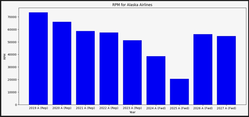
RPM histogram for American Airlines
-
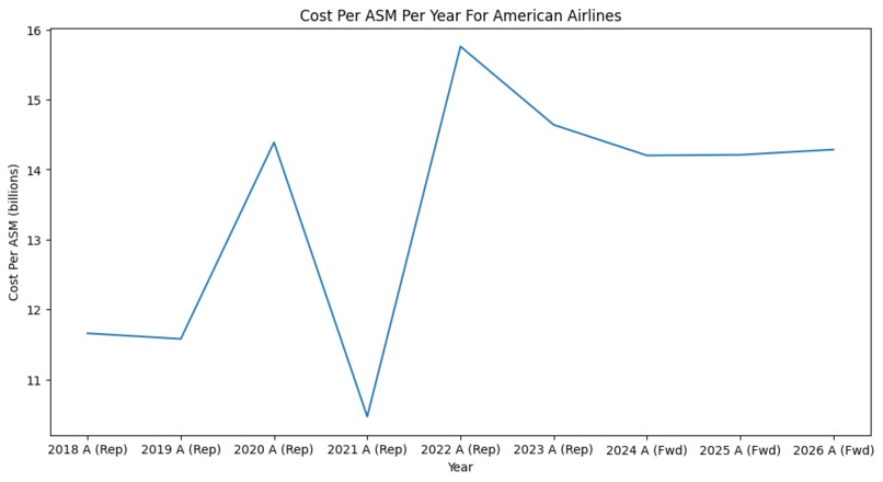
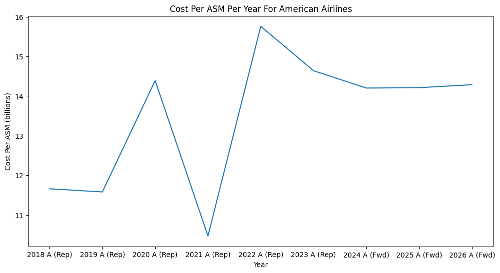
Cost Per ASM line graph for American Airlines
-
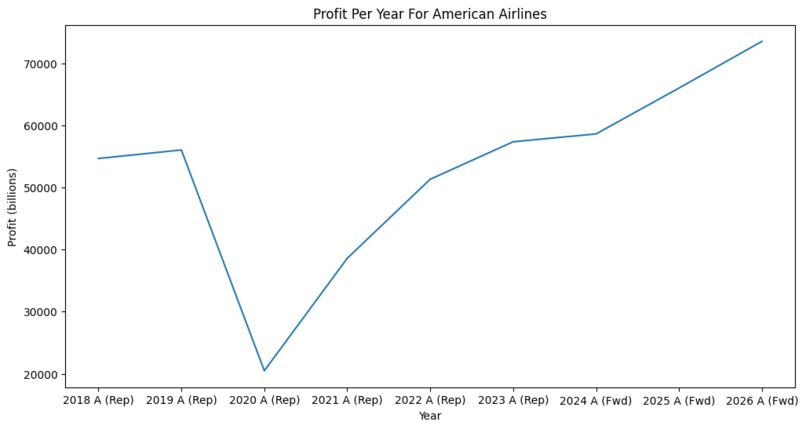
Profit line graph for American Airlines
-
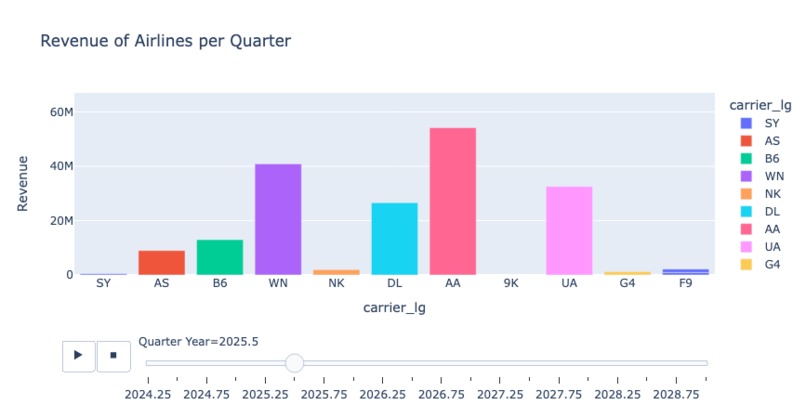
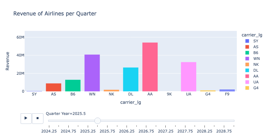
Graph of Airline Revenues by Quarter: Interactive on HTML!
-
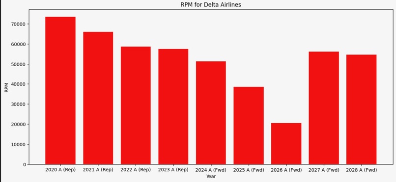
RPM histogram for Delta Airlines
-
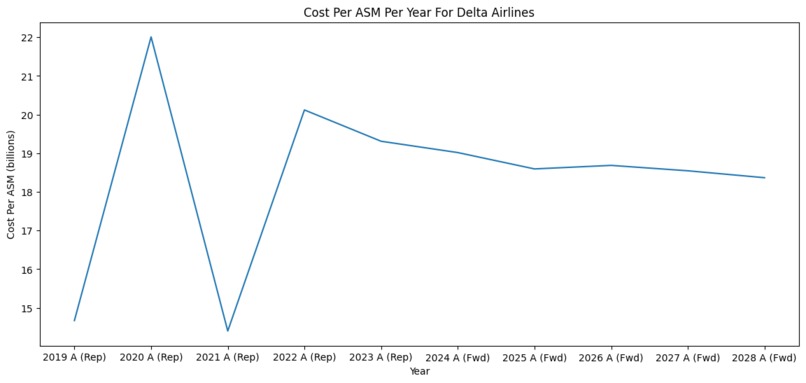
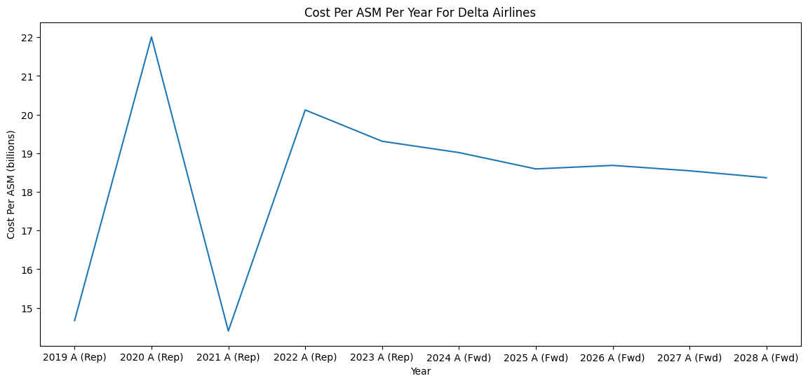
Cost Per ASM for Delta Airlines
-
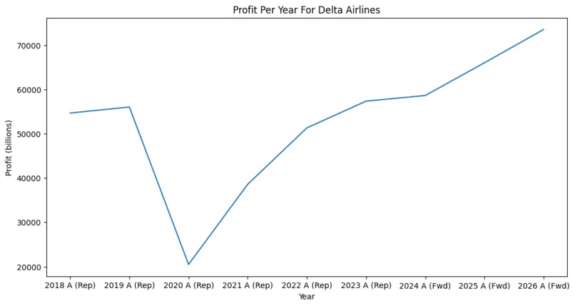
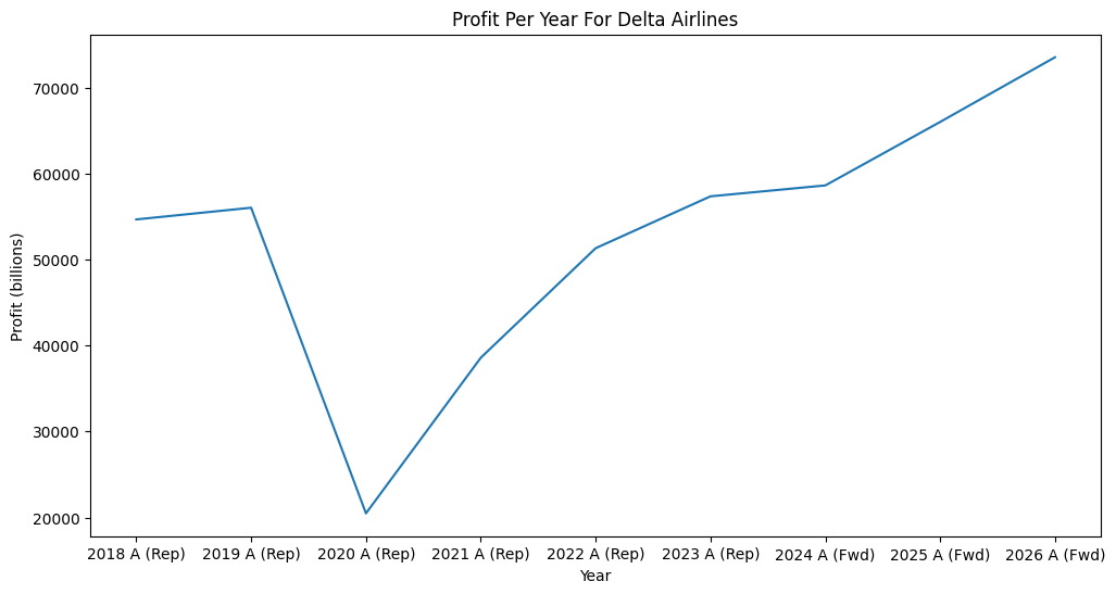
Profit line graph for Delta Airlines


Inspiration
We were inspired to analyze and optimize profits within the airline industry. Additionally, we wanted to use this data to drive business proposals for airlines to improve profit margins and grow the industry as a whole. As consumers of the airline industry, we are excited and inspired to see the future of it and contribute meaningful insights.
What it does
We built a web page with interactive predictive analysis displaying predicted fares, passenger rates, and revenues alongside Bloomberg projections of cost-revenue analysis of airlines over the next five years. Through our integrated map data with predicted airline profit backing, financial advisors of airlines gain access to in-depth geodata of revenue hotspots and a further-developed understanding of competitor projected profits and physical marketspace.
How we built it
We utilized Jupyter notebooks and HTML to build a web page showcasing our interactive visualizations. To map the data, we found that the geo data provided in the original dataset was insufficient, so we supplemented it with the latitude and longitude of the airports from a publicly available airport dataset. We used a RandomForest algorithm trained on the time data and 30 years of information to predict flight fares and daily passenger counts for the next five years, then calculated a relative revenue feature to produce geo data visualizations on HTML. To extract the Bloomberg projections to supplement the graphs, we went to the Kenan-Flagler Capital Markets Lab to access the server and combined the data of every airline in the dataset.
Challenges we ran into
We went into this project with the idea of utilizing linear programming analysis to predict costs of connecting flights using a “Cheapest Flight Algorithm” through the pulp library in Python. We built a linear programming model with the goal of cheapest flights and the constraints of flights operating within the same time frame and most likely being through the same or partnering airlines. However, because we did not have data on the frequency or fare of such a flight occurring other than an attempted extrapolation through combining the variables for the connected flight (which is inaccurate due to connecting flights being cheaper than a flight between each connecting airport), we ended up not using the model in our analysis. We also ran into a challenge with our visualizations on HTML: certain plugins which allowed for further interactivity on visualizations like the heat map would not appear on the main HTML page. We uploaded the interactive heat map separately, but have not yet determined the cause of this issue.
Accomplishments that we're proud of
We were able to integrate our visualizations and analysis into a dynamic HTML page significantly increasing the user experience compared to a static presentation of our findings. This transition allowed us to present our findings in a more engaging, interactive, and accessible manner.
What we learned
We learned the intricacies of the airline industry, especially the financial aspects of it. Understanding the profit margins on a day-to-day basis offered us, and potential business relationships or consumers, a more immediate view of airline performance.
What's next for Flysight
We would like to further look at the market share of airline carriers using predictive analysis to determine if there is an airline company that will stand out and rise in the market for a specific route/destination. The market share factor has a large influence on both consumers and industry competitors in relation to items such as pricing and route availability.
Built With
- bloomberg
- css
- excel
- folium
- google-places
- html
- import
- javascript
- jupyter
- matplotlib
- numpy
- pandas
- plotly
- python
- scikit-learn
- seaborn

Log in or sign up for Devpost to join the conversation.