Inspiration
Airplane accidents, while statistically rare, leave a profound impact on aviation safety and public perception. Our inspiration came from the need to provide a comprehensive, data-driven, and interactive way to explore these incidents—not just as isolated events, but as part of a larger narrative of safety improvements, technological progress, and regulatory changes. Instead of presenting raw data, we aimed to create an engaging, highly visual dashboard that helps users identify patterns, analyze trends, and gain insights into aviation risks and safety advancements.
What It Does
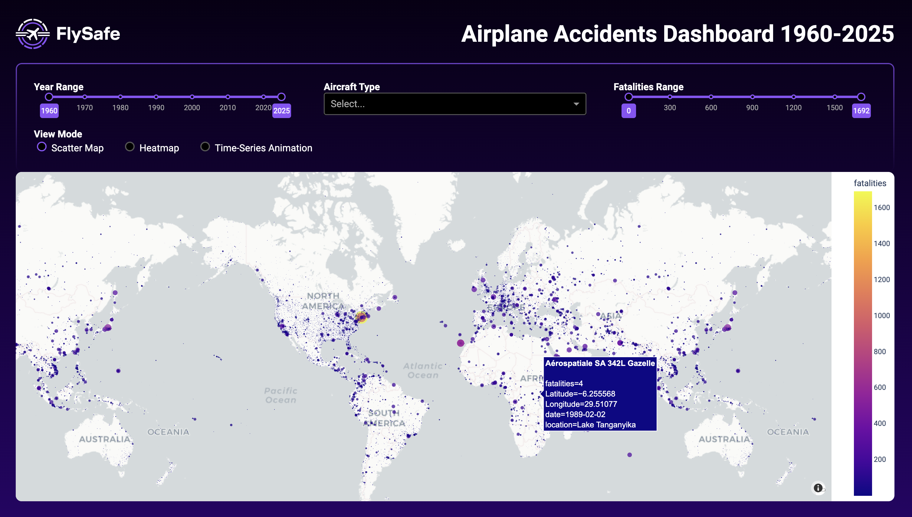
Our project is an interactive Airplane Accident Visualization Dashboard that allows users to explore historical airplane accidents from 1960 to 2025. It includes:
- Dynamic Heatmaps: Showing accident frequencies by aircraft model and year with intensity-based transparency.
- Airline & Aircraft Risk Trends: Visualizing which aircraft types and airlines have historically had more accidents and fatalities.
- Survivability Analysis: Examining the relationship between accident severity and survival rates across different incidents.
- Interactive Geographic Mapping: Using scatter plots and density maps to pinpoint accident locations globally.
- Sankey Diagram for Accident Causes: Tracking how various factors (e.g., pilot error, mechanical failure, weather) contributed to accidents over time.
- Aircraft Model Leaderboard: Displaying the top aircraft types involved in accidents, ranked by fatalities and total incidents.
- Yearly Trends & Timeline Animation: Allowing users to visualize accident trends dynamically.
Our goal was to move beyond static reports and enable users to explore aviation accidents in an intuitive and data-driven manner.
How We Built It
Data Processing & Cleaning
- We gathered aviation accident records spanning over 60 years, cleaned and standardized data using Pandas, and handled missing values through interpolation and verification.
- Google Maps API was used to convert accident locations into latitude and longitude coordinates for visualization.
Visualization & Interaction
- Plotly & Dash were used to create interactive visualizations, including heatmaps, scatter plots, and time-series animations.
- Sankey diagrams were implemented to analyze the causes of accidents and their impact on aviation regulations.
- Data was structured into a relational format to filter accidents by aircraft type, operator, and severity dynamically.
Performance Optimization
- Since handling decades of aviation data in real-time is computationally demanding, we implemented:
- Downsampling and caching mechanisms to optimize query speeds.
- Data aggregation techniques to reduce rendering time for visualizations.
- Optimized filtering and UI responsiveness to ensure a smooth user experience.
Challenges We Ran Into
Data Inconsistencies & Missing Information
Many accident records lacked structured information on causes, exact locations, or aircraft details, requiring manual validation and interpolation.
Geospatial Data Processing
Geocoding thousands of accident locations led to API rate limits, so we built caching and retry mechanisms to optimize data retrieval.
Scaling Interactive Visualizations
Plotting thousands of data points on maps caused performance bottlenecks, requiring dynamic aggregation and filtering techniques.
UI/UX Balancing Depth and Simplicity
Making complex accident data accessible to non-experts was challenging, leading to several iterations in interface design and feature prioritization.
Accomplishments That We're Proud Of
- Building a fully interactive dashboard that brings accident data to life instead of just displaying static statistics.
- Creating a visually engaging heatmap system that highlights accident frequencies over time using intensity-based transparency.
- Developing a comprehensive aircraft risk ranking system, allowing users to compare aircraft models and operators based on historical safety records.
- Integrating a Sankey diagram to show accident causes, offering a clear breakdown of key contributing factors to aviation incidents.
- Optimizing real-time data visualization, ensuring smooth performance even with large datasets spanning over 60 years.
What We Learned
- Effective storytelling enhances data visualization – By presenting accident data in a structured and visually intuitive way, we make complex safety trends more understandable.
- Handling large datasets efficiently is key – We improved our data optimization techniques, learning how to balance interactivity with performance.
- User experience matters – Designing filters, interactive graphs, and intuitive UI elements helped - make data insights more accessible.
- Aviation safety is a constantly evolving field – Understanding how accidents have shaped modern regulations gives new perspective on why safety measures exist today.
What's Next for FlySafe
- Expanding Data Scope
Integrate real-time aviation incident reports and include factors like weather, flight paths, and pilot experience. - Enhancing 3D Visualizations
Develop flight path reconstructions for select incidents, allowing users to see how accidents unfolded in real-time. - Machine Learning for Predictive Safety Insights
Implement models to analyze accident trends and predict potential risk factors based on historical data. - Improved User Engagement
Add gamification elements, expert insights, and educational resources to encourage aviation safety awareness. - Cloud Deployment & Mobile Optimization
Make FlySafe accessible on mobile devices and cloud-hosted for broader usability.
Final Thought
"Aviation safety is not just about learning from the past—it’s about preventing the same mistakes in the future. By making accident data accessible, interactive, and insightful, we hope to contribute to a safer sky for everyone."


Log in or sign up for Devpost to join the conversation.