


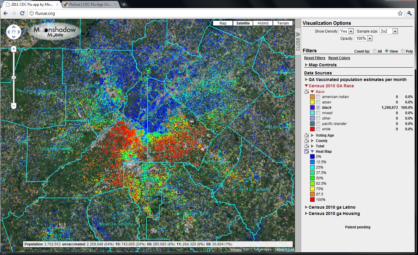

Mission: FluVue is a visual user environment to view the flu. Submission: FluVue operates inside of Google Maps and visualizes vaccinations over time per age category for each census block. FluVue also includes the Census 2010 data so you can compare vaccination information with Census data. Because FluVue runs inside of Google Maps it is very easy to use. Anyone familiar with Google Maps will learn quickly how to visualize the data and move around the state. You can zoom and pan to any area of the state and instantly visualize the vaccination rates for each month. As you are moving around in Google Maps the number of vaccinated people per age group is updated instantly in the side panel. You can filter the data by month, age, county and vaccination status and the maps and see the numbers change. When you zoom in to the Census Block level you can actually download the data for that census block into a spreadsheet. The submitted version is a proof-of-concept for the State of Georgia and should not be used as an actual reference because we did not have access to sufficiently detailed data. If it is provided with enough detailed information FluVue would become a visual interface to inform people at all levels about vaccination rates and infections. Vision: In an ideal world here’s how FluVue would work: every day data about vaccinations and infections are uploaded into the system for the entire country by local health officials or the public. The data is provided with as much detail as possible, preferably even down to the census block level. FluVue could even allow the public to upload vaccination or infection information about themselves from a web browser or a mobile app. Health officials, doctors and the public have access to the system and can visualize the spread of the flu over time. Some data may be restricted to health officials. The public can look at vaccination rates as well as infections, apply filters, create heat maps and export numerical data. Infection rates can be compared with demographical information. Officials or the public can create maps or spreadsheets at any level of detail. FluVue could even be used to create animations that show the spread of the disease over time. To illustrate how animations would work we included a link to a sample animation for a different field on YouTube at http://www.youtube.com/watch?v=YZcMo3GpTJo . This animation shows the growth of population in the Portland metro area between 1990 and 2000. FluVue could be used to create animations that show vaccination or infection rates over days, weeks or months at any zoom scale.
FluVue

Updates

Leave feedback in the comments!
Log in or sign up for Devpost to join the conversation.