-
-
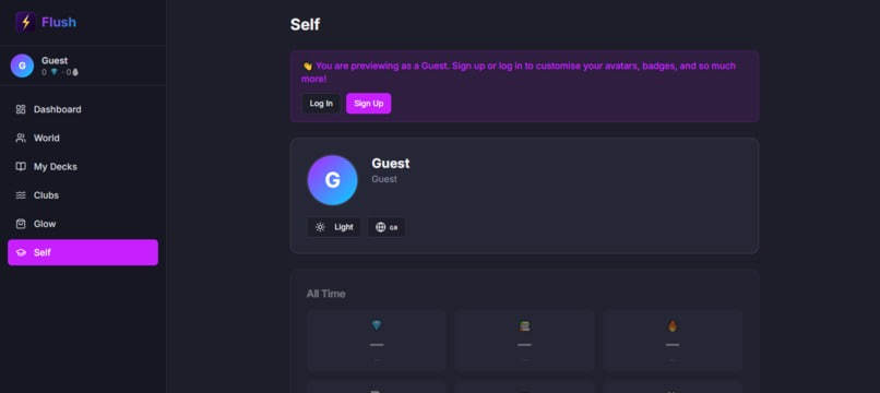
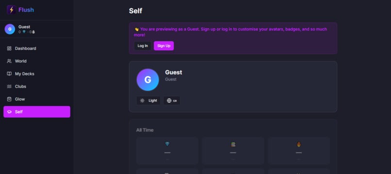
Preview in Guest mode
-
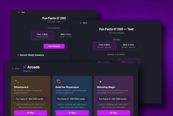
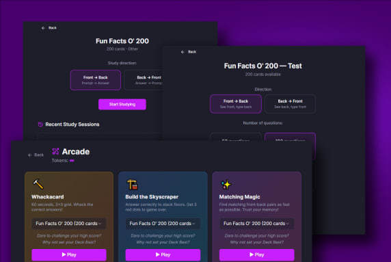
Learning's a breeze with 3 or more ways; hands-on, always
-
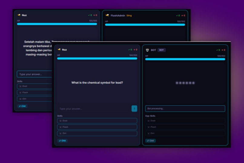
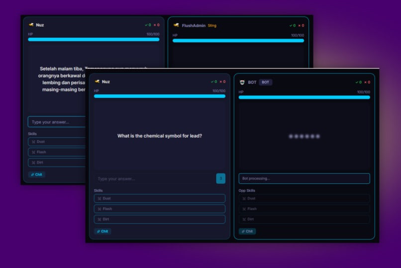
Real-time matches. Keep the competition up!
-
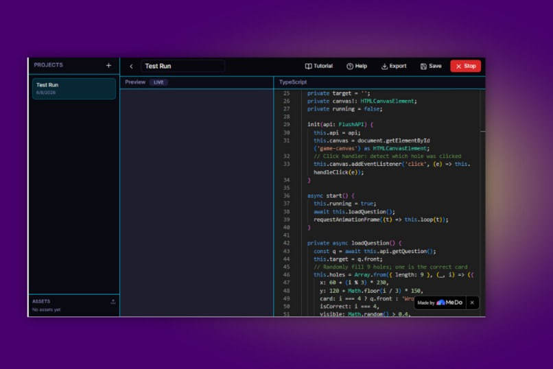
Design new arcades for the community in Studio!
-
Thanks for coming by; have a wonderful day!
Inspiration
Studying is a chore. Most flashcard apps feel like index cards—no spirit, no reward, no reason to come back. I wanted to build something that makes students want to and enjoy studying. Something that feels real, relatable and actually applicable to exams. So I set the tagline "Study Smart. Play Hard." and everything else followed.
What Flush does
- Flush turns plain flashcards into hands-on tests and arcade games. Plus, who will stand the longest in real-time flashcard battles? Choose between Flush's Bot or invite your friends and challenge them live!
- Study with traditional flip cards (front-to-back or back-to-front). Test yourself with typed answers on a timer instead of wondering if you got the grammar or punctuation right or wrong. Earn gems to play mini-games: Whack-a-Card, Build the Skyscraper, and Matching Magic.
- Spend gems on game tokens, AI hints, and 10+ themes. Don't forget to stock up on Skills and Charms that power you up in Arena matches!
- Track daily goals, badges, and personal stats.
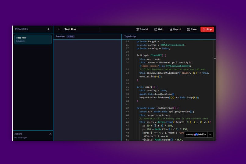
- Community vibe in Athenaeum to share decks and create new arcades. There's an in-built TypeScript editor in Flush to encourage learners to code. Ideas without action are simply imagination.
- Guest mode lets anyone experience Flush with starter decks.
- Sign up to add cards, save your progress, join clans, leaderboards, and so much more.
Challenges I ran into
- UI anxiety. Would the card flip be smooth? How would Whack-a-Card feel at 1.25x speed? Would the green flash and red vibration work without lag? Does it work the same for desktop and mobile? Are standard user expectations met — like does clicking the outside space close the modal? The app needed to feel good, not just "working."
- Real-time tracking. I had trouble implementing global leaderboards, efficient opponent searches, and public profiles. More often than not, the leaderboard returned empty, and opponent matching was uneven. By uneven, I meant that one user was connected and the other was still in search mode — and the match had already begun. Thankfully, determined and detailed debugging set features straight.
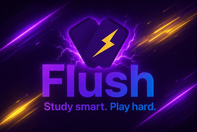
- Logo identity crisis. Gaming console? Book with lightning? Where should the lightning be positioned? A single, 3D lightning bolt? Animated or static? I changed my mind more than four times before finally settling on a thick, bold lightning bolt on a purple/dark gradient background — I wanted it to be simple yet modern and recognisable.
Accomplishments that I'm proud of
- A flashcard app that really captures the vibe and spirit
- A responsive design for desktop and mobile without "crushing" the display
- Front-to-back or back-to-front as a niche feature for users who benefit from a two-way recall
- The unique built-in code editor to encourage community coding and flashcard duels in Arena. Most importantly, it actually makes memorising engaging.
What I learned
- Edge cases matter (What if the user is on a very small screen? What if a user spams the buttons? What happens when a deck has 0 cards?).
- Guest mode is important so everyone can explore without commitment.
What's next for Flush
Spaced repetition algorithms (SRS) for smarter card scheduling. Add reminders and a motivational system. Have more arcade games: Spaceshooter, Flappy-Card, Desert Run, Smack-A-Web. Hide Easter Eggs in themes and events. Community deck sharing and global leaderboards. Custom user avatars. For now, Flush is ready to make studying addictive. Study smart, play hard, and enjoy!
Built With
- supabase
- typescript

Log in or sign up for Devpost to join the conversation.