-
-
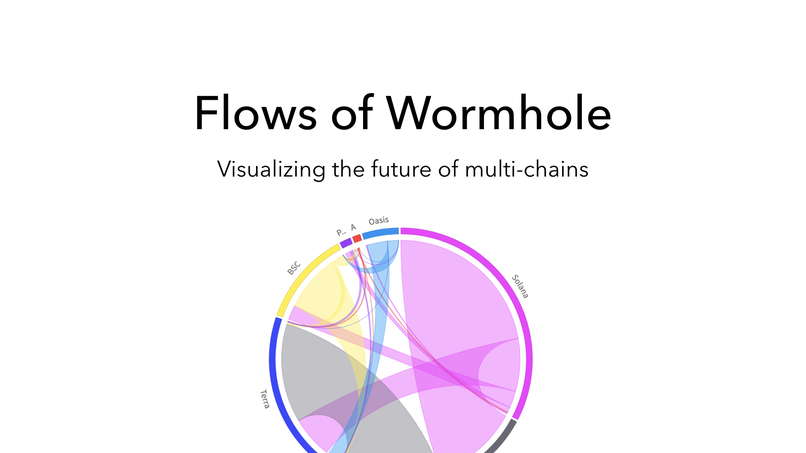
visualizing the future of multi-chain
-
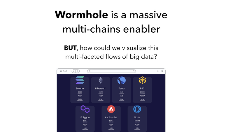
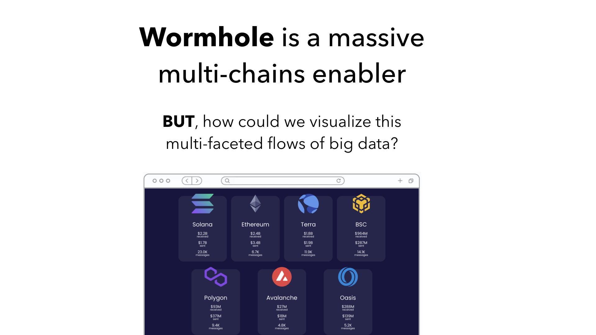
exploring rich multi-faceted data of Wormhole
-
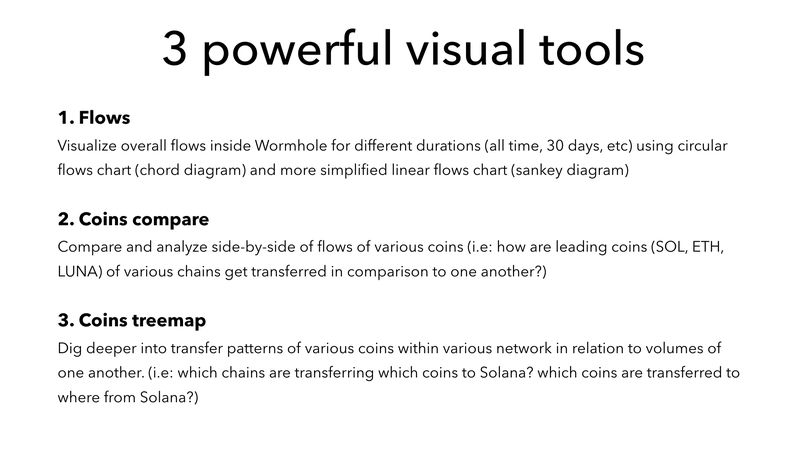
3 powerful visual tools to make sense of Wormhole activities
-
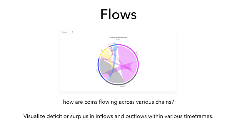
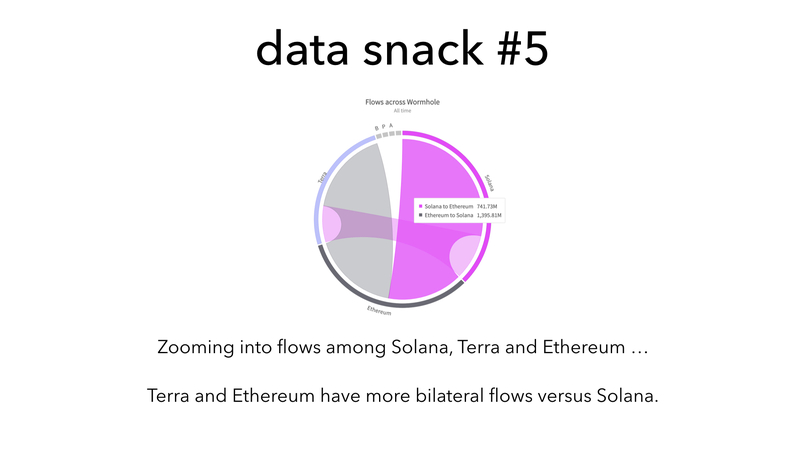
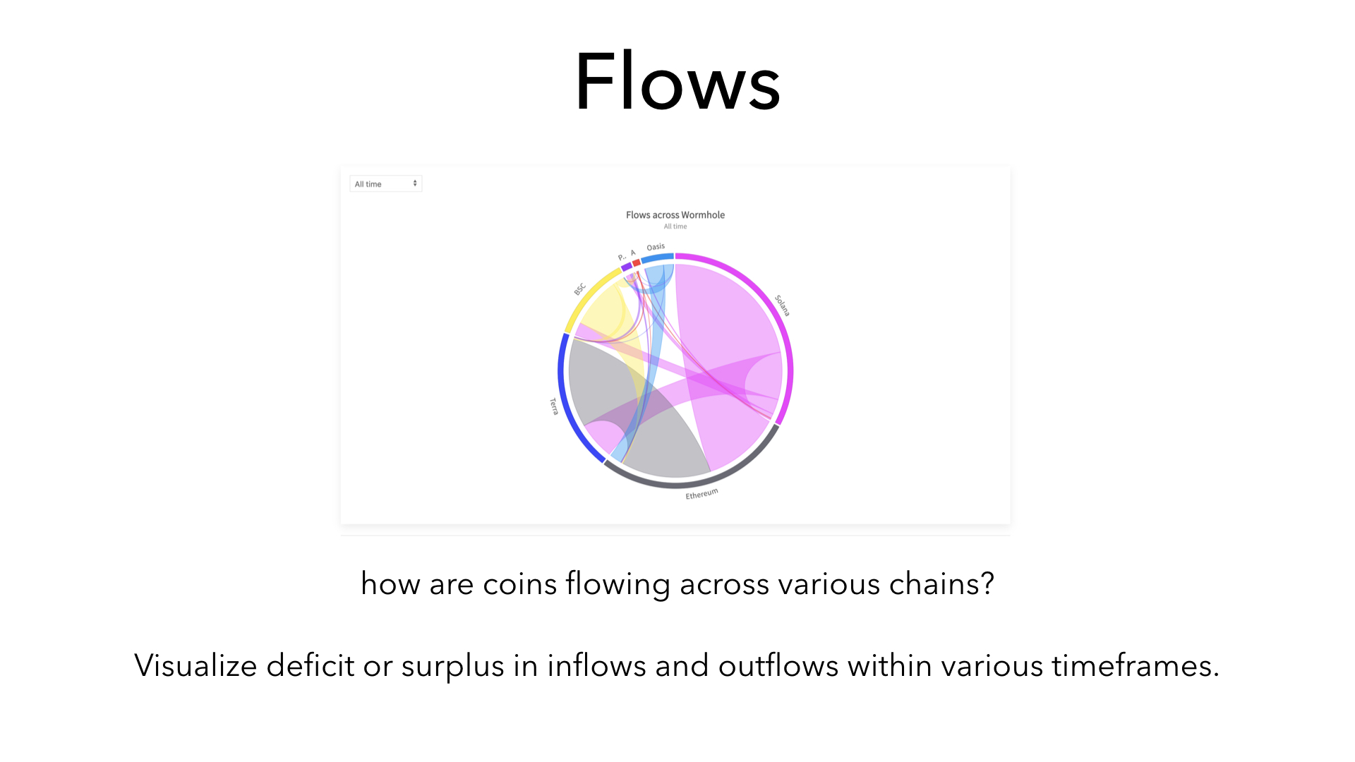
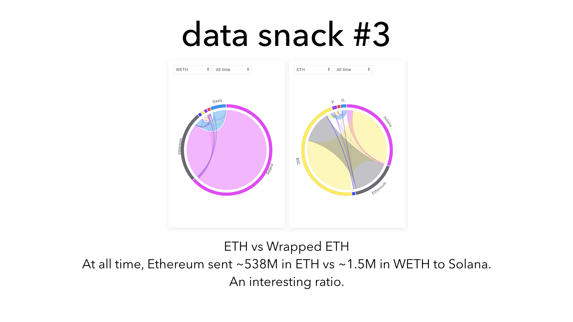
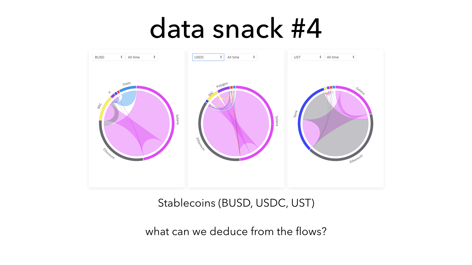
visualize flows across various chains (or specific chains) for various timeframes
-
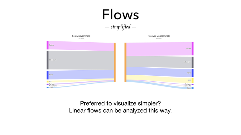
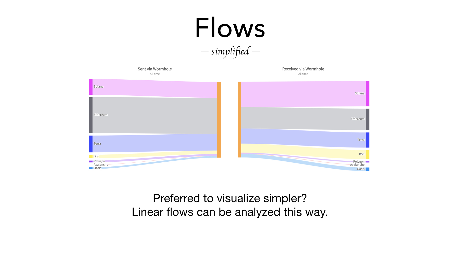
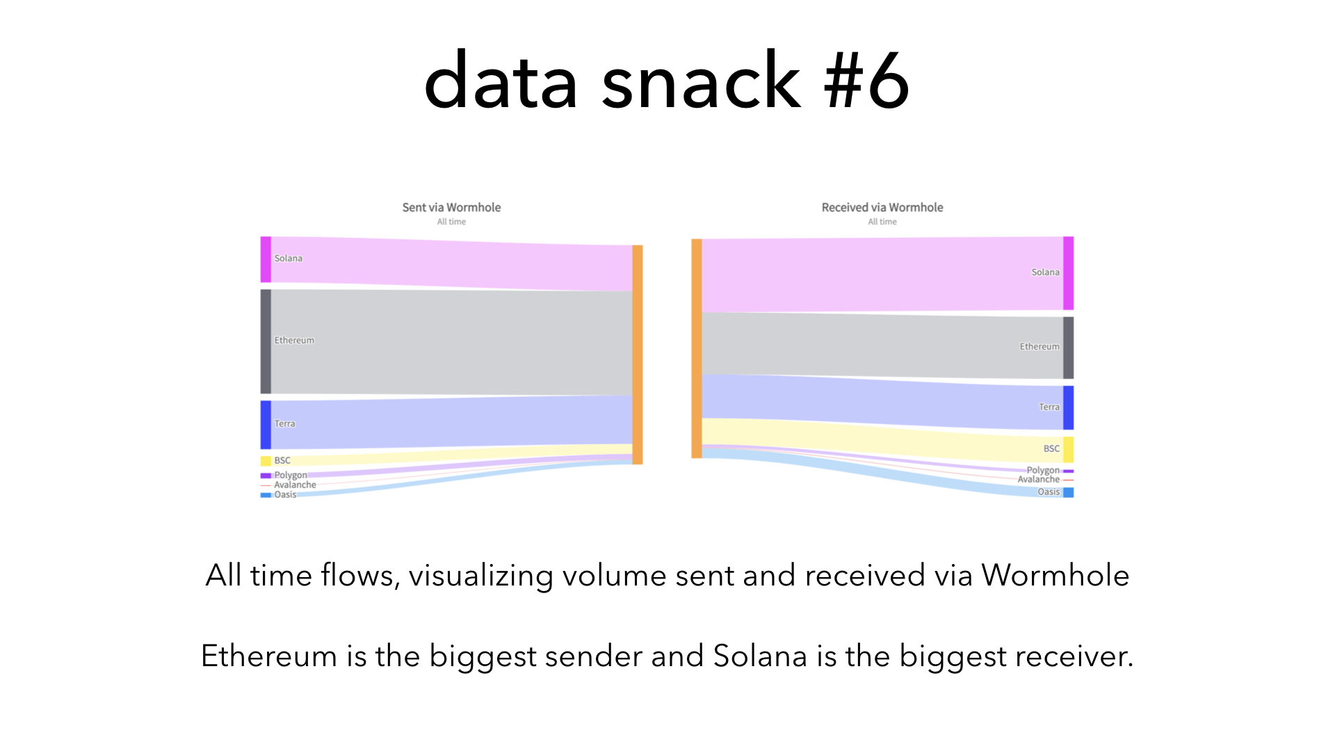
visualize flows in simpler way with linear diagram
-
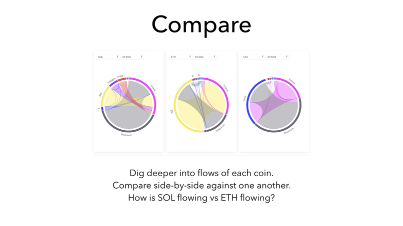
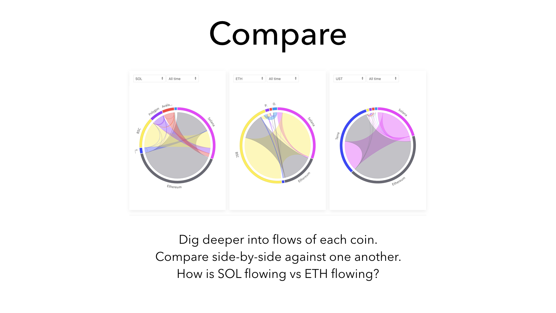
compare flows of 3 coins side-by-side
-

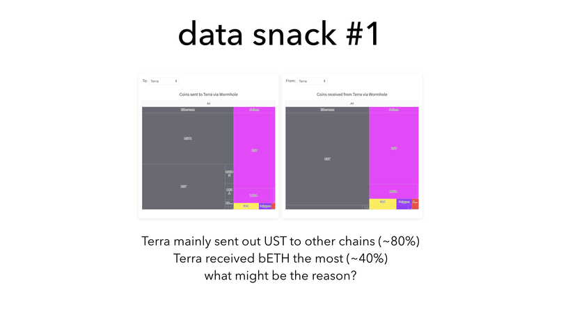
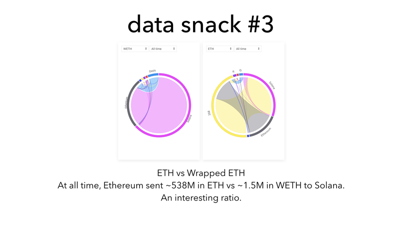
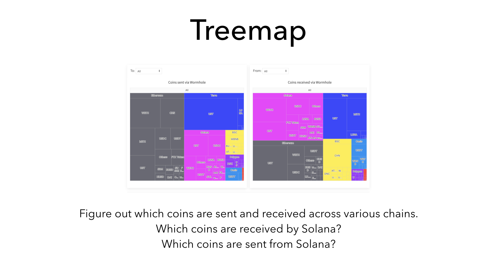
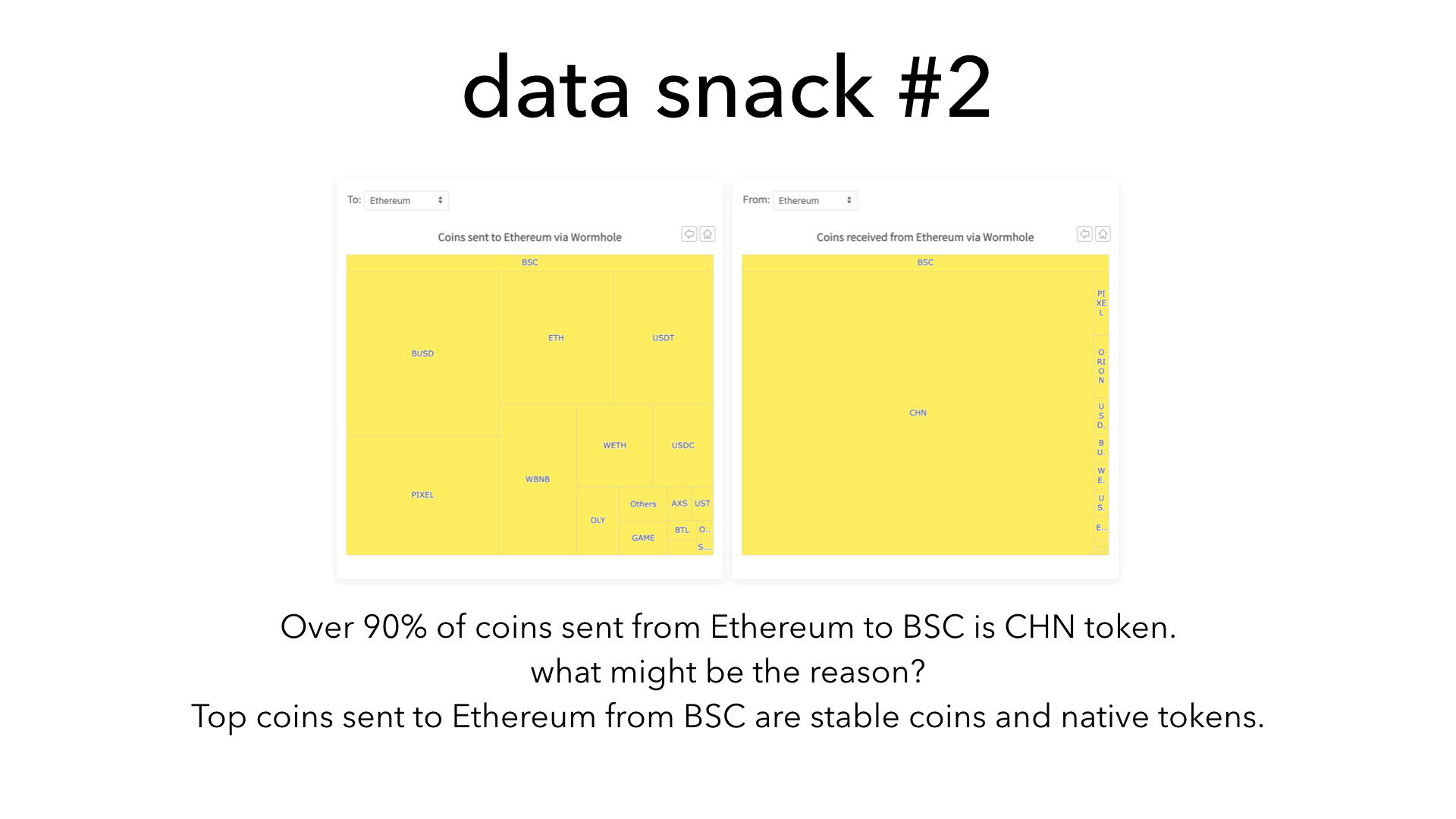
analyze coin transfer volumes, both to and from, across various chains
-

next steps
-
-

-
-

-
-


Inspiration
Data turned into visual stories and insights can lead to enormous impacts. I am inspired to build a visualizer tool to help users make sense of Wormhole data easily so that they can find answers and insights within the state of Wormhole and build wonderful use-cases on top of Wormhole.
What it does
The visualizer tool has 3 simple but powerful capabilities:
- Flows - visualize overall flows inside Wormhole for different durations (all time, 30 days, etc) using circular flows chart (chord diagram) and more simplified linear flows chart (sankey diagram).
- Coins Compare - compare and analyze side-by-side of flows of various coins (i.e: how are leading coins (SOL, ETH, LUNA) of various chains get transferred in comparison to one another?)
- Coins Treemap - dig deeper into transfer patterns of various coins within various network in relation to volumes of one another. (i.e: which chains are transferring which coins to Solana? which coins are transferred to where from Solana?)
How we built it
Simple web frontend using a charting library and JSON data extracted from Wormhole's bigtable.
Challenges we ran into
As Wormhole data APIs are not public yet, I needed to figure out how to index and grab data from various contract addresses. After prototyping in a few ways, I decided to peek into the bigtable dataset and build on top of it.
Accomplishments that we're proud of
Ready-to-use visualizer tool https://wormhole-flows.netlify.app/ built within short timeframe
What we learned
- immense volume of value flows inside Wormhole
- interesting relations among various chains (a peek into the future of Multi-chains)
- how data can empower decisions and actions
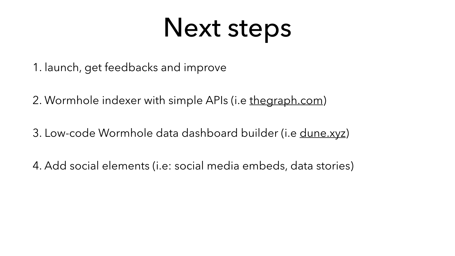
What's next for Flows of Wormhole
- let users use and improve with feedbacks
- build a Wormhole indexer with easy data APIs (i.e: thegraph.com)
- build a low-code Wormhole data dashboard builder (i.e: dune.xyz)
- Add social elements (i.e: social media embeds, data stories)


Log in or sign up for Devpost to join the conversation.