Inspiration
Flow was inspired by a simple but important gap: many people are not financially irresponsible, they are financially unclear. They may earn good incomes, save inconsistently, hold too much idle cash, miss tax advantages, or misunderstand what parts of their net worth are actually helping them move toward their goals. Most tools either track spending, push products, or overwhelm users with disconnected information. We wanted to build something that turns a financial profile into clear, actionable understanding.
What it does
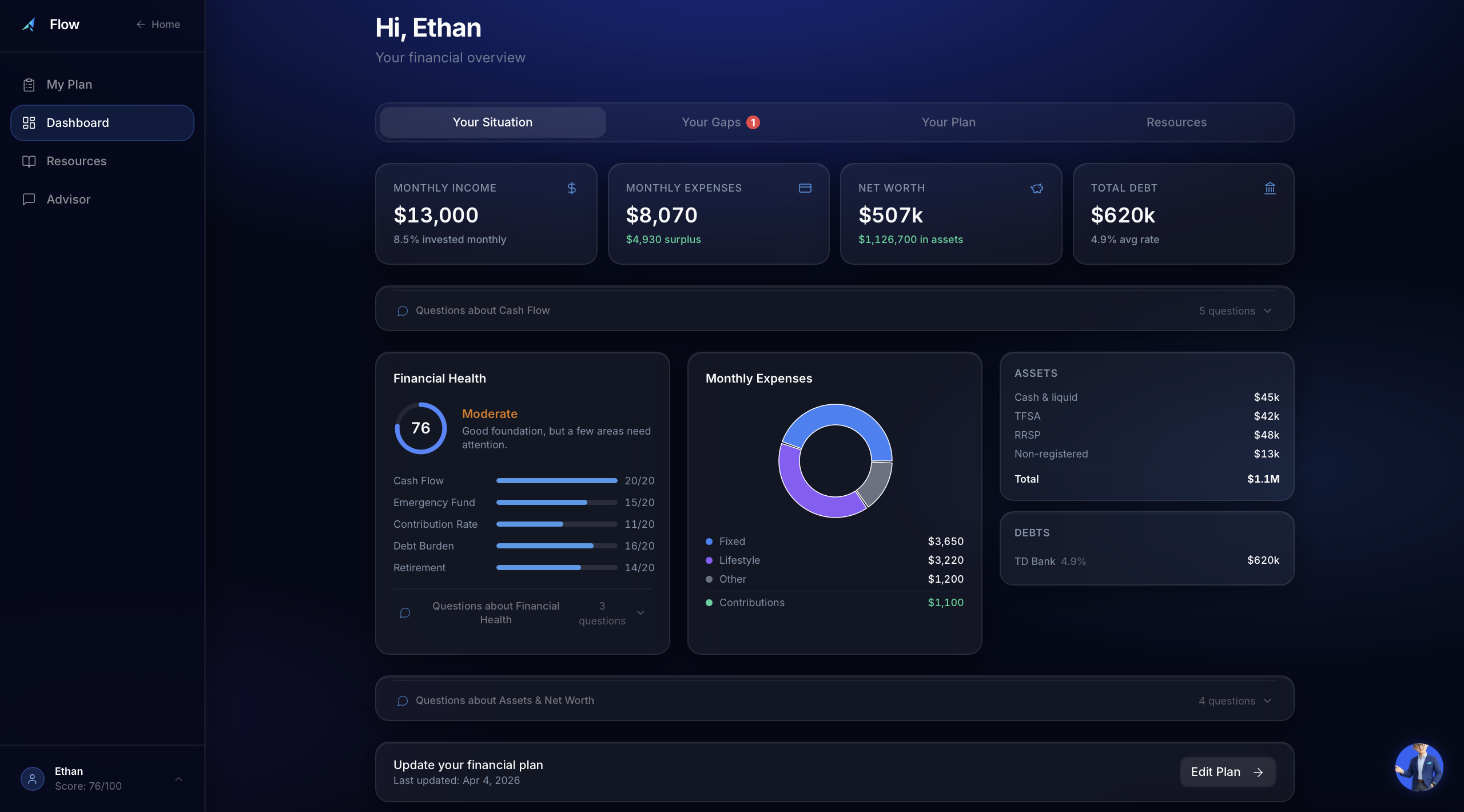
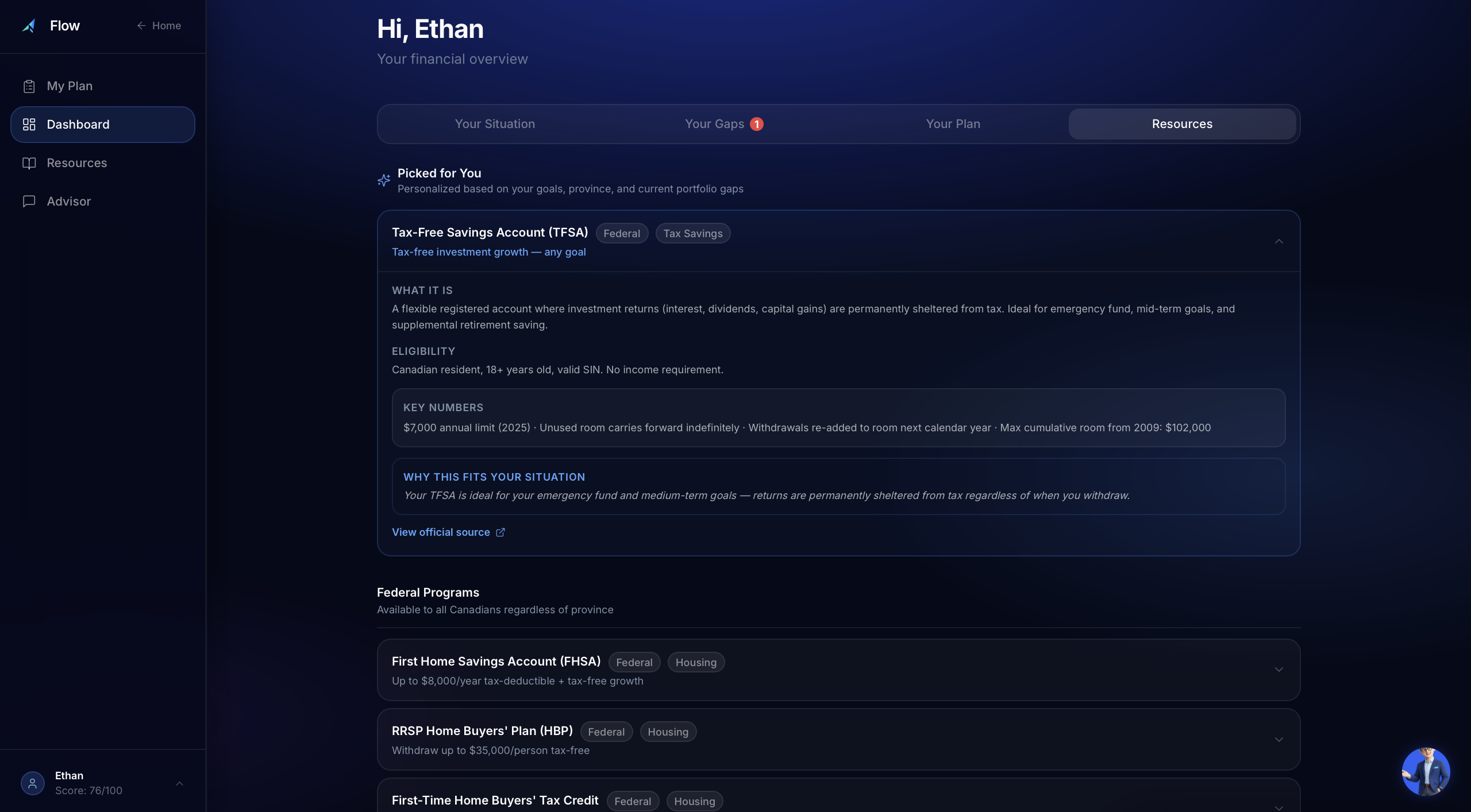
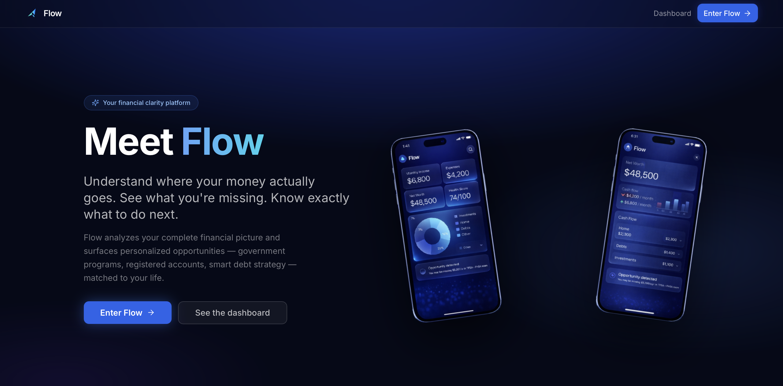
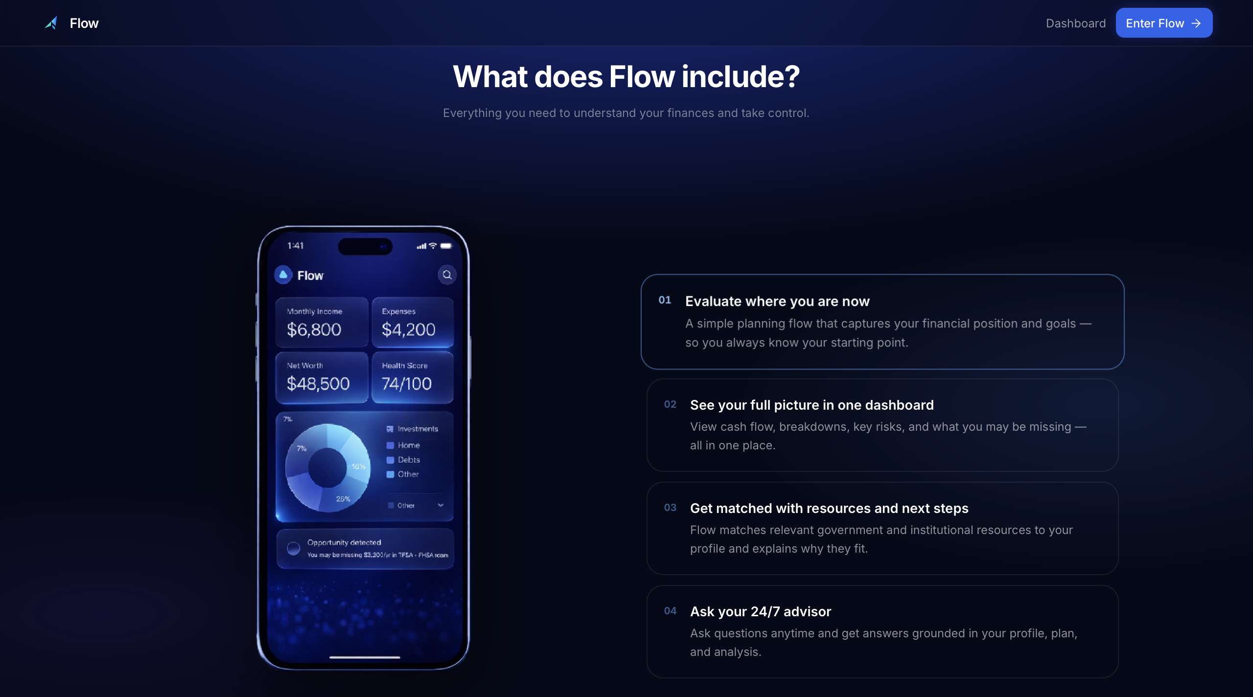
Flow is an AI-powered financial planning and decision-support platform. It helps users input their financial profile, analyze their cash flow, assets, debts, and goals, identify inefficiencies or missed opportunities, compare future scenarios, and receive tailored next-step guidance. It also connects users to relevant financial resources and explains insights in plain language through a guided in-app assistant.
How we built it
We built Flow as a full-stack web application using TypeScript, React, Vite, Tailwind CSS, Node.js, and Express. The frontend handles the planning flow, dashboard, scenario comparison, resource views, and guided assistant interface. The backend supports structured advisor logic and system outputs. We designed the product around three layers: user input, financial interpretation, and action guidance. A major part of the build process involved refining the planning assumptions, recommendation logic, scenario design, and the user experience so the product would feel both intelligent and easy to use.
Challenges we ran into
The hardest challenge was balancing realism, clarity, and usability at the same time. It was not enough for the calculations to be directionally correct — they also had to be understandable, trustworthy, and relevant to the user’s exact situation. We had to fix inconsistencies in data flow, improve the distinction between account types, tighten the recommendation hierarchy, reduce form friction, and design outputs that felt insightful rather than generic. We also had to turn a technically correct system into something that was emotionally clear and strong enough for a live demo.
Accomplishments that we're proud of
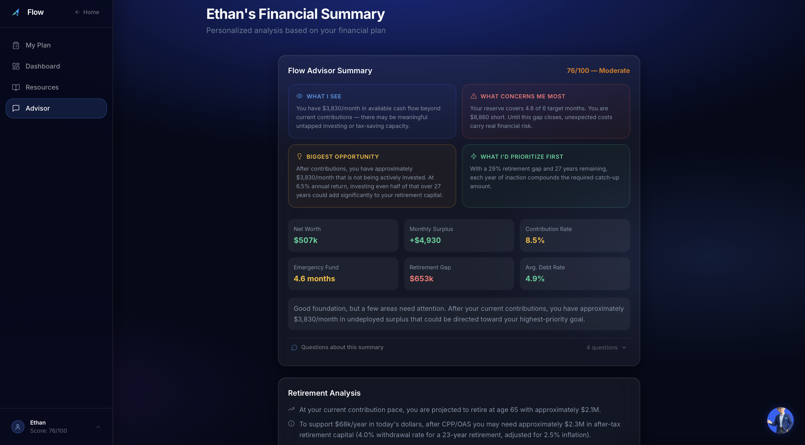
We are proud that Flow goes beyond surface-level budgeting and actually helps users understand what is inefficient, what is missing, and what to do next. We are especially proud of the scenario design, the “Your Gaps” insight layer, the retirement and scenario comparison logic, the contextual resource matching, and the guided assistant experience that explains outputs in plain language. We are also proud of how much the product matured from a general finance app concept into a much more focused decision-support system.
What we learned
We learned that in financial products, correctness alone is not enough. A result can be mathematically sound and still fail if the user does not understand what it means or what action to take. We also learned that small UX details matter a lot: showing only relevant inputs, reducing ambiguity, clarifying account logic, and surfacing the right insight at the right moment can completely change how trustworthy a system feels. More broadly, we learned how important it is to connect data, logic, explanation, and design into one coherent user experience.
What's next for Flow
The next step for Flow is to make the platform even more dynamic, personalized, and reliable. That includes improving the assistant experience, expanding the resource matching system, strengthening scenario-based planning, and making the product more useful over time rather than just at setup. We also want to deepen the action layer so Flow not only shows users what is happening, but helps them move more directly from insight to execution.
Built With
- express.js
- git
- local-browser-storage
- node.js
- react
- tailwind-css
- typescript
- vite


Log in or sign up for Devpost to join the conversation.