-
-

Research and Problem Framing Brainstorm using FigJam
-
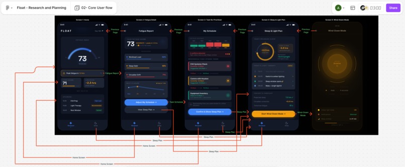
FLOAT - Core User Flow
-
Design System Starter - 1 / 4
-

Design System Starter - 2 / 4
-
Design System Starter - 3 / 4
-
Design System Starter - 4 / 4

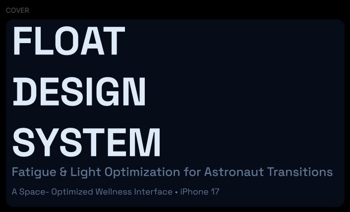
FLOAT
FLOAT is an interactive phone-frame prototype for tracking fatigue, circadian rhythm, and sleep—wrapped in a calm, mission-inspired interface. The UI was designed in Figma; this repo is the exported web app.
Design: FLOAT prototype.
Design System Starter: DSS.
Inspiration
We wanted a fatigue and sleep companion that felt purposeful rather than clinical—like a quiet mission dashboard. The space-adjacent framing (mission time, streaks, EVA-style scheduling) nods to environments where circadian disruption is extreme, while the visuals stay grounded in everyday wellness: sleep score, phase shift, and predictable peaks.
Design System Starter
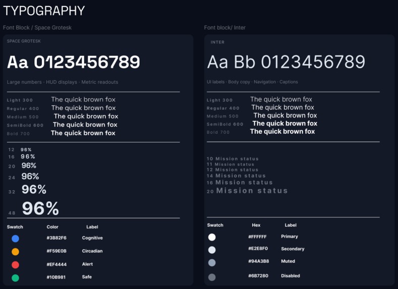
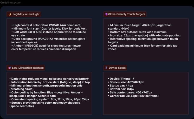
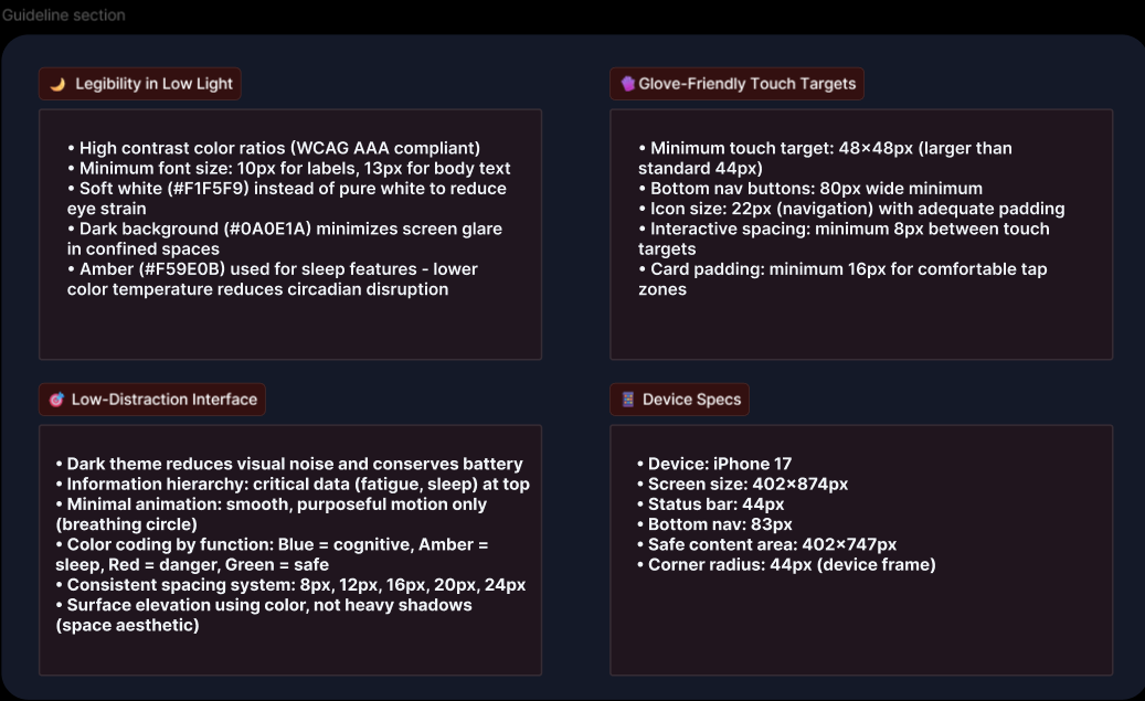
The design system starter link is pasted above it provides an overview of the considerations that went into designing the framework for the prototype that is mentioned below, it includes why certain fonts and colors were chosen to design the app pages.
What it does
- Home — A Fatigue Index arc, peak-fatigue alert, Sleep Score and Circadian summary, and an Upcoming timeline (e.g. EVA prep, light therapy, rest windows).
- Fatigue report — Deeper view with smooth trend curves and context for how fatigue builds through the day.
- My schedule — Time-of-day fatigue forecast so you can see when load is low, medium, or high.
- Sleep & light plan — A circadian clock-style visualization tying sleep timing to light exposure.
- Wind-down — A guided 4-4-6 box breathing session with a dedicated warm palette, plus status cues (amber light, silenced notifications, sleep window).
Navigation uses React Router (/, /fatigue, /schedule, /sleep, /wind-down).
How we built it
- Stack: Vite + React 18, React Router for routes, Tailwind CSS for global styling, and shared UI primitives aligned with shadcn/ui patterns (see
ATTRIBUTIONS.md). - FLOAT screens: Custom layouts and motion in
src/app/components/FloatScreen*.tsxand shared chrome infloat-shared.tsx(phone frame, status bar, bottom nav, design tokens). - Graphics: SVG arcs, gradients, and Catmull–Rom curves for charts—implemented directly in React for crisp scaling in the phone frame.
- Wind-down: RequestAnimationFrame-driven timing for inhale / hold / exhale phases and coordinated ring animations.
Challenges we ran into
- Design fidelity — Matching the Figma Make export meant tuning SVG geometry, stroke caps, and glow filters so the fatigue ring and clocks read clearly at a fixed phone size.
- One codebase, two moods — The wind-down flow uses a warmer, amber-forward theme while the rest of the app stays in a cooler night-sky palette; we kept tokens explicit so the two modes stay visually distinct without duplicating the whole shell.
- Performance vs. polish — Smooth breathing and chart curves needed careful easing and frame timing so animations stay calm, not busy.
Screen Descriptions
- Screen 1 — Mission Status: Frames the arc gauge as a capacity signal, not a score — how much cognitive reserve remains before the next mandatory rest.
- Screen 2 — Fatigue Timeline: Positions the wave chart as a trajectory, not a snapshot — burnout accumulates quietly, and reading the slope is the first defense.
- Screen 3 — Task Re-Prioritizer: Describes workload shaping as biological scheduling — anchoring complex procedures to peak windows, sliding maintenance into fatigue valleys.
- Screen 4 — Sleep & Light Plan: Uses the "16 sunrises a day" framing to explain why circadian anchoring matters, and treats light exposure as a pharmacological intervention.
- Screen 5 — Wind-Down Mode: Reframes stopping as protocol — as deliberate as any EVA checklist, with breathing as an autonomic reset tool. Screen Description : (https://www.figma.com/make/1gpM1CU96NmgpJfrRxg5Uq/Float---Individual-Screen-Descriptions?fullscreen=1&t=HOI5iT4DG9mSYqK1-1).
Accomplishments that we're proud of
- A cohesive end-to-end flow from dashboard → fatigue detail → schedule → sleep/light → wind-down, all navigable in the browser.
- Readable data viz in a small viewport: arc gauges, heatmap-style forecast bars, and the circadian clock ring.
- The wind-down experience: box-breathing phases, independent ring motion, and a clear “ready for sleep” atmosphere.
What we learned
- SVG + React is a strong fit for bespoke mobile dashboards when you need full control over paths and filters.
- Routing early makes multi-screen prototypes feel like a real product; deep links beat stacked modals for this kind of demo.
- Small motion and color choices carry a lot of meaning for a “rest” vs. “monitor” mode.
What's next for FLOAT
- Live data — Connect to wearables or manual check-ins so the Fatigue Index and schedule reflect real inputs, not static demo values.
- Notifications & routines — Reminders for light therapy, rest windows, and wind-down start tied to forecasted peaks.
- PWA or native shell — Installable app or React Native wrapper for daily use on a phone.
- Accessibility — Screen-reader labels, reduced motion, and keyboard paths through the flow.
Running the code
Install dependencies:
npm i
Start the development server:
npm run dev
Production build:
npm run build
Built With
- figma
- react
- typescript
- vite


Log in or sign up for Devpost to join the conversation.