Inspiration
I’ve always been obsessed with desk setups and the cozy, lo-fi aesthetic. I wanted a classic retro split-flap clock to display on my second monitor while I worked, but I ran into a problem: everything out there was either a heavy native screensaver app that required installation, or a web-based clock that was ugly, cluttered with ads, and poorly designed. I wanted something that felt like a piece of digital furniture—clean, beautiful, and accessible instantly from a browser tab. I couldn't find it, so I decided to build FlipClock.
What it does
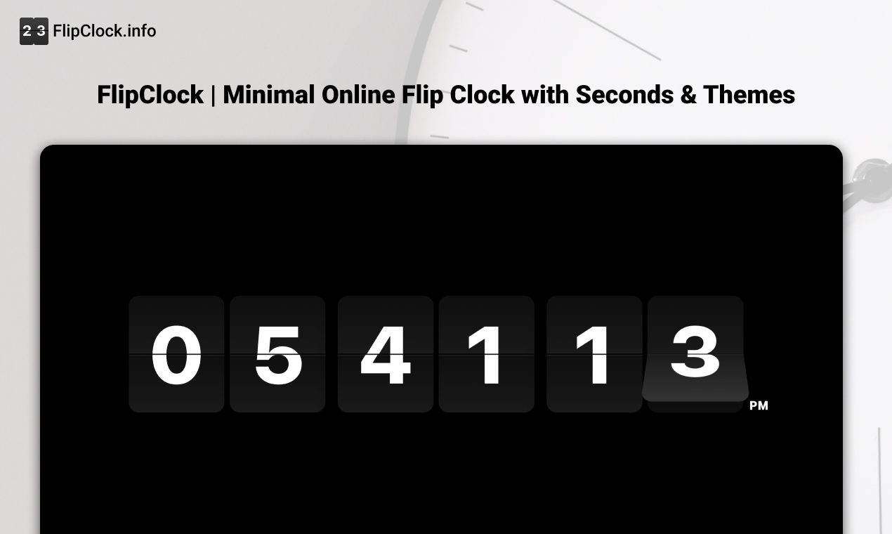
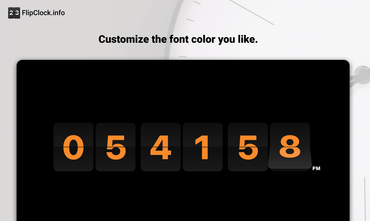
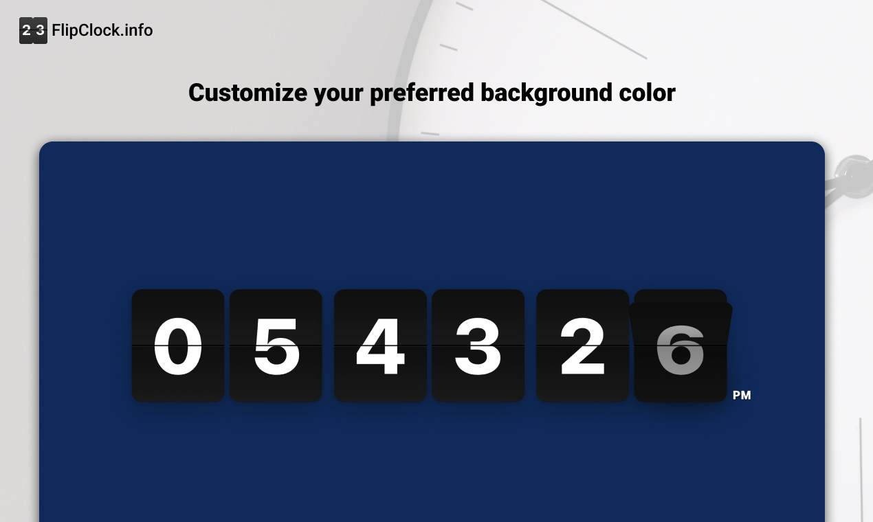
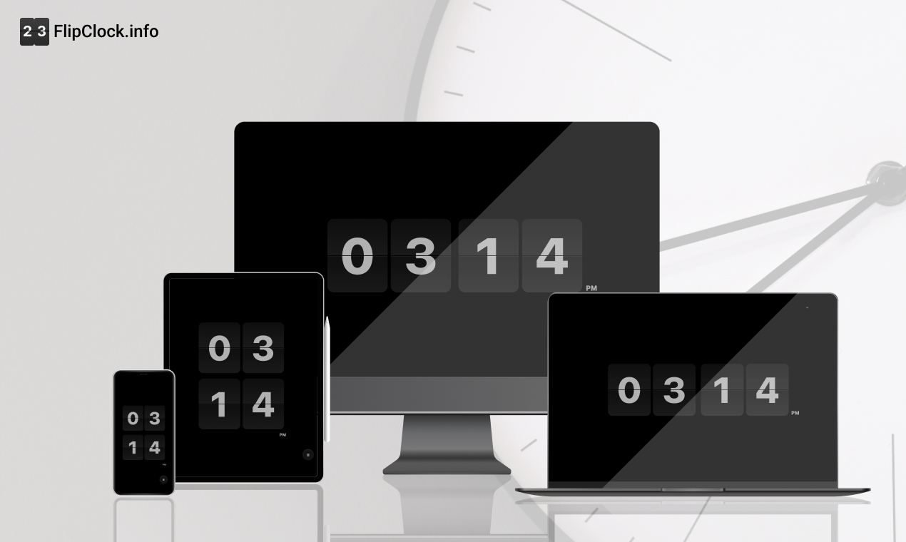
FlipClock is a minimalist, browser-based timepiece that turns any screen into an aesthetic retro clock. Zero Friction: No download, no sign-up. It just works. Focus Mode: One-click fullscreen to remove all distractions. Highly Customizable: Users can toggle between 12/24h formats, show/hide seconds, and customize background/font colors to match their room's lighting. Aesthetic Themes: Includes a curated collection of background images (Paintings, Landscapes, Starry Skies) that users can switch between instantly. Smart Memory: It uses Local Storage to remember your preferences, so your clock looks exactly how you left it every time you visit.
How I built it
As a UI designer who codes, I prioritized performance and visual stability. Tech Stack: I chose Vanilla JavaScript, HTML5, and CSS3. I deliberately avoided heavy frameworks like React or Vue to keep the initial load time lightning-fast and the bundle size minimal. Animation: I utilized CSS 3D transforms and the @pqina/flip library to ensure the flipping animation is buttery smooth (60fps) on all devices. Optimization: To handle high-quality background images without slowing down the site, I implemented a hybrid loading strategy—generating ultra-small WebP thumbnails for the selection panel and using loading="lazy" + decoding="async" to prevent render blocking.
Challenges I ran into
The biggest challenge was balancing high-resolution aesthetics with web performance (Core Web Vitals). Initially, adding the background image feature caused the page size to balloon, hurting my SEO and loading speed on mobile devices. I had to refactor the image loading logic completely, moving from a naive implementation to a highly optimized thumbnail-to-full-res swapping mechanism. This taught me that "simple" on the surface often requires complex optimization underneath.
Accomplishments that I'm proud of*bold*
The "Vibe": I successfully translated the tactile feel of a mechanical clock into a digital web experience. User Retention: Seeing users keep the tab open for hours as a desk companion (avg. engagement time > 1 min) proves it provides real value. Performance: Achieving a 90+ Performance score on Lighthouse/PageSpeed Insights even with rich media features. Global Reach: Seeing organic traffic coming from diverse regions like Brazil and the Netherlands without paid marketing.
What I learned
SEO is Engineering: I learned that technical SEO (like Server-Side Rendering concepts, semantic HTML, and performance metrics) is just as important as the visual design. Less is More: Resisting the urge to add too many features (like alarms or complex settings) kept the product focused and easy to use. Privacy Matters: Users appreciate tools that don't ask for their data. Keeping everything client-side (Local Storage) was the right architectural choice.
What's next for FlipClock
Digital Clock Mode: Adding a one-click switch to a modern, non-flip digital display for users who prefer a cleaner tech look. PWA Support: Turning it into a Progressive Web App so users can install it on their desktops and use it offline. Pomodoro Integration: Adding a simple focus timer overlay for productivity seekers.
Built With
- cloudfare
- figma

Log in or sign up for Devpost to join the conversation.