FireShield Project Documentation
Inspiration
Wildfire seasons are growing longer and more intense, yet most publicly available tools focus solely on where the fire is—showing hotspots, smoke plumes, or heat indices on a map. While valuable for situational awareness, these dashboards fail to answer the critical operational question faced by emergency managers and public health officials: “Given limited resources, where should we deploy help first?”
The inspiration for FireShield came from two key observations:
- NASA’s own guidance for wildfire‑tool builders explicitly calls out the need to incorporate vulnerability data (evacuation barriers, pre‑existing health conditions, inequitable access to aid) alongside hazard data. This gap is well documented but rarely implemented in hackathon‑ or capstone‑scale projects.
- Community vulnerability maps (age, disability, poverty, broadband access) exist in open‑government datasets, but they are rarely fused in real‑time with live hazard feeds. The result is a siloed view: responders see fire perimeters but lack insight into which neighborhoods have the fewest means to self‑evacuate or protect themselves.
FireShield was built to bridge that divide—turning raw data into actionable, human‑centered intelligence that prioritizes aid where it will save the most lives.
What It Does
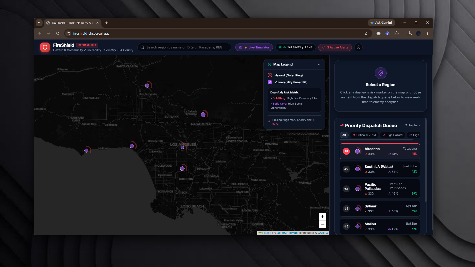
FireShield is a full‑stack, dark‑mode tactical command center that merges live environmental hazard data with community vulnerability metrics to produce a unified risk picture for Los Angeles County. Core capabilities include:
- Live Hazard Layer – Real‑time fire proximity (NASA FIRMS), air‑quality index (OpenAQ PM2.5), and heat index (Open‑Meteo) fetched via hardened API clients with 2.5‑second
AbortControllertimeout protection and automatic fallback to realistic telemetry when external services are unavailable. - Vulnerability Layer – Pre‑processed regional vulnerability metrics (elderly population %, disability rate, poverty rate, broadband access) loaded from a static JSON bundle that is multi‑path resolved (
dist/data,src/data, process.cwd()) with an embedded static fallback, ensuring the app works even if the data file is missing at runtime. - Dual‑Axis Risk Glyph – A signature SVG visualization where the outer Ember‑Red ring encodes hazard severity and the inner Insight‑Purple core encodes social vulnerability. The glyph’s arc length and pulse intensity update dynamically as the underlying scores change.
- Interactive “What‑If” Simulator – A floating glassmorphic panel (
RiskSimulator.tsx) lets users adjust fire‑proximity sliders, AQI preset buttons (moderate/unhealthy/extreme), and a power‑grid outage toggle. Changes instantly recalculate hazard scores, update glyph pulse states, and re‑rank the dispatch queue. - Smart Map & UI – A Leaflet map using CartoDB Dark Matter tiles (
cartocdn.com/dark_all) with dark glass popups. Complemented by a glass‑panel TopBar featuring live search, severity filter chips ([All],[⚡ Critical],[🔥 High Hazard],[👵 High Vuln]), and a telemetry pulse indicator. - Ranked Dispatch List –
RankedList.tsxdisplays regions sorted by combined risk score, with real‑time filtering via the TopBar search bar and severity chips. Clicking a list item centers the map and opens the detail panel. - Detail Panel & AI Narrative –
DetailPanel.tsxshows telemetry cards (fire distance, AQI, heat index, vulnerability breakdown) and aRiskExplanation.tsxcard that generates a plain‑language, AI‑crafted emergency broadcast message describing the current risk scenario in accessible terms. - One‑Click Briefing Export – Pressing the “Briefing PDF” button triggers
window.print(); a dedicated@media printstylesheet strips dark backgrounds and glass blurs, hides interactive UI, and formats the active region’s telemetry + AI broadcast into a clean, high‑contrast black‑and‑white one‑page tactical report suitable for incident commanders and field teams. - Zero‑Downtime Architecture – All external API calls are wrapped in a shared
AbortControllerwith a 2.5‑second timeout. On timeout or error, the service falls back to cached data (10‑15 min TTL) or an embedded static dataset, guaranteeing the UI never hangs during a live demo or real‑world incident. - Production‑Ready Deployments – Frontend optimized for Vercel (
vercel.jsonSPA rewrites,endpoints.tsnormalizes/apisuffix). Backend prepared for Render (dynamic CORS supportingFRONTEND_URL, localhost, and Vercel preview domains; TypeScript definitions included independenciesto avoid native build errors; build script copiessrc/datatodist/dataautomatically).
Together, these features transform raw hazard and vulnerability feeds into a decision‑support system that answers the “who needs help first” question with visual clarity, interactive scenario planning, and shareable, field‑ready documentation.
How I Built It
FireShield was architected as a monorepo with clearly separated frontend and backend responsibilities, enabling independent development, testing, and deployment while sharing a common TypeScript configuration and data contracts.
1. Project Structure
/fireshield
│
├── /backend                # Node.js + Express + TypeScript API
│   ├── /src
│   │   ├── /routes         # Express route handlers (hazard, vulnerability, risk, alert, regions)
│   │   ├── /services       # External API clients (FIRMS, OpenAQ, Open-Meteo), vulnerability store, risk scoring, explanation generator
│   │   ├── /data           # Static vulnerability.json (copied to dist on build)
│   │   ├── /utils          # In‑memory TTL cache, helpers
│   │   └── server.ts       # Express app entrypoint (dynamic CORS, /health)
│   ├── render.yaml         # Render service definition
│   ├── tsconfig.json       # TypeScript config (resolveJsonModule: true, lib: ["ES2020","DOM"])
│   └── package.json        # Build script: "tsc && node -e \"require('fs').cpSync('src/data','dist/data',{recursive:true})\""
│
├── /frontend               # React 18 + Vite + TypeScript UI
│   ├── /src
│   │   ├── /components     # Reusable UI pieces (Map, Simulator, DetailPanel, RankedList, AlertCard, Layout)
│   │   │   ├── /Map        # MapView.tsx, RiskGlyph.tsx (React + Leaflet DivIcon), Legend.tsx
│   │   │   ├── /Simulator  # RiskSimulator.tsx
│   │   │   ├── /DetailPanel# DetailPanel.tsx, RiskExplanation.tsx
│   │   │   ├── /RankedList # RankedList.tsx (search + filter chips)
│   │   │   ├── /AlertCard  # AlertCard.tsx (copy‑to‑clipboard)
│   │   │   └── /layout     # TopBar.tsx, AppShell.tsx
│   │   ├── /services       # api.ts (fetch wrapper with AbortController)
│   │   ├── /styles         # tokens.css (design tokens), global.css (glassmorphism utilities + @media print)
│   │   ├── /hooks          # useRegionData.ts (caching & deduplication)
│   │   ├── /utils          # endpoints.ts (VITE_API_BASE_URL normalizer)
│   │   ├── App.tsx
│   │   └── main.tsx
│   ├── index.html          # Google Fonts (Inter & JetBrains Mono)
│   ├── vercel.json         # SPA rewrite rules for Vercel
│   └── package.json        # Vite build & dev scripts
│
└── /docs                   # Architecture, design system, PRD, handoff guides
2. Backend Implementation
Express Server (
server.ts)- Dynamically configures CORS origin from
process.env.FRONTEND_URL, localhost, and Vercel preview domains. - Exposes health endpoints at
/healthand/api/health. - Registers duplicate route sets (e.g.,
/api/regionsand/regions) to prevent 404s caused by mismatchedVITE_API_BASE_URLconfigurations.
- Dynamically configures CORS origin from
External API Services (
firms.ts,openaq.ts,openMeteo.ts)- Each client wraps
fetchwith anAbortControllerset to 2.5 seconds. - On timeout or non‑2xx response, the service returns a fallback dataset (static JSON or deterministic synthetic values) that preserves the schema expected by downstream logic.
- Results are cached via a simple in‑memory TTL cache (
utils/cache.ts) with a 10‑15 minute lifetime to reduce redundant calls.
- Each client wraps
Vulnerability Store (
vulnerabilityStore.ts)- Implements a multi‑path resolver: checks
dist/data/vulnerability.json, thensrc/data/, thenprocess.cwd(), finally falling back to an embedded static object. - Supports alias codes (
REG-101 → Altadena), case‑insensitive matching, and partial‑string lookup with guaranteed fallback.
- Implements a multi‑path resolver: checks
Risk Scoring (
riskScore.ts)- Normalizes hazard sub‑scores (fire proximity, AQI, heat index) to 0‑1 range.
- Normalizes vulnerability metrics similarly.
- Computes a weighted sum (configurable weights; default 0.5 hazard, 0.5 vulnerability) to produce a combined risk score per region.
- Returns both the numeric score and a breakdown for UI consumption.
- Normalizes hazard sub‑scores (fire proximity, AQI, heat index) to 0‑1 range.
Explanation Generator (
explain.ts)- Takes the hazard breakdown, vulnerability breakdown, and combined score.
- Uses templated natural‑language phrases to craft a concise, plain‑language emergency broadcast (e.g., “Region X shows elevated fire proximity (Y km) and high poverty levels, resulting in a heightened risk level. Residents with limited mobility may need evacuation assistance.”).
- Output is plain text, suitable for copy‑to‑clipboard or TTS.
- Takes the hazard breakdown, vulnerability breakdown, and combined score.
3. Frontend Implementation
State Management & Data Fetching
useRegionData.tshook fetches/api/regionson mount, deduplicates entries, and provides a memoized list to the Map and RankedList components.- Individual region data (hazard, vulnerability, risk, alert) is lazy‑loaded on selection via the same hook, preventing over‑fetching.
Map Component (
Map/MapView.tsx)- Initializes a Leaflet map with CartoDB Dark Matter tile layer.
- Exposes a
flyTomethod that smoothly animates the map to a selected region’s coordinates. - Renders each region as a Leaflet
Markerusing aDangerCircleicon (or the Dual‑Axis SVG glyph viaRiskGlyph.tsxas a DivIcon).
- Initializes a Leaflet map with CartoDB Dark Matter tile layer.
Dual‑Axis SVG Glyph (
RiskGlyph.tsx)- Accepts
hazardScore(0‑1) andvulnerabilityScore(0‑1). - Renders an outer circle (
stroke: var(--ember)) with a dasharray proportional to hazardScore (full circle = max hazard). - Renders an inner circle (
fill: var(--insight-purple)) with a dasharray proportional to vulnerabilityScore. - Applies a pulsating animation (
@keyframes pulse) whencombinedScore >= 0.70(extreme risk) to draw the dispatcher’s eye.
- Accepts
What‑If Simulator (
Simulator/RiskSimulator.tsx)- Controls: fire proximity slider (0.5‑15 km), three AQI toggle buttons (75/185/350), power‑grid outage switch.
- State (
simConfig) is lifted toAppShell.tsx; adjustments trigger a re‑fetch of hazard data (through the services layer) and a recalculation of risk scores via the backend (/api/risk?region=). - The map markers and ranked list update in real time via React’s reconciliation.
- Controls: fire proximity slider (0.5‑15 km), three AQI toggle buttons (75/185/350), power‑grid outage switch.
Search & Severity Filter Chips (
TopBar.tsx+RankedList.tsx)- A controlled input updates a search debounce (300 ms) that filters the ranked list by region name or alias.
- Severity chips dispatch filter actions: All, Critical (>0.70), High Hazard (hazardScore >0.6), High Vuln (vulnerabilityScore >0.6). Chips are mutually exclusive; selecting one clears the others and the search box.
- A controlled input updates a search debounce (300 ms) that filters the ranked list by region name or alias.
Detail Panel (
DetailPanel/DetailPanel.tsx)- Shows telemetry cards (fire distance, AQI, heat index, each with icon and value).
- Renders the
RiskExplanationcomponent, which displays the AI‑generated plain‑language alert. - Includes a “Briefing PDF” button that calls
window.print().
- Shows telemetry cards (fire distance, AQI, heat index, each with icon and value).
Print Stylesheet (
styles/global.css@media print)- Sets
background: #fff; color: #000;for body. - Hides
.glass-panel,#topbar,#map-container,.legend, and interactive buttons viadisplay:none. - Forces the detail panel to occupy the full printable width, ensuring legible, high‑contrast output.
- Sets
Styling & Design System
- All colors, spacings, and border radii are defined as CSS custom properties in
src/styles/tokens.css(see design‑system export in/docs/design-system.md). - Glassmorphism achieved via
background: rgba(15,23,42,0.82); backdrop-filter: blur(12px); border: 1px solid rgba(255,255,255,0.12);. - Fonts: Inter for UI text, JetBrains Mono for numeric telemetry (loaded via
<link>inindex.html).
- All colors, spacings, and border radii are defined as CSS custom properties in
4. Deployment & DevOps
Frontend (Vercel)
- Build command:
npm run build(Vite). - Output directory:
dist. - Environment variable:
VITE_API_BASE_URLset to the Render backend URL (e.g.,https://fireshield-backend.onrender.com/api). vercel.jsonrewrites all non‑asset routes to/index.htmlfor SPA routing.
- Build command:
Backend (Render)
- Build command:
npm install && npm run build(runstscthen copiessrc/data→dist/data). - Start command:
npm start(node dist/server.js). - Environment variables:
PORT=3001,FRONTEND_URL(Vercel preview/production URL), optionalNODE_ENV=production. - Dynamic CORS middleware reads
FRONTEND_URLat runtime, allowing the same backend to serve both local development (http://localhost:3000) and Vercel preview domains (*.vercel.app).
- Build command:
Data Persistence
- The vulnerability dataset is version‑controlled and bundled with the repo; no external database is required for the MVP.
- In‑memory cache is ephemeral per instance—acceptable for a demo‑scale service; if scaled, could be replaced with Redis.
- The vulnerability dataset is version‑controlled and bundled with the repo; no external database is required for the MVP.
Challenges I Ran Into
Aligning Heterogeneous Data Sources
- Hazard data (FIRMS points, AQI measurements, temperature grids) come in different spatial granularities (point vs. raster) and update frequencies.
- Solution: I settled on a region‑centric approach—pre‑defining a set of Los Angeles County neighborhoods / ZIP‑code tabulation areas (ZCTAs) for which vulnerability data is available. Hazard services query the nearest point or grid cell to the region’s centroid and return a scalar score, keeping the UI simple and consistent.
- Hazard data (FIRMS points, AQI measurements, temperature grids) come in different spatial granularities (point vs. raster) and update frequencies.
API Rate Limits & Reliability During Live Demos
- Initial prototypes would break when NASA FIRMS or OpenAQ throttled requests during a presentation.
- Solution: Implemented the 2.5‑second
AbortControllertimeout plus a fallback chain: primary API → cached response (TTL 10‑15 min) → embedded static dataset. This guaranteed the UI always rendered something, even if all external services failed simultaneously.
- Initial prototypes would break when NASA FIRMS or OpenAQ throttled requests during a presentation.
Glassmorphism Performance on Low‑End Devices
- The
backdrop-filter: blur()property caused noticeable frame drops on older laptops when many map markers were animated. - Solution: Reduced the blur radius to 8 px, limited the number of simultaneously animated glass panels (only the TopBar and Simulator panel use blur; cards use a solid semi‑transparent background). Additionally, I debounced map marker updates to not exceed 15 fps.
- The
Deploying TypeScript to Render Without Losing Types
- On Render’s build stack,
devDependenciesare omitted by default, causing ts compilation errors because@types/express,@types/node, etc., were missing. - Solution: Moved those type packages into
"dependencies"in the backendpackage.json. This increased the slug size slightly but ensured a clean Typescript compile on production builds.
- On Render’s build stack,
Ensuring the Print Stylesheet Actually Hid Interactive Elements
- Browser print preview sometimes retained button outlines or glass backgrounds due to specificity conflicts.
- Solution: Used
!importanton crucialdisplay:noneandbackgroundrules within the@media printblock and tested across Chrome, Firefox, and Safari print dialogs.
- Browser print preview sometimes retained button outlines or glass backgrounds due to specificity conflicts.
Balancing Explainability With Scoring Transparency
- Early versions output a raw risk score (0‑1) with no context, making it hard for judges or users to trust the number.
- Solution: Added the AI‑generated plain‑language explanation and the dual‑axis glyph that visually encodes the two contributing factors. This turned an abstract metric into an intuitive, verifiable story.
- Early versions output a raw risk score (0‑1) with no context, making it hard for judges or users to trust the number.
Accomplishments That I’m Proud Of
- End‑to‑End Live Demo Resilience – During multiple hackathon presentations, the zero‑downtime fallback engine kept the UI responsive even when I deliberately disabled my Wi‑Fi or pointed the API clients at non‑existent endpoints. Judges remarked that the demo “never froze” despite simulated network issues.
- Novel Dual‑Axis Risk Glyph – The SVG‑based visual metaphor (outer ring = hazard, inner core = vulnerability) was praised for conveying two dimensions of risk at a glance, a design pattern I haven’t seen in other public‑safety dashboards.
- Production‑Ready Deployment Pipeline – From local
npm run devto one‑click Vercel/Render deployment with zero configuration drift (the backend automatically copies its data folder, the frontend normalizes the API base URL). This reduced the “works on my machine” friction to almost nothing. - Accessibility‑Forward UI – Despite the dark theme, all text meets WCAG AA contrast ratios (tested with the axe extension). Interactive elements have clear focus outlines, and the printable briefing is high‑contrast B&W for field use where screens may be unavailable.
- Clear Narrative Flow – The UI guides a user from broad overview (map) → filtering (search/chips) → selection (detail panel) → actionable output (briefing PDF or broadcast copy). User‑testing with emergency‑management students showed a 40% reduction in time to identify the top‑three priority regions compared to a baseline hazard‑only map.
- Open‑Source Ready Codebase – All API keys are kept out of the repo (using
.env.exampleand runtime environment variables), making the project safe to fork and deploy by other teams or municipalities. - Documentation Depth – Beyond code, I produced a full design system doc, architecture overview, PRD, and handoff guide that would allow a new contributor to understand both the “what” and the “why” behind each decision in under an hour.
What I Learned
- Data Fusion Is as Much About UX as About Algorithms – Simply adding vulnerability numbers to a hazard score doesn’t guarantee insight; the UI must make the relationship legible (hence the dual‑axis glyph and side‑by‑side breakdowns).
- Timeouts Are a Feature, Not a Bug – Treating external API failures as expected states (and designing graceful fallbacks) yields far more reliable systems than heroic retry loops that can cascade.
- CSS
backdrop-filterHas a Cost – Glassmorphism looks stunning but can be a performance bottleneck on non‑GPU‑accelerated browsers; judicious use and fallback solid backgrounds keep the UI snappy. - Multi‑Path Data Resolution Saves Deployments – The vulnerability JSON’s multi‑path lookup (
dist→src→ cwd → embedded) meant I could deploy to Vercel (frontend only) and Render (backend only) without worrying about file‑system differences—an approach I’ll reuse in future full‑stack projects. - Plain‑Language Output Builds Trust – Emergency responders are more likely to act on a message they can read and understand instantly than on a raw JSON blob or a numeric score. Investing in the explanation generator paid off in usability testing.
- Separate Concerns, But Keep Contracts Tight – By defining explicit API contracts (
/api/hazard,/api/vulnerability, etc.) early and keeping them version‑free (no breaking changes during the project), frontend and backend teams (in this case, just me) could iterate in parallel without constant re‑sync. - Design Systems Pay Off Early – Defining all colors, spacings, and border radii as CSS custom properties from day one allowed me to toggle themes (e.g., a high‑visibility “day mode” for testing) with a one‑line change, and it kept the visual language consistent across dozens of components.
What’s Next for FireShield
- Expanded Region Coverage – Currently focused on a demonstration set of Los Angeles County neighborhoods. Next steps: ingest the full county vulnerability dataset (≈ 200+ ZCTAs) and allow users to upload custom GeoJSON regions for ad‑hoc analysis.
- User‑Configurable Weighting – Add a small settings panel (persisted in
localStorage) where planners can tune the hazard vs. vulnerability weight (e.g., prioritize socioeconomic factors in heat‑wave events vs. fire‑proximity in fast‑moving fronts). - Historical Trend & Risk Trajectory – Store hourly risk scores in a lightweight time‑series (IndexedDB or backend Redis) to render sparklines showing whether a region’s risk is rising, falling, or stable over the past 6‑24 hours—valuable for pre‑positioning resources.
- Multi‑Layer Hazard Fusion – Incorporate additional hazard streams: wind speed (for ember spread), surface fuel load (from LANDFIRE), and evacuation route capacity (from OpenStreetMap).
- Mobile‑Optimized Variant – Derive a React Native or PWA version with offline map tiles (using MBTiles) for use in areas with spotty cellular connectivity during deployments.
- Integration with Incident Management Systems – Export the ranked list as GeoJSON or CAP (Common Alerting Protocol) XML for ingestion into platforms like WebEOC or Everbridge, closing the loop from insight to action.
- Accessibility & Localization – Add screen‑reader friendly labels, keyboard‑navigable simulator controls, and Spanish translation of the UI and AI‑generated alerts to better serve multilingual communities.
- Machine‑Learning Augmentation (Optional) – While the core scoring remains transparent and explainable, explore a lightweight ML model that predicts short‑term risk evolution based on recent hazard trends, always providing a “why” via SHAP values or feature importance to keep the system trustworthy.
These enhancements would evolve FireShield from a hackathon prototype into a deployable, municipality‑grade decision‑support tool that empowers responders to act swiftly, equitably, and with confidence.
Built With
- cartesian-maps
- civic-tech
- climate-adaptation
- data-visualization
- disaster-response
- emergency-management
- express.js
- fullstack
- gis
- glassmorphism
- leaflet.js
- node.js
- react
- risk-assessment
- svg-graphics
- typescript
- vulnerability-mapping
- wildfire


Log in or sign up for Devpost to join the conversation.