-
-
Thumbnail
-
Refrence & metrics
-
Workflow


FINFUSION- Inspiration
FINFUSION started with one simple question: “Why do finance apps feel like they’re hiding something?”
Most people including us struggled with:
confusing dashboards, unclear data usage, messy personal vs business account switching, AI insights that had no explanation, and zero understanding of where our data goes
This made us realize something huge: Finance apps track our money, but users don’t know what the apps themselves are tracking.
That gap inspired us to design a platform where clarity, transparency, and user control come first.
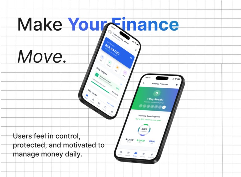
A finance app built on trust. A system that actually explains itself. A place where users feel safe not overwhelmed. That became FINFUSION.
How We Built It
We approached FINFUSION like building a digital trust ecosystem.
Here’s how:
- Research
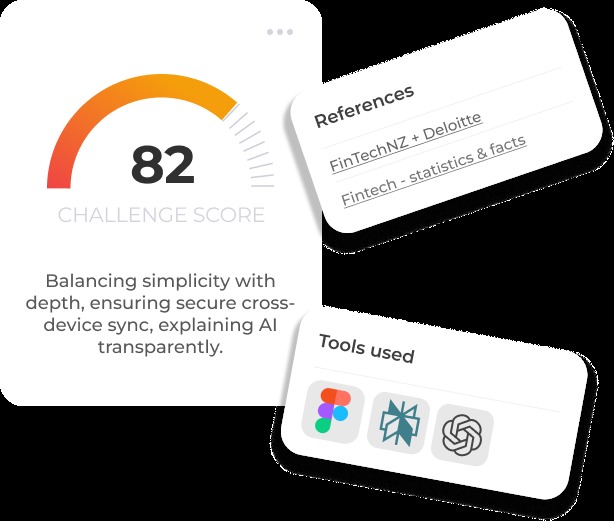
We explored: user pain points, data transparency studies, fintech UX patterns, Statista + Deloitte reports on trust, real financial app frustrations, behavioural psychology behind saving motivation. This research shaped the product direction.
- UX Architecture
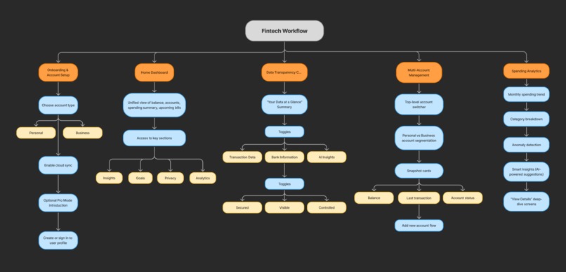
Using FigJam, we mapped: onboarding flows, multi-account switching, transparency hubs, analytics → insights path, goal motivation system, AI explainability patterns
- UI Design & Prototyping
In Figma, we created: clean dashboards, permissions interface, spending analytics, smart insights, goal tracking visualizations, cross-device sync screens
- Tech Ideation
We defined a secure, realistic architecture using: Render (backend hosting), Supabase (auth + DB + storage), AES-256 encryption, Blockchain-inspired audit logs, Node.js .Every part supports transparency + trust.
Challenges We Ran Into
Every good project has hurdles. Here were ours:
- Balancing Simplicity + Depth
How to make the interface feel clean… while still showing all the essential financial information?
This was a major design puzzle.
- Explaining AI Without Making It Scary
Users love insights but hate “mystery AI.” So we had to design explainable, human-friendly recommendations.
- Multi-Account Structure
Personal + multiple business accounts → Clarity, color coding, and minimizing confusion was tough.
- Creating True Transparency
Most apps “hide” privacy info in legal text. We wanted to turn transparency into an actual feature — not fine print.
Accomplishments We’re Proud Of FINFUSION came out stronger than we imagined.
- Built a Transparency Hub
Users can see and control exactly what data is used.
- Designed a Multi-Account Fintech Workflow
Personal + business switching feels effortless.
- Created Smart Spending Insights
With explainable, non-intrusive AI.
- Made Finance Motivating
Goals, streaks, achievements finance that feels human.
- Built a Secure, Trust-Ready Architecture
AES-256 encryption + audit-layer logic for accountability.
- Delivered a Full End-to-End Case Study
From research → UX → UI → architecture.
This is the kind of work that could scale into a real product.
What’s Next for FINFUSION?
We’re just getting started.
Here’s what’s coming:
- Real Machine Learning for Insights
Adaptive savings advice Spending predictions Personalized financial coaching
- Full Blockchain Audit Layer
Immutable logs User-verifiable transparency Consent-based workflows
- UPI + Bank Integrations
Sync real accounts Auto-read transactions Unified financial history
- A Mobile App with Offline Mode
Save, sync, analyze → anywhere.
- Family & Team Finance Spaces
Shared goals Shared budgets Shared streaks
- Financial Wellness Engine
Gamified planning Behavior nudges Reward system
What We Learned
Building FINFUSION taught us a powerful lesson:
Transparency isn’t a feature. It’s a feeling. A relationship. A promise.
When users feel in control of their data, they naturally trust the product more, engage more, and stay longer.
And that’s exactly what FINFUSION is designed to create.
Built With
- aes
- figjam
- figma
- react-native
- restapi
- supabase
- typescript
