Inspiration
We were inspired by how stressful and time-consuming the resume-building process can be, especially for students and early professionals trying to stand out. Many existing tools feel either too rigid or too complicated, forcing users to spend hours formatting instead of focusing on their experience.
When we explored Finch, we were drawn to its goal of simplifying this process through automation and smart integrations. That inspired us to design a website that clearly communicates not just what the product does, but how it feels to use it—fast, intuitive, and empowering.
What it does
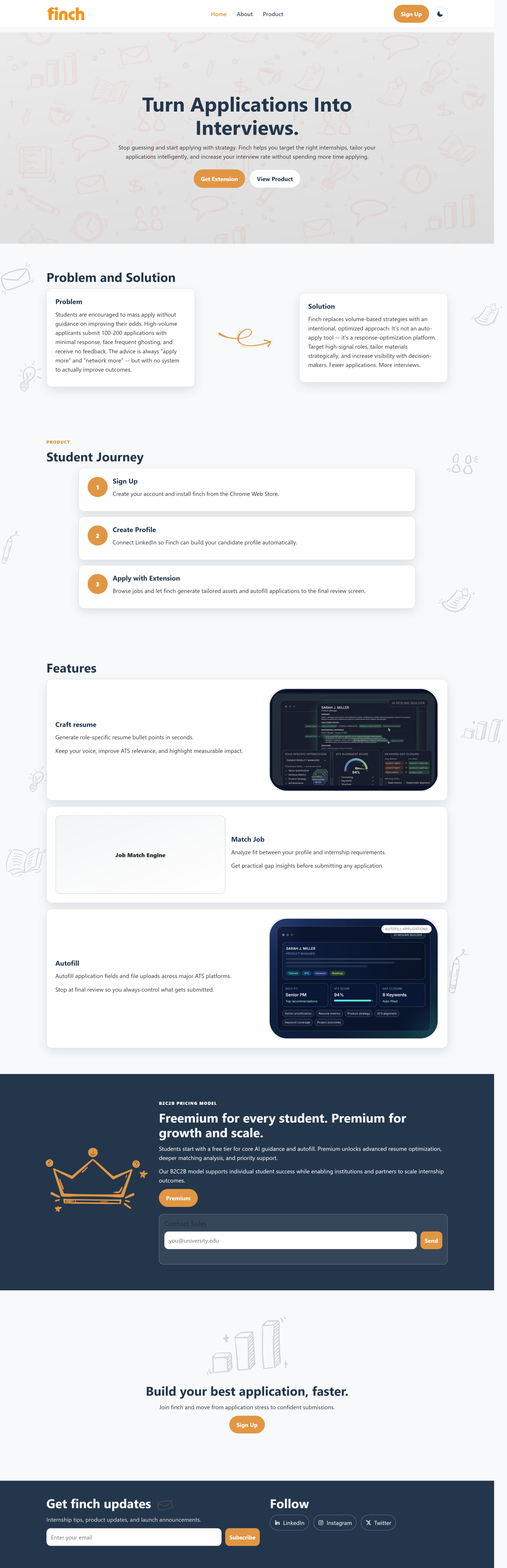
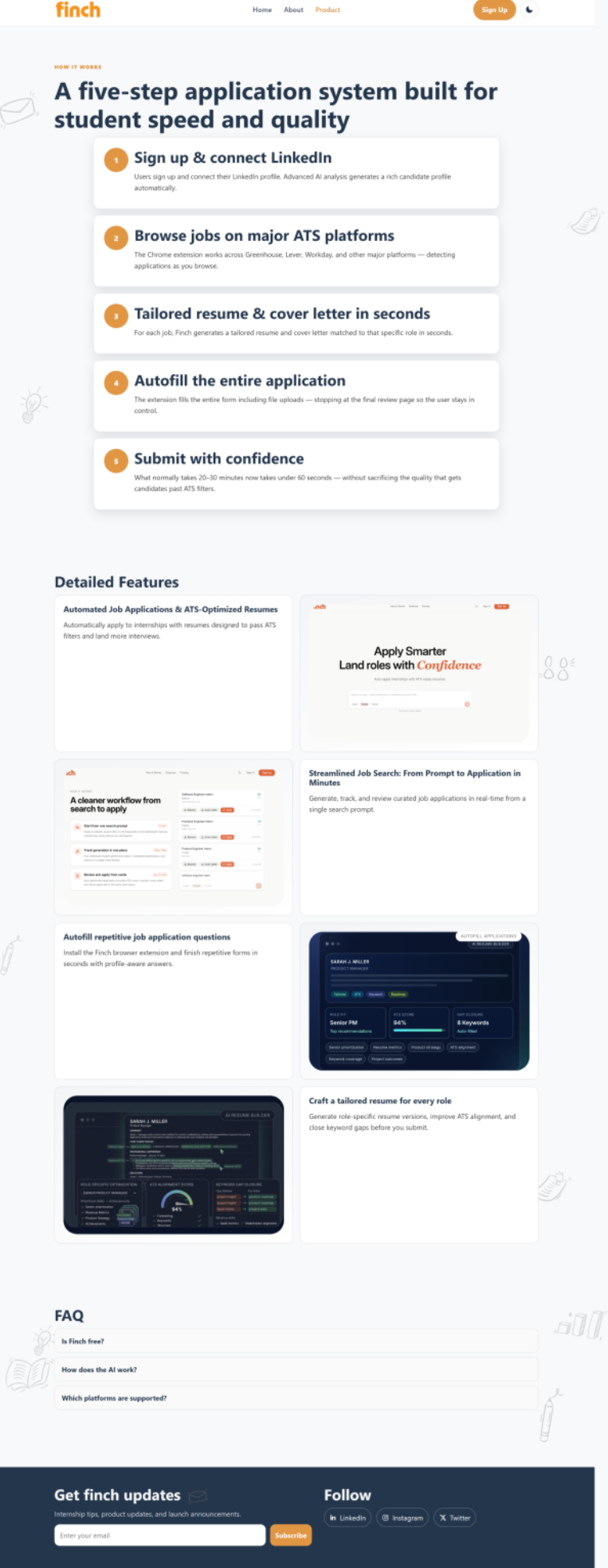
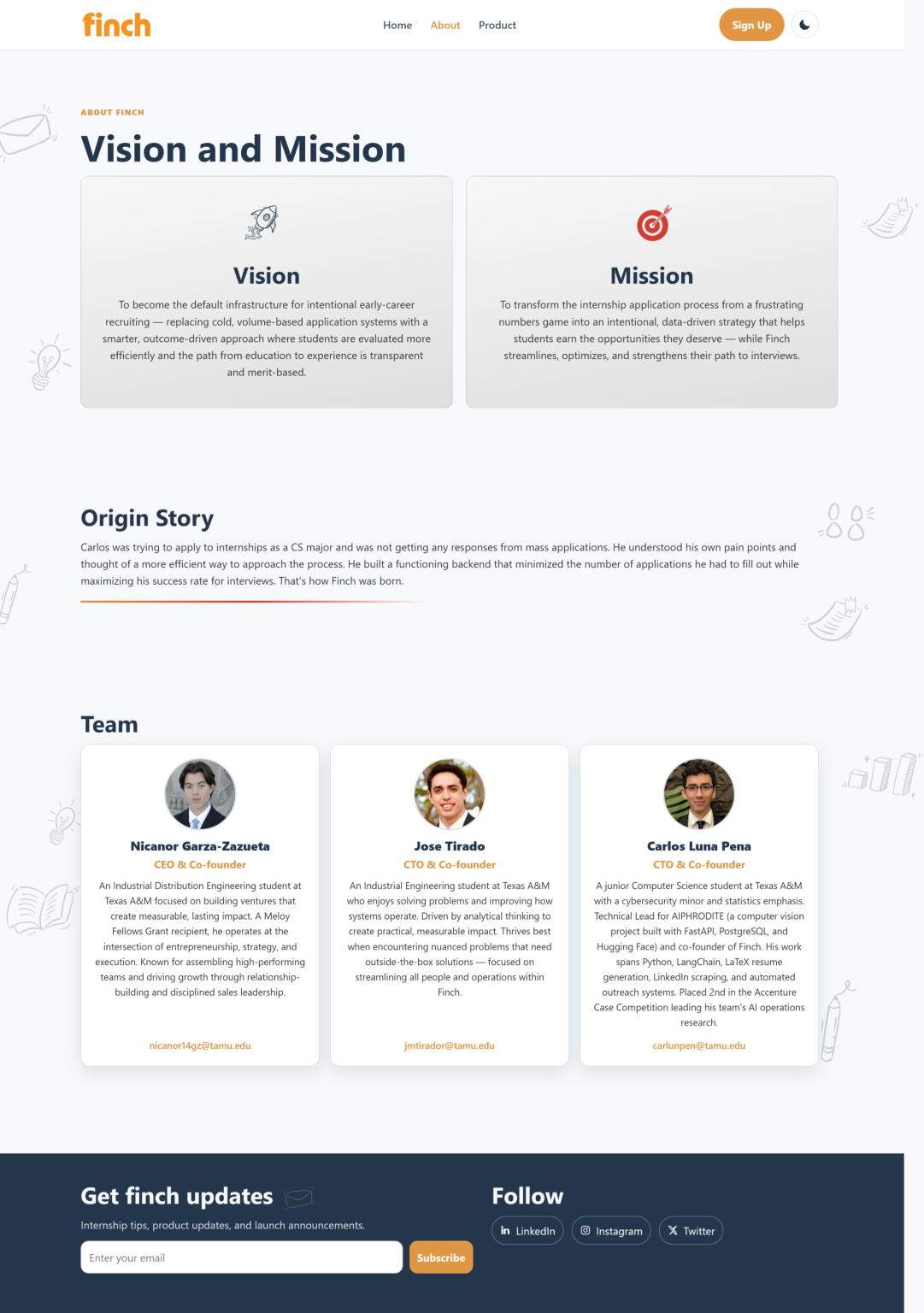
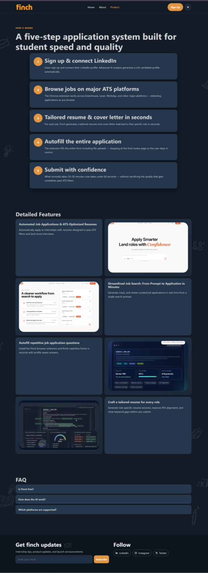
Our project is a fully designed, front-end website for Finch that showcases its core features and user experience. The site walks users through the product journey—from signing in and connecting their information to generating a polished resume—using clean layouts and engaging visuals.
We focused on presenting Finch as a modern, accessible tool that helps users create professional resumes quickly and confidently.
How we built it
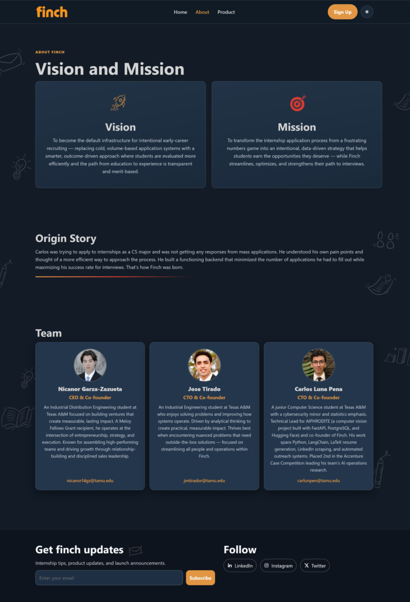
We approached this project as a design-first challenge, starting with wireframes to map out the structure of each page: Home, About, and Product. From there, we developed a cohesive visual identity using the provided branding assets, including logos, colors, and hand drawn icons.
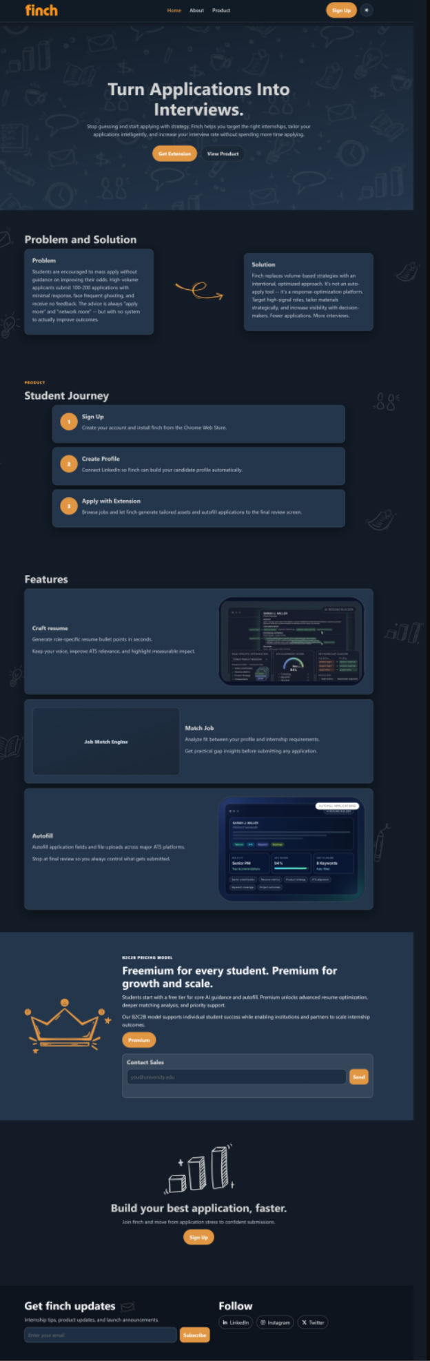
We designed key product screens and user flows to simulate the experience of using Finch, then translated those designs into a responsive front-end website. We also incorporated interactive elements such as animations, a dark mode toggle, and clear call-to-actions to create a more engaging user experience.
Challenges we ran into
One of the main challenges was balancing clarity with creativity. We wanted the website to feel visually unique while still being easy to navigate and understand.
Another challenge was designing product screens that felt realistic without having access to a fully built backend. We had to carefully craft mockups that accurately represented the product while maintaining consistency with the overall design.
Ensuring a smooth user flow across multiple pages while keeping the content concise was also something we iterated on throughout the project.
Accomplishments that we're proud of
We’re especially proud of how cohesive the final design feels. From the landing page to the product walkthrough, every section works together to tell a clear story about Finch.
We also successfully created a realistic product experience using only front-end design and mockups, making the site feel like a fully functional platform.
Additionally, our use of consistent branding, thoughtful layouts, and subtle animations helped elevate the overall user experience.
What we learned
Through this project, we learned how important it is to design with both the user and the product story in mind. A well-designed website isn’t just about aesthetics—it’s about guiding users through an experience in a clear and meaningful way.
We also gained experience working with branding constraints and turning provided assets into a cohesive design system.
Finally, we improved our ability to communicate complex ideas visually, especially when working without full functionality.
What's next for Finch - Startup Showcase
If we were to continue developing this project, we would focus on adding real functionality to the product experience, such as user authentication and dynamic resume generation.
We would also expand the website with additional pages, deeper feature interactions, and more personalized user flows.
Beyond that, we see potential in refining the design further based on user feedback and continuing to evolve Finch into a fully realized platform.
Built With
- css
- html
- javascript
- procreate


Log in or sign up for Devpost to join the conversation.