Inspiration
The financial world is reliant on fast or real-time information otherwise the market will have left them behind. This communication between major corporations is important for us as well as our messages are going through them. The large amounts of messages that end up being processed in these financial institutions are likely in the millions+, therefore it's very hard for humans to visualize and process this information. We decided to build an application help users who would like to understand and visualize this large amount of messaging information done by financial institutions.
What it does
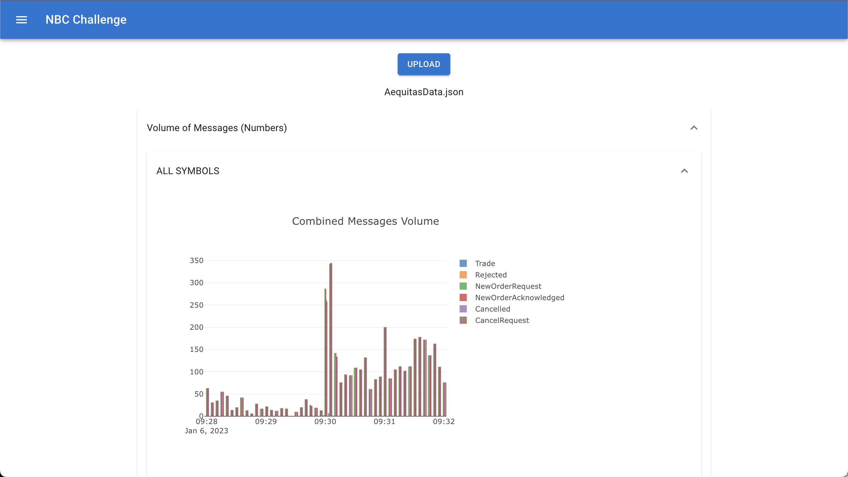
This web application that we built allows users to upload the messaging data, that a financial institution does, into our app and visualize the information to allow for easier understanding of it.
How we built it
Through the use of React, Plotly and Danfo.js, we were able to build many graphs to help show trends and visualize the information that the data might be concealing when viewing the messages individually.
Challenges we ran into
A big amount of big data that is done nowadays is processed easily with Python usually. However, since we wanted to keep this a client sided web application, we had to use some obscure libraries that does not have much support to process this data. This had resulted in a lot of inefficient code to process the data, which slows down the time it takes to visualize it.
Accomplishments that we're proud of
Seeing the results makes us really happy as we did not believe it would even function for the first couple of hours that we were trying to debug and create it.
What we learned
We learnt that there are many difficult challenges when trying to actually build a application that must utilize many different libraries together, to create a fully working application.
What's next for Finance Data Visualization
In the future, we would like to make the application more adaptable to the different kinds of formats for data to be able to process it. Furthermore, we would also like to implement more visualizations to help further understand what the data could reveal to us.
Log in or sign up for Devpost to join the conversation.