-
-
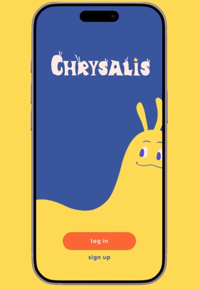
Chrysalis's start screen, featuring our metamorphosis-themed logo and caterpillar avatar!
-

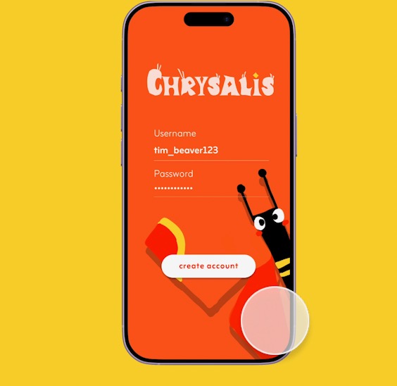
Chrysalis's sign up screen, with our butterfly avatar in the background!
-

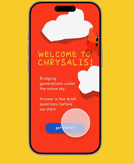
New users are shown a couple onboarding questions to learn more about Chrysalis and customize their user experience.
-
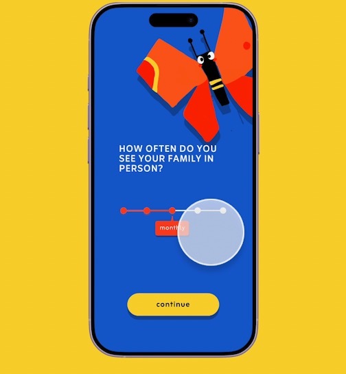
One of three onboarding questions that Chrysalis uses to suggest in-person (if they see family frequently) or virtual mode for the user.


Prototype link:
A video demo with a maximum of 3 minutes:
Responses to questions about the user research and design thinking process
Describe your project (Max 150 words)
Our project, Chrysalis, is a butterfly-themed mobile app that helps families bridge generational gaps by turning everyday moments into shared stories and memories. The app allows family groups containing relatives of all ages to virtually participate in daily text prompts and photo opportunities, tailored to different communication styles. Generations are represented by playful avatars—caterpillars for Gen Alpha/Z, cocoons for millennials, and butterflies for Gen X/boomers—symbolizing different stages of growth, knowledge, and life experience that should be celebrated. Chrysalis also supports in-person gatherings with family-friendly games to spark conversation around the same table. Bright, intuitive visuals and approachable language invite kids, teens, parents, and grandparents to contribute and connect at their own pace. Over time, these shared snapshots form an intergenerational family archive cherishing differences in routine, culture, location, and perspective while highlighting common values, helping families gently transform their connections—like a chrysalis into something new.
Describe your research process and findings. If you conducted any surveys or interviews, please include the survey form and/or interview questions here. If you conducted secondary research by pulling from online sources, please include a link to your sources. (Max 500 words)
For Chrysalis, we conducted surveys, interviews, and secondary research to guide our design decisions and app ideas. To start, we reviewed studies concerning how to design UI/UX for older generations–since we were building an app to facilitate intergenerational connections, the design being accessible to all generations was an important guiding principle for us. We noted that [1] and [2] presented sound research and a clear set of qualities proven to make apps more accessible for older users, as well as carefully taking into consideration inputs and studies from older adults, noting the decline in vision, mobility, memory, attention, and executive function that comes with aging and how that would affect best practices for UI/UX for older users. The main takeaways that we implemented were the importance of high contrast colors in our design, sufficient size and distance between pressable components, easy-to-understand instructions, simplicity of design, and intuitive icons.
In addition to research on UI/UX design to suit the needs of older generations, we created a Google Form survey and conducted follow-up interviews to understand how people currently connect with family across generations and where pain points arise.
Quantitatively, 80% of ~50 respondents saw family in person only monthly or yearly, but text/call contact was often daily or weekly. Top barriers included distance, different priorities and routines, and not understanding each other’s perspectives. Language barriers also appeared multiple times as a write-in--a main priority for Chrysalis as a final product would be to extend support to multiple languages. Respondents especially wanted to ask older generations about life experiences, culture, and advice, inspiring us to create text prompts for all family members to answer. Participants felt more comfortable sharing day-to-day activities rather than emotions with their family, which led us to the idea of having both photo and text prompts. Furthermore, because many respondents shared that there may not always be things to talk about with family, we designed prompts to be playful and story-oriented so interactions feel natural. We responded to concerns voiced about accessibility for older generations by emphasizing simple and clean UI.
We also conducted semi-structured interviews with a few survey respondents. We showed users our draft and asked them to share their feedback in terms of ergonomics, cognitive perception, and emotional experience, the criteria highlighted in [3]. We also asked users to elaborate on their responses given in the survey, and asked what changes they’d personally like to see to make the app more effective for them. These conversations corroborated our findings from research, as well as drawing our attention to the importance of minimalism and cultural norms (such as younger generations initiating connections in some cultures).
These findings directly informed Chrysalis’s design: we focused on daily, lightweight prompts that gradually encourage deeper sharing, and prioritized low-stakes interactions over metrics like likes or streaks that participants worried may make the app feel performative.
Sources:
[3] Berni et al.
~~
Survey Responses & Statistics
Describe your most important design decisions. What research findings and/or user testing results led you to make these decisions? (Max 500 words)
Virtual vs. in-person: We designed both a virtual and an in-person mode for Chrysalis to help families of different generations stay connected and build empathy, regardless of physical distance. We chose to make the virtual mode the default as 80% of our survey participants reported seeing their family only monthly, yearly, or even less frequently, with 72.3% attributing geographical distance as a major barrier to feeling connected. Since most users interact with family members remotely, placing the virtual tab first creates a more intuitive and accessible entry point.
At the same time, users can switch to an in-person mode from their family page. This mode offers short games and challenges designed to spark conversation and shared moments, often prompting users to pass the phone around or approach specific relatives in the room. We intentionally kept the interface simple, prioritizing passing a single phone around with minimal on-screen interaction, so that the device acts as a shared guide for the group rather than a distracting personal screen for everyone. This approach also helps ensure the experience remains accessible and engaging for users of all ages and levels of technological familiarity.
VIRTUAL MODE FEATURES Our goal for the virtual experience is to support connection through frequent, lightweight interactions that fit naturally into users’ daily routines. By using quick check-ins, we aim to help families maintain relationships and better understand one another without adding a significant time burden. Daily prompt: Each day, every family member responds to a short, fill-in-the-blank prompt, such as “Today, I spent more time than expected ___.” Many participants in our research expressed a desire to better understand the everyday experiences of family members from different generations. The simplicity of this format allows users to share perspective and context in just a few taps. Our survey results also showed that users are more comfortable sharing daily activities than emotions—as a result, our prompts focus primarily on experiences rather than feelings. Responses are displayed in a split-screen layout, with a user’s answer shown alongside responses from family members of different generations. Presenting these answers side-by-side emphasizes parallel lived experiences, encouraging empathy through visual comparison. Daily photo: At a random time each day, users are also prompted to take a quick photo or selfie. They are encouraged to respond within ten minutes to create a sense of shared, real-time moments, even when physically apart. After posting, users can swipe through their family members’ photos, creating an experience similar to browsing a shared scrapbook or family album.
MOTIF + VISUAL DESIGN We chose the caterpillar–chrysalis–butterfly as our visual motif because its life cycle reflects how people at different life stages may appear different, yet are part of the same continuous journey. Our app name, Chrysalis, represents the transition and connection between these stages, just as our app aims to serve as a bridge between younger and older generations. We utilize bold colors to create a warm and playful environment, while symbolizing the vibrant perspectives that different generations within a family bring together.
If applicable, describe how you utilized AI in your design process in detail. Please explain where AI fit into your workflow, which tools you used, and the specific purpose AI served at that stage. Include a concrete example of how AI influenced a design decision. (Max 500 words)
Our team had limited experience building complex prototypes using Figma, so we primarily utilized AI to learn how to implement interactive flows, conditional logic, component states, and variables. We used ChatGPT and Claude to advise us on what steps to take in order to allow the user to have certain interactions (such as toggling the slider bar, and selecting certain options during the “onboarding” stage). Ultimately, after understanding and looking into the AI-provided advice (in conjunction with Figma learn and tutorials created by other users) we then translated that technical guidance into Figma interactions, variants, and different kinds of variables ourselves.
Aside from implementation support, we intentionally did not use AI to create content, visuals/assets, or interaction ideas, and otherwise did not rely on it to influence our design decisions. While we recognize AI’s growing power, Chrysalis is rooted in celebrating unique human differences, and family tensions around age can be sensitive in ways that AI may not reliably or empathetically handle. All of our characters were also hand drawn (we hope you like them)!
Built With
- figma


Log in or sign up for Devpost to join the conversation.