- Prototype link (Please submit a link to a playable prototype, not a link to your design file)
- Describe your project (max 150 words)
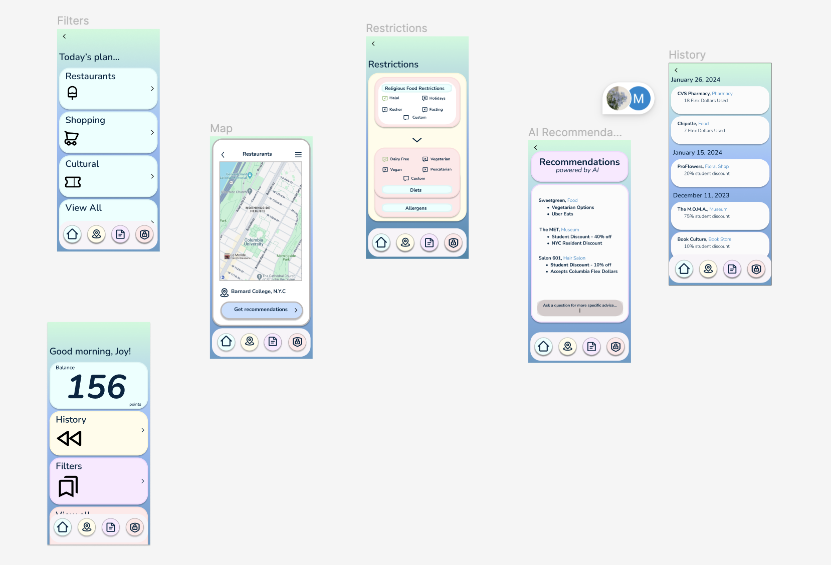
We wanted to develop an app that would help and advise students on places to visit based on their preferences and deals associated with the college they attend. Based on a student’s college, dining points for delivery services, and discounts on places near the college’s location, students will receive personalized recommendations on where to visit, shop, and eat with real-time updated information.
The app includes a home page with personalized information, current location, and quick recommendations. From the filters a user chooses, a map will be displayed that identifies the relevant locations that match what the user is looking for.
Each user can input specific food restrictions in order to find restaurants that not only are discounted and convenient, but adhere to each student’s needs.
Users will also be able to access a history log of past purchases so they can better understand how they’ve been spending their points.
- Describe your research process and findings. If you conducted any surveys or interviews, please include the survey form and/or interview questions here. If you conducted secondary research by pulling from online sources, please include a link to your sources. (Max 500 words)
After our initial brainstorm, we wanted very general feedback from users so we could understand which topic to focus our efforts on. We created a poll to identify if budgeting, discounts, and location were key aspects in how students choose where to visit.
From the responses, we determined that students were very interested in college discounts for shops, food, and cultural locations available to them and finances were often a problem. From there, we shifted our focus to discounts and more popular locations for our users to visit.
https://forms.gle/saJGjpwd9LDBmFX69
One aspect of our research included looking at current financial apps and their color choices. Using Dribbble.com to look at other finance app designs, and reflecting on apps we use everyday, we found that many designs use bright, bold colors that are high in contrast. Most financial apps also have a similar layout. Therefore, to make sure our app did not blend in with other financial apps, we took advantage of unconventional, calming colors not normally associated with finances and a different, smoother layout.
- Describe your most important design decisions. What research findings and/or user testing results led you to make these decisions? (Max 500 words)
In general, finances make people stressed out. This is especially true for college students. In our survey 95.2% of respondents said that budgeting in college was either “fine” or “very difficult”. To ease some of the difficulty and stress associated with financial decisions, we used a calming color palette. Using colors that are not normally found on financial apps, such as pastel-toned blues, yellows, and purples, allows the user to feel more at ease and comfortable while dealing with finances.
Another one of our most important design decisions was adding features and sections to our app that would account for differences in diet, allergens, and religious food restrictions. This way, users of all backgrounds and personal preferences can use the app.
Respondents noted that services outside of restaurants also offer student discounts or allow students to use their university’s points. Therefore, we made sure to design a category of services that specialize in shopping. Also, for the user to view all of their options, we added a “View all” category so users can see the full range of all categories offered.
In our survey, 90.5% of respondents noted that they would be more likely to go to a restaurant, store, or other service if they knew that service took points or offered a student discount. Additionally, 66.7% of respondents said they would be likely to take the advice of an app that suggested locations to spend their dining dollars, with people further elaborating on the desire for a map feature that they had felt was absent in our concept. Therefore, we included a map in our design to ensure users can easily access these locations.
Built With
- figma

Log in or sign up for Devpost to join the conversation.