Inspiration
Every fall, enrollment teams decide where to send their recruiters, usually by repeating last year's list of states, fairs and high schools. The stakes are rising: the number of US high school graduates is projected to peak around now and then fall for more than a decade, and many public universities depend on the higher tuition out-of-state students pay. The habit has a cost for students too. Research on public universities' out-of-state recruiting found their visits concentrate on affluent schools, many of them private, so a capable student at a large public school in a low-income area may never meet a recruiter. I wanted a desk that finds the places where young people already lean a university's way, and that sends recruiters to students who are usually missed.
What it does
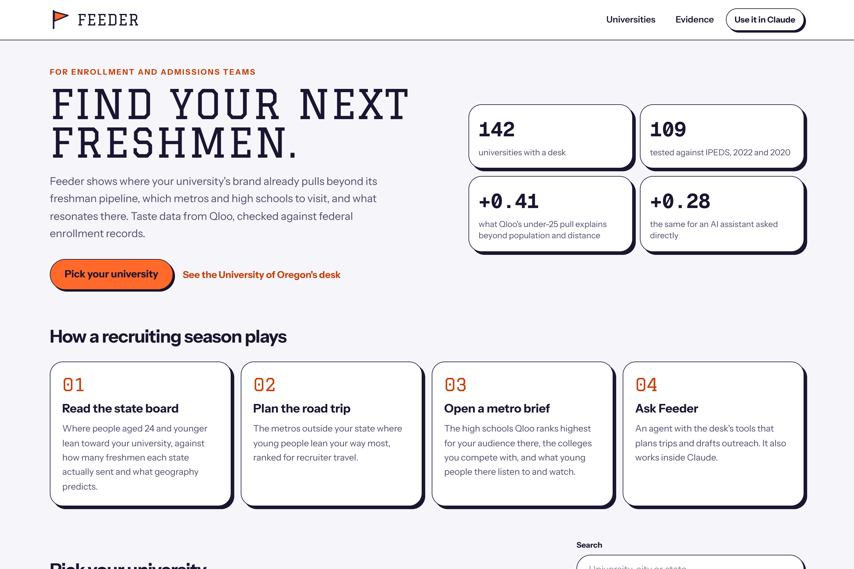
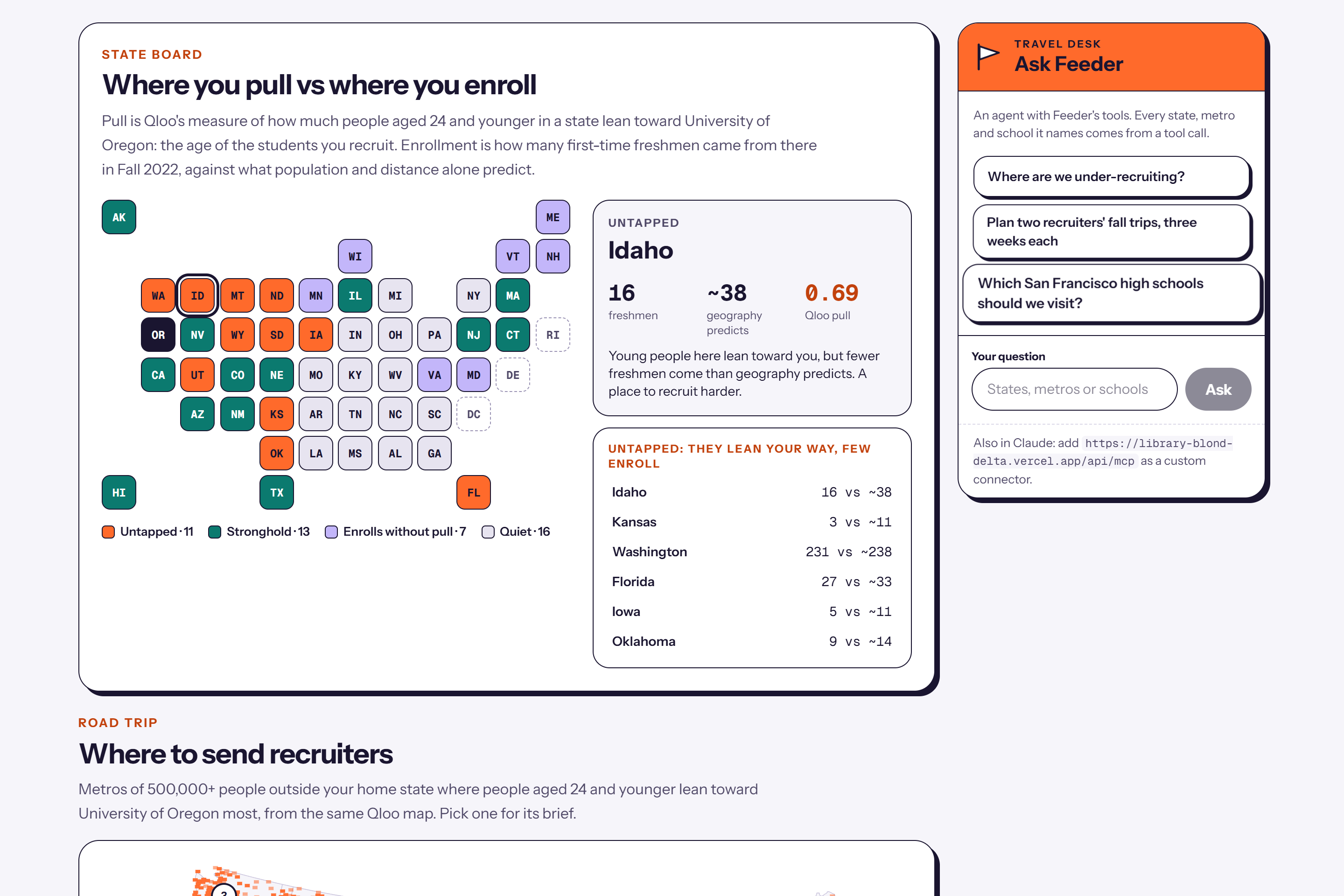
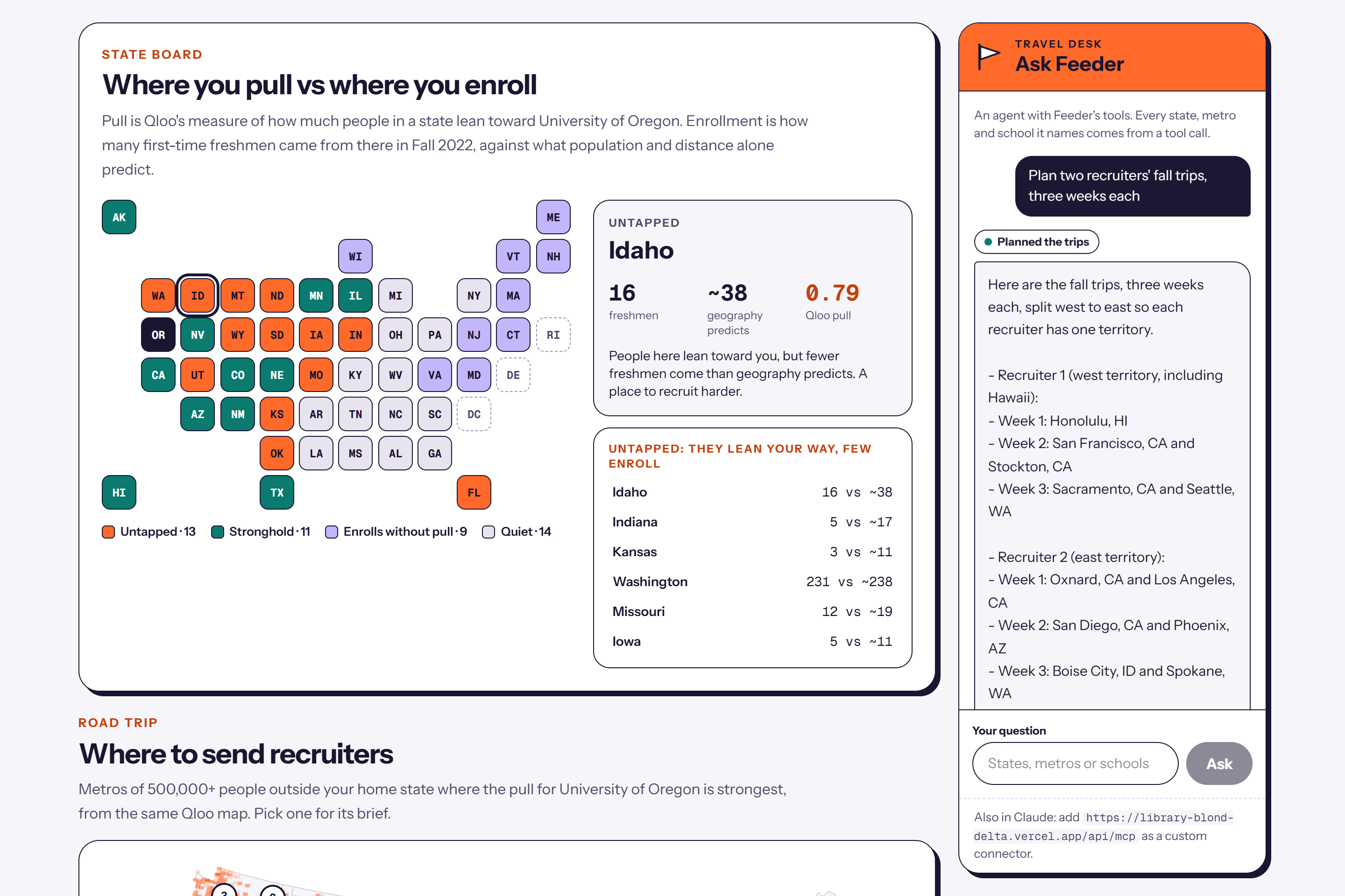
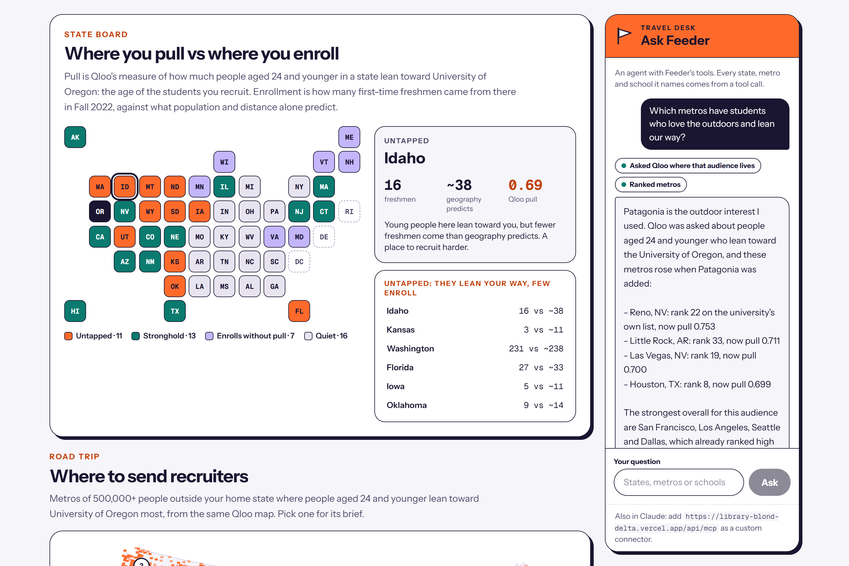
Pick any of 142 four-year universities that draw at least a fifth of their freshmen from out of state. The state board puts three things side by side for every state: how many first-time freshmen came from there in Fall 2022 (federal IPEDS data), how many population and distance alone would predict, and how much people aged 24 and younger there lean toward the university in Qloo's taste graph. Untapped states lean the university's way but send fewer freshmen than geography predicts, so they are the place to recruit harder. For the University of Oregon, Idaho is untapped: 16 freshmen against about 38 predicted.
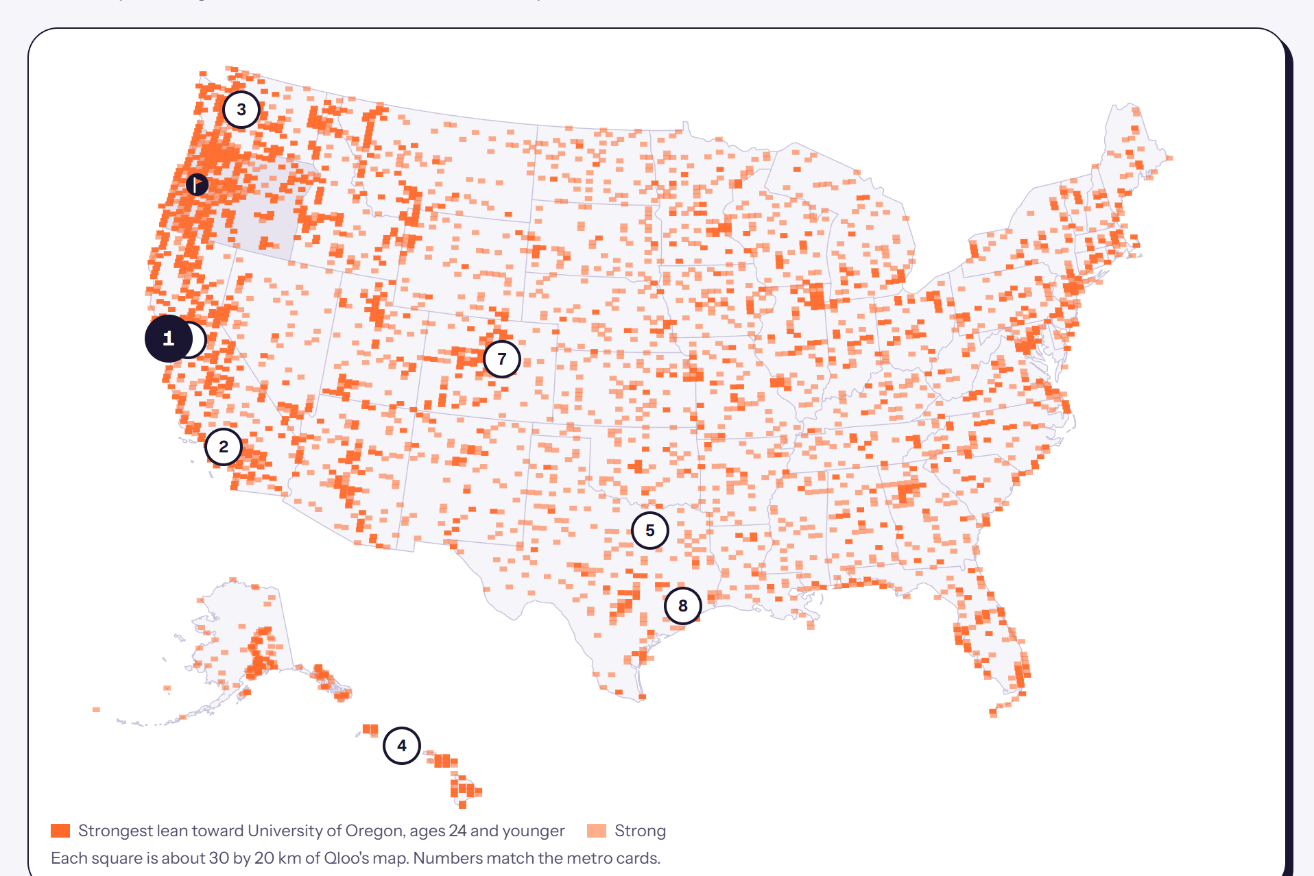
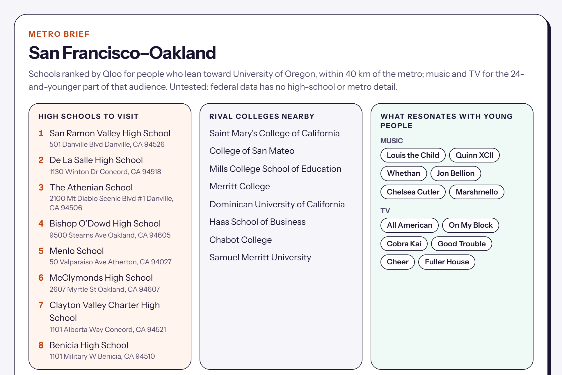
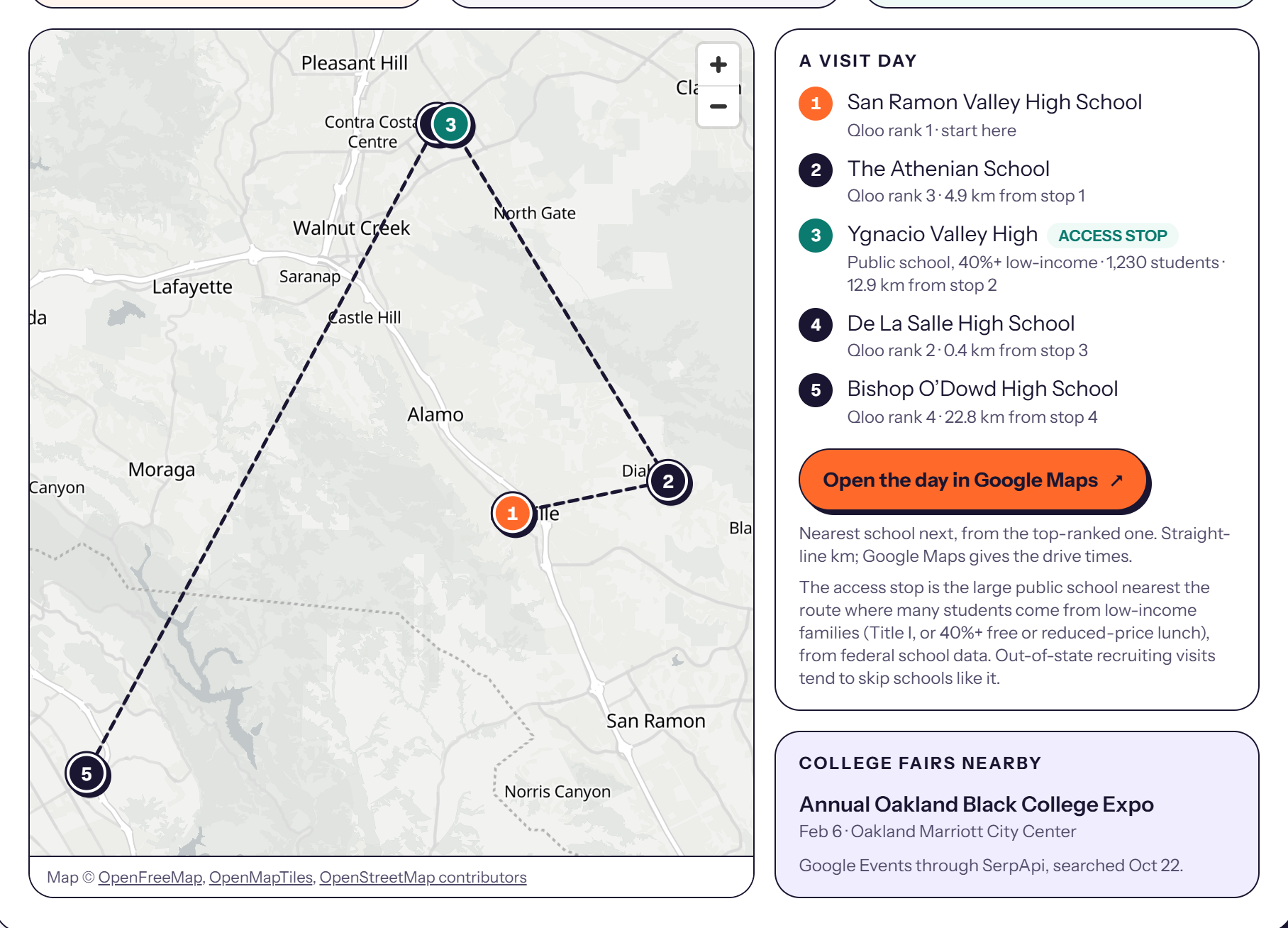
An audience map draws Qloo's national heatmap of those young people, with the campus and the strongest recruiting metros pinned. Each metro opens a brief: the high schools Qloo ranks highest for people who lean toward the university, the rival colleges nearby, and the music and TV young people there like. The visit day puts four of those schools on a street map in driving order and adds an access stop: the nearest large public school where many students come from low-income families, taken from federal school data and labelled as such. One link opens the whole route in Google Maps, and upcoming college fairs in that city are listed beside it.
"Ask Feeder" is an agent with the desk's seven tools. Ask it "where do students who love the outdoors lean our way?" and it picks an interest (Patagonia), asks Qloo live where young people who lean toward the university and like Patagonia live, and reports which metros rise: for Oregon, Reno jumps from 22nd to 2nd. It also plans recruiters' trips by territory and week. The same tools work inside Claude as an MCP connector, with no sign-in.
How I built it
Qloo does the core work. Each university is resolved with /search under a strict rule: the entity's name must equal the federal name or one of its listed aliases. For each university, one national heatmap from /v2/insights (filter.type=urn:heatmap, the university as the interest signal, signal.demographics.age=24_and_younger) gives affinity and popularity per map cell. A state's pull is the popularity-weighted mean affinity of its cells, a metro's pull is the same within 60 km, and the cells become the audience map. Metro briefs are place, artist and TV-show insights within 40 km of the metro, fetched once and kept. The agent's live tool resolves an interest with /search and asks for a heatmap with the university and that interest together as the signal, then ranks metros by it.
Federal data is the ground truth. Fall 2022 and Fall 2020 residence data come from IPEDS, populations from the Census Bureau, and the access stops from the Common Core of Data: Title I schoolwide schools, or 40% or more of students on free or reduced-price lunch where a state reports no Title I status. College fairs come from Google Events through SerpApi, filtered to admissions events. The street map is MapLibre GL with OpenFreeMap tiles. The app is Next.js 16 on Vercel with Neon Postgres, and the agent runs on the Vercel AI SDK with Claude Haiku 5.5; its tools are also served as a stateless MCP endpoint.
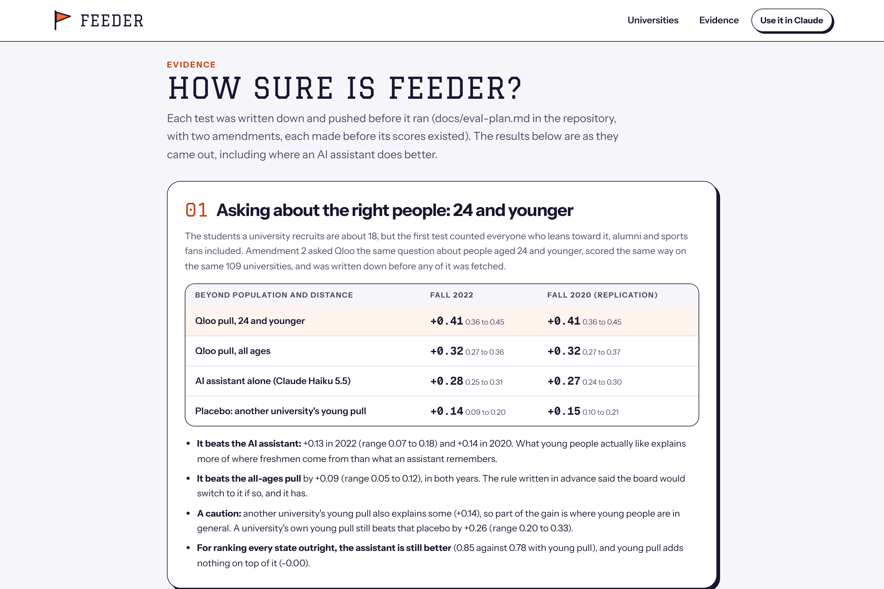
Every test was written down and committed before it ran. On 109 universities, Qloo pull among people 24 and younger explains what population and distance miss (partial correlation +0.41, interval 0.36 to 0.45) better than all-ages pull (+0.32) and better than an AI assistant asked the same question (+0.28), in Fall 2022 and again in Fall 2020.
Built in coordination with an AI coding assistant, Claude Code.
Challenges I ran into
This repository started as a different product. Shelf Desk used Qloo's book graph to pick teen books from students' interests, and its pre-registered test on Seattle library checkouts failed: the picks did no better than random. I retired it, kept the record in the repository, and researched where taste data would carry real weight before building Feeder.
Feeder's first test came out level with the AI assistant: Qloo pull for everyone who leans toward a university explained about as much as an assistant's ranking from memory. Then I realised I had been asking Qloo about the wrong people. Everyone who leans toward a university includes alumni, parents and sports fans, while the students it recruits are about 18. I wrote a second test down before fetching anything, asked Qloo about people aged 24 and younger, and that pull beat both the all-ages pull and the assistant, in both years. I also report the caution that came with it: another university's young pull explains a little too (+0.14), so part of the gain is where young people are in general. For ranking every state outright, the assistant is still better, and the Evidence page says so.
The data needed care. Name matching produced false matches ("Arkansas Online", a two-letter alias, and a luggage brand called Bentley standing in for Bentley University), and I removed each one in writing. California reports no Title I status in recent federal data, so its access stops use the lunch share instead, labelled on the page. The fair search was fragile too: "college fair San Francisco CA" returned nothing, while "college fair San Francisco" found the Oakland Black College Expo.
Accomplishments that I'm proud of
Qloo beats the AI assistant on a test written down in advance and checked against federal records for two separate years. And the product uses that edge for something good: every visit day includes a school that recruiters tend to skip, so the tool widens who gets seen instead of narrowing it.
What I learned
Who you ask about matters as much as what you ask. The same Qloo question about all ages was a tie with an AI assistant; asked about the age of the students, it won. Taste data is also most useful where nothing else reaches: at the level of a metro or a single high school there is no federal record and little for an assistant to remember.
What's next
I want to test the metro and high-school rankings against a university's own application records (by ZIP code, with its permission), add transfer students, and let a team save and share a season's trip plan.
Built With
- claude
- ipeds
- maplibre
- model-context-protocol
- nces-common-core-of-data
- neon
- next.js
- openfreemap
- postgresql
- python
- qloo
- react
- scipy
- serpapi
- tailwindcss
- typescript
- vercel
- vercel-ai-gateway
- vercel-ai-sdk
- vitest

Log in or sign up for Devpost to join the conversation.