-
-
Dashboard 1
-

Dashboard 2
Inspiration
Product teams don’t struggle to imagine features—they struggle to choose them. Every day, truly valuable signals are buried in Slack scrollback, forum threads, and support tickets. The loudest message wins the meeting, the quiet-but-critical pattern gets missed, and weeks slip by debating anecdotes. That gap between what customers need and what teams ship is the problem that inspired this project. We wanted to fix three things: Scattered signal Useful feedback lives everywhere and nowhere. A PM has to hop between channels, copy–paste into sheets, de-dupe by hand, and still can’t prove what matters most. It’s slow, error-prone, and demoralizing.
Opaque prioritization Roadmap calls often default to intuition or influence. Without transparent rationale, leadership can’t defend decisions, and contributors don’t see their input reflected.
Lost customer context When feedback becomes a line in a spreadsheet, the human story disappears. Teams need to see real words from real users to build the right thing with conviction.
The spark We asked a simple question: “What if the top themes picked themselves—backed by evidence—inside the tools teams already use?” Not another voting portal. Not another silo. Just one pane of glass that makes signal obvious, explainable, and trusted. Why now Volume: Modern SaaS teams hear from more channels than ever. Volume has outgrown manual triage.
Maturity: NLP is good enough today to cluster and summarize feedback reliably—if you design for human review.
Stack fit: Salesforce + Data Cloud + Tableau make it possible to keep data governed, auditable, and instantly visual.
Design principles we committed to Evidence over opinions: Every score must trace back to real messages. Click to drill down. No black boxes.
Explainable math: PriorityScore blends frequency, recency, and VIP impact with weights you can tune. If a leader asks “why is this #1?”, the answer is one sentence—not a model card.
Meet teams where they work: Store the source of truth in Salesforce objects, stream via Data Cloud, explore in Tableau. No extra logins, no new habits required.
Privacy by default: Pseudonymize authors; keep idempotent keys; log every manual override. Trust is a feature.
Start simple, scale sensibly: Slack today; forums and CRM tomorrow. Nightly clustering is enough for most teams. Real-time can come later.
What “good” looks like A PM opens a dashboard and instantly sees the top 5 themes that matter this month—ranked, with VIP context, confidence, and trend lines.
Leadership asks for rationale; the PM clicks and shows the actual customer quotes. Discussion shifts from “do we believe this?” to “what’s the smallest valuable version we can ship?”
Support can demonstrate the impact of recurring issues; engineering can scope work that clearly moves the needle.
The human side We’ve all been in that meeting where time disappears into scrolling Slack, hunting a message no one bookmarked, or arguing over a hunch. This project is the antidote to those meetings. It gives teams time back for discovery, design, and user conversations—because the aggregation and de-duplication are already done. Results we want to enable Speed: Roadmap decisions in days, not weeks.
Alignment: Shared, defensible priorities reduce re-litigation.
Customer closeness: Building with the user’s actual words visible changes how teams think about quality and scope.
Focus on value: VIP-weighted insights keep high-impact work at the top without drowning out broad demand.
Why this stack Salesforce is the governed system of record—perfect for storing Feedback, Cluster, and ClusterMember with audit trails.
Data Cloud turns those objects into analytics-ready datasets without copy/paste.
Tableau Next delivers the clear, interactive “receipt” PMs can show to anyone: ranked clusters, momentum lines, and drill-through to raw messages.
What we chose not to do No public voting portals (can be gamed, rarely representative).
No vanity metrics.
No inscrutable ML. If a metric can’t be explained to a VP in one sentence, it doesn’t ship.
The north star Make it obvious what to build next—and obvious why. When a team can say, “We’re building X because it’s the top cluster by unique users, trending up, and 32% of mentions are from VIP accounts—here are three customer quotes,” that’s a culture shift. That’s product management with receipts. That’s the inspiration: turn noise into narrative, opinions into evidence, and backlog chaos into a confident, customer-anchored plan.
What it does
What Our Project Does
Ingests Raw Feedback from Multiple Sources Today, product teams get feedback scattered across Slack channels, community forums, and support/CRM systems. We built ingestion pipelines that capture this raw, unstructured data and load it into Salesforce Feedback objects. This ensures no user voice is lost, no matter the channel.
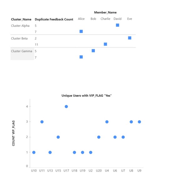
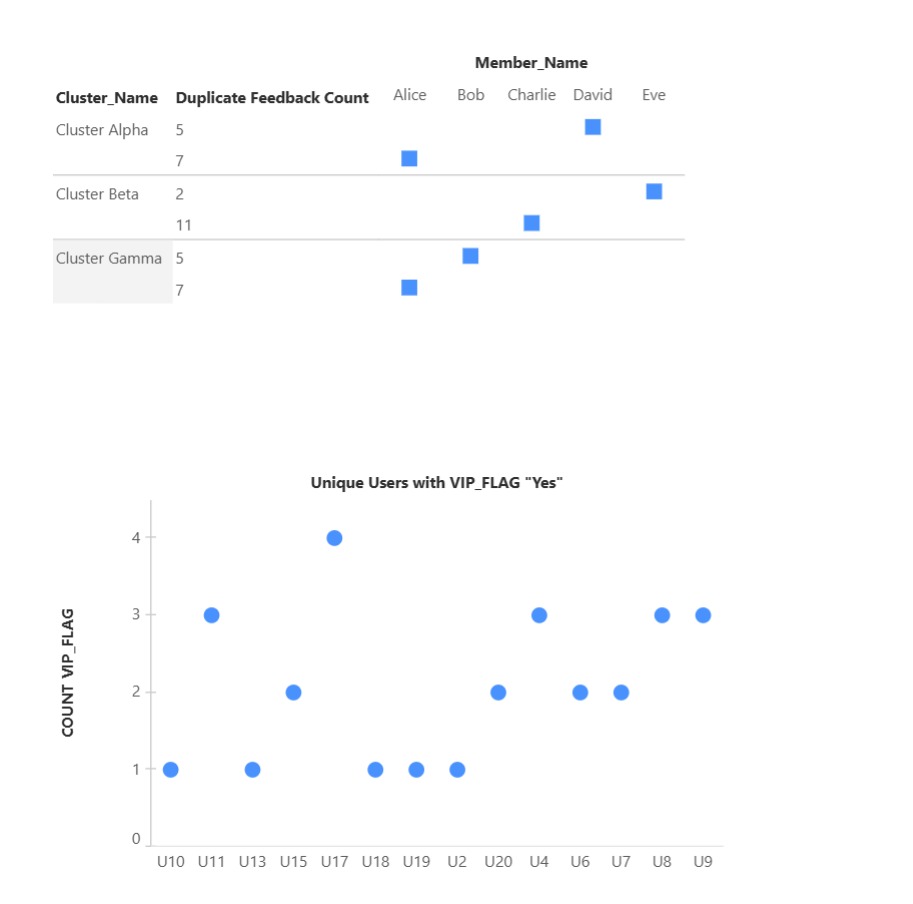
Cleans, Deduplicates & Clusters with NLP Using natural language processing (NLP): Deduplication: Detects repeated/near-duplicate requests.
Clustering: Groups related messages into Clusters (e.g., “Dark Mode requests” or “Export bugs”).
Traceability: Each cluster links back to original feedback via ClusterMember objects, so PMs can drill down and see real user quotes.
- Scores & Prioritizes Requests We assign each cluster a Priority Score based on transparent, explainable factors: Frequency (how many unique mentions)
Recency (how recently it’s being asked for)
VIP% (how many requests came from high-value customers)
This score is stored in the Score object and ensures PMs and leadership see an objective, data-backed ranking instead of relying on gut feeling.
Maintains Governance & Auditability Every manual override or priority adjustment is logged in Audit Log objects. This gives leadership confidence that prioritization is transparent and avoids the perception of bias.
Streams to Data Cloud → Tableau Next All objects are pulled into Salesforce Data Cloud via data streams. Tableau Next then provides: Dashboards of top clusters & trends.
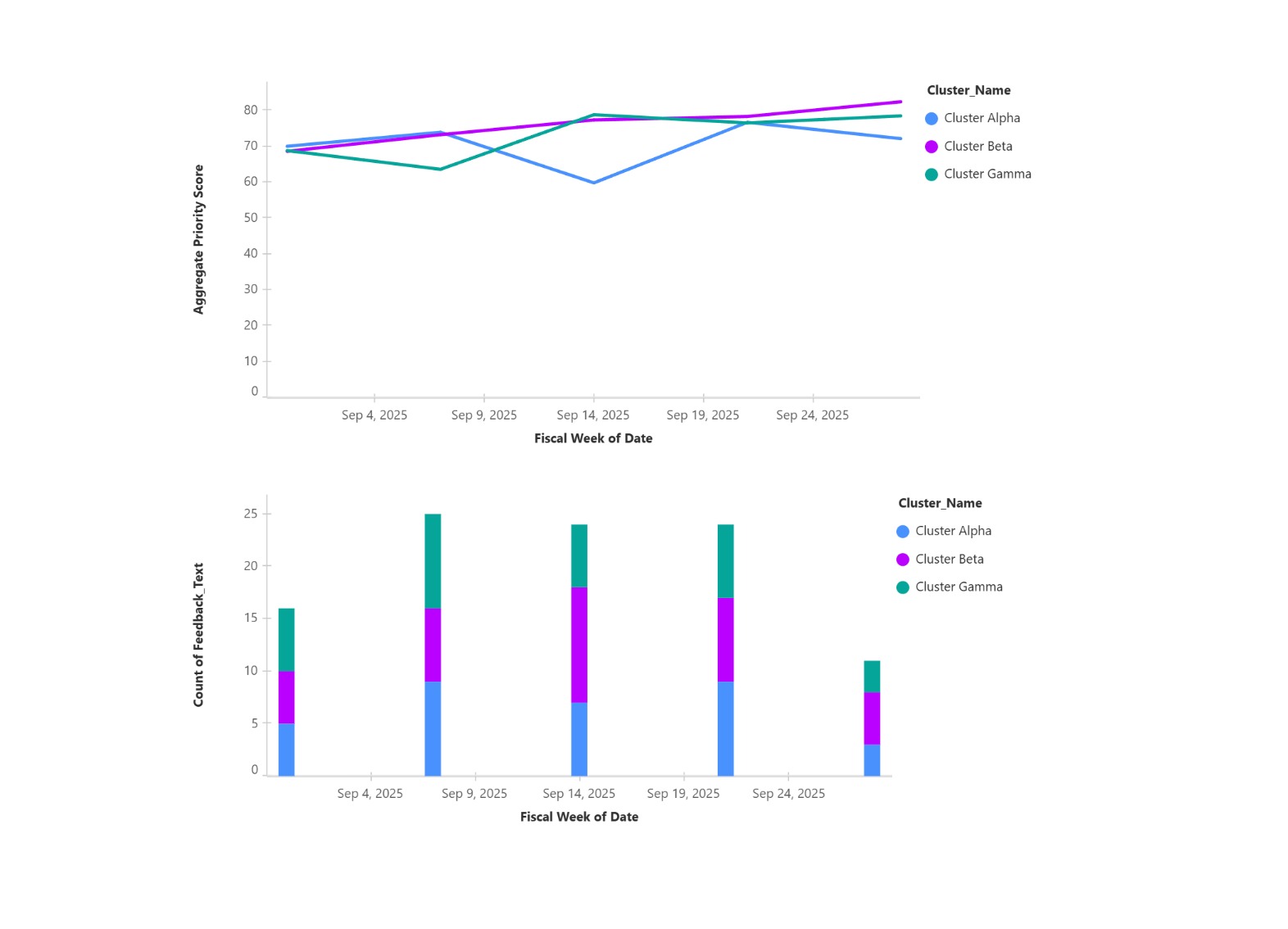
Trend lines from the ClusterTrend dataset (e.g., “Requests for AI integrations are growing weekly”).
Filters by channel, product area, or time.
Drilldowns to raw Slack/forum/support quotes.
- Defined the Data Model We designed five custom Salesforce objects to mirror the product feedback lifecycle: Feedback__c: raw messages ingested from Slack, forums, CRM.
Cluster__c: grouped themes generated by NLP.
ClusterMember__c: link table tying Feedback to Cluster, with similarity score and role.
Score__c: stores computed PriorityScore (frequency, recency, VIP share).
AuditLog__c: captures every manual override or adjustment.
This model ensures traceability from raw message → cluster → score → decision.
- Built Ingestion Pipelines We implemented connectors to bring external feedback into Salesforce: Slack API for designated product/feedback channels.
Forum/Community APIs for discussion threads.
CRM export hooks for support cases.
For the hackathon demo we used synthetic CSV data, but the same format feeds into Salesforce via Data Streams.
- Applied NLP for Clustering We used Python (Flask service for rapid iteration) with: Sentence embeddings to encode feedback text.
Agglomerative clustering to merge similar items.
Deduplication filters to collapse repeated requests.
Summarization to generate concise cluster titles.
The output is written back as Cluster_c and ClusterMember_c records.
- Developed Explainable Scoring We implemented a transparent PriorityScore formula: Frequency: number of unique users requesting.
Recency: exponential decay on request age.
VIP%: share of requests from high-value accounts.
Weights are tunable but the formula is simple enough to explain to stakeholders.
Integrated with Salesforce Data Cloud All objects were ingested into Data Cloud via data streams. This gave us analytics-ready datasets without leaving Salesforce’s governed environment. Relationships mirror the data model, so Tableau can query them directly.
Visualized in Tableau Next We designed three key dashboards: Prioritized Clusters: top themes ranked by PriorityScore, with filters.
Trend Lines: how clusters rise/fall over weeks.
Drilldown Quotes: direct access to raw messages and user context.
Visuals use Tableau’s interactivity so PMs and leadership can self-serve insights.
- Ensured Governance and Privacy Anonymized authors at ingestion (hashes, not names).
Audit logs for all overrides.
Role-based access to unmask details when necessary.
Retry logic for API calls to ensure reliability.
- Demo Setup for Hackathon For speed and repeatability, we generated synthetic Slack/forum CSVs, loaded them as Salesforce objects, created data streams in Data Cloud, and then built Tableau dashboards. This allowed us to demonstrate the full pipeline even without live APIs. End-to-End Impact PMs save hours of manual triage every week.
Leaders get a live, ranked view of what matters most to customers.
Support teams see their logged issues rise transparently into the roadmap discussion.
The company ships features that are aligned with true customer demand, faster.
So in short: We turn scattered feedback into explainable priorities — moving from chaos to clarity with Salesforce + Tableau.
How we built it
- Designed the Data Model We started by defining custom Salesforce objects that mirror the real-world workflow of product feedback: Feedback: every raw comment or request from Slack, forums, or CRM.
Cluster: a theme that groups together similar requests.
Cluster Member: the link between individual feedback items and the cluster they belong to.
Score: a calculated record that holds the PriorityScore for each cluster.
Audit Log: a history record of every manual override, adjustment, or review.
This model guarantees that we can trace a decision all the way back to the original user’s words.
- Built the Ingestion Layer We created a lightweight ingestion pipeline that can either: Connect to APIs like Slack, community forums, or Salesforce Service Cloud, or
For the hackathon, load CSV exports that mimic those systems.
This step ensures we always have a single, consistent stream of feedback entering Salesforce.
- Applied Natural Language Processing Once feedback is ingested, we run an NLP pipeline that: Embeds text into vector space so we can compare meaning, not just words.
Clusters similar items together using an algorithm (agglomerative clustering).
Deduplicates nearly identical requests so PMs aren’t flooded with repeats.
Summarizes clusters into human-readable titles.
The output is written back into Salesforce as Clusters and Cluster Members.
- Implemented Explainable Scoring Every cluster is ranked using a formula that blends: Frequency: how many unique users asked for it.
Recency: how fresh the requests are.
VIP impact: how many requests came from high-value accounts.
This PriorityScore is transparent, tunable, and defensible in leadership meetings.
Streamed Data into Salesforce Data Cloud We then created Data Streams to pull Feedback, Clusters, Cluster Members, Scores, and Audit Logs into Salesforce Data Cloud. This step transforms operational data into an analytics-ready format.
Built Dashboards in Tableau Next Using Tableau Next, we created interactive dashboards with three key views: Prioritized clusters ranked by score, with filters.
Trends showing how themes grow or fade over time.
Drilldowns where PMs and leaders can read the original customer quotes.
These dashboards turn raw text noise into visual, actionable insights.
- Added Governance and Privacy Authors are anonymized at ingestion.
Every override is logged in Audit Logs.
Role-based access determines who can see sensitive data.
This makes the system secure, compliant, and trustworthy.
- Built the Demo Setup for the Hackathon For the hackathon timeframe, we used synthetic Slack-style CSVs to simulate real-world data. We loaded those into Salesforce, streamed them to Data Cloud, and built the Tableau dashboards. This allowed us to demo the full end-to-end pipeline with no dependency on live APIs.
Challenges we ran into
Our initial plan was to create around 8 distinct visualizations to showcase the full breadth of our model (covering feedback clustering, member-level drilldowns, scoring over time, duplicate detection, VIP analysis, and trend progression).
However, due to the limited set of chart types currently supported in Tableau Next, we had to narrow down the scope of our dashboard. Instead of implementing all 8 visuals, we focused on the most impactful 3–4 views that highlight clustering, scoring, and trend analysis.
Accomplishments that we're proud of
End-to-End Prototype in Just 2 Days We went from raw idea to a working prototype that ingests feedback, clusters it, scores it, and visualizes it in Tableau Next — all within the hackathon timeframe.
Unified Data Model Across Sources We successfully designed a flexible Salesforce schema (Feedback, Cluster, Cluster Member, Score, Audit Logs) that can scale from dummy CSVs today to real Slack/CRM/Community integrations tomorrow.
Explainable Prioritization Formula We created a simple but powerful scoring system (Frequency + Recency + VIP weight) that product managers can explain and defend in leadership discussions — not a “black box” ML.
Realistic Demo Data & Dashboards We simulated Slack-style raw feedback and showed how it flows into clean clusters, trend lines, and prioritized dashboards — a demo that feels close to production reality.
Seamless Salesforce → Data Cloud → Tableau Next Flow We proved the full pipeline works: data captured in Salesforce, streamed into Data Cloud, and then visualized in Tableau Next dashboards. This validates our architecture for scale.
Team Collaboration & Rapid Learning None of us were experts in Salesforce Data Cloud or Tableau Next before this hackathon. We divided roles, leaned on docs, and built something production-ready in record time.
What we learned
The Power of a Clear Data Model We discovered how much clarity comes from defining objects early. By structuring Feedback, Clusters, Scores, and Audit Logs in Salesforce, we made the rest of the pipeline far easier to build.
Balancing NLP Automation With Human Oversight We learned that clustering can never be 100% perfect. Building manual overrides and audit trails isn’t “extra work,” it’s essential for PM trust and adoption.
Salesforce + Tableau Next = End-to-End Flow We experienced firsthand how Salesforce Data Cloud and Tableau Next complement each other. Salesforce handles ingestion and governance, while Tableau makes the insights instantly consumable.
Rapid Learning Under Pressure Our team had little prior experience with Salesforce Data Cloud or Tableau Next. We had to learn new tools, APIs, and integrations in just two days — and found that Trailhead, docs, and quick division of tasks made it possible.
The Importance of Realistic Demo Data We realized that even the most brilliant dashboards fall flat if the data looks fake. Designing synthetic Slack-style CSVs helped our demo feel authentic and showed how the system would work in production.
Collaboration & Role Division We learned the value of splitting responsibilities across product design, ingestion/ML, and visualization. This not only saved time but also gave each teammate ownership of a critical layer of the solution.
What's next for Feature Prioritization and PM Automation
Current Achievements Built ingestion → clustering → scoring → visualization pipeline.
Created dashboards for:
Duplicate feedback counts across clusters.
VIP user distribution across clusters.
Cluster trend scores over time.
Weekly volume of feedback per cluster.
Current Limitations (Hackathon constraints) Limited to dummy datasets (CSV) instead of live Slack/Community ingestion.
Scoring (Frequency • Recency • VIP%) implemented, but no real-time recalculation.
Could not yet build:
Sentiment analysis dashboards.
Persona-based feedback slicing (e.g., new users vs enterprise customers).
Automated Jira/roadmap integration.
Future Roadmap Live data ingestion: Plug into Slack, Salesforce Community, Jira.
Advanced clustering & NLP: Sentiment, topic modeling, duplicate detection.
Deeper PM insights:
VIP-weighted prioritization matrix.
“What changed this week?” trend alerts.
Automated release notes and feature dashboards.
Decision automation: Push prioritized clusters directly into PM tools (Jira, Asana).

Log in or sign up for Devpost to join the conversation.