-
-
-
-
-
-

-
-
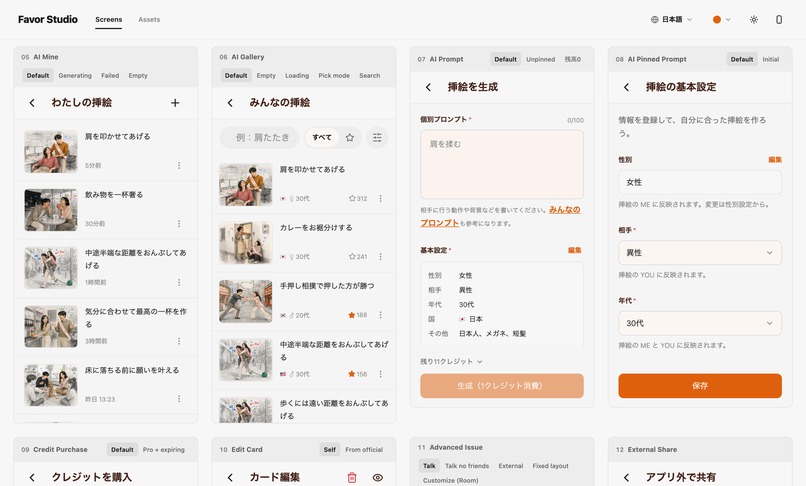
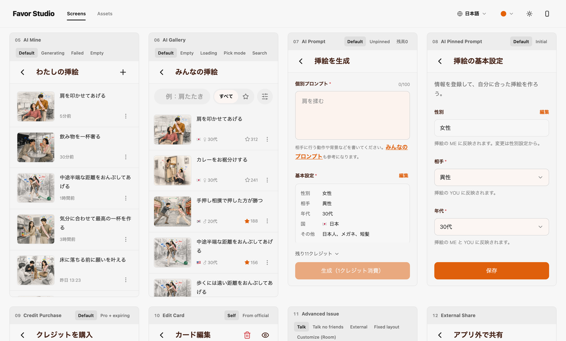
A development-only view listing the real app screens with mock data.
-

The illustration for the official card "Time Capsule".
-

App icon.


Inspiration
Years ago I worked part-time at a karaoke place. For a few coworkers I got along with, I made paper cards — each one something they'd probably be glad to have me do for them.
Use it any time, I told them. But I left the conditions deliberately vague, so I could still turn them down depending on my mood.
They were a huge hit. Then I moved away soon after, and not one of the cards was ever used.
I've wondered ever since what would have happened if those cards had actually been played. I built Favor Cards to find out.
What it does
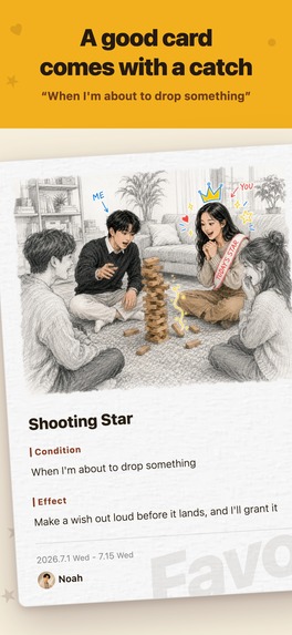
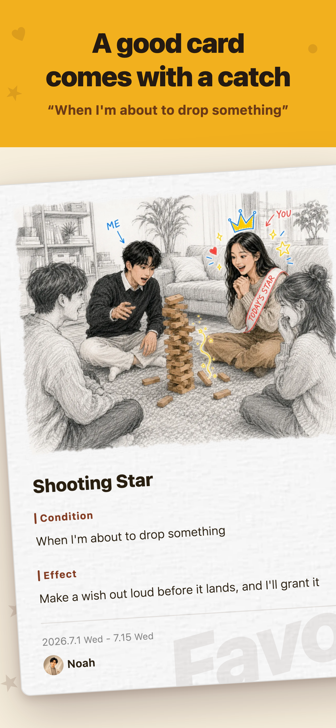
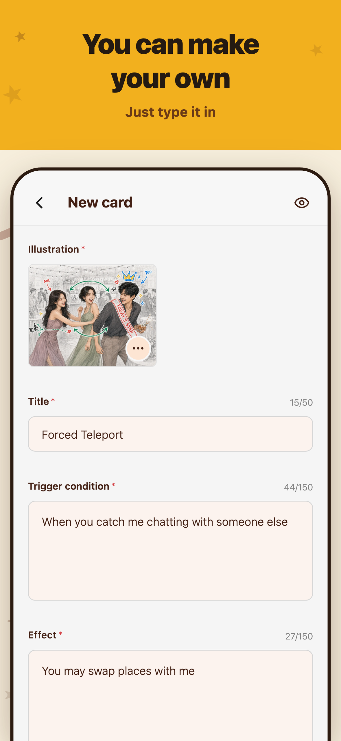
In Favor Cards, you hand a friend a card with a Condition and an Effect written on it.
For example:
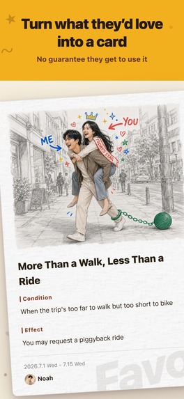
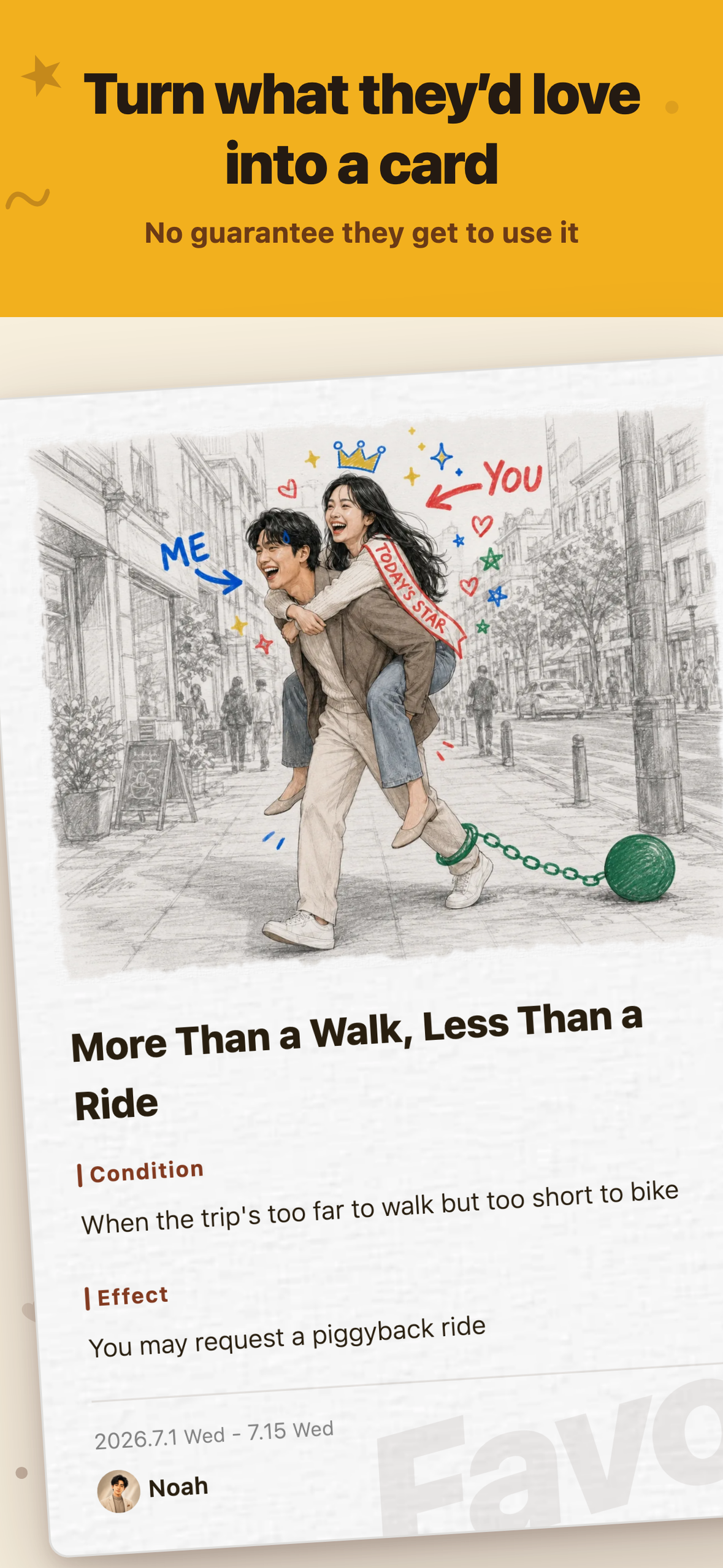
More Than a Walk, Less Than a Ride
- Condition: When the trip's too far to walk but too short to bike
- Effect: You may request a piggyback ride
Whimsical Wake-Up Call
- Condition: When you look about to snooze and drift back off
- Effect: I'll phone to drag you awake
You're free to attach conditions that suit you to something the other person would genuinely enjoy. The back-and-forth that follows — "Can I use it now?" "That doesn't meet the condition" — is part of the game.
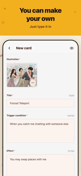
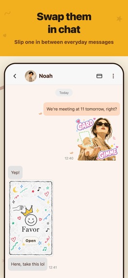
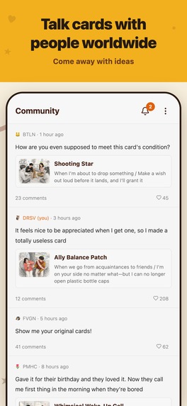
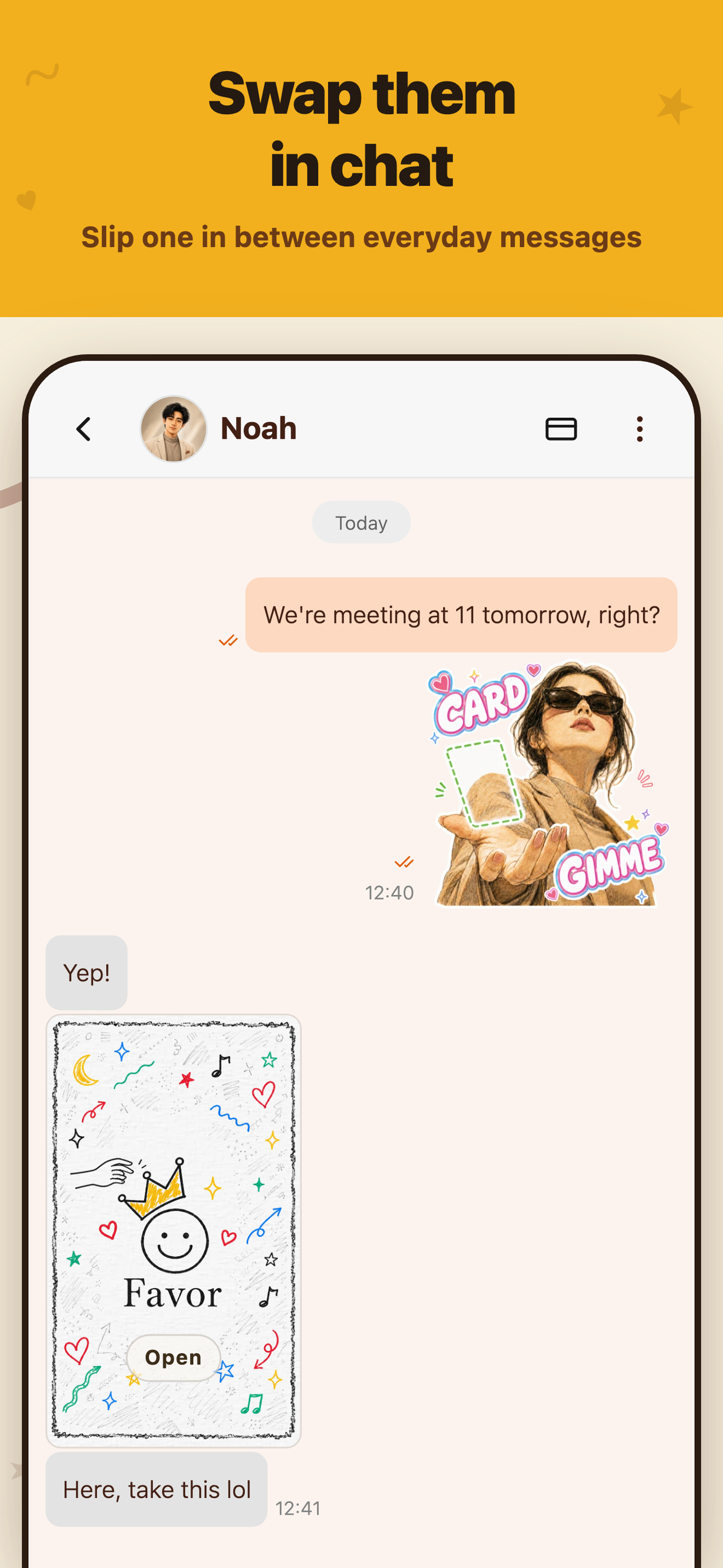
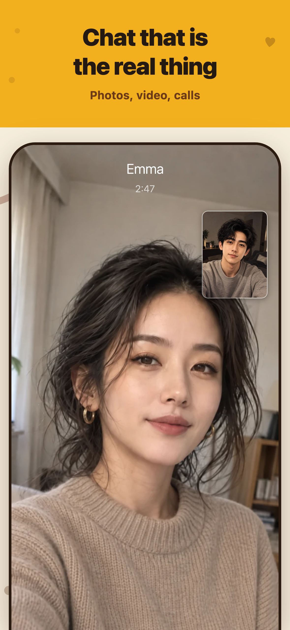
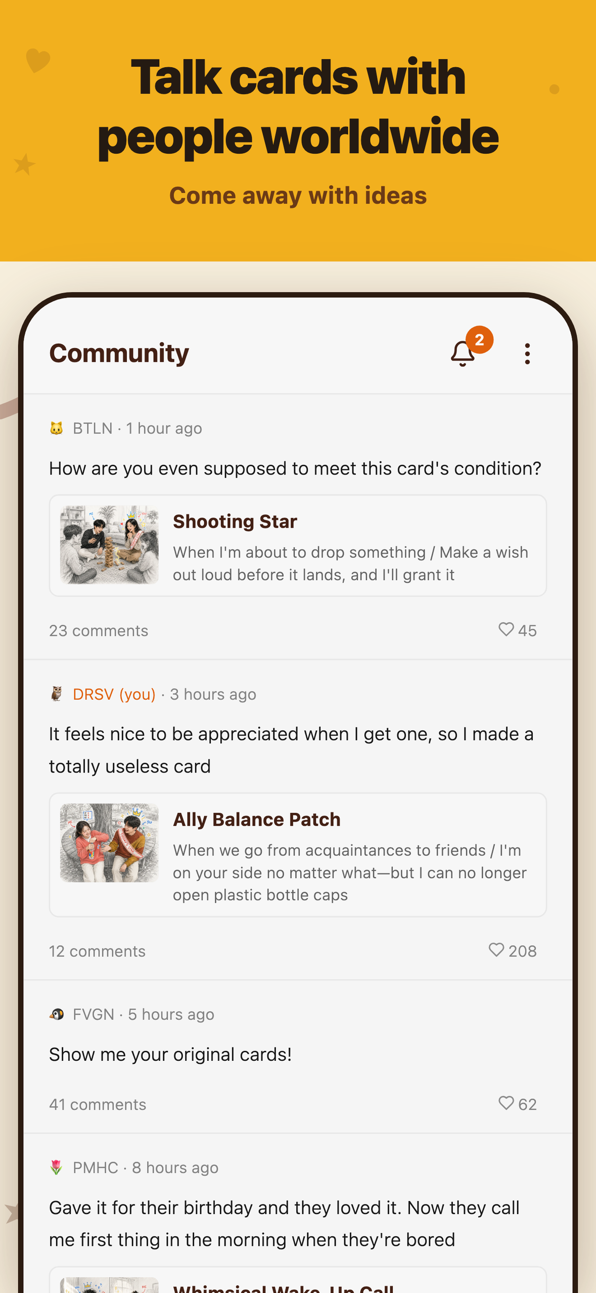
Beyond the cards we provide, you can write your own Condition and Effect and generate the illustration with AI. Cards are handed over in one-on-one or group chats, and there's a shared feed where you can trade ideas for new cards with other users.
The app doesn't judge whether a condition is met, and it doesn't carry out the effect. That part is left to the two people involved.
How I built it
I built it alone in React Native, for iOS, Android and web. The backend runs on Firebase, and media is stored on Cloudflare R2. I used Claude Code for the implementation and ChatGPT for the visual work.
Favor Cards lives in the same monorepo as another chat app I shipped earlier. Auth, UI, purchases, localization and moderation are shared, and the features I added for Favor flow back to the other apps.
Laying out every screen with AI
Once the direction of a spec is settled, I have the AI build every screen, then work out the details with all of them side by side.
Seeing the whole set at once makes it easier to keep spacing, sizing and color consistent, and easier to catch UI bugs and gaps in the spec.

A development-only view listing the real app screens with mock data.
For the store, I built a responsive version of these screens on the web and shoot them automatically with Playwright while switching device size and language — 6 devices × 8 languages × 6 shots, 288 images in total.
Challenges I ran into
Keeping illustration quality stable, whatever users type
Harder than locking down a single art style was making sure the illustration holds together no matter what scene a user types in.
Backgrounds are pencil, the two main figures are colored pencil, and marker doodles go on top. Just naming the media wasn't enough to separate the textures, so I wrote the prompt as "three people drawing in turn":
- an architecture student sketches the background
- an illustrator draws the two main figures
- a friend scribbles over the finished drawing with a marker
Splitting it by who draws what, and in what order, made the difference in texture much easier to get.

The illustration for the official card "Time Capsule".
On the other hand, "a piggyback ride while holding a card in one hand" produced a person with three arms.
Adding "don't draw extra arms" didn't fix it, so I dropped the requirement to hold the card at all. Since then, before piling on more prohibitions, I check whether the composition itself is asking for something impossible.
Accomplishments that I'm proud of
Making illustrations that fit Favor Cards — ones I'd consider worth paying for.
I'm not a designer or an illustrator, and I have no training in art. All I had were excessive demands.
The background is drawn in full detail, but kept low in color so the subject doesn't get buried, and the image as a whole sits toward off-white. The marker colors match the app's theme colors, so the cards feel at home inside the app.
The two figures have requirements too. The relationship has to read as: the person receiving is very happy, the person giving is a little happy. Friends rather than romance, and a bit silly. The settings are places friends would actually go.
I also varied locations and compositions so the illustrations don't start to look alike. "Both seated" in particular gets used a lot for meals, so I held it in reserve for the cards that need it. Where a drawing alone couldn't carry a nuance, I added small extra illustrations.
I broke plenty of images by piling on too many demands, but working through them one at a time got me to a style that fits Favor Cards.
What I learned
Make AI mistakes recoverable, rather than impossible
I once left things to the AI and ended up with Firestore provisioned in a multi-region configuration I hadn't intended.
Now I get the staging environment close to finished before creating production. Rather than trying to make sure the AI is never wrong, I design the workflow so its mistakes are cheap to undo.
Don't pile up specs nobody reads
As the app grew, so did the specs.
Having the AI write exhaustive documents is pointless if I don't read them. Now, when I need something, I just ask the AI directly.
What's next for Favor Cards
I want to get it into the hands of actual groups of friends, and watch: what kinds of cards people actually want to give, how mean a condition can get before it stops being funny, and what kind of back-and-forth the conditions produce.
Last time it ended at handing them out and getting a laugh.
This time I want to see what happens next.
Built With
- chatgpt
- claude-code
- cloud-firestore
- cloud-functions
- cloudflare
- cloudflare-r2
- cloudflare-workers
- expo.io
- firebase
- playwright
- react-native
- revenuecat
- tamagui
- typescript
- webrtc


Log in or sign up for Devpost to join the conversation.