

Inspiration
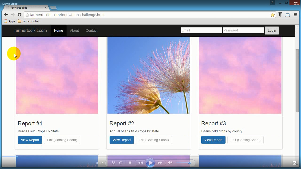
I took a look at the way NASS quick stats offers predefined queries. My approach was to offer predefined reports using NASS predefined queries and data in json and csv formats.
What it does
Visualize and filter data over time.
Everything starts from selecting a predefined report from the home page. Then, a chart by year, time line and map with legend is shown. All charts are actionable, so the user has the ability to select data or apply filters to the data.
How I built it
Showing information visually through charts. Allowing the user to 'play' with the charts to discover data trends.
Accomplishments that I'm proud of
I think that actionable charts are easy to use.
What I learned
Usage of d3 in conjunction for chloropleth maps
What's next for farmer toolkit
Implement online report creation process

Log in or sign up for Devpost to join the conversation.