-
-
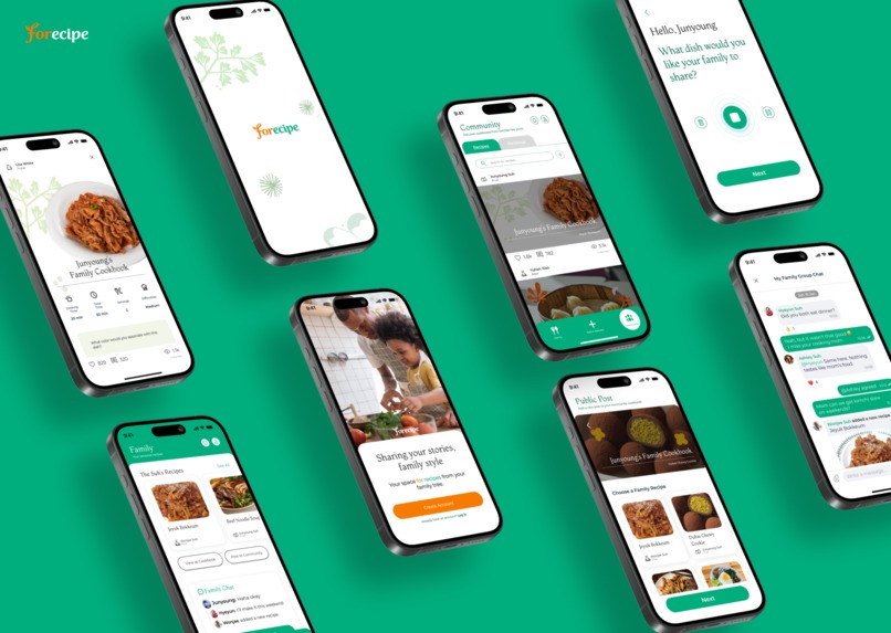
Mockup

Prototype link: Link
Video demo: https://youtu.be/pSRasp0ke1Y
Describe your project:
Forecipe is the space for recipes from your family tree.
Many families lose connection as generations move out of the house. Forecipe aims to fix that with a universal love language: food.
In our app, Roots (grandparents), Trunks (parents), and Fruits (children) can fill their family cookbook with the comfort meals they love making or ask a family member to add that one dish they used to make every Friday evening. Each recipe entry stores photos, videos, stories, and memories, forming a living archive that spans distance and time.
We view recipes as a means to spark intergenerational conversations; in-app chat allows family members to keep that conversation flowing right where it started. Families can export their cookbook as a lasting heirloom or publish recipes to the app, extending intergenerational sharing beyond the home.
Forecipe is designed to keep families present in each other’s lives, one recipe at a time.
Describe your research process and findings. If you conducted any surveys or interviews, please include the survey form and/or interview questions here. If you conducted secondary research by pulling from online sources, please include a link to your sources.
Our research process had three stages: qualitative interviews, quantitative surveys, and usability testing.
For our qualitative interviews (link), we divided our user base into three groups: Roots (grandparents), Trunks (parents), and Fruits (young adults/children). For younger users, we focused on communication habits, cooking behaviors, and emotional connection to older generations. For older users, we explored technology comfort, motivations for sharing recipes, and what makes family connection feel meaningful.
We also conducted observations of older generations testing various apps to determine their actual interaction patterns compared to their self-reported comfort levels (link). Notably, older users prioritized clear wayfinding elements such as back buttons, expressed confusion when faced with popups, and preferred explicit text labels over icon-based navigation.
Through these methods, we developed rapid user profiles to synthesize behavioral patterns across each generation. Fruits wanted to maintain relationships with older generations but often lacked the time or attention to do so in their daily lives. Trunks wanted consistent updates on both Fruits and Roots, and wanted to show support in any way possible. Roots wanted a glimpse into the daily lives of Trunks and Fruits, often feeling disconnected and craving a consistent channel of communication. We saw interest in a family recipe-collector with quotes such as “My grandma was a really good cook, but a lot of her recipes are stuck in her mind. I want to release those recipes for my mom to try.”
To validate these findings, we conducted quantitative surveys (link) separated into younger (20 responses) and older (12 responses) generations. The results reinforced what our interviews surfaced. Among younger respondents, 65% did not have access to family recipes, and 70% wanted to have that access, directly reflecting the disconnect Fruits expressed in interviews. Among older respondents, 91.7% valued their family having access to their recipes, with seeing their family's reactions (83.3%) and preserving recipes for future generations (75%) as their primary motivators for sharing recipes. Across all respondents, 78.1% preferred speaking as their primary form of storytelling, with video (53.2%) and audio (34.5%) emerging as the top choices for experiencing a story.
Our user research also led to several discreet (but intentional!) design choices in our app, such as adding a search feature to the Community page because 75% of younger respondents usually get recipes from Google searches and sending a confirmation notice to the recipe author before publishing a recipe because some users mentioned secret family recipes.
Finally, we conducted usability tests (link) with all three generations to identify friction in our information architecture. We discovered that some of our navigation labels were unclear, which led to a refresh of all our copy and color contrasts to best fit our brand and promote accessibility. We were also able to validate many aspects of our designs, including our generational grouping and our memories section, which is the most important part of it all!
Describe your most important design decisions. What research findings and/or user testing results led you to make these decisions?
Our most important design decision was to frame the app around action-driven interaction rather than passive communication. Through interviews, we found that food is one of the few topics that naturally bridges generations without conflict. Participants consistently described family recipes as deeply tied to memory, culture, and a desire to “pass something down.” At the same time, our research revealed that meaningful intergenerational connection does not emerge from frequent communication alone, but from conversations rooted in shared purpose and emotional relevance. This insight led our team to design Forecipe as a space where everyday conversations are triggered by actions such as asking family for a recipe, sharing photographs and memories related to the recipe, or sending a recipe to family in one's own voice. Our in-app prompts work directly to facilitate meaningful conversation in this way.
Our decision for action-driven interaction informed our second major decision: structuring the app around a single shared family space, rather than multiple recipe-tied chats. During user testing, users naturally conceptualized "family" as one continuous space and did not look for multiple group chats. Designing a single 'Family Chat' supported by 'Recipes' and 'Requests' reduced cognitive load and reinforced the idea that all content belongs to a shared family history.
We also faced a scoping issue: should we let users share recipes with just their family, or with anyone on the app? We wanted family for the willingness to share private stories and community for the breadth of intergenerational learning opportunities. In the end, we decided to have both. Our qualitative research confirmed that 60% of the older generation were not willing to share personal stories tied to recipes published to the community, but 60% of the younger generation were interested in learning recipes from other families. Thus, we created a clear distinction between family recipes and community publishing using colors, copy, and prioritized user flows, so that Forecipe could have the best of both worlds.
Accessibility was our fourth key design decision. Through usability testing, we found that labeling Fruit as “children” during onboarding caused hesitation among young adult users, so we refined the description to explicitly include young adults, minimizing onboarding flow friction. User testing also surfaced critical usability issues that directly shaped our design decisions regarding the interface. Participants expressed confusion around the purpose of the "Add" button and were unsure whether it was meant for adding a recipe or making a request. Based on this feedback, we changed it to an "Add or Request" button to clearly communicate our intent. Similarly, repeated difficulty locating the "Next" button during the cookbook sharing flow revealed misleading visual affordances; the participants tried to click an arrow instead, which prompted us to remove the arrow and reestablish a clearer visual hierarchy. Finally, we refined button visibility, typography, and layout after observing that key actions were occasionally missed due to insufficient visual weight. These changes were particularly important for older users, whose adoption depends heavily on clarity, simplicity, and a clearly communicated purpose.
If applicable, describe how you utilized AI in your design process in detail. Please explain where AI fit into your workflow, which tools you used, and the specific purpose AI served at that stage. Include a concrete example of how AI influenced a design decision.
During our design process, we integrated AI at several key stages to enhance clarity, creativity, and efficiency. At the user research phase, we used ChatGPT to ensure our interview questions were unbiased, accessible, and inclusive across generations. Given that our app targets both older and younger users, it was essential that the language be emotionally sensitive yet easy to understand. ChatGPT helped us rephrase prompts to sound warm and clear, allowing us to reach a wider range of participants.
We used AI to generate longer supporting texts within the app, including full recipe instructions, ingredient lists, and memory-based storytelling samples. These content pieces were necessary to prototype and communicate the core features of our product, but would have been time-consuming to write manually. ChatGPT allowed us to quickly fill in realistic, emotionally resonant example texts.
In building our brand's visual identity, we used ChatGPT’s Explore – Logo Design feature to generate initial logo directions. We inputted a detailed explanation of our app’s concept, tone, intended audience, and color themes. The AI provided logo designs and mood-based suggestions that reflected the idea of “intergenerational connection through food.” We further refined the chosen design in Adobe Photoshop and Illustrator.
AI also supported our creative direction by offering helpful suggestions based on our concept. When we fed our detailed information about our app, such as target users, brand tone and goals, and the app’s key features to ChatGPT, it returned relevant conceptual ideas that helped us explore the overall mood of the brand. These suggestions didn’t define our final direction, but they helped us think more clearly, consider more angles, and iterate faster as we shaped the identity of Forecipe.
Built With
- figma


Log in or sign up for Devpost to join the conversation.