-
-
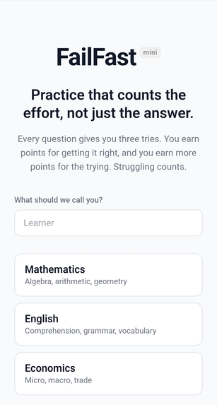
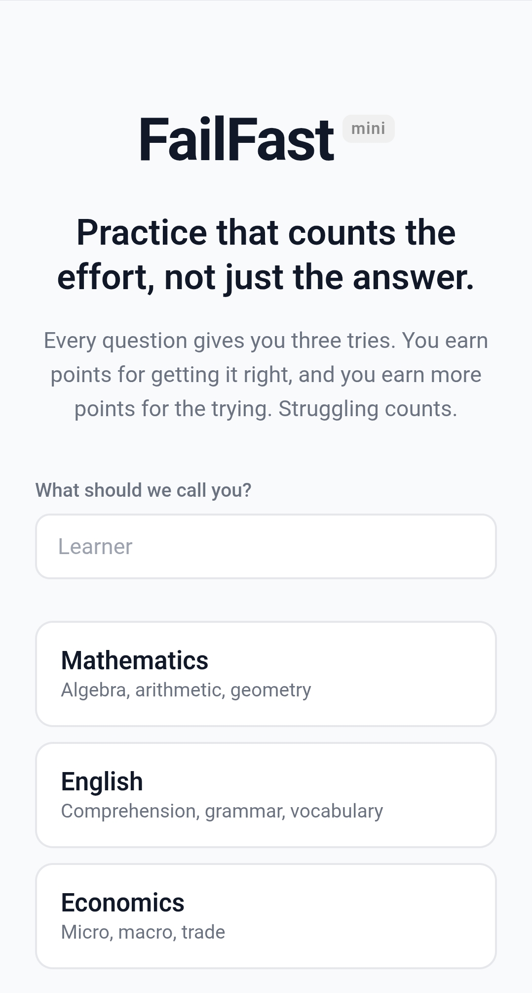
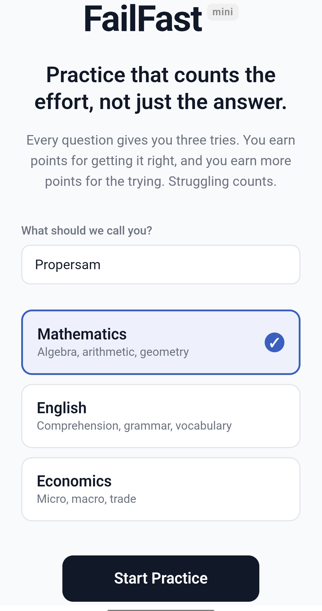
Initial Start Page
-
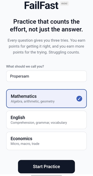
After Entering name and select subject
-

When a wrong answer is selected
-

When correct answer is selected
-
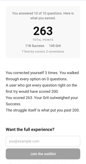
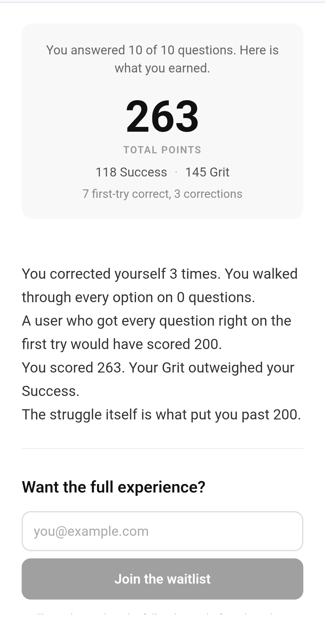
Final MicDrop Summary page


Inspiration
Most Nigerian students preparing for WAEC and JAMB have had this experience: they open a practice app, get a question wrong, see the red X, and close the app. Not because the question was too hard, but because getting it wrong felt bad enough to stop.
That reflex is not a personality trait. It was installed by years of schooling that treated wrong answers as evidence of inadequacy rather than as the actual mechanism of learning. By the time a student reaches a high-stakes exam, they have been conditioned to avoid attempting anything they might get wrong. The fear of failure becomes a greater obstacle than the subject matter itself.
FailFast Learner is a carve-out from a larger product I am building called FailFastNG. The exam-prep framing is the entry point. The real bet is behavioural: a scoring system that rewards effort over first-try correctness can produce a different emotional response at first contact. Not a quiz app with a kinder UI. An attempt to rewire the fear of failure that the educational system installed.
The mechanic has a citable foundation. Manu Kapur's research on Productive Failure at ETH Zurich shows that struggling through a problem before instruction produces learning outcomes 2–3 times better than direct instruction alone. FailFast Learner is an application of that principle, not just an intuition.
What it does
Students pick a subject (English, Mathematics, or Economics) and work through ten questions drawn from WAEC and JAMB past papers.
Each question allows up to three attempts. First-try correct earns 15 Success Points and 5 Grit. Second-try correct flips the ratio: 5 Success and 15 Grit. Third-try correct earns 3 Success and 20 Grit. Failing through all three attempts and having the answer revealed earns 0 Success and 25 Grit, the highest single-question score in the system.
Every completed session scores at least 200 points, the same as a perfect-first-try run. Sessions with deeper struggle score above 200, which is the mechanic's whole point.
The app makes its case with arithmetic, not banners or congratulatory modals. The summary screen at the end of a session shows learners exactly how their score compares to a hypothetical perfect run. In the STRUGGLE variant, where a student missed many questions but fought through, the copy reads: "You scored [X]. A student who got every question right on the first try would have scored 200." The struggle itself is the story, not a consolation footnote.
Progress persists across sessions. A level-up bar tracks the cumulative Success Points for each subject. When a student crosses the Skilled threshold, a brief modal fires: quiet, under three seconds, no confetti. The badge persists. Skilled does not regress.
How I built it
This project was built spec-first. Before writing a line of code, the idea went through a planning process that produced a scope document, a product requirements document, a technical spec, and a build checklist. I wanted to prove to myself that spec-driven development is viable for a solo developer shipping software, not just a pattern teams use. FailFast Learner is the tangible output. The workflow is the real test.
The frontend is built with Expo SDK 54 and Expo Router, exported as a static web build. React Native was new territory for me coming into this. I build in React on the web daily, but this was my first real mobile-first production project. Getting the feel right (the pacing of animations, the weight of touch interactions, and the iOS Safari rendering edge cases) required iteration I had not anticipated from a web-only background.
The backend is NestJS 11, also new to me. I have shipped in Express before, but never in a structured framework. Building the session analytics pipeline, event endpoints, and waitlist service gave me real experience with NestJS module architecture and Prisma in a deployment context.
The deployment is Cloudflare Pages for the frontend and a Dockerized NestJS container for the API. The app is live at learner.failfastng.com.
Challenges I ran into
The hardest challenge was tonal, not technical. The app had to be honest about failure without being patronising. Every wrong-answer moment, every summary screen, had to thread the line between acknowledging that something went wrong and not treating it as a shame event. The first versions of the copy were too soft and over-explained. Later versions were too clinical. The version that landed uses the mechanic itself to carry the message rather than asking the text to do interpretive work that the numbers already do.
The session analytics turned out to be more structurally complex than expected. The summary screen fires a session POST on mount, before the user can interact with the share or waitlist CTAs. That meant any action the user took after the summary loaded would not be captured in the initial POST. The fix required dedicated event endpoints that patch the session row directly on tap, with careful error handling so that a returning user's waitlist duplicate-email rejection did not block the session update.
Accomplishments that i'm proud of
Shipping a spec-first product solo, from a PRD to a live deployment, within a hackathon timeframe. The full pipeline (scope, PRD, spec, checklist, build, deploy) held together under real conditions.
The scoring mechanic behaves correctly across all four outcomes. The math is right. The wrong-answer experience has no red, no shake, no explicit failure language. The Grit Points float-up fires quietly and gets out of the way. The summary screen lets the numbers make the argument without narrating it.
The app is live and shareable. It passed iOS Safari manual testing. The OG preview renders correctly on Twitter, WhatsApp, and Facebook with full card dimensions. Anyone can open a link from a WhatsApp message and start a practice session in under ten seconds.
What I learned
Spec-driven development works solo. The planning documents were what made the build coherent when I was three days in and losing context on why specific decisions were made. The scope document, in particular, saved several design decisions from drifting.
React Native for web is viable for a product with deliberate polish requirements, but it requires more explicit handling of web-specific rendering than I expected. The gap between "it works" and "it feels right" is real and worth budgeting for.
The hardest decisions in the product were copy decisions. What words appear when a learner gets something wrong shape the entire emotional contract. The copy is what the product actually says to the person using it.
Planning the mechanics on paper before building revealed the design implications much earlier than coding would have. Writing down the four scoring outcomes and their point totals in the scope document surfaced the question of whether failing through all options should feel like punishment or acknowledgement. That question got answered in planning, not during a late-night refactor.
What's next for FailFast Learner
Full subject coverage. The current question bank covers three subjects. Expanding to full coverage is the primary item on the content roadmap.
Spaced repetition. The current session structure does not yet track which questions a student consistently misses and return them at the right interval. That layer would make the practice loop significantly more effective, and it is the most direct application of the Productive Failure research that inspired the mechanic.
The larger FailFast product. FailFast Learner is a carve-out, an exam-prep context for testing the core mechanic with a defined audience. The full product extends the same fail-forward principle to other skill domains: professional learning, creative practice, and technical skill-building.
FailFast Learner is the proof of concept that the mechanic works in a real learning context before it scales.
Built With
- cloudflare
- docker
- education
- expo.io
- failfast-arena
- failfast-edu
- failfastng
- nestjs
- oracle-cloud
- postgresql
- prisma
- productive-failure
- pwa
- react-native
- typescript

Log in or sign up for Devpost to join the conversation.