-
-
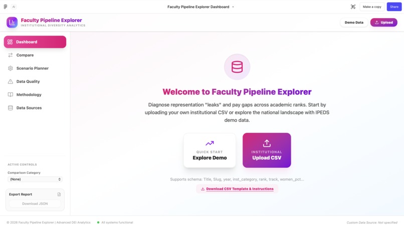
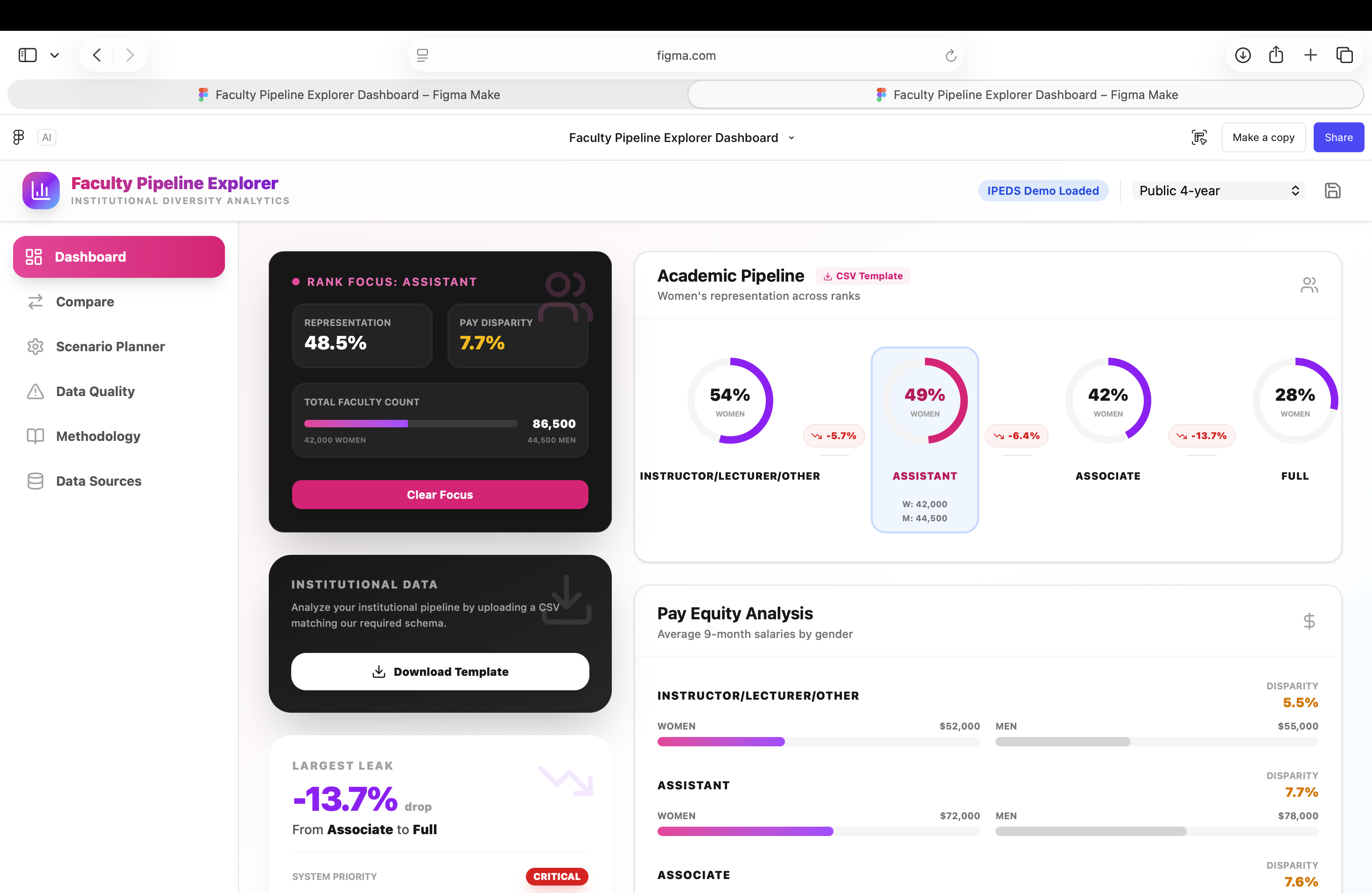
Dashboard
-
-
-


About the project
Universities can look diverse overall while still losing representation at specific promotion steps. We built Faculty Pipeline Explorer to help provost and institutional research (IR) teams identify where the pipeline leaks most, quantify pay gaps by rank, and prioritize interventions that actually move senior representation.
Example dataset
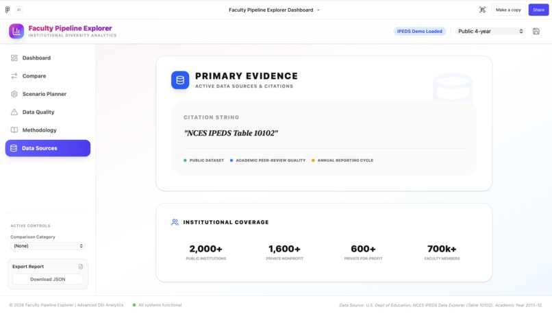
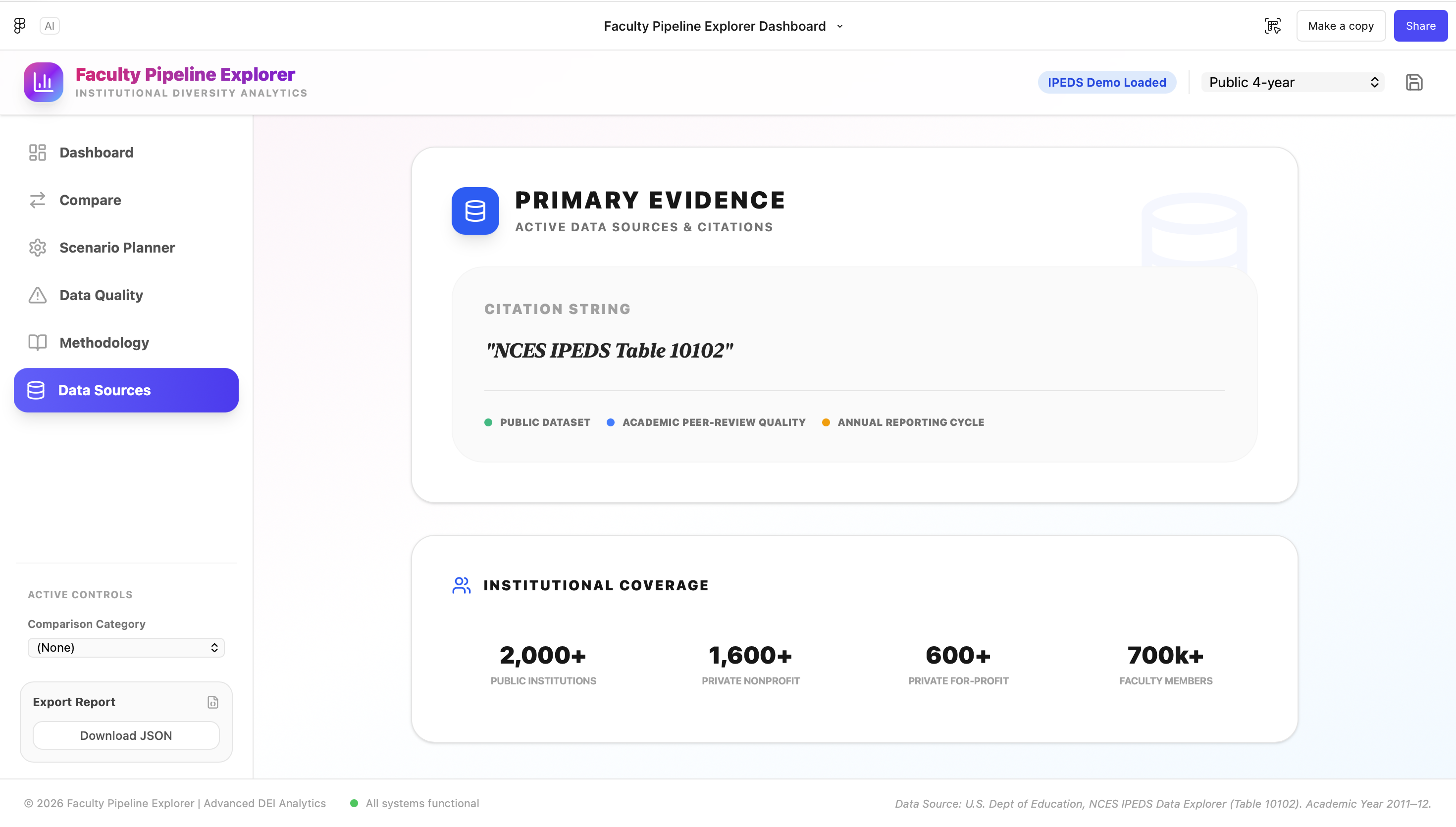
Our demo mode uses a converted, public table from the U.S. Department of Education’s NCES IPEDS Data Explorer (tableId=10102) for academic year 2011–12, which reports counts and adjusted 9‑month average salaries by academic rank, control/level, and gender.
How it works
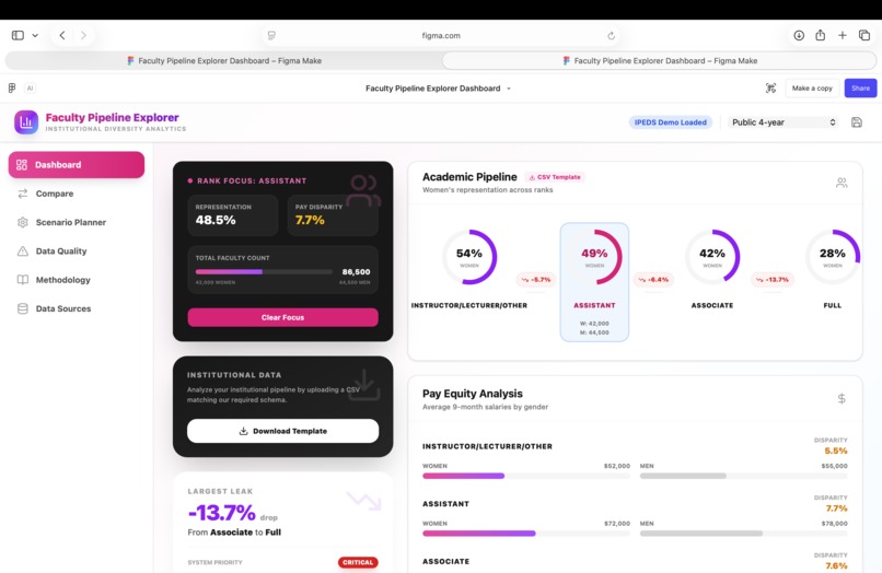
We standardize rank into a 4-step pipeline: Instructor/Lecturer/Other → Assistant → Associate → Full.
We define representation “leaks” as the change in women’s representation between adjacent ranks: [ \text{leak}(\text{from}\rightarrow\text{to}) = \text{women_pct}(\text{to}) - \text{women_pct}(\text{from}) ] A negative value indicates a drop in representation at that transition.
We define pay gap percentage by rank as: [ \text{salaryGapPct} = 100 \times \left(1 - \frac{\text{women_avg_salary_usd}}{\text{men_avg_salary_usd}}\right) ] This lets users see where pay inequity may compound representation drops.
How we built it
- Designed a strict CSV contract so any institution can upload data using the same schema (Title, Slug, year, inst_category, rank, track, women_pct, women_avg_salary_usd, men_avg_salary_usd, women_count, men_count, source).
- Implemented an interactive pipeline view (rank order fixed) and computed leak values for the selected
inst_category. - Implemented pay-gap calculations per rank with tooltips showing counts and salaries for auditability.
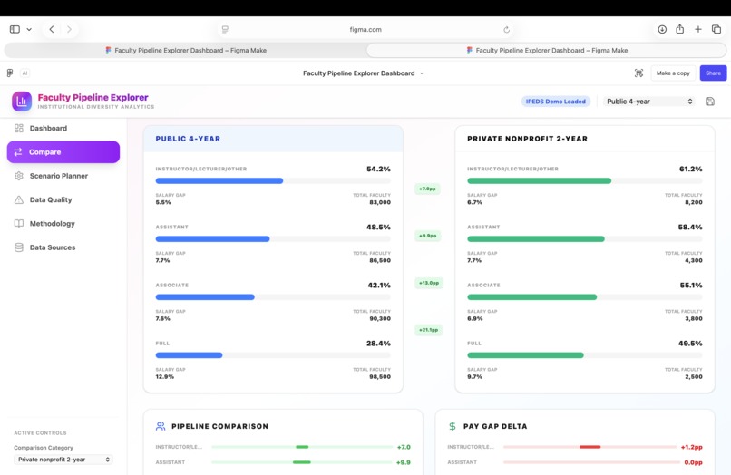
- Added comparison mode, an insight card that generates a copyable narrative, and a scenario planner to test “what if promotion improved?” without overwriting raw data.
Challenges
- Normalizing messy real-world rank labels into a consistent pipeline without losing meaning.
- Making interactions insight-driven (largest leak, worst pay gap, compounding flags) instead of just visually complex.
- Communicating methodology clearly (especially what IPEDS “adjusted 9-month average salary” means).
What we learned
The most useful visualizations behave like decision tools: they surface a non-obvious “where to act first,” provide transparent definitions, and make it easy to share a concise, defensible insight.
What’s next
- Add multi-year support to track whether leaks shrink over time.
- Expand to additional roles (chairs/deans) as a separate leadership pipeline when data is available.
- Support intersectional breakdowns when institutions can provide them responsibly.
Links / citation
- IPEDS Data Explorer table (tableId=10102): https://nces.ed.gov/ipeds/search/ViewTable?tableId=10102
Built With
- figma
- gemini

Log in or sign up for Devpost to join the conversation.