-

Factors Contributing to the Number of Passengers
-
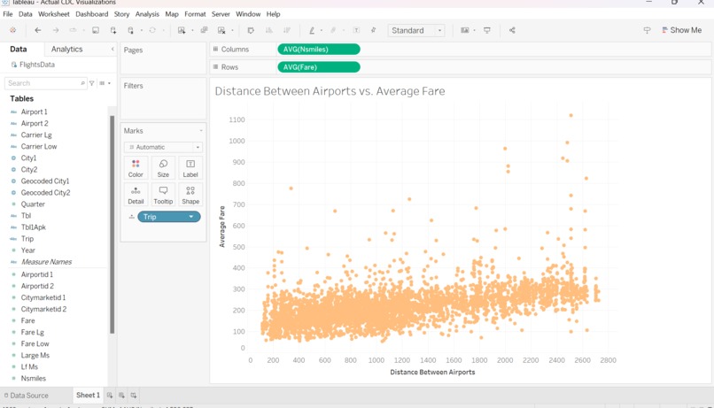
Distance vs. Average Fare
-
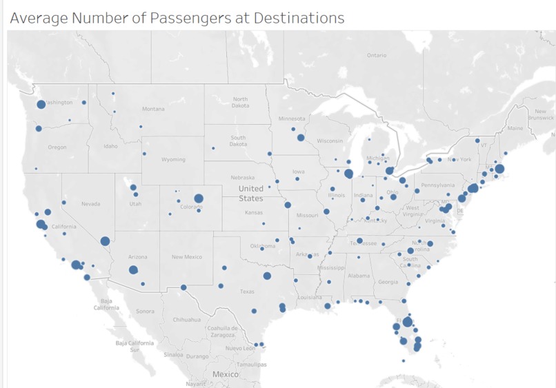
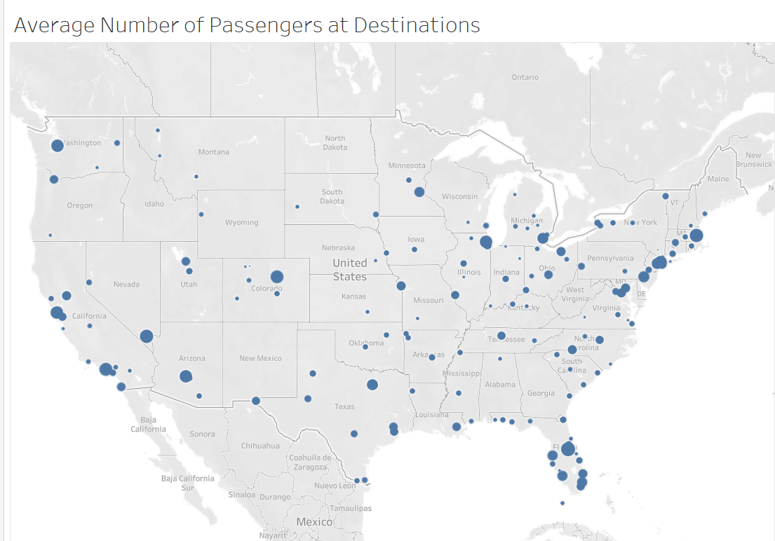
Average Number of Passengers at Destinations Map
-
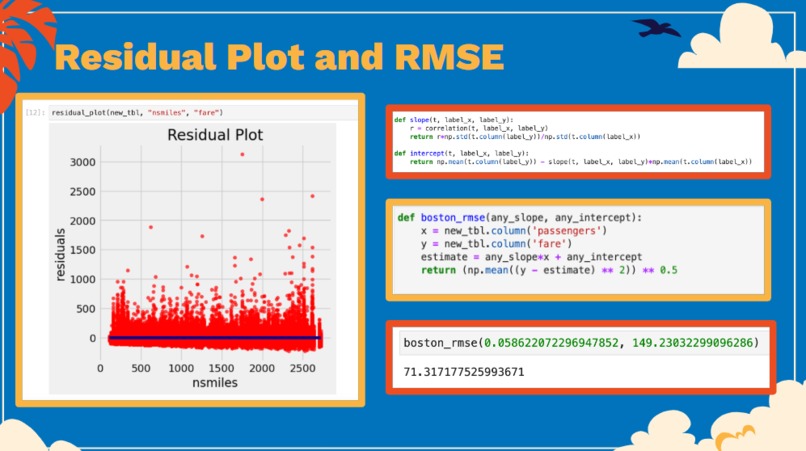
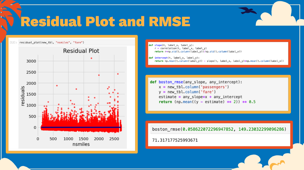
Residual Plot and RSME

Inspiration
When we were discussing ideas to work on this project, we both learned that we really enjoy travelling! After seeing that flight information was provided as a data set, we decided that this would be a good topic to surround our project.
What it does
We created a variety of data tables and visualizations in order to see the relationship between passengers and different explanatory variables such as average fare, distance of flight, time of year, and flight destination.
How we built it
We used Excel, Python, and Tableau in order to create our tables and visualizations.
Challenges we ran into
While working on this project, we ran into a few computer issues. At times, our computers were moving quite slow and occasionally crashed. But we were able to push through and finish our work! We also had limited knowledge of Tableau, so we had to take some time to learn how to create some of our visualizations.
Accomplishments that we're proud of
We're happy we were able to produce what we have for this project! We're especially proud of our visualizations and the residual plot that we made.
What we learned
We learned how to use Tableau for a variety of purposes. We learned about the possible relationships between certain factors and passenger volumes.
What's next for Factors Contributing to the Number of Passengers
To continue this project and help airlines optimize revenue, our next step would be to create a dynamic pricing model using factors such as economic indicators, market trends, and historical data. We would also analyze social media trends or sentiment related to travel to see how they correlate with passenger numbers. It introduces qualitative data and help us understand what passengers think.

Log in or sign up for Devpost to join the conversation.