🏎️ Inspiration
Formula 1 generates an enormous amount of race data, but most fans only see the final race results. We wanted to create an interactive dashboard that makes race analytics easy to understand for everyone. Our goal was to transform raw race data into meaningful visual insights that allow users to explore driver performance, compare strategies, and better understand what happened during a race.
📊 What it does
F1 Insight is an interactive Formula 1 analytics dashboard that allows users to:
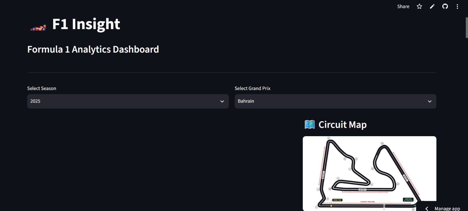
- Select different Formula 1 seasons and Grand Prix events.
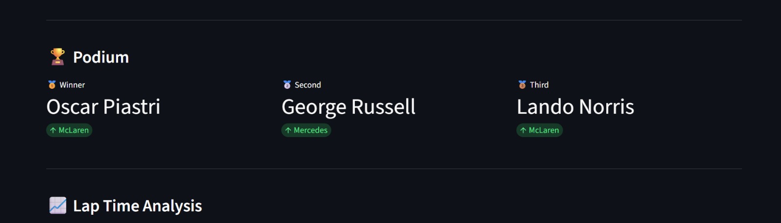
- View the complete race leaderboard and podium finishers.
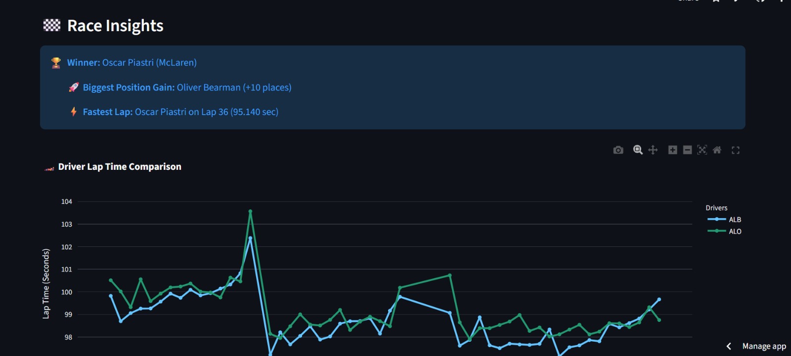
- Compare lap times between any two drivers.
- Visualize tyre strategies throughout the race.
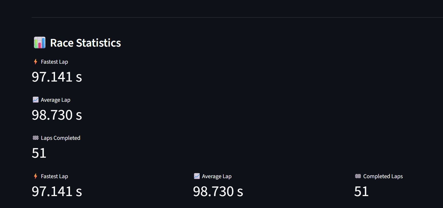
- Display race statistics such as fastest laps and average lap times.
- Generate race insights including the race winner, biggest position gain, and fastest lap.
- Display the selected circuit map for a more immersive experience.
The dashboard helps transform complex race data into clear and interactive visualizations.
🛠️ How we built it
We built F1 Insight using:
- Python as the primary programming language.
- Streamlit for creating the interactive web application.
- FastF1 to access official Formula 1 race data.
- Plotly for interactive charts and visualizations.
- Pandas for data processing and analysis.
- Git & GitHub for version control and deployment.
The application loads official race data, processes it into useful statistics, and presents it through an intuitive dashboard.
🚧 Challenges we ran into
One of our biggest challenges was learning an entirely new technology stack within a very limited time.
We encountered issues such as:
- Understanding how FastF1 structures race data.
- Handling Streamlit caching and deployment.
- Fixing cache directory issues when deploying to Streamlit Cloud.
- Converting lap time data into formats suitable for visualization.
- Designing an interface that remained simple while presenting multiple analytics features.
Each challenge helped us better understand Python, data visualization, and deployment workflows.
🏆 Accomplishments that we're proud of
We're proud that we successfully built a fully functional Formula 1 analytics dashboard in a short amount of time.
Some highlights include:
- Interactive race leaderboard.
- Driver comparison using lap time analysis.
- Team-colored performance graphs.
- Tyre strategy visualization.
- Automatic race insights.
- Circuit map integration.
- Successful cloud deployment.
Most importantly, we transformed raw racing data into an experience that is both informative and engaging.
📚 What we learned
Throughout this project we learned:
- How to work with real-world sports datasets.
- Building interactive dashboards using Streamlit.
- Using FastF1 to analyze Formula 1 race sessions.
- Creating effective visualizations with Plotly.
- Deploying Python applications to the cloud.
- Managing project development using Git and GitHub.
Beyond the technical skills, we also learned the importance of rapid prototyping, debugging, and building under tight hackathon deadlines.
🚀 What's next for F1 Insight
We plan to continue improving F1 Insight by adding:
- AI-generated race summaries and predictions.
- Driver and constructor championship standings.
- Pit stop analysis.
- Sector time comparisons.
- Qualifying session analysis.
- Historical race comparisons.
- Live race analytics during Grand Prix weekends.
- Mobile-friendly responsive design.
Our long-term vision is to build F1 Insight into a comprehensive Formula 1 analytics platform for fans, students, and motorsport enthusiasts.


Log in or sign up for Devpost to join the conversation.