-
-
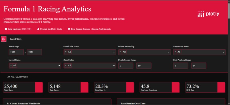
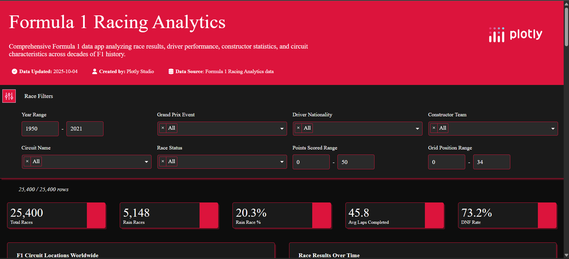
Formula 1 Racing Analytics
-
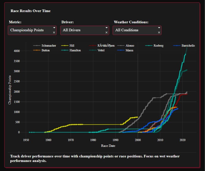
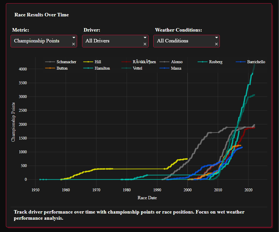
Track driver performance over time with championship points or race positions
-
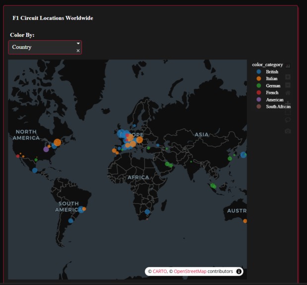
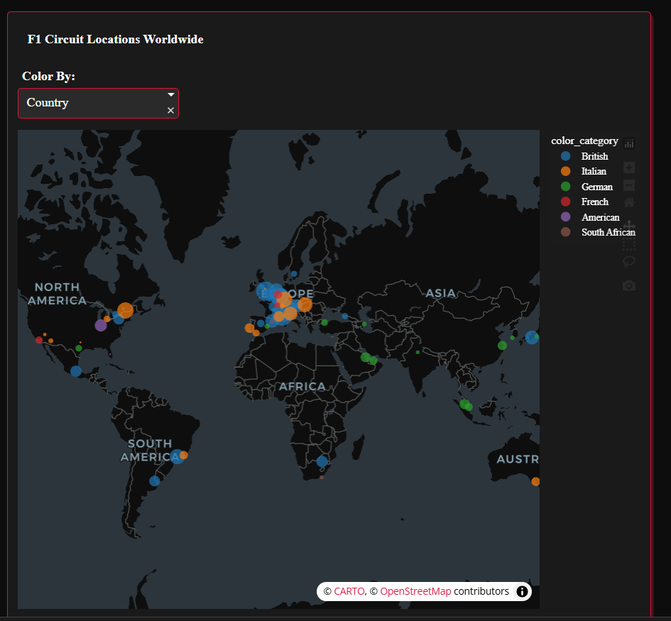
Interactive map showing Formula 1 circuit locations with filteres to show different countries, constructors and event types
-
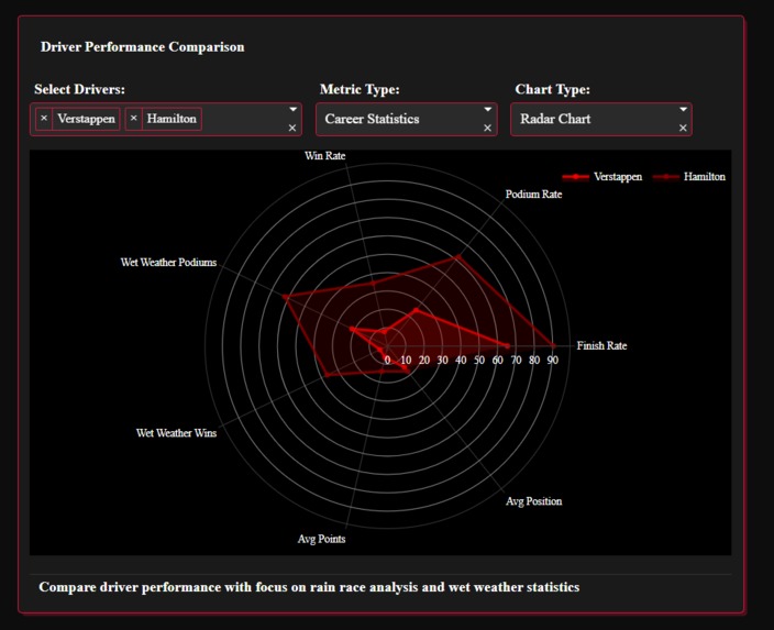
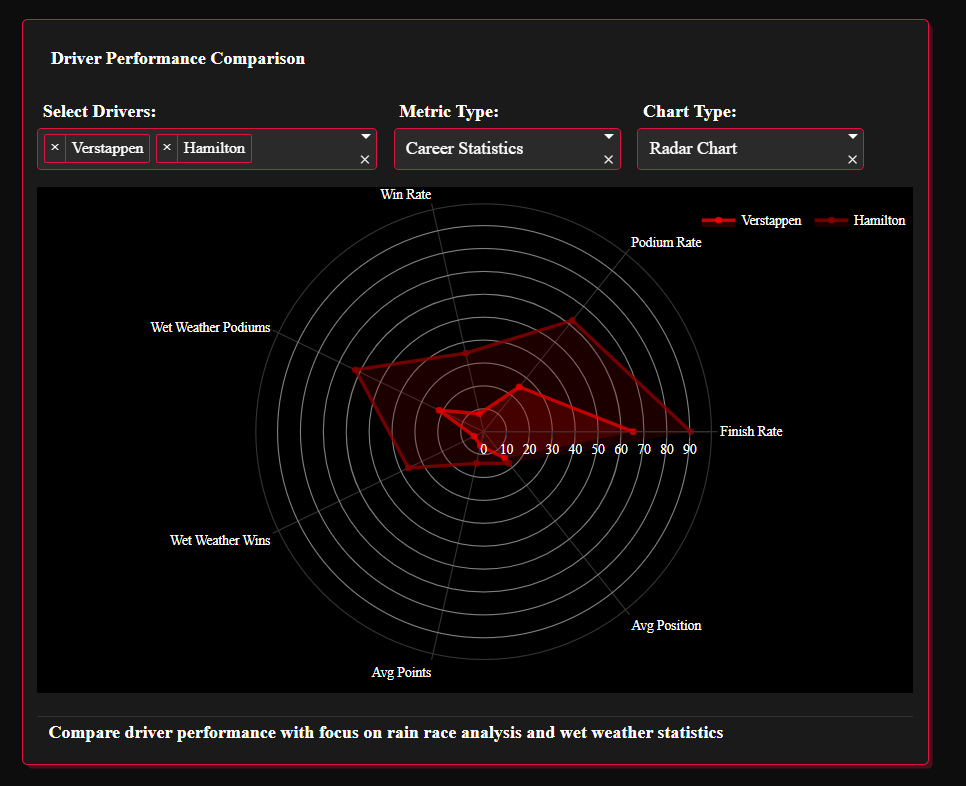
Compare driver performance
-
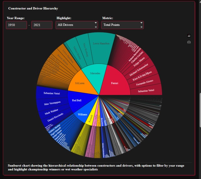
Sunburst chart showing the hierarchical relationship between constructors and drivers
-

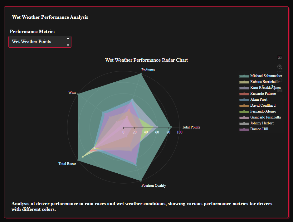
Wet Weather Performance Analysis
-
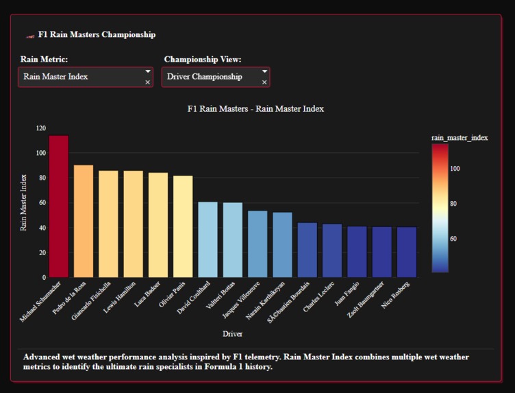
Rain Specialists
-
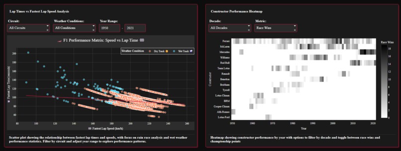
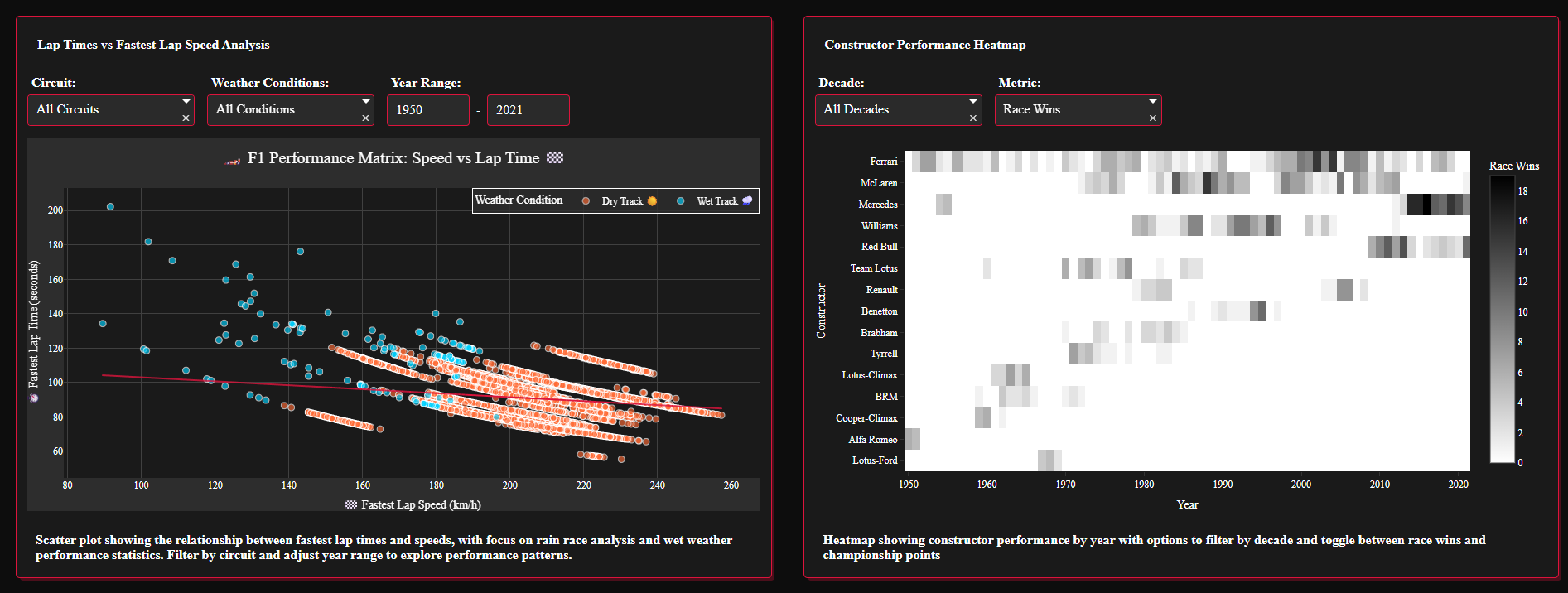
Lap Times vs Fastest Lap Speed Analysis and Constructor Performance Heatmap


Formula 1 Racing Analytics
Inspiration
My inspiration was to move beyond a typical sports dashboard. Formula 1 is a sport incredibly rich with data, but its story is often told through simple leaderboards. I wanted to create a narrative-driven, visual experience that tells the story of the sport's history, global expansion, and the legendary drivers who defined its eras. My goal was to build an application that was not only analytically powerful but also beautiful and engaging enough for any F1 enthusiast to explore and discover something new.
What it does
This is a fully interactive dashboard for exploring over 70 years of Formula 1 history. The application allows users to: Explore Historical Data: Interactively browse through decades of race results, driver standings, and constructor information. Analyze Legendary Drivers: Compare the careers of iconic drivers, from Fangio to Schumacher to Hamilton, across different eras and metrics. Uncover Unique Insights: A special "Rain Specialist" analysis identifies drivers who have historically performed best in wet conditions.
How we built it
This application was built entirely within Plotly Studio, leveraging its powerful combination of natural language prompts for rapid prototyping and direct code editing for fine-tuning and debugging.
Challenges we ran into
The primary challenge was significant network instability encountered when trying to integrate a live external API. This caused timeout errors and a poor user experience. Instead of allowing this to compromise the project's quality, I made a strategic decision to pivot. I removed the live data functionality to guarantee a fast, stable, and seamless application for the hackathon. This challenge taught me the valuable real world lesson that a polished, fully functional product is always superior to a more complex but unreliable one.
Accomplishments that we're proud of
I am incredibly proud of several key accomplishments: Creating a truly "jaw-dropping" animated map that tells a clear and compelling story of F1's history. The successful data engineering required for the "Rain Specialist" analysis, which involved creating a new metric from existing data to generate a unique insight. Overcoming numerous bugs and architectural challenges to deliver a fully functional, visually cohesive, and polished application. Designing a professional and intuitive user interface with a consistent, F1-inspired dark theme where every component is polished and functional.
What we learned
This project was an immense learning experience. Key takeaways include: The power of rapid prototyping with natural language tools. The importance of adaptability when faced with unexpected technical roadblocks. Advanced data manipulation and visualization techniques within Plotly. The critical role of a well-designed UI in creating an engaging user experience.
What's next for Formula 1 Racing Analytics
The foundation of this app is incredibly strong. Future development could include: Re-integrating a stable, live data feed for real-time race information. Adding more advanced statistical models, such as driver performance predictors. Expanding the analysis to include technical data from the cars themselves. Creating a mobile-responsive version for on-the-go access.
Built With
- plotly
- plotlystudio


Log in or sign up for Devpost to join the conversation.