-
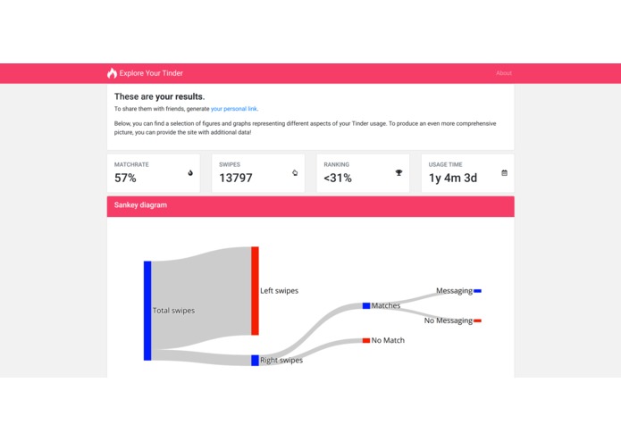
The main view the data analysis.
-
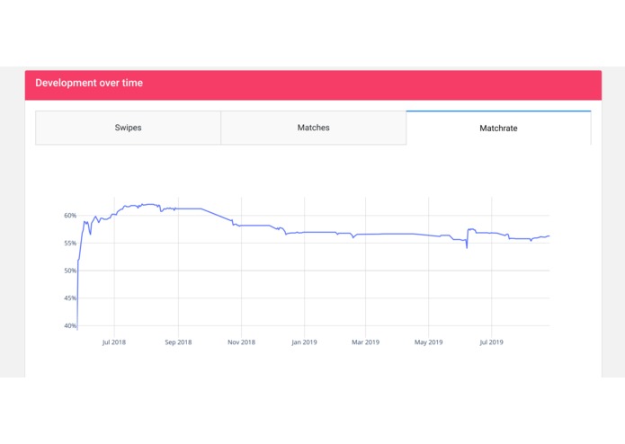
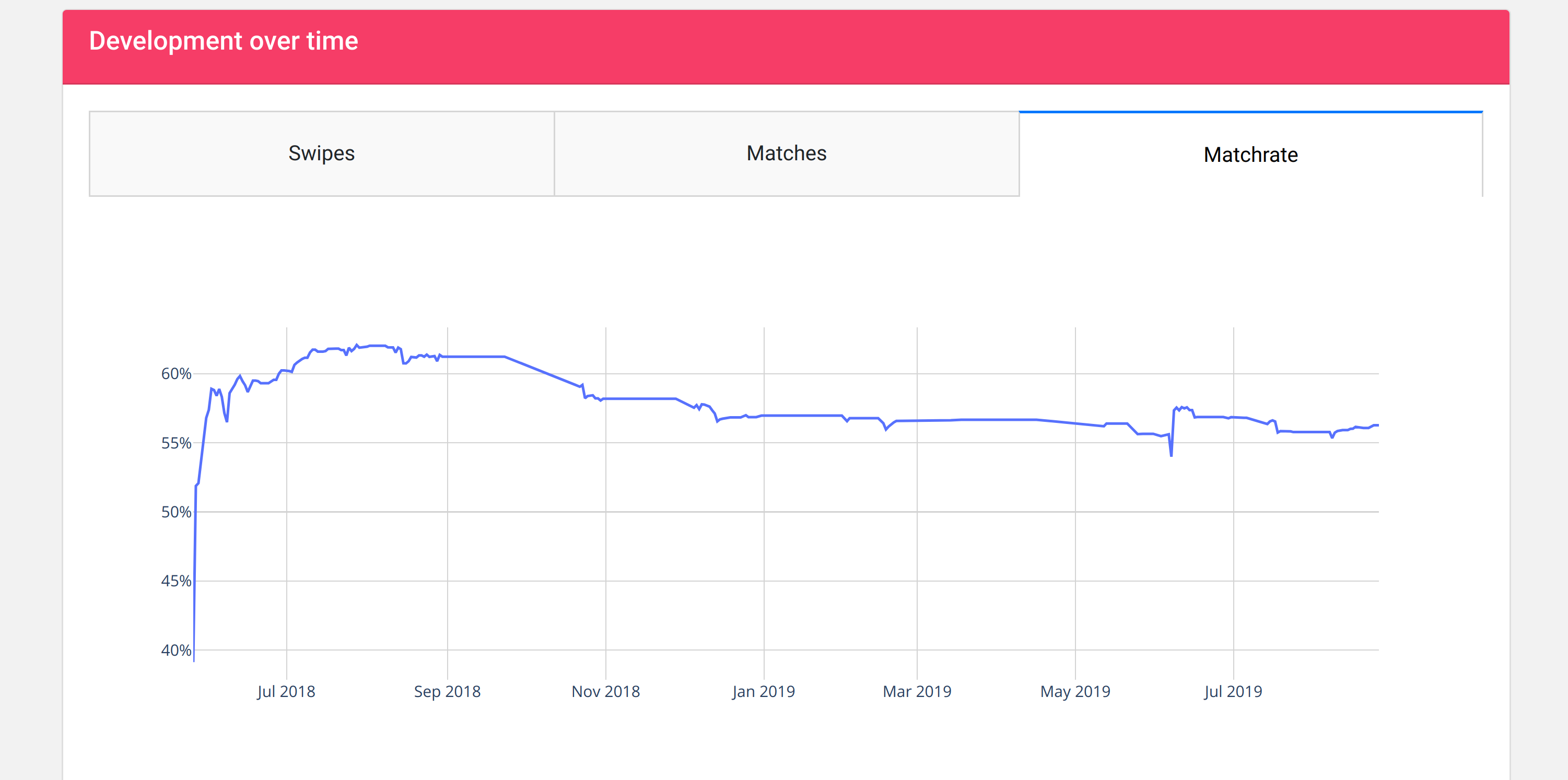
Additional graphs providing more detailed information, e.g. how the usage developed over time.
-
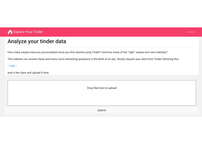
The landing page containing instructions from where to get the data.


A web application visualizing Tinder user data.
Tinder is the biggest online dating application with millions of users. Recently, the company behind Tinder started providing users access to their usage data. However, a concise visualization seems out of reach for the average user. That’s why we created an intuitive and easy-to-use web application to access and visualize this data.
The data itself is quite interesting: Wouldn't you want to know how successful your search for a partner ;) is compared to others? Or simply how many swipes you have accumulated over the course of actively using the app?
Surprisingly, a visualization app is not yet available making it the perfect opportunity for us to develop a scalable and useful app for the many. In addition, using Tinder ourselves and chatting with friends about the ups and downs of the dating experience, we reckoned it to simply be a fun project matching our skill level.
As we both have a physics background, we are quite used to analyzing and even producing data ourselves. On the other hand, we lack a lot of experience in web development but told ourselves that web development ain't rocket science. A not too rigorous investigation on our site and we decided to build our app with Plotly Dash. However, embedding a Dash app into a Flask app environment introduced some complicated issues into the architecture of the project that slowed us down big-time.
We learned that stuff takes always at least double the amount of time that you estimate beforehand.


Log in or sign up for Devpost to join the conversation.