-
-
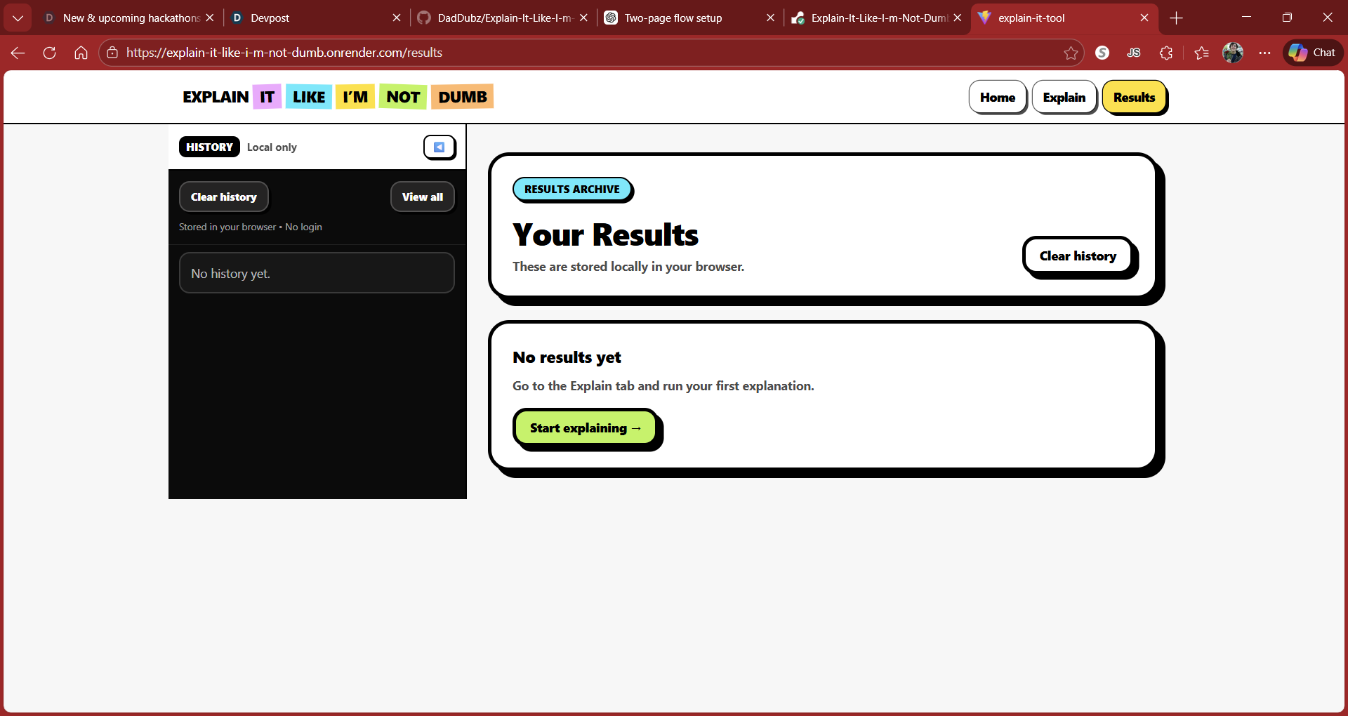
Result Page
-
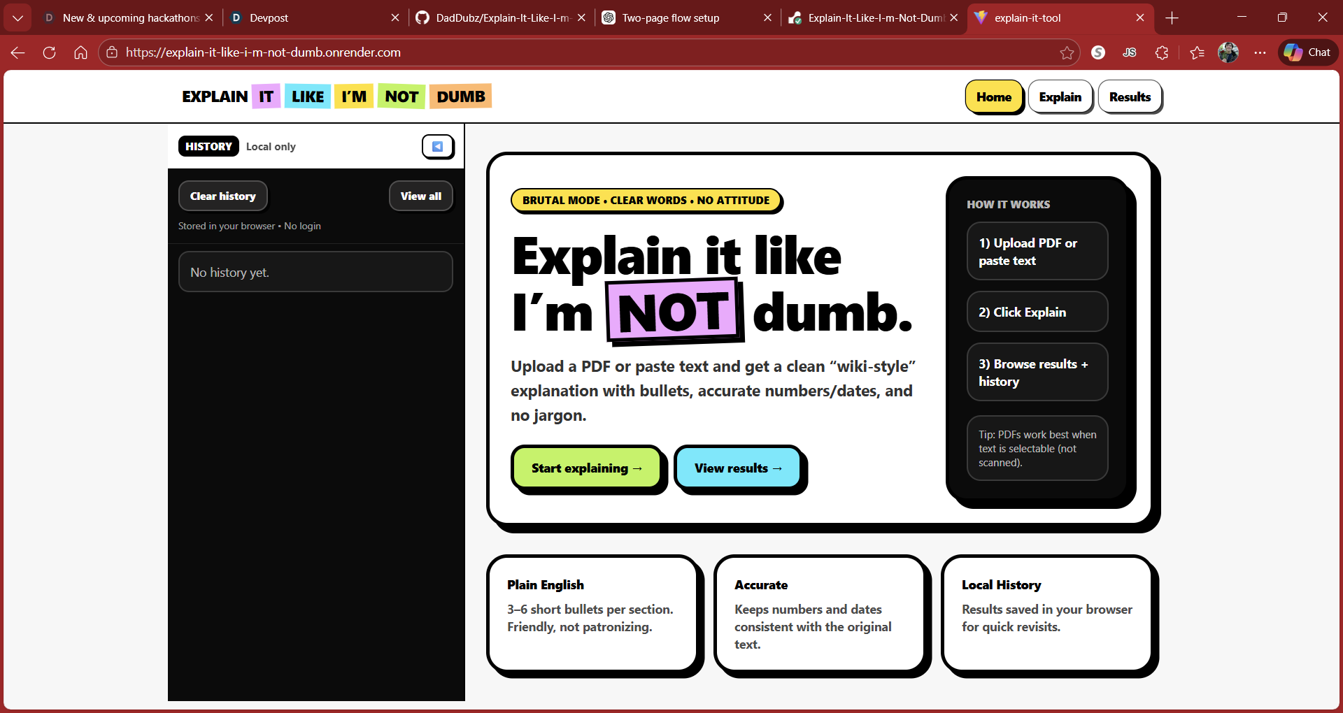
Home Page
-
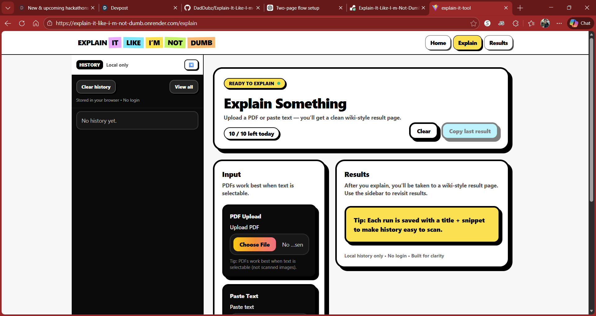
Explain Page
Inspiration
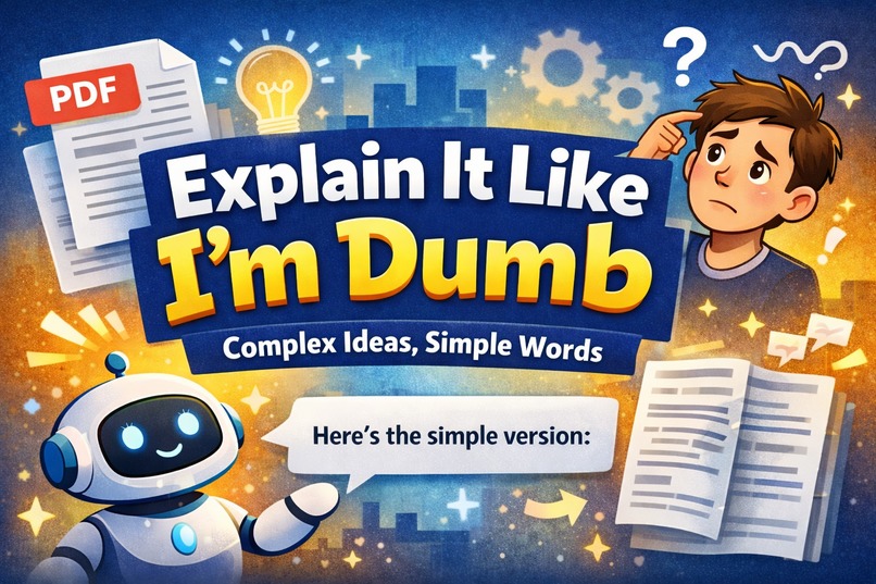
Most tools that “explain” complex information still assume a lot of background knowledge. Manuals, PDFs, legal documents, academic papers, and even workplace documentation often leave people feeling confused—or worse, stupid for not understanding.
I wanted to build something that does the opposite.
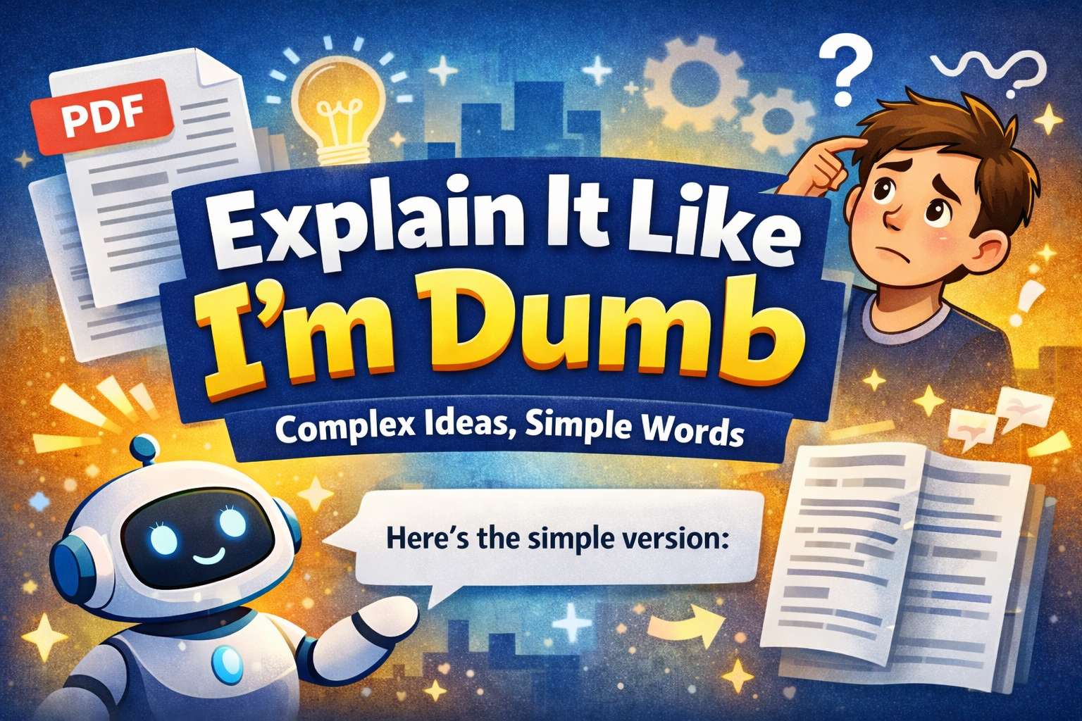
Explain It Like I’m Dumb was inspired by the idea that clarity should feel human, respectful, and accessible. If someone doesn’t understand something, that’s a design failure—not a personal one. This project is about removing unnecessary complexity and replacing it with clear, friendly explanations in plain English.
What it does
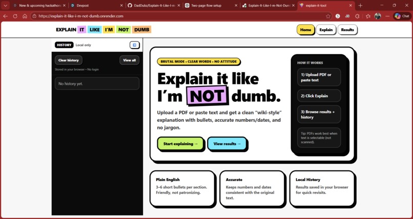
Explain It Like I’m Dumb takes text or PDFs and breaks them down into simple, understandable explanations—without jargon or condescension.
Users can:
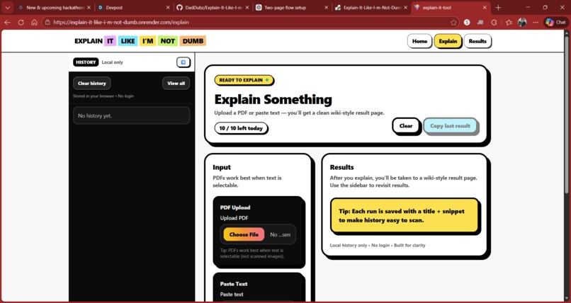
- Paste in text or upload a PDF
- Receive paragraph-by-paragraph explanations in plain English
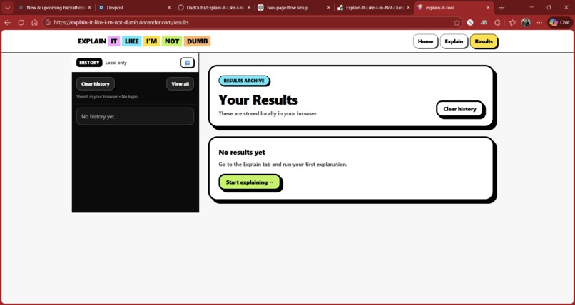
- View their most recent explanations through saved local history
- Use the tool within a daily usage limit to keep it lightweight and fair
- The goal isn’t to “dumb things down,” but to make understanding feel approachable.
How I built it
The project is a full-stack web application with a clean separation between frontend and backend:
- The frontend is built with React and TypeScript, using Vite for fast development and Tailwind CSS for a simple, professional interface.
- The backend is a Node.js + Express server that handles requests and communicates securely with the OpenAI API.
- The application processes text input by sending it to the backend, which generates clear explanations and returns structured results to the UI.
- Usage limits and history are handled locally to keep the app lightweight while still feeling complete.
I focused heavily on:
- Clear UX
- Minimal visual noise
- Predictable behavior
- Respectful language
Challenges & lessons learned
One of the biggest challenges was scope control. It’s easy to keep adding features but finishing something usable and polished was more important than overengineering.
Other challenges included:
- Properly handling environment variables and API security
- Designing a UI that feels professional without looking “AI-generated”
- Managing conditional rendering for landing pages, history views, and usage limits
- Making sure the app failed gracefully when limits were reached or errors occurred
This project reinforced the importance of:
- Building incrementally
- Keeping the user experience simple
- Treating clarity as a feature, not an afterthought
What’s next
Future improvements could include:
- User accounts for persistent history
- Adjustable explanation depth
- Exporting explanations
- Accessibility improvements
- Mobile-first refinements
But for now, the project achieves its core mission: helping people understand things without feeling talked down to.
Built With
- actions
- api
- ci/cd)
- css
- express.js
- github
- localstorage
- node.js
- openai
- react
- tailwind
- typescript
- vite
