Inspiration
The inspiration behind ExpensiveUS came from the need to provide a clear comparison of the cost of living across different U.S. states for individuals from various countries. Many people moving to the U.S. struggle to understand whether their expected salary can cover the living expenses in a particular state. Our project aims to make this information accessible and visually appealing.
What it does
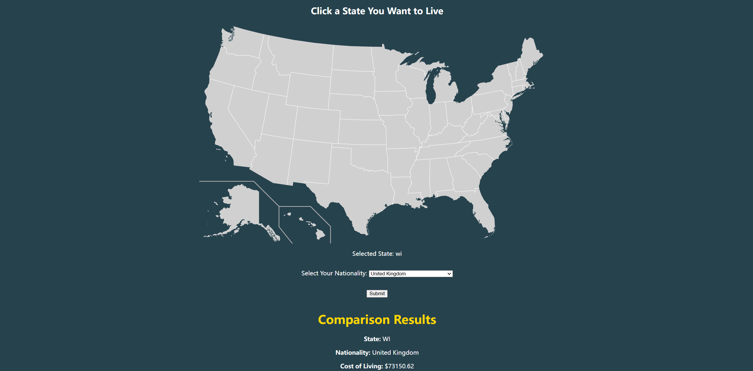
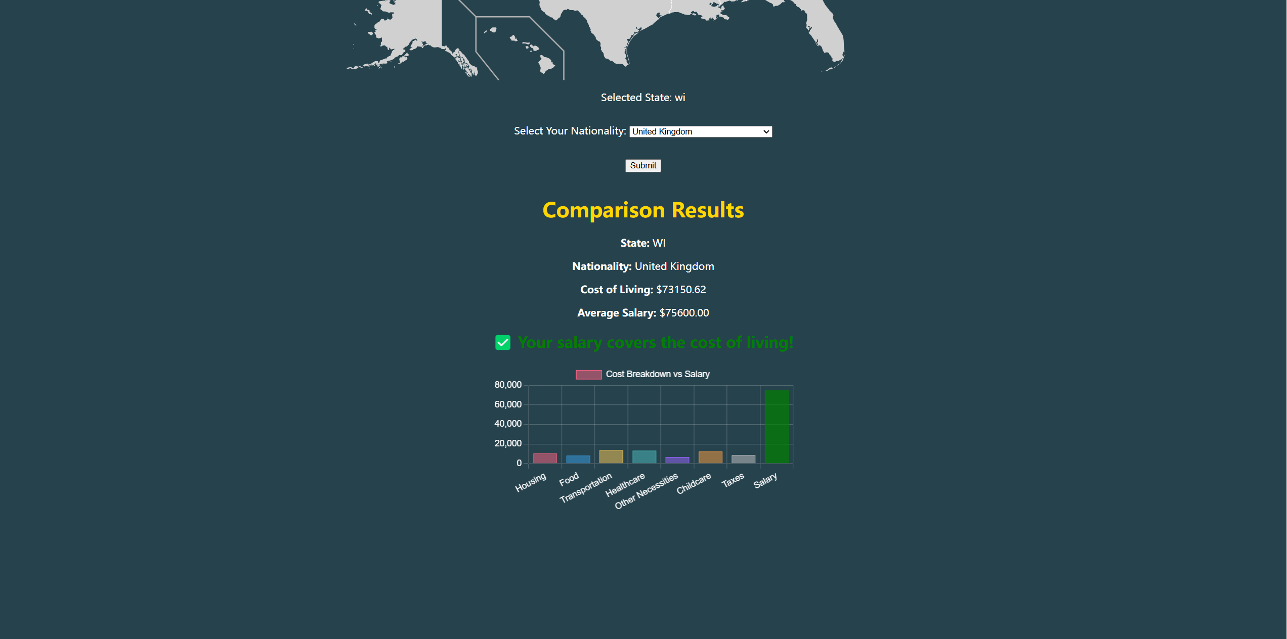
ExpensiveUS allows users to: Select a U.S. state by interacting with an interactive SVG map. Choose their nationality from a dropdown list. Retrieve and compare cost of living and average salary data. View a detailed bar graph that visualizes key financial metrics. Receive an instant analysis on whether their salary can cover the living costs in the selected state.
How we built it
Frontend: HTML, CSS, and JavaScript for an interactive user interface. The state selection is enabled via an embedded SVG map. Backend: Java (using Spark framework) to handle requests and process cost of living and salary data. Data Handling: CSV files containing detailed cost and salary data, parsed and stored using Java’s HashMap for efficient lookups. Visualization: We used Chart.js to create an informative bar chart, comparing expenses and income.
Challenges we ran into
Handling CSV data efficiently: Mapping states and country names correctly was tricky due to format inconsistencies (e.g., state abbreviations vs. full names). SVG interaction: Ensuring smooth click detection and event handling for the embedded map. Centering the map and results page: CSS styling issues made it challenging to perfectly align the content. Debugging JavaScript and API calls: Getting data to display correctly and match user input required multiple fixes.
Accomplishments that we're proud of
Successfully integrating an interactive SVG map with data-driven results. Implementing a clean and responsive UI, improving the user experience. Generating visual comparisons through bar charts, making data easier to interpret. Overcoming Java’s CSV parsing and HashMap lookup issues, ensuring accurate data retrieval.
What we learned
The importance of data format consistency when working with external datasets. How to handle dynamic content with JavaScript and interact with Java-based backend services. Effective ways to use Chart.js for displaying financial comparisons. The power of CSS flexbox and positioning techniques for responsive UI design.
What's next for ExpensiveUS
Expanding the dataset to include more financial factors, such as taxes and healthcare costs. Adding filters for users to specify job industries for a more precise salary comparison. Implementing real-time updates by fetching live cost of living data. Improving mobile responsiveness to ensure the tool works seamlessly across devices. Enhancing UI/UX design with animations and a more user-friendly interface.


Log in or sign up for Devpost to join the conversation.