-
-
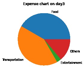
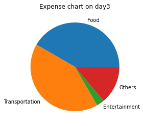
Expense chart for a particular day
-
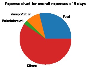
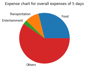
Expense chart for overall data
Inspiration
To get started with data visualization using matplotlib
What it does
It helps us to visualize our expenses in pie charts so that we can manage our expenses effectively
How we built it
I used google colab for implementing this project. I have also used python libraries such
Challenges we ran into
Importing excel file. I tried to make the file importing process more dynamic so that it will become user friendly.
Accomplishments that we're proud of
I completed my first data science project on my own
What we learned
Mounting google drive to colaboratory notebook, Importing data using pandas and data visualization using matplotlib
What's next for Expense calculator
- Adding many visualization features and make it easy for user to use
- Deploying it to a user friendly web app.
- New features to handle very large excel sheet data

Log in or sign up for Devpost to join the conversation.