-
-
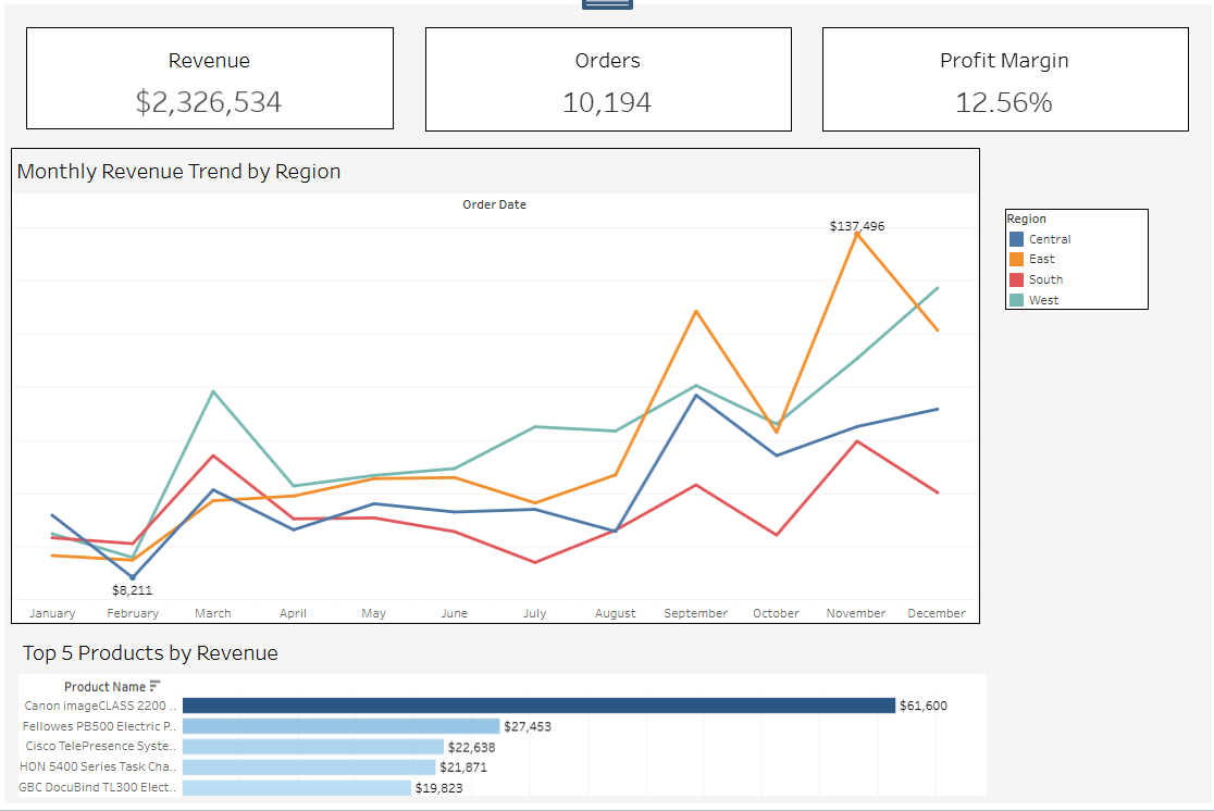
Dashboard
-
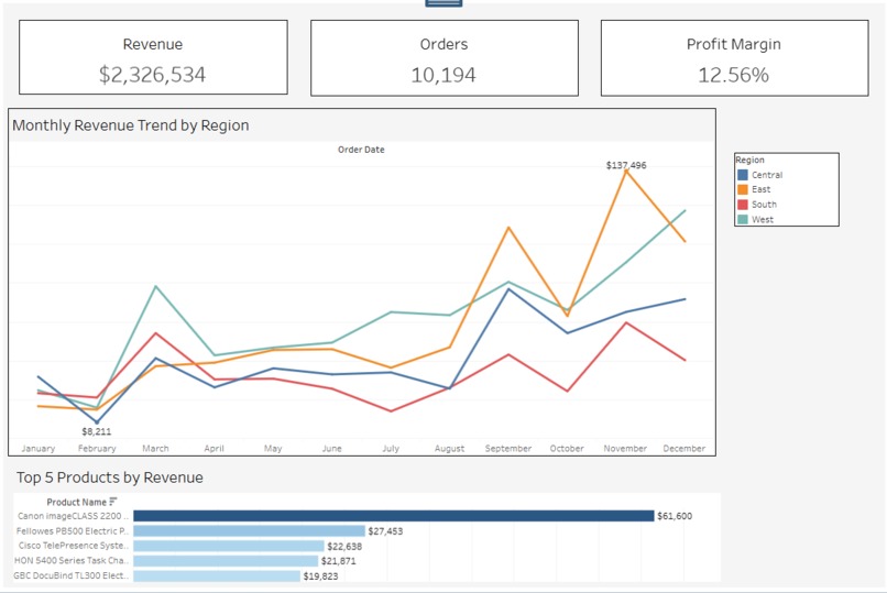
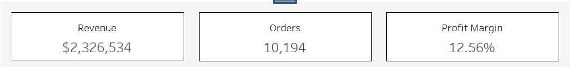
KPI cards
-
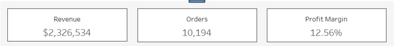
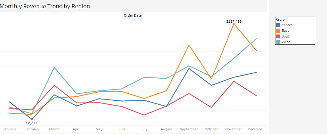
Monthly Revenue chart
-

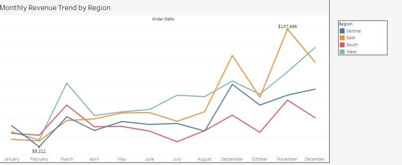
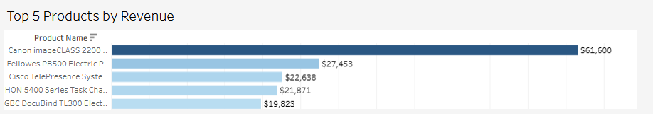
Top 5
Inspiration
Decision-makers often struggle with scattered data, outdated reports, and dashboards that show information but do not explain performance. I wanted to build a clean, modern solution that helps executives instantly understand how the business is performing—and why.
My goal was to create something simple enough for leadership, yet powerful enough for analysts.
What It Does
The Executive Decision Intelligence Dashboard centralizes the most important business metrics into a single interactive view.
It provides:
- A clear snapshot of KPIs (Revenue, Orders, Profit Margin)
- Monthly revenue trends with regional comparison
- Performance insights by geographic region
- A ranked list of the Top 5 revenue-generating products
The dashboard answers:
- “How are we performing?”
- “Where are we growing or declining?”
- “Which regions or products need attention?”
- “What should leadership focus on right now?”
How I Built It
- Built in Tableau Cloud
- Used the Sample Superstore dataset as the foundation
- Created calculated fields for KPIs and profit margin
- Designed KPI cards for executive readability
- Built monthly trend line charts for revenue performance
- Added regional breakdown charts for diagnostic insights
- Selected top products using ranking + filtering logic
- Styled the dashboard for clarity, spacing, and storytelling
My focus was on clean design, practical usability, and real business impact.
What I Learned
- Designing dashboards for executives requires simplicity, clarity, and storytelling
- How to build KPI cards, custom calculations, and trend visualizations in Tableau
- How layout, spacing, and minor formatting choices dramatically affect readability
- How to organize data into a narrative that leads the user from “overview → insight → action”
Challenges we ran into
- Making the layout balanced and visually clean
- Ensuring KPIs looked consistent and professional
- Controlling chart spacing and formatting inside Tableau Cloud
- Optimizing the dashboard for clarity without overwhelming the user
- Turning raw metrics into meaningful insights
Overcoming these helped me build a polished, decision-ready experience.
What's next for Executive Decision Intelligence Dashboard
- Add drill-downs for product categories and customer segments
- Integrate real business data via Tableau APIs
- Add forecasting for revenue using statistical models
- Add alerting or automated insights for executives
The goal is to evolve this into a full intelligence system that guides decisions, not just displays charts.
Accomplishments That We're Proud Of
- Built a polished, executive-grade dashboard with clean KPI cards, trend insights, and regional breakdowns
- Created a complete data story that moves from high-level performance → trends → root cause → opportunities
- Transformed raw data into actionable insights that make sense for business leaders
- Overcame major layout and formatting challenges in Tableau Cloud to achieve a professional design
- Optimized visual clarity, spacing, and structure so that the dashboard feels intuitive and easy to navigate
- Applied real BI planning principles—KPI definition, diagnostic visuals, and prioritization of insights
- Achieved a modern, consistent aesthetic suitable for hackathon judging standards
- Completed the entire build solo, learning every component hands-on
These accomplishments reflect not only the dashboard itself, but also the learning, discipline, and design thinking behind it.

Log in or sign up for Devpost to join the conversation.