-
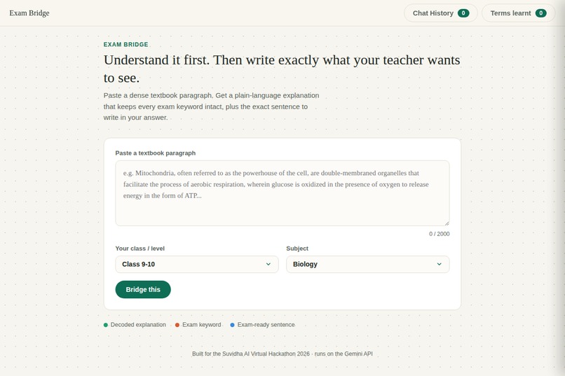
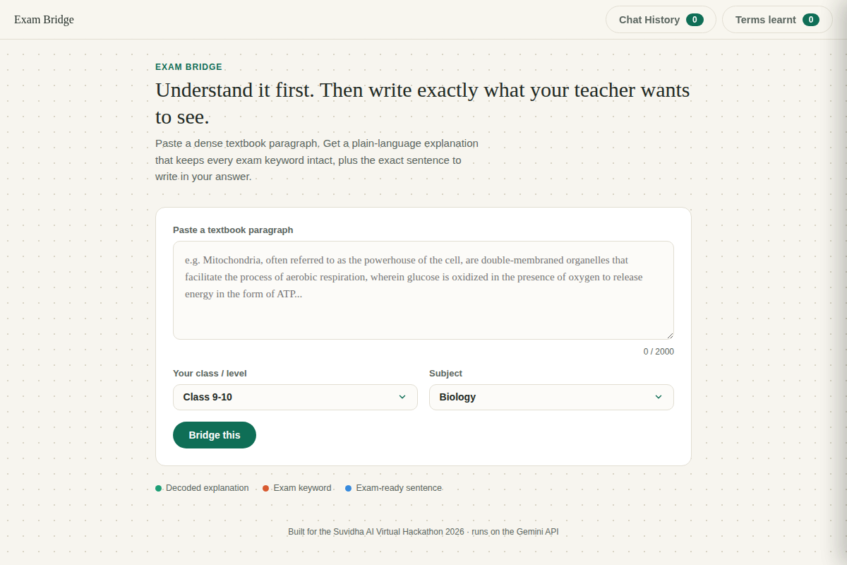
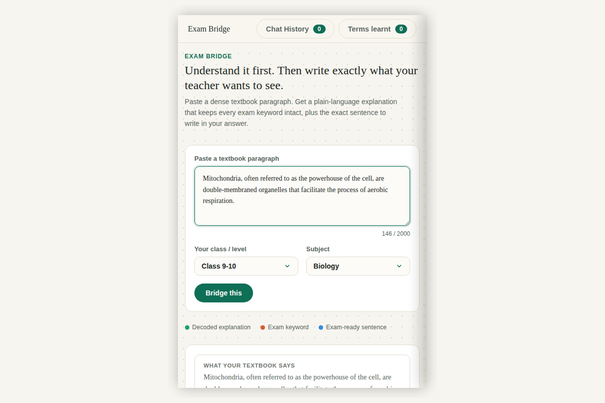
Paste a dense textbook paragraph, pick your class and subject, and hit Bridge this to get started.
-
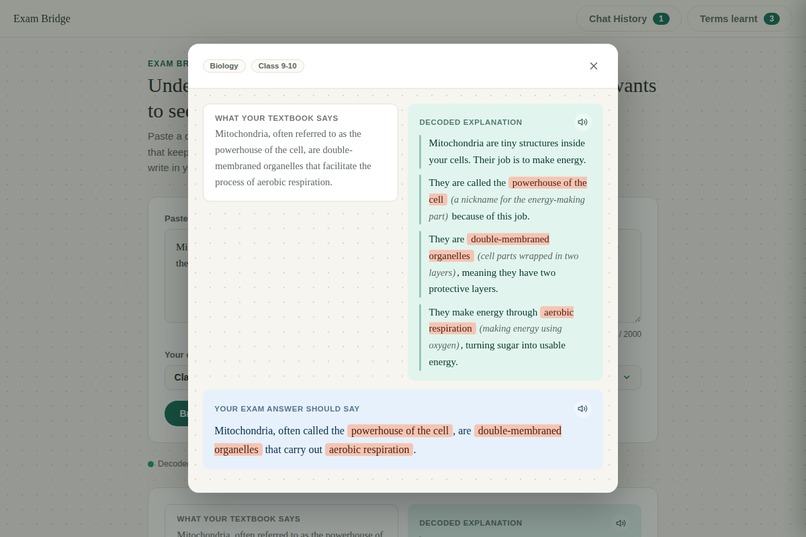
Click a past entry to reopen its full result, exactly as it looked the first time.
-
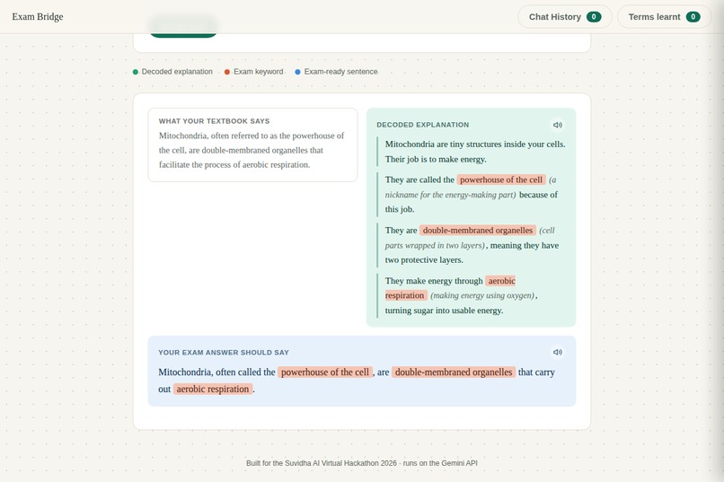
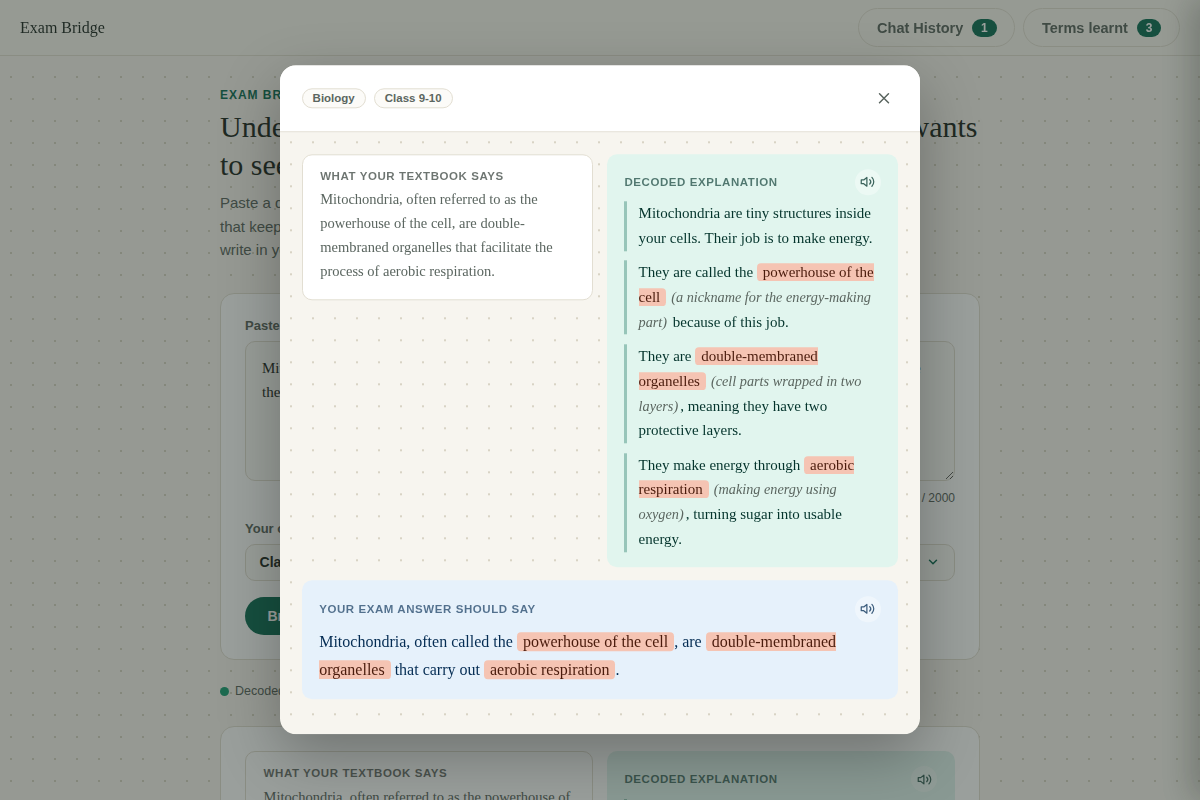
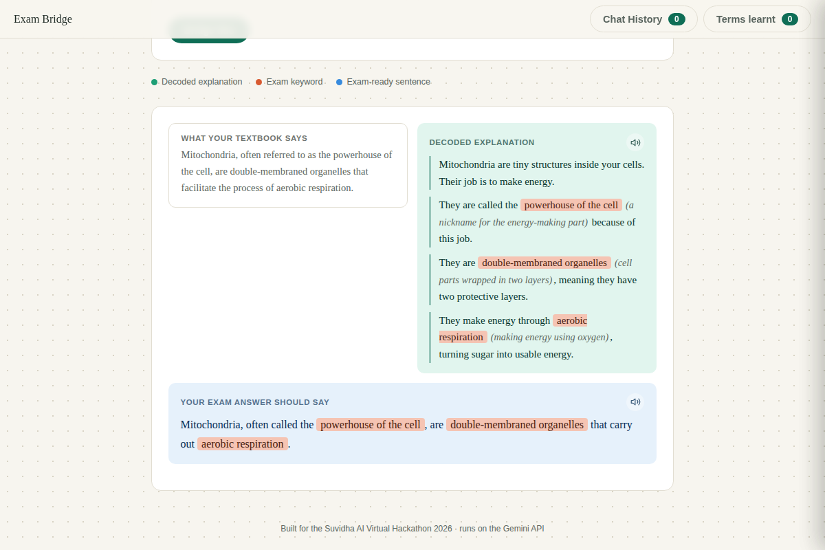
See your original paragraph next to a plain explanation and the exact sentence to write for exams.
-
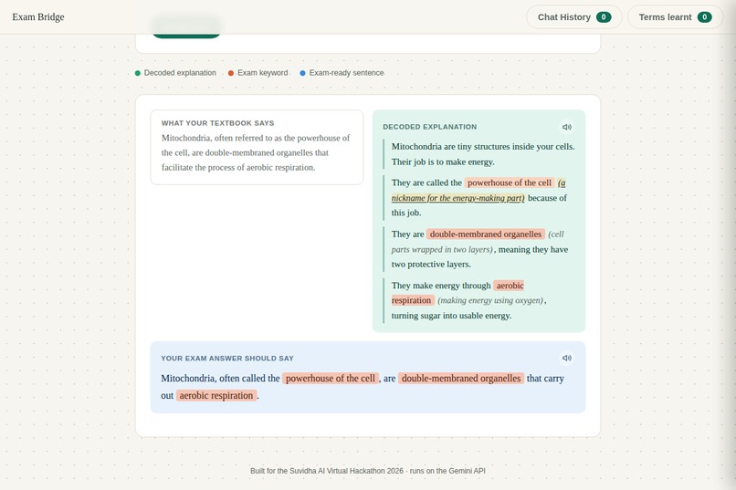
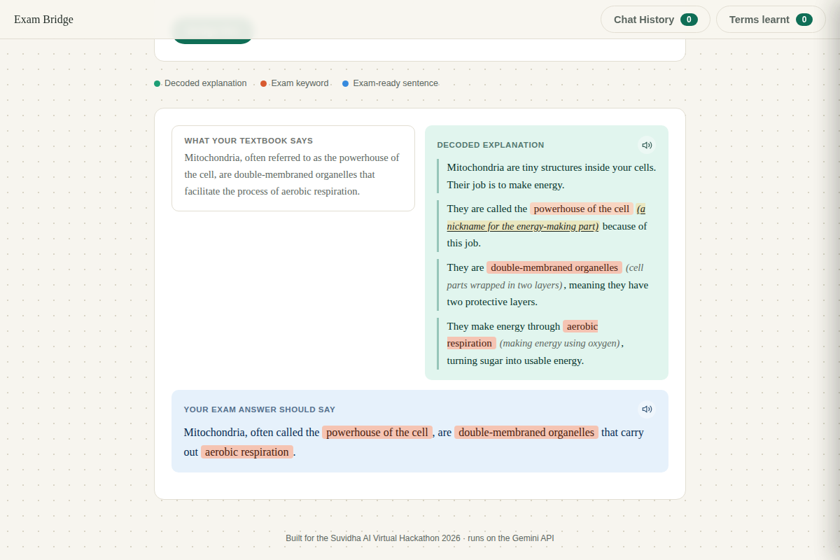
Hover any keyword to see its meaning underline and glow, without hiding it behind a popup.
-
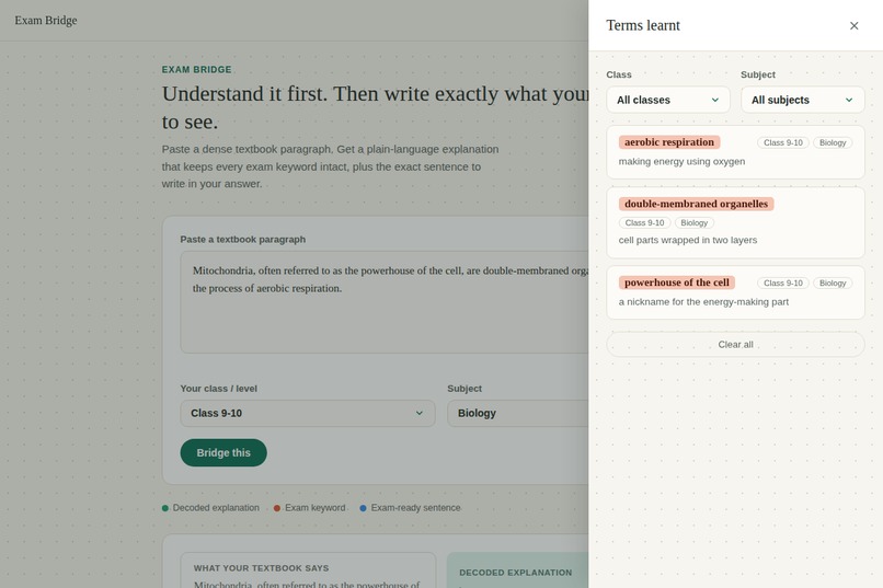
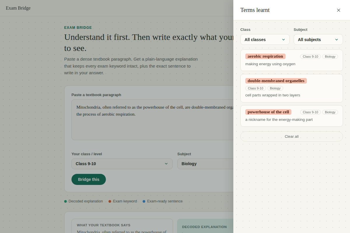
A personal glossary that grows over time, filterable by class and subject, saved locally.
-
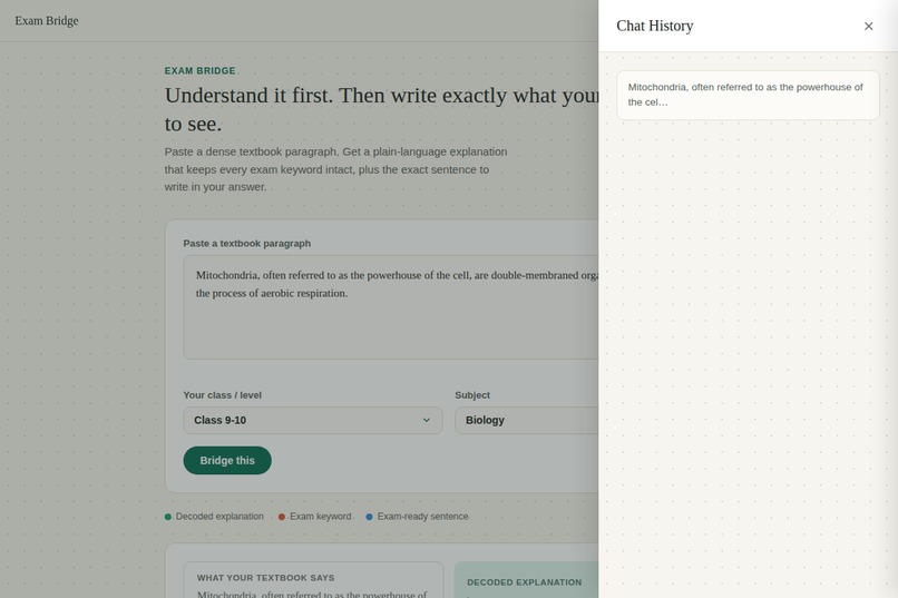
Every paragraph you run this session is saved here, one click away, no scrolling required.
-
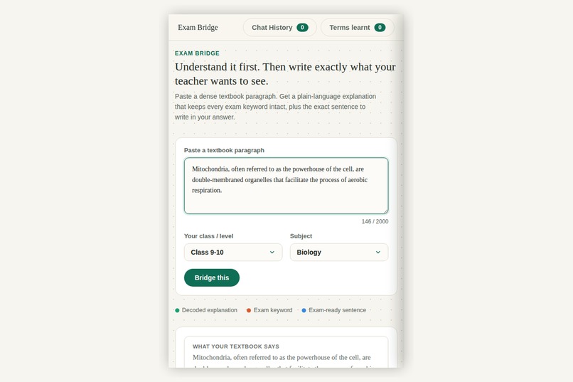
Fully responsive: works the same way on a phone as it does on a laptop.

Inspiration
The prompt asked for something at the intersection of education and accessibility, not education in general, not accessibility in general. That framing stuck with me. I kept coming back to a specific kind of student: someone with dyslexia or ADHD who understands a concept perfectly well when it's explained simply, but gets lost the moment it's written the way textbooks actually write it: dense, clause-stacked, jargon-heavy sentences that bury the idea instead of carrying it.
My first instinct was the obvious one: build a text simplifier. But partway through designing it, I realized something that changed the whole direction of the project. In Indian schools, exams are graded on exact keyword phrasing. If a student writes a correct, well-understood answer but leaves out the phrase "powerhouse of the cell" or "aerobic respiration," they lose marks, even though they clearly understood the biology better than someone who just memorized the sentence. A simplifier that strips out that exact phrasing to make text "easier" actually makes things worse for the one thing that matters most on exam day.
That tension, simplify for understanding versus preserve for grading, became the real problem I wanted to solve.
What it does
Exam Bridge takes a dense textbook paragraph and gives back two things side by side with the original: a plain-language explanation broken into short, digestible chunks, and the exact sentence a student should write on their exam, both containing every keyword the original teaches, never dropped.
The explanation doesn't just simplify vocabulary away. Every exam-critical term still appears, introduced with a short inline meaning the first time it shows up, so the student learns the real word instead of a dumbed-down substitute. Hovering a keyword highlights its meaning with a subtle underline and glow, so the definition is always in view without cluttering the page.
It also calibrates to the student's class level and subject, auto-detects the subject from the pasted content if the student forgot to select it, reads any section aloud through built-in text-to-speech, and quietly builds a personal glossary over time, but only saving terms that are genuinely worth remembering, not every word that happened to get highlighted.
How I built it
It's a single static HTML file: plain JavaScript, no framework, no build step, talking directly to the Gemini API. I leaned on Gemini's structured output mode (responseSchema) to force the model to always return a consistent shape: the keyword list, the chunked explanation, the exam sentence, a subject classification, and a flag per keyword for whether it's actually worth saving long-term. That last part matters more than it sounds; without it, every single highlighted word would flood the glossary, even filler terms nobody needs to revise.
The interface itself went through several real redesigns as the idea sharpened. It started as a flat "before and after" text box. It became a side-by-side comparison. The glossary and history moved from floating corner widgets, to full-width cards, to a proper slide-in drawer system reachable from a fixed top bar, because a panel you have to scroll to find isn't actually accessible.
Challenges I ran into
The single biggest challenge was getting reliable structured output out of an LLM at all. Early on, I had the model return plain JSON directly in the prompt, and it kept breaking: unescaped quotes, stray meta-commentary leaking into the response, inconsistent formatting on dense or unusual paragraphs. I tried a marker-based text format instead of JSON as a workaround, which helped but still wasn't fully reliable. The real fix was switching to Gemini's actual schema-enforcement feature, which stops asking the model to try to format correctly and instead makes it structurally impossible not to.
I also hit real infrastructure friction: rate limits on a free-tier API key mid-build, a rejected model name on a backup provider, and a security scare when I nearly committed a live API key to a public GitHub repo before GitHub's push protection caught it. That last one was a good reminder that a hackathon deadline is not an excuse to skip basic key hygiene.
Accomplishments that I'm proud of
I'm proud that the core insight, the exam-keyword problem, came from genuinely stepping back and asking "would this actually work for a real student in a real Indian classroom," not from chasing technical complexity for its own sake. The rubric rewards exactly that kind of narrow, well-understood problem over an ambitious feature list, and I tried to hold myself to that the whole build.
I'm also proud of the small details that took real iteration to get right: the "worth remembering" filter that keeps the glossary useful instead of noisy, the auto-subject-detection that corrects a student's mistake instead of silently mistagging their work, and an interface that's actually usable one-handed on a phone, not just a desktop demo.
What I learned
I learned that structured, schema-constrained output is a far more reliable pattern for building on top of an LLM than trusting a model to follow formatting instructions in plain prose, and that this matters even more, not less, when the person you're building for is someone who can't afford a broken or inconsistent tool.
I also learned that the best version of a feature usually isn't the first one you build. The tooltip-on-hover design felt complete until real feedback showed it hid information that should have been visible by default. The floating corner panels felt clever until they just felt cramped. Being willing to redesign something that already "worked" was, in the end, what made the product actually good.
What's next for Exam Bridge
- Support for regional Indian languages, so the plain explanation can be generated in a student's first language while keeping exam keywords in the language they're actually tested in
- A teacher-facing view, so an educator can review what a student's glossary shows they've struggled with
- Offline / low-bandwidth mode, for students without a reliable connection
- Image input, so a photographed textbook page can be processed directly instead of requiring the text to be typed or pasted in first


Log in or sign up for Devpost to join the conversation.